Cephalophores

denis1.jpg

Martyrdom of Saint Denis, Saint Eleutherius and Saint Rusticus by Pierre II Mignard.

Consider this an addendum to an earlier post about decapitations in art history. What I didn’t know then was that decapitated saints have their own “cephalophore” category if they’ve been recorded as going for a post-decapitation stroll; a case of “take up thy head and walk”. Saint Denis of Paris receives more attention than most on account of his being a patron saint of France. This also explains why his martyrdom is depicted in gory detail on the wall of the Pantheon in Paris.

denis2.jpg

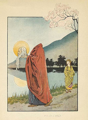
St. Denis bearing his head and halo (1896).

Nine-year-old Saint Justus of Beauvais differs from the strolling cephalophores—who manage to walk some distance before finally expiring—in having picked up his head severed head and carried on speaking. Rubens is one of the few artists to depict this event, although his habitual all-shall-have-muscles technique makes the boy look a lot older. Wikimedia Commons has a few more examples of Saint Denis, with and without head.

justus.jpg

The Miracle of Saint Justus (c. 1635) by Peter Paul Rubens.

Previously on { feuilleton }
Decapitations

Decapitations

heads03.jpg

Judith with the Head of Holofernes (1520–1540) by Lucas Cranach the Elder.

It doesn’t take much effort to refute the jeremiads of those who complain that popular culture is exclusively violent, all that’s usually required is to direct attention to Titus Andronicus or The Revenger’s Tragedy. Compared to the stage, the art world seems at first to be more circumspect, especially in the 19th century when the battles scenes of history painters sprawled across acres of canvas, all of them devoid of the physical trauma of warfare.

salome6.jpg

The Beheading of Saint John the Baptist (1455–60) by Giovanni di Paolo.

There are exceptions, however, and the nearer you move to Shakespeare’s time the more examples you’ll find. Paintings produced in an age when violent street executions were still a common sight would have seemed less surprising to their intended audience than they do to our eyes. Several of the paintings here provide a useful contrast with the many sanitised depictions of John the Baptist’s severed head in the Salomé archive.

heads01.jpg

Medusa (c. 1590) by Caravaggio.

Of all the paintings of Medusa’s head the one by Caravaggio is the sole example with a gout of spurting blood. It’s also unusual for being painted on a convex panel intended to resemble the reflecting shield of the Gorgon’s killer, Perseus. Given the violent life of the artist the gore isn’t so surprising although the jet of red in his painting of Judith beheading Holofernes still seems shocking if you’ve never seen it before.

heads04.jpg

Judith Beheading Holofernes (1598–99) by Caravaggio.

The Biblical story of Judith and Holofernes may be the poor cousin to the more popular story of Salomé but depictions of the crucial event make an impression by being consistently gruesome. I suspect the reason is less to do with the story itself than with the success of Caravaggio’s paintings among cultured Europeans. The copying or imitation of celebrated works became a thriving industry in the days of the Grand Tour with the result that 17th- and 18th-century art is overburdened with variations on earlier paintings.

Continue reading “Decapitations”

Tentacles #1: The Boats of the ‘Glen Carrig’

boats-1945.jpg

Famous Fantastic Mysteries, June 1945. Illustration by Lawrence (Sterne Stevens).

Following last week’s revelation of Lovecraftian horror, I thought it might be worth demonstrating just how much the tentacle-menacing-a-ship scenario is owned by William Hope Hodgson. The Boats of the ‘Glen Carrig’ (1907) is one of Hodgson’s lesser novels, overshadowed by the cosmic horrors of The House on the Borderland and The Night Land, but it’s a memorable work all the same. The narrative fits into his cycle of Sargasso Sea stories: a small band of 18th-century sailors, survivors of the wreck of the ‘Glen Carrig’, drift across the Atlantic into the weed-strewn “cemetery of the oceans” where they have to fight off giant octopuses and the predations of “weed men”, humanoid creatures with tentacular hands. As will be seen below, it’s the attack on a wrecked ship trapped in the weed that many of the illustrators have chosen to focus on.

tideless-1911.jpg

Illustration by Lawson Wood (1911).

This was something I hadn’t seen before: an illustration for a story with a scenario very similar to ‘Glen Carrig’ where the sailors journey under canvas in their lifeboats. Another tale of the sinister Sargasso:

This is the fifth message that I have sent abroad over the loathsome surface of this vast Weed-World, praying that it may come to the open sea ere the lifting power of my fire-balloon be gone, and yet, if it come there, how shall I be the better for it? Yet write I must, or go mad, and so I choose to write, though feeling as I write that no living creature, save it be some giant octopus that lives in the weed about me, will ever see the thing I write. (more)

boats-1971-1.jpg

Les Canots du “Glen Carrig” / La Maison au bord du monde / Les pirates fantômes (1971). Illustration by Philippe Druillet.

A French Hodgson collection, the octopoid cover of which can be seen here. These were the endpapers; the rest of Druillet’s illustrations can be seen here.

Continue reading “Tentacles #1: The Boats of the ‘Glen Carrig’”

Victorian typography

type1.jpg

“Victorian” isn’t really the correct term for the products of 19th century America but then “19th century” covers rather a lot of ground. Mr BibliOdyssey’s most recent post is a stunning collection of title pages from fire insurance maps of the late 19th and early 20th century. Rather than repost any you ought to go and see them for yourself, they’re excellent examples of the best and worst of “Victorian” graphic design, insanely and pointlessly ornate yet often very inventive in their elaborations and stylised letterforms. Being a typophile I’d often feel frustrated when looking at 19th century documents and seeing type designs in use for which there were no contemporary equivalents. There was such a profound reaction against ornamented design in the 20th century that it’s only relatively recently that typography of this period has been reappraised and, in some cases, resurrected. The book from which these examples are taken dates from 1897, and it fascinates for putting names to some of those neglected designs. This is a big catalogue of 740 pages so I’ve been sparing in my selection. Anyone wishing to see more can download the whole thing here.

type2.jpg

Despite my affection for curvilinear Art Nouveau, when it comes to typography I’m often drawn to the spikier styles. Atlanta was digitised by P22 in a style they call Victorian Gothic. Their accompanying ornament set replicated that curious shape from Victoria below.

type3.jpg

type4.jpg

This typeface, or ones which resemble it, is a common one in 19th century newspaper and advertising design but I’d never seen it given a name until now. The catalogue pages have a number of variations which is no doubt an indicator of its popularity. A bold weight of the design was digitised by Scriptorium as a font they call Mephisto.

type5.jpg

Rubens is my favourite of all the designs in this catalogue, probably because I always liked the way it looked when it enjoyed a surprising flush of popularity in the 1960s and 1970s. The narrow style made it very useful for book covers (as with the examples here) while those spiky serifs made it popular with art directors looking for a typeface that said “horror”. Wooden Type Fonts recently digitised a version of Rubens but their version lacks the elegance of the original. Anyone else want to have a go?

type6.jpg

Lastly the catalogue has many pages of clip art figures and decorations including the pointing hands which people always associate with 19th century design. I’d wondered a few times whether these jagged decorations were meant to be electrical or not. Electricity was a new thing in 1897 so these would have seemed distinctly modern.

Previously on { feuilleton }
Steampunk overloaded!
Penguin Labyrinths and the Thief’s Journal
Masonic fonts and the designer’s dark materials

Penguin Labyrinths and the Thief’s Journal

labyrinths1.jpg

Detail from La Havane by René Portocarrero; photo by C. Marker.

This week’s book finds are a pair of titles I hadn’t come across before in these particular editions, another haul from the vast continent that is the Penguin Books back catalogue. Labyrinths I’ve had for years in a later edition (see below) but the cover of this one seems more suited to Borges (as much as he can be illustrated) than the somewhat bland Surrealism of illustrator Peter Goodfellow. René Portocarrero (1912–1985) was a Cuban painter with a post-Picasso style who specialised in hallucinogenic profiles like the one here. And it’s a guess but I’d bet the “C. Marker” who photographed the painting is French filmmaker Chris Marker (who I compared to Borges last year), director of La Jetée and Sans Soleil. Marker worked as a photo-journalist for many years and made a documentary entitled ¡Cuba Sí! in 1961.

Continue reading “Penguin Labyrinths and the Thief’s Journal”