Michel Henricot, 1936–2022

henricot1.jpg

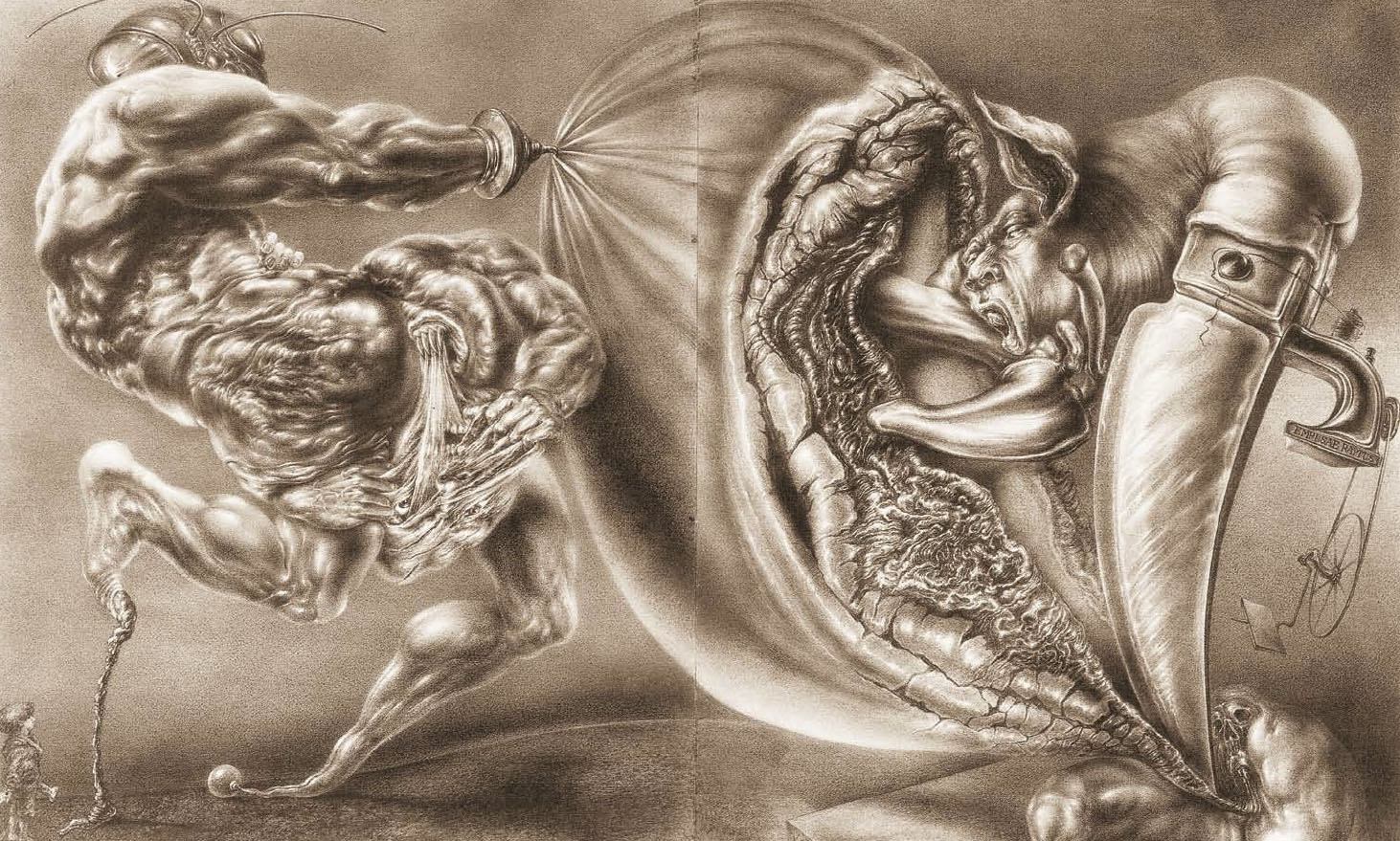
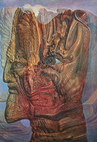
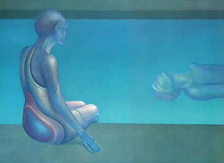
Deux Personnages (1974).

Jan of JKK Fine Arts was in touch this week to inform me that the French artist Michel Henricot died in February, a month before the opening of an exhibition of his work organised by JKK Fine Arts for the International Cultural Centre in Cracow, Poland.

henricot2.jpg

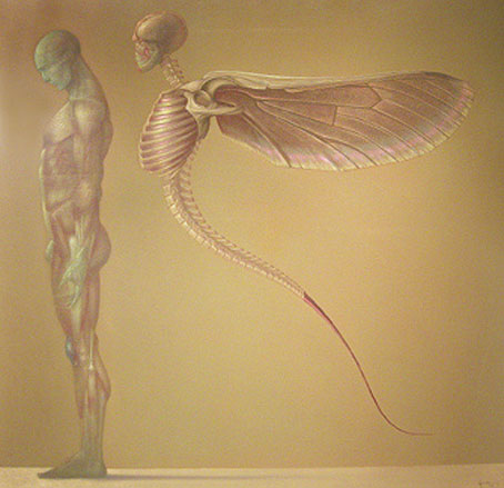
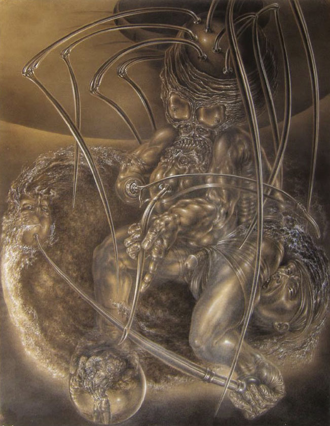
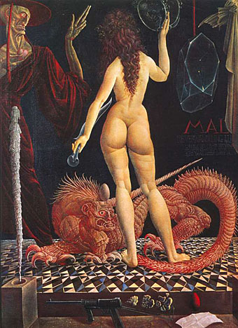
Le Voyageur IV (1996).

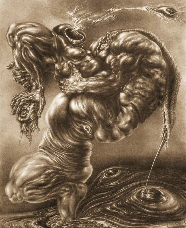
I first encountered Henricot’s work in the pages of OMNI magazine where he was one of several featured artists who can be grouped together as “fantastic realists”—Ernst Fuchs, Mati Klarwein, HR Giger, Robert Venosa, Rudolf Hausner, De Es Schwertberger—although the label wouldn’t have necessarily been agreed to by any of them apart from Fuchs and Hausner, both of whom were members of the Vienna School of Fantastic Realism in the 1960s. Henricot’s sombre and obsessive figure studies were a good fit for the magazine, with the science fiction context lending his paintings suggestions of the futuristic or alien that might otherwise be absent in the empty space of an art gallery.

henricot3.jpg

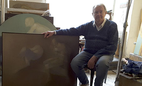
The artist photographed by Jan K. Kapera.

Despite such a high-profile showcase Henricot’s work has never been as visible as his more famous contemporaries so I’m grateful to Jan for supplying additional information, including the artist’s actual birth date, 8th July, 1936, rather than the erroneous dates found all over the internet. Henricot was friends with Leonor Fini, an artist whose work was also preoccupied with the human figure, often just as stylised and set against featureless monochrome backgrounds. Like Henricot, Fini’s art gets tagged as Surrealist even though her own obsessive paintings evolved away from any particular school. Henricot’s Les Promeneuses (1954) was definitely reaching for a Dalínean/Delvaux-like quality, but if his mature work belongs anywhere it’s with that small collection of French artists who don’t comprise any defined movement but who share a taste for the fantastic, the strange and the inexplicable: Sibylle Ruppert, Jean-Marie Poumeyrol, Jean-Pierre Ugarte, Gérard Trignac, Erik Desmazières, Jean-Paul Faccon, Pierre Clayette, Raymond Bertrand, Roland Cat, Gilles Rimbault, Jean-Michel Mathieux-Marie, and others. If I was given the opportunity to put together an art show for a French gallery (or even the Pompidou Centre…), these are some of the artists I’d choose.
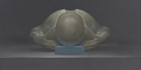
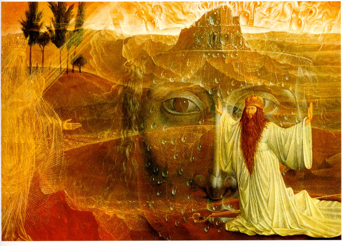
henricot4.jpg

Le Silence (1979).

Henricot will be running at the International Cultural Centre, Cracow, until the end of April.

Elsewhere on { feuilleton }
The fantastic art archive

Previously on { feuilleton }
Saint Sebastian in NYC
The art of Michel Henricot

The art of Robert Venosa, 1936–2011

venosa.jpg

A few years back, while experimenting with the hallucinogens, I experienced visions of a dynamic energy in constant high-velocity motion, crystallizing and manifesting in a form which could only be described as angelic. Potential energy, crystallizing energy and structured energy were all visible in the same instant…time and space transcended. These visions, and a new-found awareness of spirit brought about through worship and meditation, were too powerful not to be expressed: a translation had to be attempted.

Robert Venosa, Manas Manna, 1978.

I only discovered a few days ago that American artist Robert Venosa had died last month. As with the late Sibylle Ruppert there’s the inevitable wish for some wider acknowledgement of the passing of these unique talents.

santana.jpg

Millions of people have seen one of Venosa’s creations without being aware of it: in 1970 he designed the logo/title for Santana’s Abraxas album (the one with the amazing Mati Klarwein cover), a design which is still in use today. But it’s as a painter that he ought to be remembered. Manas Manna was the first collection of Venosa’s art published by Peter Ledeboer’s Big O imprint in 1978, and could be found on bookshelves that year with a pair of equally remarkable auto-monographs: Mati Klarwein‘s God Jokes and the first English edition of HR Giger‘s Necronomicon. All three artists were aware of each other (Venosa was friends with the other two), and all had managed the difficult feat of having their work sold in art galleries whilst also being visible to a much larger audience on album covers. All three books were eagerly plundered that year by the art team of OMNI magazine whose early issues made heavy use of paintings by Klarwein, Giger, Venosa, De Es Schwertberger and others. Of this Venosa has said:

OMNI was the first to give the artist equal credit with the author…something that to this day is still not seen in any other newsstand magazine. OMNI also put Fantastic Realism, Surrealism, Visionary, and every other type of ‘Fantasy’ art, square into the public’s eye. I and my colleagues owe OMNI a large measure of gratitude for its uncompromising stance and visionary concepts.

Venosa had been an art director at Columbia Records in the 1960s, a job he abandoned after he met Mati Klarwein and decided he’d rather devote his time to painting. Despite describing Klarwein in his book as his painting master, only a couple of his pictures are reminiscent of Klarwein’s distinctive style. Many of Venosa’s works are more loose and abstract than Klarwein’s tableaux, extending the processes of decalcomania which Max Ernst refined in works such as Europe After the Rain (1942) and The Eye of Silence (1944) to create stunning views of cosmic eruptions and vistas of crystalline beings rendered in a meticulous, hyper-realist manner. Many of his pictures could serve as illustrations for the later chapters of JG Ballard’s The Crystal World.

If the lazy definition of psychedelic art refers merely to shapeless forms and bright, clashing colours, Venosa’s art is psychedelic in the truest sense, an attempt to fix with paint and brush something revealed by a profound interior experience. This was deeply unfashionable by 1978, of course, but he carried on working anyway, and there are further book collections for those interested in his paintings. The Venosa website has a small selection of his extraordinary pictures although they really need to be seen at a larger size.

Elsewhere on { feuilleton }
The album covers archive
The fantastic art archive

Sibylle Ruppert revisited

ruppert1-1.jpg

Empusae Raptus (1977).

Another post about this astonishing artist (I’ll keep talking about her if no one else does…). The pictures here are taken from the catalogue for the 2010 Sibylle Ruppert exhibition at the HR Giger Museum, Gruyères, Switzerland. Leslie Barany was good enough to send me a copy of this, and the pictures are posted courtesy of the museum. To purchase a copy of the catalogue contact marcowitzig@gigerworkcatalog.com

ruppert2-1.jpg

Le Chant de Maldoror (1978).

Looking over Sibylle Ruppert’s work this week I’ve been pondering why she wasn’t better known. She was working throughout the 1970s and could easily have been swept up in the vogue for fantastic art when it was being popularised by Omni magazine. Giger, Mati Klarwein, Robert Venosa, De Es Schwertberger and others all benefited from Bob Guccione’s publication, and to a lesser degree from appearances in Heavy Metal magazine. Ruppert’s lack of visibility may have been a result of the usual situation whereby women artists were overlooked or marginalised. But I think it’s far more likely that her work was simply too intense and visceral for the newsstands. Giger could get by with paintings like the semi-abstract NY City series which were attached to science fiction stories without causing a stir. It’s difficult to imagine Ruppert’s work gaining such a popular acceptance, especially in the United States where, lest we forget, Giger’s Penis Landscape did cause a stir in 1985. One of the great benefits of the web is the way so much previously buried culture is surfacing and finding new and enthusiastic audiences. Sibylle Ruppert’s greatest audience has yet to find her but they’re surely out there, you can’t keep work of this quality buried forever.

For a few more Ruppert works see that haven of all things grotesque, Monster Brains.

ruppert3-1.jpg

Le Spectacle de l’Univers (1977).

Continue reading “Sibylle Ruppert revisited”

The art of Mati Klarwein, 1932–2002

godjokes.jpg

If book collecting is frequently a waiting game, some waiting periods can be longer than others. In the case of Mati Klarwein’s God Jokes, my patience and hope have sustained themselves for 28 years until I finally acquired a copy this Thursday afternoon. God Jokes was the second book of Mati Klarwein’s work, published by Harmony Books, New York, in 1976, a slim catalogue-style collection of his paintings, some of which were featured in the early issues of Omni magazine. In 1979 and 1980 God Jokes turned up in a chain of UK remainder shops and for a while it seemed like everyone I knew owned a copy which possibly explains my unaccountable decision to avoid buying one myself. As the years passed and I became increasingly enamoured with Mati Klarwein’s work I came to regret that decision, not least because the book seemed to disappear completely. Copies have turned up since on Abe.com but at bizarrely inflated prices (£50 for a 56-page art book?!). I paid £4.99; patience sometimes pays off.

abraxas.jpg

Abraxas by Santana.

Mati Klarwein’s work has been most visible via the album sleeves of the Sixties and Seventies which borrowed his pictures for their covers. Chief among these is one of the best Santana albums, Abraxas (1970), which used his stunning 1961 painting The Annunciation (and a lettering design by Robert Venosa), and one of all-time favourite albums, the Miles Davis masterpiece Bitches Brew (1970). Miles Davis was a great Klarwein enthusiast for a while and commissioned new work for his Live-Evil album in 1971.

davis.jpg

Live-Evil by Miles Davis.

It’s not necessary to go into detail describing Mati Klarwein’s work when you can go to the web gallery maintained by his family and feast your eyes there. Klarwein is one of the few 20th century artists to have taken Salvador Dalí’s photo-realist painting style and make of it something unique to himself; his work is always immediately recognisable. That this work is still known mainly for its illustrative connections tells you more about the iniquities of the art world than it does about the value of the paintings as works of art.

maarifa.jpg

The most curious thing about having to wait so long to find a copy of God Jokes was that I ended up working with a picture of Mati Klarwein’s three years before I found the book; I would have expected to find the book one day but the latter eventuality was far less predictable. In 2005 Jon Hassell asked me to design his new CD, Maarifa Street, and Jon was keen to use a tiny video detail he made of a huge and incredible Klarwein painting, Crucifixion (1963–65). The detail is the rectangle in the centre of the cover, juxtaposed against some Hubble galaxies: the very small against the very large. We used the painting itself and further details inside the digipak. Jon was another of those who used Klarwein’s art for his album sleeves (for Earthquake Island, Dream Theory in Malaya and Aka-Darbari-Java/Magic Realism) and the two men became great friends as a result.

crucifixion.jpg

Crucifixion by Mati Klarwein.

Jon Hassell writes about Bitches Brew—and Mati Klarwein’s sleeve art—here. His site also includes a 1998 Mati Klarwein interview from The Wire in which the painter discusses his life and work. If you want a copy of God Jokes for yourself, be prepared to wait…or pay over the odds.

Elsewhere on { feuilleton }
The fantastic art archive

Elsewhere on { feuilleton }
The album covers archive

Previously on { feuilleton }
Ballantine Adult Fantasy covers
Visions and the art of Nick Hyde
The poster art of Marian Zazeela