Powell & Pressburger: A Pretty British Affair

archers1.jpg

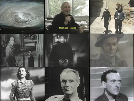
“It’s the only thing that fulfils its promise…magic,” says Martin Scorsese, referring to a shot of an arrow thudding into its target at the beginning of a feature film. A pierced target accompanied by the words “A Production of The Archers” heralded the films made by Michael Powell and Emeric Pressburger from 1943 to 1957, films that included The Life and Death of Colonel Blimp (1943), A Canterbury Tale (1944), I Know Where I’m Going! (1945), A Matter of Life and Death (1946), Black Narcissus (1947), The Red Shoes (1948), Gone to Earth (1950) and The Tales of Hoffmann (1951). A Very British Affair (1981) is a 50-minute documentary made for the BBC’s Arena strand by Charles Cabot and Gavin Millar that charts the progress of Powell and Pressburger’s partnership. There’s also some discussion of Powell’s Peeping Tom (1960), the film that sank his career in Britain but which is now regarded as a masterpiece of self-reflexive cinema.

archers2.jpg

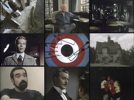
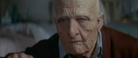
This is the best documentary about The Archers, not only for the interviews with the two men but also for the extraneous business with Michael Powell in Los Angeles and New York. In both cities the director is seen with two younger filmmakers who helped resurrect his reputation in the 1980s: Francis Coppola (seen wandering around the sets used in One from the Heart) and Martin Scorsese. The latter is interviewed during the filming of The King of Comedy, and we get to see a brief between-takes moment with Jerry Lewis and Robert De Niro. Powell was a kind of backroom advisor to Scorsese at this time, offering suggestions during the production of Raging Bull and After Hours. On the west coast he was working on projects that would have been films for Coppola’s American Zoetrope but—as we now know—nothing materialised.

Previously on { feuilleton }
The Rite of Spring and The Red Shoes
Michael Powell’s Bluebeard revisited
The Tale of Giulietta

Dick Smith, 1922–2014

smith1.jpg

left: Dummy head by Dick Smith for The Picture of Dorian Gray (1961); right: Cover art by Michel Atkinson (aka Michel) for The Unquiet Grave (1963).

Cinema in the 1970s would have been very different without Dick Smith‘s makeup artistry.

smith2.jpg

Dustin Hoffman in Little Big Man (1970).

smith3.jpg

Marlon Brando in The Godfather (1972).

smith4.jpg

Linda Blair in The Exorcist (1973).

Continue reading “Dick Smith, 1922–2014”

Graphic design in Heat

heat4.jpg

Amy Brenneman.

In which Neville Brody’s early record sleeves lurk in the midst of a Michael Mann crime drama…

I picked up some cheap DVDs last week, among them a copy of Mann’s Heat (1995) which I hadn’t seen for over ten years. I like Mann best when he’s doing his high-tech thriller thing (although I also have a soft spot for The Keep), and enjoy this one despite its being too long for the thin story and characterisation. Something I’d completely forgotten when re-watching it was the scene where Eady (played by Amy Brenneman), a part-time graphic designer, is on the phone to her bank-robbing boyfriend, played by Robert De Niro. This is one of those cinematic moments where some stray cultural reference that no one is meant to notice leaps to your attention and for a few seconds upsets all interest in plot and dialogue. Offhand I can think of the moment in Alan Pakula’s Presumed Innocent where a copy of a Ramsey Campbell novel is seen on a bookshelf during a conversation. Much worse, since it’s an error as well as a distraction, is Picasso’s Les Demoiselles d’Avignon being shown onboard the Titanic in James Cameron’s fatuous disaster movie when the real painting has been hanging safe and sound for years in the Museum of Modern Art in New York.

heat1.jpg

In Heat we have a scene in Eady’s apartment where the walls are covered with what I assume are meant to be examples of her design work. 99.9% of the audience will pay no attention to this but anyone with a copy of The Graphic Design of Neville Brody would recognise a number of familiar designs. Something I hadn’t spotted before was the word “FUSE” on the computer screen, Fuse being the name of the experimental typography magazine created in the 1990s by Brody and Jon Wozencroft. On the window to the left of the computer there’s pinned a copy of Brody’s design for Wipe Out, a single by Z’ev on the Fetish label. Brody designed nearly everything for Fetish during the label’s brief existence in the early 1980s, and the most visible Brody examples in this scene are all Fetish designs. This seems an odd choice for a film made in the mid-90s although in an earlier conversation Eady mentions having designed some music CDs. Brody’s later design work was very influential and overshadowed his work for Fetish which I’ve always liked a great deal.

wipe_out.jpg

Wipe Out by Z’ev.

heat2.jpg

In another part of Eady’s apartment there’s a large reproduction of the sleeve for a Fetish compilation, The Last Testament.

testament.jpg

heat3.jpg

While further along the same wall there’s the sleeve for Diddy Wah Diddy by 8 Eyed Spy, yet another Fetish single. On the far right of the shot above there’s a face from one of Brody’s theatre posters which confirms that Mann’s set decorators must have plundered a copy of Brody’s book.

diddy.jpg

This isn’t a complaint, of course, I’d commend Mann and co. for their excellent taste, and for having used work by a real graphic designer rather than trying to fake something. It’s even possible to find a tenuous connection between the record sleeves and Mann’s eclectic soundtrack. Many of the Fetish artists—Throbbing Gristle, 23 Skidoo, Clock DVA, Stephen Mallinder—were in the first wave of Industrial music, and Mann briefly uses a great piece by Einstürzende Neubauten from their own Industrial phase. I’d have suggested he also use Blue Heat by Cabaret Voltaire (from an album with another Brody cover) but that’s just my obsessions showing.

Previously on { feuilleton }
Neville Brody and Fetish Records
Alex in the Chelsea Drug Store