The Needful Thing

needful1.jpg

Very fitting this one turning up today of all days, especially when the story takes place in the month of October. This time last year I was still working on the interior illustrations. It’s a heavyweight volume, bulked out to 730 pages by Richard Christian Matheson’s afterword and the sturdy slipcase; I designed the cover lettering but the rest of the book design is by Michael Smith. I also signed the main run of 1000 copies, with a smaller run (40 copies, I think) being signed by author and artist. Demand from collectors sold out the book very quickly but if you’re really needful you can find them on Abebooks and eBay for the inevitable high prices.

needful2.jpg

Still to come is a post about the illustrations but before I can do that I need to create a new page for the main website. In the meantime, here’s a picture of Mr Gaunt making Polly Chalmers an offer she can’t refuse.

needful3.jpg

Previously on { feuilleton }
All the Things
Needful Things

All the Things

needful.jpg

Over the weekend I braved repetitive strain injury and solvent delirium from the fumes emitted by metallic markers while autographing this stack of signing sheets. The weighty pile is now on its way back to PS Publishing which means that the forthcoming illustrated edition of Needful Things is closer to being with its needful purchasers.

Needful Things

needful1.jpg

This is the first time I’ve mentioned this doorstop volume but it won’t be the last. I’ll be writing at greater length about last year’s heavy-duty illustration project once the book is in print. Needful Things is the latest in an ongoing series of reprints of Stephen King books from PS Publishing, each volume being limited to 1000 cased, hardback copies. Each book showcases the work of a different illustrator who also signs a tipped-in bookplate. There’s a thriving international market for deluxe reprints of King’s books so these things always sell out fast. This post serves as an alert to let interested purchasers know that the pre-ordering queue will open on the publisher’s website this Friday.

needful2.jpg

It was just over a year ago when PS asked if I’d like to illustrate Needful Things. I agreed with some trepidation, having already started work on another major illustration/design project (still in progress). The request from PS was for a cover design and 30 full-page interior illustrations; that’s only a little more than the amount of work I had to do when illustrating Dracula a couple of years ago, but those illustrations were mostly digital collages which took two or three days each to complete. A full-page drawing with this level of accuracy and detail takes me the best part of a week so I could see nine months of frantic plate-spinning ahead. Everything worked out, anyway, and I’m very pleased with the end results. So is Stephen King, which is good to know.

needful3.jpg

I’m afraid I don’t have price details for this one but the PS edition of Cujo was priced at £90. Anyone wanting to join the pre-order stampede is advised to first join the publisher’s mailing list. The most recent PS mail has some additional information about the ordering process. I’ll write a little more about the illustrations once the dust has settled.

Previously on { feuilleton }
Long Live the New Flesh: The Films of David Cronenberg
Berni Wrightson in The Mist

Mr Sandman

sandman1.jpg

The last cover reveal of the year isn’t my last cover of the year, two more will follow this one but they won’t be made public until next year. As before, I’ve only done the illustration this time, PS Publishing having an in-house designer who does the rest. Mr Sandman by SJI Holliday is another hardback novella, a horror tale with a sense of humour and a Monkey’s Paw-like warning about careless wishes:

Sophie is bored with her perfectly nice but deathly dull boyfriend Matthew. Sensing he’s about to lose her, Matthew takes her on a last-ditch attempt trip to the seaside, hoping to rekindle their dying flames. But things take a dark turn when Sophie visits Mr Sandman, a Haitian priest, who claims that he can change Matthew into the boyfriend that she wants. But does Sophie really know what she wants? Never has the phrase “be careful what you wish for” been more apt. Because Matthew does change…just not in the way that anyone could’ve predicted.

sandman2.jpg

Worthing is a seaside town on the south coast of England that’s generally regarded as a poor relation of nearby Brighton. Despite this status the town does possess an award-winning pier which is the main focus of SJI Holliday’s story, so this seemed an inevitable focus for the cover as well. My idea was for something in the manner of Tom Adams, an artist who specialised in arrangements of carefully-painted objects on vague or sketchy backgrounds, with the backgrounds often depicting the location of the story. Having grown up in another seaside town blessed with three piers I’m well aware that all these structures aren’t the same so the pier details have been properly researched. The Tarot cards are an example of artistic licence, however, since the novella doesn’t mention Tarot divination. But with a narrative that concerns a visit to a fortune-teller’s booth this didn’t seem like too much of a stretch, as well as being a convenient way of depicting the main characters. Pamela Colman Smith’s cards were the model for these; the two main characters look a little stiff but that’s the way the figures are represented on her Lovers card, and the awkwardness of the relationship is a dominant theme. As for the cupcakes, these are all very relevant to the story but you’ll have to read the book to find out why.

sandman3.jpg

Endpaper illustration.

sandman4.jpg

Previously on { feuilleton }
Tom Adams Uncovered
Out of season

Double weird

weird1.jpg

Two of the books whose covers I was working on late last year have been announced so here they are. This is more work for PS Publishing where wraparound covers are the standard, so once again I was able to work in a pictorial, landscape format. (PS also do their design in-house so I only did the art this time. Click on the pictures below for larger views.)

weird2.jpg

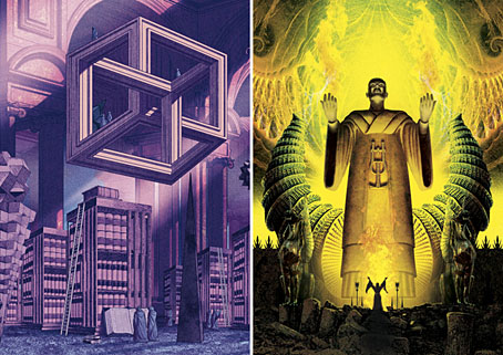
Apostles of the Weird is a collection of contemporary weird fiction edited by ST Joshi:

Weird fiction is an incredibly rich and varied genre, running the gamut from supernatural horror to imaginary-world fantasy to psychological terror. This anthology seeks to exhibit the wide range of themes, motifs, and imagery that weird fiction allows, as embodied in the work of some of the leading contemporary writers in the field. (more)

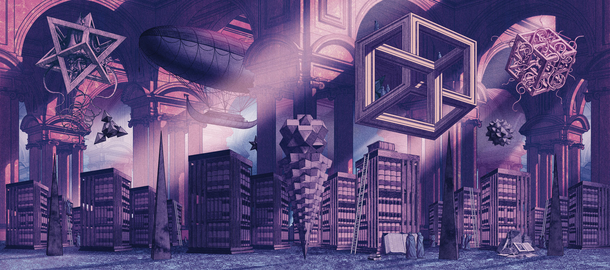
“Weird” is indeed a very broad category so rather than try and create something that represented a single genre I opted for a weird view instead. The idea was to do something like Borges’s Library of Babel in a space that was a hybrid of Piranesi and MC Escher. I was hoping originally to make this more Escher-like, with a number of gravity-defying staircases, but the underlying drawing took so long that I didn’t have time.

weird3.jpg

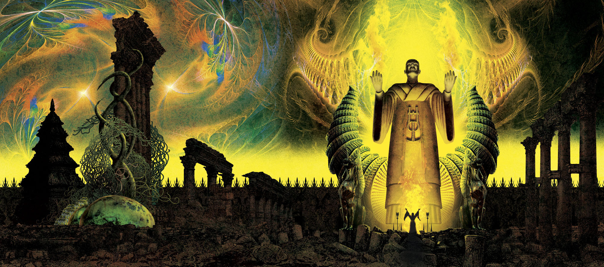
His Own Most Fantastic Creation: Stories About HP Lovecraft is also edited by ST Joshi:

HP Lovecraft (1890–1937), the pioneering writer of weird fiction, has himself become an icon in popular culture. Stories, novels, and other works featuring the gaunt, lantern-jawed gentleman from Providence, Rhode Island, have proliferated. These works have been triggered by the incredible amount of knowledge we have on the writer—his family, his friends, his idiosyncrasies and eccentricities—as found in his thousands of surviving letters. (more)

This was much easier to achieve since HP Lovecraft is familiar territory. The idea here was to do a portrait of Lovecraft situated in a Lovecraftian zone, a colossal idol of a type that might be found in some of his Cyclopean ruins. Lovecraft and his Weird Tales colleagues had a habit of referring to each other in their stories and letters as though they were ancient priests or sorcerers so portraying Lovecraft in this manner is fitting. The combination of perspective and lighting worked against creating an accurate likeness, however—it doesn’t help that Lovecraft’s features are weird in themselves—so the “HPL” icon is there to affirm the identity.

Both books will be published next month if Great Cthulhu hasn’t risen from the depths by then.

Elsewhere on { feuilleton }
The Lovecraft archive

Previously on { feuilleton }
Something from Below