Weekend links 528

durer.jpg

The Rhinoceros (after 1620) by Albrecht Dürer.

• “Today—Tolkien, Lovecraft, Miéville and M John Harrison!” Paul StJohn Mackintosh at Greydogtales explores HP Lovecraft’s lack of interest in fictional worldbuilding. The piece includes one of my book covers (ta!) plus a link to an earlier post I wrote about the cover designs of M. John Harrison’s Viriconium books. Since I’m connected to the thesis I’ll suggest that Lovecraft was resistant to the worldbuilding impulse in part because he was almost always writing horror stories. Having studied the genre at length he was well aware of the need to leave suggestive voids for the reader’s imagination.

• RIP Denise Johnson. All the obituaries mention the big names she worked with, notably New Order and Primal Scream, but being in the pool of Manchester session artists she also appeared on a couple of records by my colleagues at Savoy. Her voice is one of those you first hear on the PJ Proby cover of I’m On Fire, while with friend Rowetta she improvised her way through a Hi-NRG original (and a favourite of Anohni’s), the scurrilous Shoot Yer Load.

• At the BFI: Axel Madsen interviews Fritz Lang in 1967; Serena Scateni on where to begin with Nobuhiko Obayashi; and Roger Luckhurst reviews the spomenik-infested  Last and First Men by Jóhann Jóhannsson.

• “Be more aware of the rest of the world!” says Jon Hassell, talking to Alexis Petridis about a life spent making music.

John Boardley on the Renaissance origins of the printed poster. Worth it for the selection of engraved details alone.

• “What Ever Happened To Chicken Fat?” Jackson Arn on a tendency to over-abundance in Jewish humour.

Erik Davis has a new writing home at Substack that he calls The Burning Shore. Bookmarked.

• Mix of the week: The Ivy-Strangled Path Vol. XXII by David Colohan.

• Garry Hensey on The Strange World of John Foxx.

• At Dennis Cooper’s: Sergei Parajanov Day.

Romantic Rhino (1981) by Ananda Shankar | The Lone Rhinoceros (1982) by Adrian Belew | Blastic Rhino (2000) by King Crimson

Weekend links 419

ellison.jpg

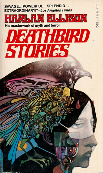
Cover art by Leo & Diane Dillon, 1975.

Art is not supposed to be easier! There are a lot of things in life that are supposed to be easier. Ridding the world of heart attacks, making the roads smoother, making old people more comfortable in the winter, but not Art. Art should always be tough. Art should demand something of you. Art should involve foot-pounds of energy being expended. It’s not supposed to be easier, and those who want it easier should not be artists. They should be out selling public relations copy.

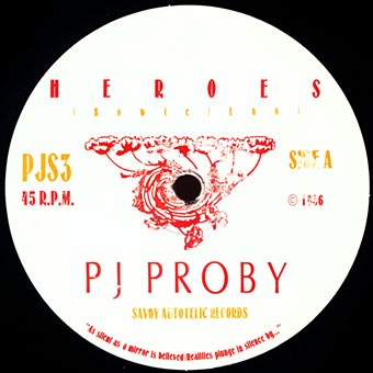
Typical of the late Harlan Ellison to describe his vocation in terms of difficulty and struggle even when his prolific output made writing seem effortless. When my colleagues at Savoy Books published a Savoy issue of New Worlds magazine in 1979 one of the features they ran was an introduction by Michael Moorcock to an Ellison story collection. (They also published two books of Ellison’s around this time.) A copy of the magazine was duly sent to the subject of the essay since Ellison always liked to keep track of his print appearances. The back page of that particular issue is blank but for a few words in bold type from singer PJ Proby: “I am an artist; and should be exempt from shit.” Ellison cut this slogan from the magazine then glued it to his typewriter, no doubt transferring it to later models since it was still visible in the 2008 Ellison documentary, Dreams With Sharp Teeth.

My first encounter with Ellison’s work was also my first encounter with what became labelled the new wave of science fiction, via a reprint of I Have No Mouth, and I Must Scream in a book in the school library. I was only about 12 or 13 at the time, and found Ellison’s story so shocking and disturbing that it overpowered everything else in the collection. The only other story that made an equivalent impression at the time was The Colour Out of Space by HP Lovecraft, so it’s perhaps fitting that Ellison gave my work a favourable mention in his introduction to the huge Centipede Press collection of Lovecraft artwork, A Lovecraft Retrospective: Artists Inspired by HP Lovecraft. I still haven’t got over that one. After the initial encounter, the Ellison-edited Dangerous Visions and Again, Dangerous Visions were just as important for me as the paperback reprints of stories from the Moorcock-edited New Worlds: a handful of books that showed science fiction to be a literary form of limitless possibilities, as opposed to the stereotype of space adventure and future technology. The Ellison and Moorcock anthologies led me to William Burroughs, James Joyce and all points beyond; they also soured for me the preoccupation with space adventure and future technology which persists today.

My final connection with Ellison replayed his compliment in a small way, when editor Jill Roberts and I took extra care with the typesetting of Jeffty is Five for The Very Best of Fantasy & Science Fiction, Volume 2. Ellison was the only author I’ve encountered in the digital age whose corrections were still handwritten comments on printed sheets; these had to be faxed to San Francisco then scanned and emailed to me (to this day I still don’t know why the oft-reprinted story required so many adjustments). It was awkward but amusingly so, a benign taste of a legendary bloody-mindedness and insistence on precision.

• “Laughing about an acid trip with members of Can and opening up about some of the ‘scars’ left from his association with Brian Eno and David Byrne’s My Life In the Bush of Ghosts, [Jon] Hassell is candid in a way that comes naturally to those who’ve lived life on their own terms.”

• Drone Metal Mysticism: Erik Davis talks with music scholar and ethnographer Owen Coggins about amplifier worship, sonic pilgrimage, “as if” listening, metal humour, and his new book Mysticism, Ritual and Religion in Drone Metal.

Psychedelic Prophets: The Letters of Aldous Huxley and Humphry Osmond; “Letters between the men who coined the term ‘psychedelic’ and opened doors to a different way of thinking about human consciousness.”

Artaud 1937 Apocalypse: Letters from Ireland by Antonin Artaud; translated and edited by Stephen Barber.

• “I thought female sexuality was an OK thing?” says writer and porn performer, Stoya.

• “How did a major label manage to lose a John Coltrane record?” asks Ted Gioia.

• Welcome to the dollhouse: Alex Denney on a century of cinematic cutaways.

• The trailer for Mandy, a new (and much-awaited) film by Panos Cosmatos.

• Rest in Anger, Harlan Ellison (1934–2018) by Nick Mamatas.

• Mix of the week: FACT Mix 659 by BD1982.

Emily Gosling on library music design.

Record Label Logos

The Deathbird Song (1997) by The Forbidden Dimension | Eidolons (2017) by Deathbird Stories | Deathbird (2017) by Tempos De Morte

The case of the fin de siècle fleuron

artnouveau.jpg

I said yesterday that poppies are a common feature of the fin de siècle magazines for the convenient way they combine long-stemmed flowers—ideal for all those Art Nouveau flourishes—with narcotic connotations that signal Decadence. The spiralling fleuron above is one example that readers of Savoy books may recognise, an occasional company logo which has been in use since the mid-1980s. David Britton chose the design from one of the Dover Pictorial Archive books, Carol Belanger Grafton’s Treasury of Art Nouveau Design and Ornament, and I later made a digital version from this page scan.

heroes.jpg

One of the earliest Savoy uses, a label design for Heroes (1986) by PJ Proby.

Having spent a great deal of time in recent years trawling through Art Nouveau magazines I was sure I was going to run into the original printing of the fleuron eventually. Some of the page decorations in Jugend are very similar but it wasn’t there or in Pan, Deutsche Kunst und Dekoration or The Studio. I don’t have a copy of the Grafton book, and Dave says his copy is lost, so I’ve no idea whether there’s a credit for the source of the designs; not all Dover books credit their source material in any detail. Earlier this week I decided to look in Art et Décoration, a magazine that was the French equivalent of The Studio, since the header at the top of the scanned page implied that the other designs might be from the same magazine. Aside from a couple of copies at the Internet Archive this means looking through the poor-quality scans at Gallica; by a fluke—because they don’t seem to have a complete run of the early issues—the January 1898 edition contained the page below showing the Savoy fleuron, an endpiece for an article devoted to another French art magazine, L’Image.

Continue reading “The case of the fin de siècle fleuron”

Reverbstorm: an introduction and preview

reverbstorm-covers.jpg

Reverbstorm: 1994–2012.

Art, intellectual pursuits, the development of the natural sciences, many branches of scholarship flourished in close spacial, temporal proximity to massacre and the death camps. It is the structure and meaning of that proximity that must be looked at. […] But there is a […] danger. Not only is the relevant material vast and intractable: it exercises a subtle, corrupting fascination. Bending too fixedly over hideousness, one feels queerly drawn. In some strange way the horror flatters attention, it gives to one’s own limited means a spurious resonance. […] I am not sure whether anyone, however scrupulous, who spends time and imaginative resources on these dark places, can, or indeed, ought to leave them personally intact. Yet the dark places are at the centre. Pass them by and there can be no serious discussion of human potential.

George Steiner, In Bluebeard’s Castle: Some Notes Towards the Re-definition of Culture (1971)

Reverbstorm is an eight-part comic series which I began drawing in 1990. Last week I finished work on the final section, and also completed the layout and design for the collected edition, a 344-page volume which Savoy Books will be publishing later this year. All the artwork has been scanned afresh, re-lettered and, in a few places, improved to fix compromises and print errors present in the published issues. This unfinished project has been hanging over me for so long that I make this announcement with some relief. The book will be published without a foreword so this post can serve as an introduction for the uninitiated. But before I get to the details, some history.

rev1.jpg

David Britton was the writer and instigator of Reverbstorm, the series being a continued exploration in the comics medium of his Lord Horror character. Lord Horror is an alternate-history equivalent of the real-life William Joyce, a member of the British Union of Fascists in the 1930s whose propaganda broadcasts to Britain from Nazi Germany during the Second World War led the press to dub him Lord Haw-Haw. The first five-part Lord Horror comic series, Hard Core Horror, showed the evolution of Horace William Joyce, aka Lord Horror, from charismatic politician to Nazi collaborator; the final two issues of the series concerned Horror’s involvement in the Holocaust. In Britton’s mythos James Joyce is the brother of Horace Joyce while Jessie Matthews, a popular British musical star of the 1930s, is Lord Horror’s wife. (Britton’s Lord Horror novels are examined in detail by Keith Seward in his Horror Panegyric essay.) My fellow artist at Savoy, Kris Guidio, drew the first four issues of Hard Core Horror; I drew issue five which was less a comic story, more a portfolio of static scenes of death-camp architecture. The series was well-received by regular Savoy readers but mostly ignored by the British comics world, with some justification: the comics were a glossy production but the narrative was very erratic, even technically inept in places. At Savoy the series was regarded as a failed experiment, Kris’s drawing style and flair for cartooning being more suited to the broad humour of the Meng & Ecker strips. But Dave liked what I’d done with the final issue and felt we could try something new that was also more original than a fictional skate through recent history.

rev2.jpg

In addition to producing comics in the late 1980s, Savoy had been recording a number of eccentric cover versions, most of them sung by PJ Proby. A music journalist, Paul Temple, came to interview Proby about the songs and stayed in touch. He subsequently approached the company with a song of his own entitled Reverbstorm, a bombastic number best described as “Wagnerian Northern Soul” which Savoy recorded in 1993. (Temple recounts the origin of the song here.) This gave a title to the new comic series that Dave was planning, the story outline being expanded from a scenario that he and Savoy colleague Michael Butterworth had sketched out when a film company showed some fleeting interest in Lord Horror. Kris Guidio and I worked on the opening pages, the initial idea being that Kris would continue drawing the Lord while I would do everything else. Once I’d convinced Dave that I could draw his Lordship to his satisfaction I took over the series while Kris carried on with the Meng & Ecker comics. I spent most of 1991–1996 drawing the first seven parts of Reverbstorm which were published as separate comics during that period. The first issue came with a CD single of Paul Temple’s song which was sung by Sue Quinn but credited to Jessie Matthews. (It’s now available on iTunes.) The last part of the series was always going to be something that differed from the preceding sections but I didn’t know how this might manifest until 1997 when I painted a series of monochrome double-spreads intended to form backgrounds for Dave’s text. That’s where the series stalled after the paintings had improvised themselves to such a degree of abstraction and incoherence that I didn’t feel able to continue. The breakthrough came a couple of years ago when I started scanning all the artwork into the computer and thinking again about the series. I realised I could complete everything now that my computer graphics skills were adequate enough to complement the earlier issues whilst also adding something new.

Continue reading “Reverbstorm: an introduction and preview”

New work for July

sh_cover.jpg

This new Savoy volume was an exhausting task, 608pp with illustrations on nearly every page. The book is another study of Savoy’s long career as publishers with many digressions examining the various maverick and often unsavoury characters that have fuelled David Britton’s books and the wider Savoy corpus, from real and imagined fascists to pulp writers, movie cowboys, PJ Proby and sundry rock’n’rollers. It forms a loose trilogy with two earlier books, Robert Meadley’s A Tea Dance at Savoy and DM Mitchell’s A Serious Life.

For the design I wanted to avoid the obvious that the title would imply and play around with a different brand of totalitarian imagery, namely the iconography of Soviet Russia and its accompanying propaganda. We used Jonathan Barnbrook’s Newspeak font for all of the titles and headings, a great design that has the right look while still being contemporary. The cover and interior chapter spreads borrow elements of the Soviet style, with some nods towards the general Bauhaus and Art Deco designs of the 1920s and ’30s. It was an enjoyable project even if it did seem interminable at times.