The writhing on the wall

hands9.jpg

Dracula (1992).

This is the closest you’ll get to a guest post here even though it’s been done remotely and I’ve changed things around a little. Following my mention yesterday of the Cocteau-derived lantern-arms in Francis Coppola’s Dracula, Jescie sent me an abandoned blog post which collected similar examples of the arms-through-the-walls motif. I’ve done this kind of thing here in the past so it’s good {feuilleton} material. Almost all these examples are fantasy- and horror-related which isn’t too surprising, and I’m sure there’ll be other examples in films I haven’t seen. If anyone has any suggestions just remember that hands grasping through doors and windows don’t count with this, it’s through the wall or not at all.

hands1.jpg

La Belle et la Bête (1946).

Jean Cocteau sets things off in 1946, a perfect piece of fairytale Surrealism and one of the many memorable aspects of this film.

hands2.jpg

La Belle et la Bête (1946).

Continue reading “The writhing on the wall”

Barney ascendant

costello.jpg

Poster by Barney Bubbles for Elvis Costello’s Get Happy!! (1980).

Adelita, the publishers of Reasons To Be Cheerful: the life and work of Barney Bubbles, announced this week that Paul Gorman’s essential collection of BB graphics has been named Book of the Year in Mojo magazine:

Reasons To Be Cheerful – the acclaimed study of the life and work of the late graphic genius Barney Bubbles – has been declared Book Of The Year by the UK’s leading rock monthly Mojo magazine.

Described as “fascinating and definitive” by the Sunday Times and “moving and lovingly researched,” by GQ editor Dylan Jones in The Independent, Reasons To Be Cheerful was written by Paul Gorman (author of style bible The Look and Straight with Boy George) and published by British independent popular culture imprint Adelita (sales and distribution through Turnaround Publisher Services).

Mojo will name Reasons To Be Cheerful Book Of The Year in its January 2010 issue (published November 27) with an exclusive interview with Factory Records designer Peter Saville praising its publication.

A quarter of a century after he took his own life at the age of 41, Reasons To Be Cheerful has transformed Barney Bubbles’ cult status by elevating him into the pantheon of graphic design greats. Among fans of the book are such prominent musicians as Paul Weller, Jah Wobble, Mick Jones, Nick Lowe and Billy Bragg.

Reasons To Be Cheerful is the first and definitive exploration of this important visual artist’s body of work, with more than 600 images including student sketchbooks, private paintings, product, brand, underground and music press and examples of the hundreds of record sleeves, posters, adverts, promotional items and music videos he created for the likes of the Rolling Stones, Hawkwind, Ian Dury, Elvis Costello, Nick Lowe, Squeeze, Depeche Mode, The Specials and Billy Bragg.

Reasons To Be Cheerful has also spawned a spectacular online presence featuring fresh interviews, information and rare and previously unseen images (see http://barneybubbles.com/blog) and has been well received in the UK and US (where it is distributed by D.A.P). Author Paul Gorman will also curate a Barney Bubbles exhibition to be inaugurated at London’s Chelsea Space gallery during Design Week in September 2010.

By coincidence, two days after Mojo appears the All-Day Barney Bubbles Benefit Memorial Concert will be staged at the 229 Club, Great Portland Street, London. Bands featured include various members of the Hawkwind/Hawklords family led by Nik Turner. There’ll also be the return of Turner’s post-Hawks outfit Inner City Unit, for whom Barney created some of his last designs, and the resurrection of the Imperial Pompadours, a one-off rock’n’roll collaboration between Nik and Barney. That’s happening on 29th November and Turner’s website has all the necessary details.

The Elvis Costello poster above comes from a feature about the Get Happy!! album at Paul Gorman’s BB site. I was never a great fan of Costello’s records but the designs Barney created for those early releases were outstanding and represent the peak of his career. (See the Armed Forces sleeve design for a real eye blast.) Paul’s post shows how much work went into creating a range of integrated graphics for the album, singles and promotional material, and he also has some exclusive material which didn’t make it into Reasons To Be Cheerful. The BB book has been a continual treat to look through this year, and the book design I happen to be finishing has not only been inspired by Barney’s example but also manages to make passing reference to him inside. More about that later.

Previously on { feuilleton }
Hawk things
Who is Heeps Willard?
The Sonic Assassins
Reasons To Be Cheerful, part 3: A Barney Bubbles exclusive
More Barney Bubbles
Reasons To Be Cheerful, part 2
Reasons To Be Cheerful: the Barney Bubbles revival
Barney Bubbles: artist and designer

Album cover postage stamps

albums1.jpg

top row: The Division Bell by Pink Floyd; A Rush of Blood to the Head by Coldplay.
bottom row: London Calling by The Clash; Tubular Bells by Mike Oldfield.

The Royal Mail follows its series of British Design Classics postage stamps with a series dedicated to what they call “classic” album covers. The design classics in the earlier series deserved the term—a  Mini motor car, a Penguin book cover, the London Underground map, etc—whereas here we have the word “classic” being used in its lazy journalist sense where it becomes a synonym for “popular” and “familiar”, two attributes which often diminish with time.

albums2.jpg

top row: Parklife by Blur; Power, Corruption and Lies by New Order.
bottom row: IV by Led Zeppelin; Screamadelica by Primal Scream.

It should be noted that the choice of cover art was limited to releases by UK artists, and the designs had to be readable at the very small size of a postage stamp. Even so, I can’t help but regard this as a missed opportunity. There was no need to feature the Beatles since they’d been given their own set of stamps in 2006, but I’ve never thought of the cover of Let It Bleed (below) as a classic, even though musically it’s one of the best Stones albums. I’d rather choose Andy Warhol’s cover for Sticky Fingers but you can imagine the upset at stamp users being forced to lick a picture of a bulging pair of jeans. As for Pink Floyd’s Division Bell, it’s a typically striking design from Storm Thorgerson but does anyone really think it’s more classic than earlier Floyd covers, not least the Dark Side of the Moon prism which even people who hate the band can instantly recognise? Nearly all these choices seem confused or compromised; the Clash cover is the token punk offering—Royal Mail wouldn’t dare choose Never Mind the Bollocks—but Ray Lowry’s design was copied from an Elvis Presley sleeve; Led Zeppelin’s IV is a great album but other releases had far better covers; Primal Scream, another great album but the whole sleeve design is perfunctory; the Blur choice is merely bewildering.

albums3.jpg

left: Let It Bleed by The Rolling Stones; right: The Rise and Fall of Ziggy Stardust and the Spiders from Mars by David Bowie.

As far as designers go, Hipgnosis (via Storm T), Peter Saville (New Order), and Stylorouge (Blur) are included here but there’s nothing from Barney Bubbles, Malcolm Garrett, 23 Envelope, Neville Brody, Designer’s Republic or any of the other pioneering British designers of the past 30 years. The trouble with those names, of course, is that many of the artists they worked for aren’t popular or familiar enough to the average British stamp purchaser so their work can’t be deemed “classic”. A best of British, then, which could have been a lot better.

Classic Album Covers will be issued on January 10th, 2010.

Elsewhere on { feuilleton }
The album covers archive

Previously on { feuilleton }
British Design Classics
Stamps of horror
Endangered insects postage stamps
James Bond postage stamps
Please Mr. Postman

Who designed Vertigo #6360 620?

autobahn1.jpg

Autobahn by Kraftwerk; Vertigo #6360 620.

Colin Buttimer was in touch last week to let me know he’d copied my Barney Bubbles post (with my permission) to his excellent new site, Hard Format, which is devoted to the art of music design. In the intro to that piece he repeats something he’d mentioned to me earlier, namely his belief that Barney Bubbles designed the UK release of Kraftwerk’s Autobahn album in 1974. I thought this unlikely at first but the more I’ve been thinking about it the more possible it seems. So here’s a quick run through the evidence in the hope that someone out there may have more information to either confirm or deny the theory.

Continue reading “Who designed Vertigo #6360 620?”

More Barney Bubbles

reasons.jpg

For those who’ve been eagerly awaiting Paul Gorman’s Barney Bubbles monograph, here’s the latest. Readers in the UK may also like to know there’s a feature about the book in the current issue of The Word. By coincidence, if you turn the page in the magazine there’s another feature about the Rob Gretton book I designed recently, 1 Top Class Manager. And for coincidence overload, designer Peter Saville turns up in both volumes.

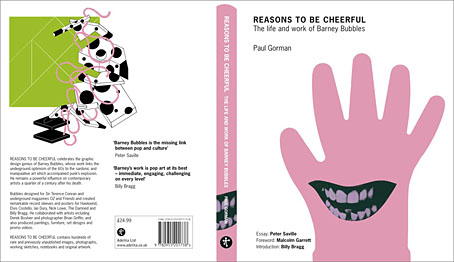
Reasons To Be Cheerful: The Life and Work of Barney Bubbles
By Paul Gorman

“Barney Bubbles is the missing link between pop and culture” Peter Saville

REASONS TO BE CHEERFUL is a lavishly illustrated celebration of the creative legacy of one of the most mysterious yet influential figures in graphic design: Barney Bubbles.

Bubbles – who died 25 years ago – links the colourful underground optimism of the 1960s to the sardonic and manipulative art which accompanied punk’s explosion a decade later.

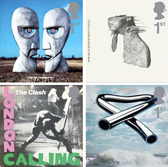
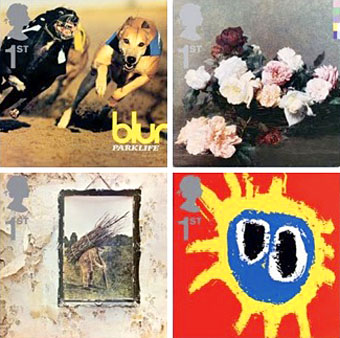
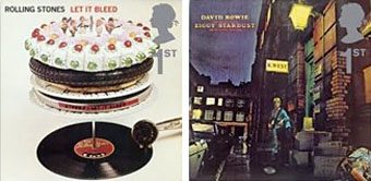
Producing extraordinary artwork under the shroud of anonymity and a number of pseudonyms, in the 60s Bubbles created early posters for the Rolling Stones, brand and product design for Sir Terence Conran and psychedelic lightshows for the Pink Floyd.

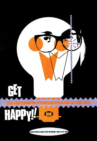
He was also responsible for the art direction of underground magazines Oz and Frendz and the masthead for rock weekly the NME, and is best known for a plethora of stunning record sleeves, logos, insignia and promo videos for musicians and performers, from counter-culture collective Hawkwind to new wave stars Elvis Costello, Ian Dury, Nick Lowe, Graham Parker, The Damned, Billy Bragg, Squeeze, Depeche Mode and The Specials.

Meticulously researched with 600 images, REASONS TO BE CHEERFUL is the first and definitive investigation into Bubbles’ life and work, with interviews and contributions from family and close friends, college pals and workmates as well as collaborators including pop artist Derek Boshier, author Michael Moorcock and photographer Brian Griffin.

Incorporating many previously unpublished images, REASONS TO BE CHEERFUL is also the only comprehensive collection of Bubbles’ output over a 30-year period: every important record sleeve, poster and advertisement as well as examples of his excursions into abstract portraiture, book design and furniture, supported by student sketchbooks, working drawings, film proposals and personal photographs and correspondence.

Singer-songwriter Billy Bragg has contributed the foreword, graphic designer Peter Saville an essay on the significance of Bubbles’ oeuvre and his contemporary Malcolm Garrett a personal memoir.

REASONS TO BE CHEERFUL is published on December 4 2008.

Trim size: 280mm x 230mm
Binding: Hardback
Pages: 224
Words: 55,000
Images: 600
RRP: £24.99

And while we’re on the subject, Barney Bubbles enthusiasts Rebecca & Mike left news on the original BB posting about a forthcoming exhibition of work by photographer Brian Griffin.

On show will be the newspaper ‘Y’, the books ‘Copyright 1978′ and ‘Power’, and associated posters, including the ‘coat hanger and scarf’ poster for Brian’s photo show in 1980. All of these (apart from ‘Power’) will be available to buy too (we think)… so, if you want to, you can bag yourself an early Christmas present (and help put some turkey on Brian’s table!)

Here’s the details: Brian Griffin, 15 November – 8 December 2008 , Monday – Saturday 11 – 6, at ‘England & Co.’, 216 Westbourne Grove, London W11 2RH.

The ‘Y’ newspaper’s got a real chunky red button on the cover (in a little plastic bag); symbolic of the nuclear button we-thinks, and there’s a great concentric circle graphic on the cover too, which is reminiscent of a few things, like the back of the not-used Dury ‘4000 Weeks Holiday’ LP sleeve design and also the front of the never released ‘Station BPR’ LP sleeve (which was due to be the second release on Billy Bragg’s ‘Utility’ label). There’s also an illustration in ‘Y’ by Nazar Ali Khan of ICU fame.

The ‘Copyright 1978′ booklet is cool too; with nearly every one of Brian’s photos in it being accompanied by thumbnail graphics by Barney, which contain cryptically encoded comments. The one that always sticks in our mind is the one that questions whether it is good or bad to receive awards for your work.

Previously on { feuilleton }
Reasons To Be Cheerful, part 2
Reasons To Be Cheerful: the Barney Bubbles revival
Barney Bubbles: artist and designer