Weekend links 270

ufo.jpg

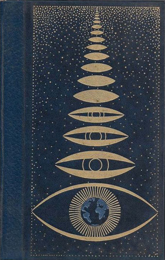
Cover design for UFOs and Extra-Terrestrials in History (four vols, 1978) by Yves Naud.

Come To The Sabbath, “a festival of dark arts delving into the influence of Black Magick, Witchcraft, Demonology and Satanism in pop culture”, takes place at Apiary Studios, 458 Hackney Road, London, from Tues 18th–Sun 23rd August.

• “Visitors, if there had ever been any, would have said that the little town of Mansfield was haunted.” Showdown is a previously unpublished short story by Shirley Jackson.

• “A sandbox stealthy immersive sim in a surreal, horror-y world inspired by writers like Burroughs and Ballard…” Alice O’Connor previews the forthcoming computer game, Tangiers.

Sometime in the late 1960s, the artist Robert Smithson took a trip to southwestern Ohio. He saw the Great Serpent Mound there and decided that he would make a great spiral too. […] Because the Great Salt Lake’s levels vary several feet from year to year, and also from season to season, Spiral Jetty is not always visible even if you make the trip to Utah. You could go out to Spiral Jetty and find that the entire earthwork is invisible underwater. When Robert Smithson created this earthwork in 1970, he did not care if it could be easily seen or who owned it. And so, even today, no one knows to whom Spiral Jetty really belongs. To view it requires a pilgrimage.

Stefany Anne Goldberg on earthworks, new and ancient, and the art of disappearance

• “Commercial book cover design is a minor portion of Gorey’s award-winning legacy, but not a lesser art.” Steven Heller on Edward Gorey: cover designer.

• “You are accepted,” he says, “by the genre that can accept you.” Samuel R. Delany talked to Peter Bebergal about being an outsider in the world of science fiction.

A battle of Witts: A brief look at ‘Taboos’ and the work of The Passage. Mark Griffiths on a great, if seldom-remembered, Manchester band.

• “Hispanic photomonteur Josep Renau aimed Technicolor jets of scorn at the mirage of US consumerist culture,” says Rick Poynor.

• Because the internet is really big… Kelli Anderson reworks the Eames’ The Powers of Ten using imagery found via Google searches.

Against Nature is a forthcoming musical adaptation of Huysmans’ À Rebours by Marc Almond, Jeremy Reed and Othon.

“What makes a film noir?” Adam Frost & Melanie Patrick have an infographic for you.

• Mixes of the week: Gizehcast #20 by LCC, and Jenny Hval‘s WEIRD Quietus mix.

• Mysterium Tremendum: Russell Cuzner on The Strange World of Lustmord.

• The charming march of the Penguin Books logo.

Cosey Fanni Tutti: Agent Provocateur

Dark Times (Peel Session) (1980) by The Passage | XOYO (1982) by The Passage | Revelation (1982) by The Passage

Weekend links 260

burgher.jpg

Bachelor with “demons” (Sleezy) [sic] (2015) by Elijah Burgher. One of a new series of artworks by Burgher showing at Zieher Smith & Horton, NYC.

• The week in HR Giger: Belinda Sallin on her documentary, Dark Star: HR Giger’s World; Ron Kretsch on the unseen cinema of HR Giger; Matthew Cheney thinks the Gigeresque has become too familiar. I can see his point but originality is always in short supply; asking for something new means setting yourself up for a long wait.

Pwdre ser, or Star jelly, is “a pale, foul-smelling jelly traditionally associated with meteorite falls”. The Rot of the Stars at the ICA, London, is an audio-visual art collaboration between Jo Fisher and Mark Pilkington dealing with the mysterious substance.

• Mixes of the week: A Tri Angle Records birthday DJ set by Björk; OreCast 196 mix by Ilius; Secret Thirteen Mix 153 by M!R!M.

To assume that a given group of people would be similar because of birthdate, Ryder thought, was to risk committing a fallacy. “The burden of proof is on those who insist that the cohort acquires the organised characteristics of some kind of temporal community,” he wrote. “This may be a fruitful hypothesis in the study of small groups of coevals in artistic or political movements but it scarcely applies to more than a small minority of the cohort in a mass society.”

Generational thinking is a bogus way to understand the world says Rebecca Onion

The plan for an airport above the streets of Manhattan. Related: Charles Glover‘s similar plan for London.

Errol Morris on how typography shapes our perception of truth.

Michael Moorcock enjoyed The Vorrh, a novel by Brian Catling.

Clive Barker on almost dying, hustling, and killing Pinhead.

• A new Penguin Books website for Angela Carter.

• Callum James on artist Philip Core.

A Beginner’s Guide to King Tubby

King Tubby Meets Rockers Uptown (1976) by Augustus Pablo | Star Cannibal (1982) by Hawkwind | Sleazy (1983) by Jah Wobble, The Edge, Holger Czukay

Recovering Viriconium

viriconium01.jpg

Detail from Assassination in the Night (c. 1600?) by Monsù Desiderio.

Yesterday’s post looked at some of the past cover designs for M. John Harrison’s Viriconium books. This post makes a few suggestions for how they might be presented in the future. Since these are mostly covers that I’d like to see they’re not necessarily ideal for the audience a publisher might be aiming at, cover design is usually a three-way process involving designer, author and publisher. In the end I’ve resisted the temptation to draft a range of original cover proposals—writing these posts has taken long enough—so almost everything here uses pre-existing art. If I was designing covers for all four Viriconium books, however, and the brief was to orient them towards a fantasy readership, the first thing I’d try would be a series of four imaginary Tarot designs. A peculiar pack of Tarot cards is a recurrent feature of the books so I’d create four emblematic cards that featured significant elements and characters from each. The characters wouldn’t be too well defined, they’d be stylised, maybe even silhouettes. Each card would feature a dominant presence: offhand these would be one of the geteit chemosit for The Pastel City, a locust for A Storm of Wings, the Barley Brothers for In Viriconium and a Mari Lwyd horse skull for Viriconium Nights. These presences together with the human characters would loom over a silhouette city at the foot of each card whose outlines would change appearance from book to book, evolving gradually from a fantastic outline of domes and towers to something that resembles a contemporary city. The colours and treatments would show a similar evolution from the bright and bold styles of the Pamela Colman Smith Tarot deck to something more photographic, collaged from elements closer to our world. Maybe.

That’s an idea for the four individual books. All the examples here use the convenience of the omnibus edition so a single image (or pair of images) has to somehow represent the entire series. To save time and effort I’ve taken the liberty of hijacking a couple of Penguin Books layouts. I hope Penguin doesn’t mind, and I should also apologise to Harrison’s UK publishers, Gollancz, for making one of their authors jump ship. The Viriconium omnibus is certainly good enough to be considered a modern classic. Penguin’s recent template for its Modern Classics series happens to be very easy to apply to a wide range of artwork.

viriconium04.jpg

The Anti-Pope (1942) by Max Ernst.

Penguin has a long tradition of using pre-existing art on its covers, especially on those in its Penguin Classics series. You can almost make this into a parlour game: match your favourite novel with the best choice of painting. The tradition was extended to its science fiction titles in the early 1960s when the art of Max Ernst was featured several times along with the work of other Surrealists. Max Ernst is a favourite artist of mine so this is one I can’t resist. Many of Ernst’s decalcomania paintings of the 1940s would suit Viriconium but The Anti-Pope with its horse heads seems especially suitable.

Also on the Penguin sf covers was a picture by the mysterious “Monsù Desiderio” one of whose works can be seen at the top of this post. Desiderio was a 17th-century painter with a vague enough presence—works have been attributed to both François de Nomé and Didier Barra—and a line in gloomy architectural fantasias to make him an ideal Viriconium artist.

Continue reading “Recovering Viriconium”

Philippe Jullian, connoisseur of the exotic

jullian01

Monsieur Jullian as seen on the back cover of Dreamers of Decadence (1971).

Here at last is the long-promised (and long!) piece about the life and work of Philippe Jullian (1919–1977), a French writer and illustrator who’s become something of a cult figure of mine in recent years. Why the fascination? First and foremost because at the end of the 1960s he wrote Esthètes et Magiciens, or Dreamers of Decadence as it’s known to English readers, a book which effectively launched the Symbolist art revival and which remains the best introduction to Symbolist art and the aesthetic hothouse that was the 1890s. If I had to choose five favourite books Dreamers of Decadence would always be on the list. This point of obsession, and Philip Core’s account of the writer, made me curious about the rest of Jullian’s career.

jullian13

An illustration from Wilson & Jullian’s For Whom the Cloche Tolls (1953). “Tata has called these his Krafft-Ebbing (sic) pictures of his friend Kuno, whatever that means.”

Philip Core was friends with Philippe Jullian, and Core’s essential Camp: The Lie that Tells the Truth (1984) has Jullian as one of its dedicatees. It’s to Core’s appraisal that we have to turn for details of the man’s life. There is an autobiography, La Brocante (1975), but, like a number of other Jullian works, this doesn’t seem to have been translated and my French is dismally pauvre. Core’s piece begins:

Philippe Jullian, born to the intellectual family of Bordeaux Protestants which produced the well-known French historian, Camille Jullian, was a last and lasting example of pre-war camp. His career began as an artist in Paris with a reputation for drag-acts parodying English spinsters. Snobbery, a talent for sensitive daydreaming, and a consuming passion for antiques, obscure art and social history, made a very different figure out of the thin and dreamy young man. Jullian suffered terribly during the Second World War; he managed to survive by visiting some disapproving cousins dressed as a maiden aunt, whom they were happy to feed. However, he made a mark in the world of Violet Trefusis, Natalie Barney and Vita Sackville-West by illustrating their books with his wiry and delicate doodles; this led to a social connection in England, where he produced many book jackets and covers for Vogue throughout the 1950s.

Having only seen Jullian in his besuited and bespectacled guise it’s difficult to imagine him dragged up, but the cross-dressing interest is apparent in his humorous collaboration with Angus Wilson and in a later novel, Flight into Egypt. As for the wiry and delicate doodles, they’re very much of their time, in style often resembling a less-assured Ronald Searle. One early commission in 1945 was for the first of what would become a celebrated series of artist labels for Château Mouton Rothschild. Later cover illustrations included a run for Penguin Books some of which can be found at Flickr.

Philip Core continues the story:

Elegant in the austerely tweedy way the French imagine to be English, Jullian exploited his very considerable talents as a writer, producing a series of camp novels throughout the 1950s (Scraps, Milord) which deal frankly but amusingly with the vicissitudes of handsome young men and face-lifted ladies, grey-haired antique dealers and criminals. One of the first to reconsider Symbolist painting, Jullian reached an enormous public in the 1960s with his gorgeous book, Dreamers of Decadence – where an encyclopaedic knowledge of the genre and its accompanying literature helped to create the boom in fin de siècle revivalism among dealers and museums.

An acerbic wit accompanied this vast worldly success; always docile to duchesses, Jullian could easily remark to a hostess who offered him a chocolate and cream pudding called Nègre en chemise, “I prefer them without.” Less kindly, to a gay friend who objected to Jullian’s poodles accompanying them into a country food shop by saying “Think where their noses have been”, he could also retort “Yes, that’s what I think whenever I see you kiss your mother.”

Continue reading “Philippe Jullian, connoisseur of the exotic”

Weekend links: Ghosts, Spooks and Spectres edition

spectres.jpg

Cover design by Philip Gough.

Ghosts, Spooks and Spectres (1972 reprint). Editor Charles Molin collected nineteen ghost stories by writers including Oscar Wilde (The Canterville Ghost), Charles Dickens (The Signal-Man), J. Sheridan Le Fanu (Madame Crowl’s Ghost) and HG Wells (The Inexperienced Ghost). This was one of my favourite books when I was ten-years old. There’s nuffin like a Puffin. Puffin Books’ parent company, Penguin, is 75 this year.

• The good people at the Outer Alliance have posted an interview with me here in which I talk about the subversive sexualities of sf in the 1970s and also admit to writing fiction.

• There’s just time to mention It Came From Pebble Mill, an event which includes another screening of David Rudkin’s Penda’s Fen.

• “In our society, there has tended to be a very strong compartmentalization of different experiences, different cultural forms, different genres. We can talk in a very broad sense and say art is separate from science, for example, or body is separate from mind, or we can talk in a specific sense and say one certain form of dance music is separate from one form of, say, heavy metal. I don’t really buy those compartmentalizations. I understand why they exist, how they’ve come into being and why they’re convenient, but it’s not the way I think, it’s not the way I experience the world, it’s not the way I believe things should be.” From an interview by Colin Marshall with David Toop at 3QD. Toop’s latest book is Sinister Resonance: The Mediumship of the Listener.

The Kingdom of the Pearl by Léonard Rosenthal, illustrated by Edmund Dulac.

Ghost Stations by Dollboy, a CD package. And then there’s the Ghostly Bento.

7 Inch Cinema are Birmingham-based cultural historians.

• Mark Pilkington’s Mirage Men now has its own site.

Borges on Pleasure Island: JLB and his love of RLS.

• RIP Arne Nordheim, Norwegian composer.

• Charlie Visnic’s Modular Ghost Synth.

On the trail of Tutankhamen’s penis.

Photos by Thom Ayres.

Ghosts by Japan | Spooky Rhodes by Laika | Purple Dusk by Spectre.