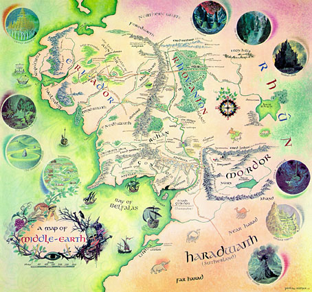
Pauline Baynes, who died earlier this week, was for a long while the only Tolkien illustrator of note. Her work was approved by Tolkien himself but faded from view as the JRRT spin-off industry began to expand in the late Seventies and other artists quickly crowded the field, many of whom lacked her subtlety and sympathy for the material. It was her artwork which Allen & Unwin used on their single-volume edition of Lord of the Rings and in the late Sixties they also produced a poster of her Middle Earth map (above; complete version here). That poster hung on my bedroom wall and fascinated me with its view of the now over-familiar characters and the vignette details of various locations.
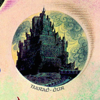
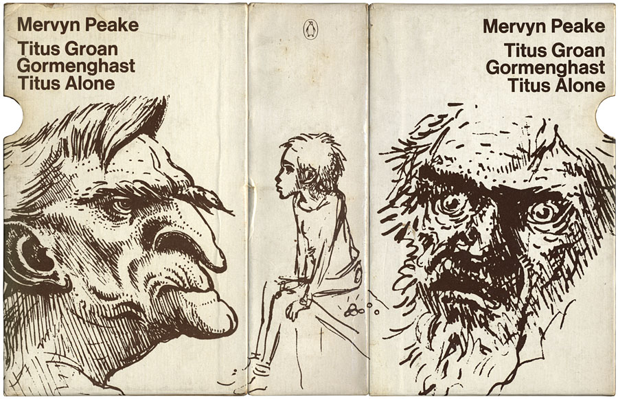
Those vignettes, such as her tiny rendering of Sauron’s Dark Tower, seemed at the time a perfect summation of Tolkien’s world and I still prefer her hulking Barad-dûr to the spiny monolith seen in Peter Jackson’s films. Her friendship with Tolkien led to a similar commission for maps and illustrations from CS Lewis and it’s as the illustrator of the Narnia books that she’s most celebrated. I never read Lewis’s work, and came to Lord of the Rings late, so the infatuation with this brand of heroic fantasy swiftly gave way to the ambivalent moralities of Michael Moorcock‘s Elric, Fritz Leiber‘s Lankhmar and Mervyn Peake’s Gormenghast. Her work wouldn’t have suited those writers but for Tolkien and Lewis she was ideal.
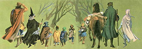
The Fellowship of the Ring from the Middle Earth map.
One of the newspaper obituaries notes:
It was somewhat to her chagrin that she developed a reputation over the years as an illustrator of mostly Christian works and, to redress the balance, one of her last creations (her “children” as she called them) was a series of designs for selections from the Qur’an, scheduled for publication in 2009.
These days Charles Williams is the writer who interests me still from the Oxford group known as “the Inklings”, of whom Tolkien and Lewis were the most famous members. Williams was also a Christian propagandist but his use of fantasy was more sophisticated and, in the extraordinary Many Dimensions (1931), he too managed to depart from the Christian sphere by blending HG Wells-style science fantasy with Islamic mysticism.
Brian Sibley wrote a Pauline Baynes obituary for The Independent and his blog features an excellent overview of her life and work.
Elsewhere on { feuilleton }
• The illustrators archive
Previously on { feuilleton }
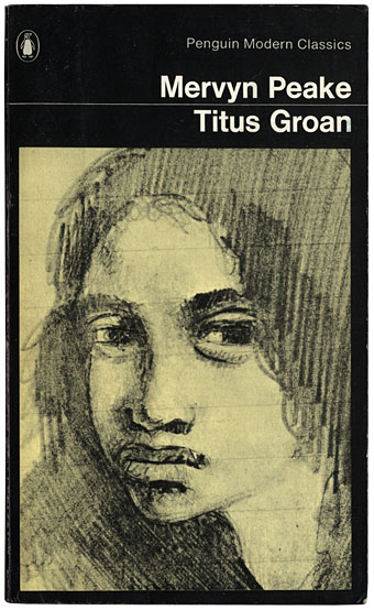
• Mervyn Peake in Lilliput