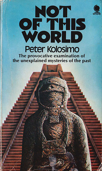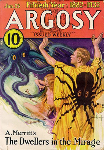
Cover artist unknown.
“Here, for the connoisseur, for the devotee of the SF genre, and for those who like their reading to combine excitement with good writing, is the Corgi SF Collector’s Library – a series that brings, in a uniform edition, many of the Greats of SF – standard classics, contemporary prizewinners, and controversial fiction, fantasy, and fact…”
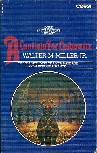
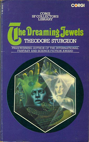
Only in the 1970s would you find a line of SF paperbacks with all the titles set in Thalia, a Victorian typeface revived by the post-psychedelia predilection for any design that was florid and ornate. Corgi’s SF Collector’s Library was published from 1973 to 1976, arriving just as my reading was moving from child-friendly SF to adult fiction. Consequently, I bought quite a few of these books, and still own a couple of them. The design was uniform but with a surprising amount of variation for such a short-lived series. The background colours ranged from deep blue to purple, while the card used for the covers was regular paperback stock for some of the titles with the majority using textured card, a treatment that further distinguished the series from its rivals on the bookshelves.

Art by Joe Petagno.
Looking at these covers again I’ve been wondering if the idea of framing the artwork in a circle was borrowed from Penguin’s run of HG Wells reprints from 1967. Corgi had done something similar the same year with their Ray Bradbury series (all with art by Bruce Pennington) but the Wells editions went through several reprints, and the SF Collector’s Library follows their form even down to allowing the artwork to break the frame.
Art by Bruce Pennington.
The samples here are a small selection of the series which featured a fair representation of British SF illustrators of the time. None of the artists were credited on the covers, however—a poor showing on the part of Corgi—so a few of them remain unidentified.

Art by Tony Roberts.
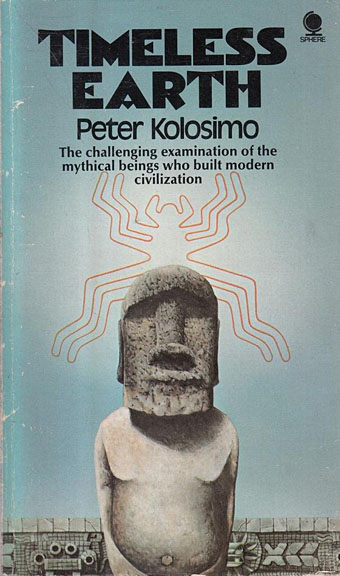
Cover artist unknown.