Weekend links 405

expo70.jpg

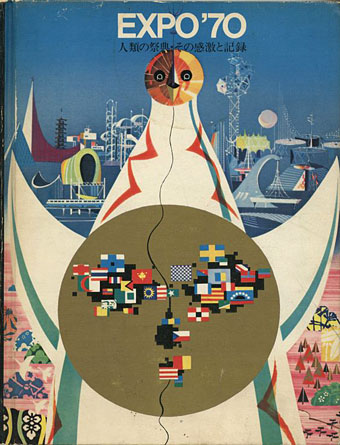
Taro Okamoto’s Tower of the Sun on the cover of an Expo ’70 guide.

• Last week I was watching the restored print of Howard Brookner’s excellent William Burroughs documentary, Burroughs. Among the later scenes are shots of the writer visiting Britain in the autumn of 1982 for the Final Academy events, a visit also recorded on Super-8 by Derek Jarman, and by the video cameras of the Haçienda nightclub at a reading I was fortunate to attend. Included in the Brookner film are brief snatches of an interview with Burroughs for BBC Radio 1 by John Peel’s producer, John Walters, something I missed when it was first broadcast.

• Taro Okamoto’s Tower of the Sun was built in Osaka for Expo ’70, and unlike many one-off expo buildings has managed to survive years of neglect and threats of demolition. Visitors to the Tower may now explore the restored “Tree of Life” interior, although places are limited so it’s necessary to book in advance. Related: Expo ’70 at ExpoMuseum, and Tower Of The Sun (1997) by Shonen Knife.

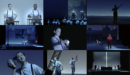
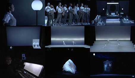
• Also at Dangerous Minds this week: a 1969 TV recording of Krzysztof Penderecki’s notorious The Devils of Loudon, an opera based on the same Aldous Huxley book as Ken Russell’s The Devils, and which includes (among other things) a singing nun enduring a forced enema.

• The new Cavern Of Anti-Matter album, Hormone Lemonade, is released this week. XLR8R has a preview. Related: an old/undated mix by Tim Gane for The Brain radio show here.

Milton Glaser on some of his favourite posters. Milton Glaser Posters, a book collecting 427 poster designs, is published this week by Abrams.

• The Ghosts of Empty Moments: Christopher Burke reviews M. John Harrison’s You Should Come with Me Now.

• Mixes of the week: FACT mix 644 by Susanna, and XLR8R Podcast 534 by Pär Grindvik.

Emily Temple found 25 of the most expensive books you can buy on the internet.

Towers Of Dub (1992) The Orb | Tower Of Our Tuning (2001) by Broadcast | Television Tower (2001) by Monolake

Weekend links 321

miyabi.jpg

The Addams Family In Kimonos by Matsuyama Miyabi. Via S. Elizabeth.

• “They’re not the men you’ll walk down the street and lock eyes with, or that you’ll spot at a bar casually. They’re a fantasy.” Michael Valinsky reviewing Tom House: Tom Of Finland In Los Angeles edited by Michael Reynolds. Related (and almost a polar opposite): Nick Campbell on The Life to Come and Other Stories by EM Forster.

Randall Dunn, musician (Master Musicians of Bukkake), producer (Sunn O))), Earth, etc), engineer, discusses making and recording music.

John Waters brings back Multiple Maniacs: “Of course I went a little too far.” he says. Waters also talked about the film at Gawker.

Q: Most cherished book on your shelves? Why?

A: Depends on the day. Today it’s Blood Meridian by Cormac McCarthy. Blood Meridian is an indictment of Manifest Destiny, the Westward Expansion, of Hollywood and its portrayal of the west; it’s confrontational and bellicose. The sheer brutality of it affected me like I’d swallowed poison or taken a shot to the liver that I didn’t remember. Blood Meridian is a reminder that literature isn’t always tame. It can bite you.

Laird Barron talking to Smash Dragons about favourite writers and his own fiction

• In East Tower Dreaming Howlround, aka Robin the Fog, processes the sounds of a former BBC office building.

• At The Headless Hashasheen: Magic Mirrors and Specters: Paschal Beverly Randolph, Hashish, & Scrying.

• At Dangerous Minds: The astonishingly beautiful three-colour photography of Bernard Eilers.

Samm Deighan on Gothic Film in the ’40s: Doomed Romance and Murderous Melodrama.

• On a scale from 1–100, Milton Glaser rates every single Olympic logo design in history.

• The overwhelming A/V experience of Paul Jebanasam and Tarik Barri.

Patrick Feaster describes how to “play back” a picture of a sound wave.

• Mix of the week: Secret Thirteen Mix 192 by Shadows.

COLLAGE—The London Picture Archive

Madrigal Meridian (1978) by Tangerine Dream | Meridian Moorland (1979) by Peter Baumann | Meridian (2009) by Espers

The Rock Machine Turns You On

rockmachine.jpg

Discovered via the latest issue of The Wire magazine in a feature about compilation albums, The Rock Machine Turns You On (1968) was the first budget sampler album. Given the success of this release I’m sure I must have seen it over the years but that cover wasn’t familiar at all. I have to assume that the “Hey, pop kids!” title would have been enough of a turn-off to ensure the fingers kept flipping through the sleeves. Priorities change with the passing of time, however, and my attention was caught by the cover art alone, another example of the engraving-collage style whose evolution I’ve been tracing over the past few years. The only design credit on the sleeve is for the back cover photo by Wadham Artists. The front cover is credited online to Milton Glaser, some of whose album covers have already featured here. He was working for Columbia/CBS in the late 60s so it’s a possibility. If anyone out there has a copy of the vinyl then maybe they can tell me if that’s an artist credit in the lower right of the picture. A CD reissue in 1996 only copied the album credits.

rockmachine2.jpg

As to the music, it’s a pretty good compilation, lots of familiar names together with a track from cult favourites of mine The United States of America whose one and only self-titled album had been released that year. One of the few negatives about the superb United States of America album is the cover design which isn’t bad but does nothing to reflect the extraordinary musical invention within. It’s a shame that whoever designed The Rock Machine… couldn’t have worked on that sleeve as well.

Update: Rick Poynor writes to say that this cover appears in Milton Glaser: Pop, so the Glaser attribution is accurate.

Elsewhere on { feuilleton }
The album covers archive

Einstein on the Beach

einstein1.jpg

Well this was a revelation. Einstein on the Beach (1976) is Philip Glass’s first opera, a collaboration with theatrical producer Robert Wilson, and the only Glass opera with which I’m familiar. With a running-time of almost five hours it’s not light listening, and when many of the pieces consist of little more than slabs of keyboard or choral arpeggios it’s always been evident that visuals are required to augment music that otherwise threatens to outstay its welcome.

einstein2.jpg

The opera has been revived several times, and in 2012 a touring presentation was staged. Despite it being one of the most celebrated works by Glass and Wilson a complete performance has never been filmed, until this month, that is, a staging at the Theatre du Chatelet in Paris. The shots here are from a video stream of the entire four-and-a-half hour show, and it’s astonishing to discover how much your appreciation is elevated—and the music enhanced—by the performance and the production.

Einstein’s life is the ostensible subject but it’s up to the audience to interpret the many allusive symbols and motifs that may (or may not) be derived from either the man’s biography or his scientific theories. The libretto is strictly formal and fragmented, and while the score alone may drive some listeners to distraction the visuals change continually, maintaining the interest while the text and music work through their cycles. Philip Glass had this to say about the work in 2012:

The opera isn’t a narrative about Einstein’s life. What connected Bob and I was how we thought about time and space in the theatre. We worked first with the time—four hours—and how we were going to divide it up. Then we thought about the images, and then the staging. I discovered that Bob thinks with a pencil and paper; everything emerged as drawings. I composed music to these, and then Bob began staging it.

Yet the piece is actually full of Einstein. Practically every image comes from Einstein’s life or ideas: trains, spaceships, clocks. And I suggested we have a musician taking his part, because Einstein played the violin—although he was such an amateur musician he couldn’t possibly have played the music I composed for him. (more)

einstein3.jpg

I’ve seen many photos of Wilson’s designs for the opera in the past but static views do nothing to convey the drama and impact of his designs when you see them coming together on the stage. The same goes for the performers, many of whom are required to be trained dancers as well as actors: several scenes are elaborate dance pieces. It’s been a pleasure to see at last the presentation of the mysterious “Knee Play” sections which separate the four acts. And I was surprised by the similarity—intentional or not—of some sequences to the shots of the slaving workers in Fritz Lang’s Metropolis, especially the climactic (and incredible) “Spaceship” scene where the whole stage erupts into light and movement. It’s easy to see why New York’s art crowd were so beguiled by this opera following its first performances in the 1970s, it really is a remarkable piece of work. The streaming version will apparently remain active for a while (there’s also a DVD release planned), and while I wouldn’t want anyone to indulge in piracy I’ll note that there’s currently a torrent of the entire video circulating if you know where to look. If you’ve any time for Philip Glass I can’t recommend this too highly. (Via Metafilter.)

Previously on { feuilleton }
Milton Glaser album covers

MC Escher album covers

scaffold.jpg

L The P (1969) by Scaffold. Art: Ascending and Descending (1960).

A follow-up to yesterday’s post. MC Escher lived long enough to see his work move from curiosities appealing to a small circle of print collectors, through enthusiasm among scientists and mathematicians, to mass acceptance in the late 1960s thanks, in part, to the general vogue for any art that looked weird or far out. New Worlds magazine used Relativity on a cover in 1967, while Thomas Albright writing for Rolling Stone in 1970 introduced a generation of American heads to Escher’s work. A year earlier, another Rolling Stone, Mick Jagger, had tried to persuade Escher to create something for the cover of Let It Bleed; the artist declined but that didn’t stop others using his prints for cover art.

mott.jpg

Mott The Hoople (1969) by Mott The Hoople. Art: Reptiles (1943).

Escher’s work is so well-suited to a vinyl sleeve that I’m surprised his lithographs and woodcuts haven’t seen more use. Liverpool group Scaffold beat Mott the Hoople to the first usage by a few months in 1969 (unless there’s an earlier example I don’t know about); L The P is a play on the Scaffold’s big hit, Lily The Pink. As is often the case with these music design histories, things start off well with sympathetic treatments of the artwork then degrade when hamfisted amateur designers take over. I can’t imagine Escher being flattered by some of the later examples. If you know of any others, good or bad, then please leave a comment.

beaverkrause.jpg

In A Wild Sanctuary (1970) by Beaver and Krause. Art: Three Worlds (1955).

mandrake.jpg

Puzzle (1970) by The Mandrake Memorial. A gatefold sleeve which opened out to reveal the whole of Escher’s House of Stairs I (1951). Inside the gatefold was Curl-up (1951). Design by Milton Glaser who also designed the group’s second album, Medium.

Continue reading “MC Escher album covers”