My pastiches

rev3cov.jpg

Lord Horror: Reverbstorm #3 (1992).

Following from the post about an art forgery exhibition (and Eddie Campbell discussing his American Gothic cover for Bacchus), I thought I’d post some of my own forgeries, or pastiches as we call them when no deception is intended.

Reverbstorm was the Lord Horror comic series I was creating with David Britton for Savoy in the 1990s. The Modernist techniques of collage (as in the work of Picasso and others) and quotation (as in TS Eliot’s The Waste Land) became themes in themselves as the series developed, so it seemed natural to imitate the styles of various artists as we went along. Pastiche is also a chance to flagrantly show off, of course, and I can’t deny that this was also one of my impulses here.

Issue #3 of Reverbstorm had marauding apes as its theme, from the Rue Morgue to Tarzan and King Kong, so I had the idea of doing an ape cover in the style of the celebrated paintings by Giuseppe Arcimboldo (1527–1593) which make human heads out of fruit, flowers or animals. Easy enough to have the idea but making it work took a lot of effort and required careful sketching beforehand, something I rarely do. The painting was gouache on board, a medium I’d been using for years and this was about the last gouache work I did before switching to acrylics.

Continue reading “My pastiches”

Revenant volumes: Bob Haberfield, New Worlds and others

moorcock_citadel.jpg

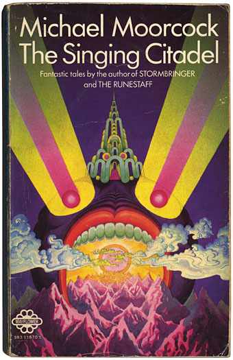
The Singing Citadel (1970).

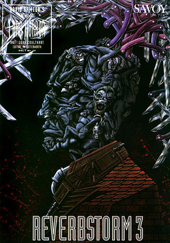
Michael Moorcock’s Elric books are being prepared for republication by Del Rey in the US next year. I’ve assisted with some minor parts of this preparation, including sourcing pictures from Savoy’s edition of Monsieur Zenith the Albino. (Anthony Skene’s albino anti-hero is a precursor of Moorcock’s albino anti-hero.)

Discussion of the Elric books with Dave at Savoy prompted my excavation of this battered Mayflower paperback from the retired book boxes. This slim volume collected four fantasy stories: the title piece (possibly the first Elric story I read), Master of Chaos, The Greater Conqueror and To Rescue Tanelorn…. I’d forgotten about the garishly strange cover, one of many that Bob Haberfield produced for Moorcock’s books during the 1970s. Haberfield is one of a number of cover artists from that period who worked in the field for a few years before moving on or vanishing entirely. The swirling clouds derived from Tibetan Buddhist art identify this as one of his even without the credit on the back; later pictures were heavily indebted to Eastern religious art and while technically more controlled they lack this cover’s berserk intensity. Haberfield’s site has a small gallery of his splendid paintings, including a rare horror work, his wonderfully eerie cover for Dagon by HP Lovecraft.

Searching for more Haberfield covers turned up these two examples, both part of the SciFi Books Flickr pool, a cornucopia of pictures by vanished illustrators. Browsing that lot is like being back inside the In Book Exchange, Blackpool, circa 1977. The digitisation of the past continues apace at the Old-Timey Paperback Book Covers pool and the Pulp Fiction pool. Don’t go to these pages if you’re supposed to be doing something else, it’s easy to find yourself saying “just one more” an hour later.

new_worlds.jpg

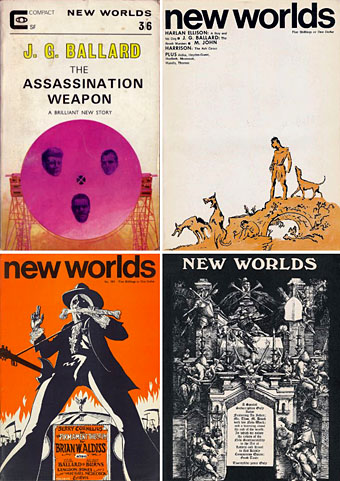
And in other Moorcock-related news, Jay alerts me today to the existence of an archive of New Worlds covers, something I’d been hoping to see for a long time. New Worlds was one of the most important magazines of the 1960s, mutating under Moorcock’s editorship from a regular science fiction title to a hothouse of literary daring and experiment. As with so many things in that decade, the peak period was from about 1966–1970 when the magazine showcased outstanding work from Moorcock himself, JG Ballard, Brian Aldiss, Harlan Ellison, Samuel Delany, M John Harrison, Norman Spinrad and a host of others. For a time it seemed that a despised genre might be turning away from rockets and robots to follow paths laid down by William Burroughs, Salvador Dalí, Jorge Luis Borges and other visionaries. We know now that Star Wars, Larry Niven and the rest swept away those hopes but you can at least go and see covers that pointed to a future (and futures) the world rejected.

Elsewhere on { feuilleton }
The book covers archive
The illustrators archive

Previously on { feuilleton }
Barney Bubbles: artist and designer
100 Years of Magazine Covers
It’s a pulp, pulp, pulp world

Edward Whittemore

whittemore.jpg

A decade after his death, with all his books back in print, Edward Whittemore remains pretty much off the literary radar.

Whittemore was an ex-CIA agent who made the people, history and landscapes of the Middle East the subject matter of a series of remarkable novels. His books aren’t always fantasy (although they were often marketed as such) yet they contain fantastical elements; they’re frequently comic yet contain moments of pure horror; they’re witty, sexy, incredibly inventive and quite unique. They also provide another example of genre readers and writers nurturing the memory and reputation of an author the wider literary world has never heard of. Michael Moorcock and Jeff VanderMeer have both spoken highly of Whittemore in recent years and with the republication of his books in 2002 he now has access to a new generation of readers.

Anne Sydenham’s Whittemore site, Jerusalem Dreaming, has just moved to a new location and is an excellent source of information about the man and his work.

Barney Bubbles: artist and designer

barney1.jpg

Image-heavy post! Please be patient.

Four designs for three bands, all by the same designer, the versatile and brilliant Barney Bubbles. A recent reference over at Ace Jet 170 to the sleeve for In Search of Space by Hawkwind made me realise that Barney Bubbles receives little posthumous attention outside the histories of his former employers. Since he was a major influence on my career I thought it time to give him at least part of the appraisal he deserves. His work has grown in relevance to my own even though I stopped working for Hawkwind myself in 1985, not least because I’ve made a similar transition away from derivative space art towards pure design. Barney Bubbles was equally adept at design as he was at illustration, unlike contemporaries in the album cover field such as Roger Dean (mainly an illustrator although he did create lettering designs) and Hipgnosis (who were more designers and photographers who drafted in illustrators when required).

Colin Fulcher became Barney Bubbles sometime in the late sixties, probably when he was working either part-time or full-time with the underground magazines such as Oz and later Friends/Frendz. He enjoyed pseudonyms and was still using them in the 1980s; Barney Bubbles must have been one that stuck. The Friends documentary website mentions that he may have worked in San Francisco for a while with Stanley Mouse, something I can easily believe since his early artwork has the same direct, high-impact quality as the best of the American psychedelic posters. Barney brought that sensibility to album cover design. His first work for Hawkwind, In Search of Space, is a classic of inventive packaging.

Update: BB didn’t work with Mouse in SF, I’ve now been told.

in_search_of_space.jpg

Hawkwind: In Search of Space (1971).

It’s fair to say that Hawkwind were very lucky to find Barney Bubbles, he immediately gave their music—which was often rambling and semi-improvised at the time—a compelling visual dimension that exaggerated their science fiction image while still presenting different aspects of the band’s persona. In Search of Space is an emblematic design that opens out to reveal a poster layout inside. One of the things that distinguishes Barney Bubbles’ designs from other illustrators of this period is a frequent use of hard graphical elements, something that’s here right at the outset of his work for Hawkwind.

This album also included a Bubbles-designed “Hawklog”, a booklet purporting to be the logbook of the crew of the Hawkwind spacecraft. I scanned my copy some time ago and converted it to a PDF; you can download it here.

Continue reading “Barney Bubbles: artist and designer”

An announcement redux

JTS1.jpg

The 2006 Jack Trevor Story Grand Prix was decided on Friday afternoon at L’Horizon, rue St Placide in Paris. The sans precedent prize can be seen above. After much deliberation the judges decided that Mr Steve Aylett was a worthy recipient of this most ingenuous of literary awards. Mr Aylett now has to spend the prize money within two weeks of its receipt and have nothing to show for it at the end of those two weeks.

JTS2.jpg

In attendance (l to r): Mr Jeff VanderMeer, Mr John Coulthart, Mr Michael Moorcock, Mr Neil Williamson and Ms Emma Taylor. Behind the camera, Mr Eric Schaller who may be seen below on the left.

JTS3.jpg

Previously on { feuilleton }
An announcement