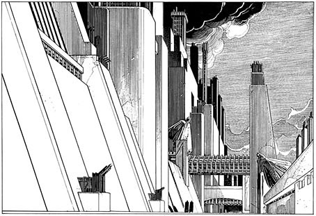
Directed by Saul Bass

bass1.jpg

Phase IV (1974).

It’s been a thrill recently poring over the Saul Bass monograph, Saul Bass: A Life in Film & Design by Jennifer Bass & Pat Kirkham, a large volume that weighs a ton and is as revelatory about the career of a great designer (and his wife and frequent collaborator, Elaine Bass) as you’d hope. One pleasure was getting to read about Bass’s film work from his own viewpoint for once. The curious science-fiction film he made in 1974, Phase IV, is well-known enough to have a cult reputation but too often his long involvement with Hollywood is passed over as a footnote to the careers of the directors for whom he worked. In addition to his celebrated title sequences, Bass was also a visual consultant responsible for the planning and filming of what used to be called “special sequences” within films, the most notorious of which is the endlessly argued-over shower scene in Hitchcock’s Psycho (1960). (See this authoritative post by Pat Kirkham on Bass’s special sequences, and the disputed history of those few seconds of black-and-white film.)

bass3.jpg

Phase IV (1974).

All of which sent me to YouTube looking for some of the shorter films that Bass directed from the mid-60s on. The monograph explores these and Phase IV in some detail, for the latter showing pages of sketches for unfilmed sequences. I’m not sure these would have improved a film which I find flawed and occasionally ludicrous but it’s good to see what the director had in mind. The film on DVD has no extras at all but a trailer can be found on YouTube that shows off some of the startling imagery, and also includes a few shots that were cut by distributors foolishly eager to try and sell it as a horror film. It’s ironic that a man who gained world recognition for his poster designs wasn’t allowed to design the poster for his own film.
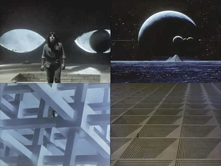
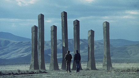
bass2.jpg

Quest (1984).

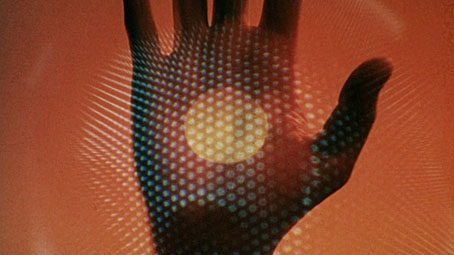
Of the short works there’s Why Man Creates (1968) here and here, an examination of the creative impulse that’s been so popular with art teachers over the years that it’s probably been seen by a lot more people than his marauding ants. Both this and The Solar Film (1980), a documentary about solar energy, utilise Bass’s hand-drawn animation. The latter is also of note for its final shot of a baby walking into a sunset, a still of which was turned by Bass into an album cover for Stomu Yamashta in 1984. Also that year, Saul and Elaine produced their strangest work, Quest, a half-hour piece of science fiction based on a Ray Bradbury short story whose quest theme is overly-familiar from a dramatic point-of-view but which typically yields a wealth of memorable visuals. In Phase IV there was a nod to Dalí with the dead man’s hand filled with burrowing ants; in Quest we find imagery borrowed from Magritte (a floating castle-topped mountain) and MC Escher (his Cubic Space Division). The copy on YouTube is rough quality but it’s certainly worth a watch. I’m amused to discover how much Saul & Elaine were prog-rock heads (not that there’s anything wrong with that…): Phase IV has Stomu Yamash’ta and David Vorhaus from White Noise on its soundtrack, The Solar Film features a dubious cover version of Tubular Bells, while the score for Quest is mostly original music (with some borrowings from Holst) that sounds much of the time like Tangerine Dream when they were leaning on their Mellotrons.

Previously on { feuilleton }
Saul Bass album covers
Pablo Ferro on YouTube

Ver Sacrum, 1899

vs-1899-14.jpg

Another post about Ver Sacrum, the art journal of the Viennese Secession and one of the world’s major art magazines during its short run from 1898 on. This is another digitised edition from the University of Heidelberg’s archive and is the second volume of the journal’s monthly issues. It’s difficult to make a small selection from over 450 pages of high-quality Art Nouveau graphics and design so I’ve mostly chosen the covers again. Anyone wanting to see more is encouraged to download the whole volume or browse individual pages here.

vs-1899-01.jpg

vs-1899-02.jpg

Continue reading “Ver Sacrum, 1899”

La fièvre d’Urbicande by Schuiten & Peeters

urbicande1.jpg

La fièvre d’Urbicande (1985) by François Schuiten and Benoît Peeters is the second volume in the Cités Obscures series. This was the one which captured my attention the most when I first saw it. The book opens with a foreword by the central character, Robick, chief architect of the city of Urbicande, in which he discusses his plans to unify the city’s separate halves by extending the design of the city’s southern half into the chaotic northern section.

urbicande2.jpg

Urbicande is built on the steeply-sloped banks of a wide river. The rational, rectilinear southern bank is exposed to the sun while the northern bank is a place of shadow and mists; traffic between the two halves is strictly controlled by the administrators of the south who fear the chaos the north represents. The style of the southern region is a superb imagining of an Art Deco metropolis, the physical and psychological opposite of the north bank which is revealed as an older place of winding lanes and dishevelled buildings. In Robick’s foreword he refers to former “masters” who happen to be people from our world: architect Étienne-Louis Boullée and architectural renderer and theorist Hugh Ferriss. Mention of Ferriss was a surprise since he isn’t so well-known outside the architectural sphere. I’ve previously discussed his Metropolis of Tomorrow which is an evident influence in the style of some of Schuiten’s skyscrapers.

Continue reading “La fièvre d’Urbicande by Schuiten & Peeters”

False perspective

hogarth.jpg

Satire on False Perspective by William Hogarth (1753).

Whoever makes a Design without the knowledge of Perspective will be liable to such absurdities as are shewn in this Frontispiece.

More eye-deceiving art for All Fools’ Day. Everyone knows MC Escher‘s pictures which continually played with the rules of perspective. Hogarth’s satire is less well-known and may even be the first of its kind. I haven’t seen any examples earlier than this.

A few contemporary equivalents follow, all of which can be found at Impossible World, a site devoted to visual disjunction.

Continue reading “False perspective”

Three today

escher_three.jpg

Three Spheres II (1946) by MC Escher.

Celebrating the third { feuilleton } anniversary and post number 1,438. It’s become customary now to list the most popular posts of the past year so here we go again:

The Underwater Sculpture Gallery. This has been surprisingly popular for several months now, despite pictures of the artworks in question having been featured on very popular sites such as Boing Boing. Typing “underwater” into Google’s image search provides the answer, revealing that one of the pictures from the post is on the first results page.

The gay artists archive. This section has also leapt in popularity after the page was linked recently on StumbleUpon. It’s not a definitive archive by any means, plenty of other sites are attempting that already. These archive pages are only a convenience so that people following some of the lengthier visual categories can see at a glance what else is there. At its best this section may introduce people to more recent work which the historical sites omit.

Barney Bubbles: artist and designer. No surprise that this is still popular two years on.

Bare blade. Part of the new semi-serious Men with swords obsession. I think people like this guy’s bum more than anything. Can you blame them?

Two guys kissing. Yes, Googlers, when you search for “Two guys kissing” you get this wonderfully sexy photo by Jack Slomovits. He’s great, buy his book.

Thanks for reading!

John x