Stairs, a film by Stefan Schabenbeck

stairs.jpg

YouTube in recent years has become an increasingly worthwhile repository for short animations or experimental films, many of which you might otherwise never get to see. Stairs (1969) is another great piece of Polish animation, a brief scenario concerning a Plasticine figure who wanders into a terrain of random steps which soon turns mountainous. The obvious precursor is MC Escher’s stairways, but Escher’s worlds are always very formal despite their paradoxes. Schabenbeck’s film, like many Eastern European animations, can be read as allegory although this only becomes apparent at the very end. Watch it here.

Previously on { feuilleton }
Walls, a film by Piotr Dumala

Morning of the Magicians book covers

motm01.jpg

Éditions Gallimard, France, 1960.

Yesterday’s post proved popular so it seemed worthwhile taking another look at the book that birthed Planète magazine. The main problem The Morning of the Magicians presents for an art director is how to encapsulate such wildly diverse contents in a cover design. To judge from the examples here, most people seem to have either given up or gone for vaguely symbolic designs which at the most correspond to the contents in a minor way. The biggest surprise for me was seeing the cover of the first edition above, one of those typically sober French titles which gives away nothing of the intellectual fireworks within. Few of these designs have any credits, and this is nothing like a complete list (more editions may be seen at Goodreads). More recent editions have been avoided altogether since they’re pretty terrible.

motm10.jpg

Arnoldo Mondadori Editore, Italy, 1963. This edition, which runs to 476 pages, includes three translated stories inserted into the text: The Nine Billions Name of God by Arthur C. Clarke, A Canticle for Leibowitz by Walter M. Miller Jr, and The White People by Arthur Machen.

A hardback edition showing an alchemist at work.

motm03.jpg

Stein and Day, USA, 1964.

You know a cover is failing when it could easily be applied to any number of other titles.

Continue reading “Morning of the Magicians book covers”

MC Escher album covers

scaffold.jpg

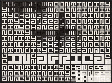
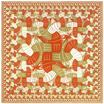
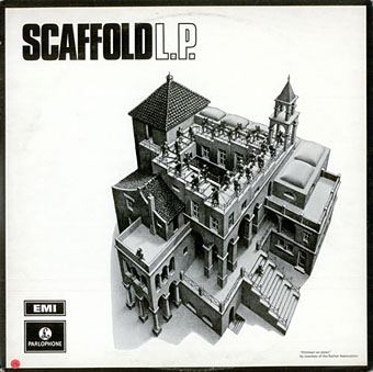
L The P (1969) by Scaffold. Art: Ascending and Descending (1960).

A follow-up to yesterday’s post. MC Escher lived long enough to see his work move from curiosities appealing to a small circle of print collectors, through enthusiasm among scientists and mathematicians, to mass acceptance in the late 1960s thanks, in part, to the general vogue for any art that looked weird or far out. New Worlds magazine used Relativity on a cover in 1967, while Thomas Albright writing for Rolling Stone in 1970 introduced a generation of American heads to Escher’s work. A year earlier, another Rolling Stone, Mick Jagger, had tried to persuade Escher to create something for the cover of Let It Bleed; the artist declined but that didn’t stop others using his prints for cover art.

mott.jpg

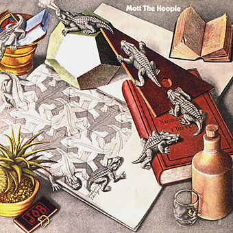
Mott The Hoople (1969) by Mott The Hoople. Art: Reptiles (1943).

Escher’s work is so well-suited to a vinyl sleeve that I’m surprised his lithographs and woodcuts haven’t seen more use. Liverpool group Scaffold beat Mott the Hoople to the first usage by a few months in 1969 (unless there’s an earlier example I don’t know about); L The P is a play on the Scaffold’s big hit, Lily The Pink. As is often the case with these music design histories, things start off well with sympathetic treatments of the artwork then degrade when hamfisted amateur designers take over. I can’t imagine Escher being flattered by some of the later examples. If you know of any others, good or bad, then please leave a comment.

beaverkrause.jpg

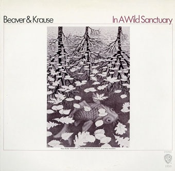
In A Wild Sanctuary (1970) by Beaver and Krause. Art: Three Worlds (1955).

mandrake.jpg

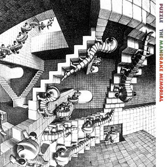
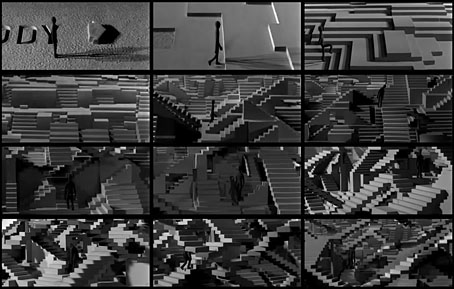
Puzzle (1970) by The Mandrake Memorial. A gatefold sleeve which opened out to reveal the whole of Escher’s House of Stairs I (1951). Inside the gatefold was Curl-up (1951). Design by Milton Glaser who also designed the group’s second album, Medium.

Continue reading “MC Escher album covers”

Escher and Schrofer

schrofer5.jpg

Design by Jurriaan Schrofer.

That’s Maurits Cornelis Escher (1898–1972), the Dutch artist, and Jurriaan Schrofer (1926–90), the Dutch typographer and graphic designer. Aside from a shared nationality the pair had a similar interest in periodicity and incremental metamorphosis, something that’s strikingly apparent when you compare their works. I don’t know much about Schrofer so I can’t say whether he was consciously following Escher’s example or whether this is coincidence. Some of the gradations and distortions also bear comparison with the Op Art paintings of Bridget Riley, Victor Vasarely and others.

escher8.jpg

MC Escher signed most of his works with three square “MCE” letters which are remarkably similar to Schrofer’s type designs.

There’s an opportunity to find out more about Schrofer’s distinctive approach to graphic design in a forthcoming book from Unit Editions (currently available at a reduced pre-order price). More of his work can be seen at But Does It Float and scattered around Tumblr. MC Escher is well-represented on the web; I’d suggest starting at WikiPaintings.

escher1.jpg

Circle Limit I (1958) by MC Escher.

schrofer1.jpg

Design by Jurriaan Schrofer.

escher2.jpg

Square Limit (colour, 1964) by MC Escher.

Continue reading “Escher and Schrofer”

The Library of Babel by Érik Desmazières

library1.jpg

The print work of French artist Érik Desmazières has featured here on several occasions, and I’ve also had reason to mention more than once his aquatints and etchings which illustrate Jorge Luis Borges’ celebrated short story The Library of Babel (1941). The prints were produced in 1997, with a small book edition being published in 2000. Copies of the volume now sell for upwards of $100, and at a mere 36 pages this somewhat exceeds my acquisitiveness threshold; hence this post which gathers some of the better online reproductions, one or two of which have only come to light in the past couple of years.

library2.jpg

Borges’ description of the architecture of the Universe-size Library is sketchy so Desmazières opens out some of the spaces to give a Piranesian sense of space to what would otherwise be little more than views of the same small rooms and corridors, endlessly repeating. MC Escher could have made something of those infinite perspectives—the hexagonal chambers are the closest to the story descriptions—but the larger rooms convey without words an impression of colossal spaces filled with nothing but people and an infinitude of books. The volumes that Borges describes contain few illustrations but one of them at least would describe this very book. Another would describe this book with a minor variation in one of the plates; another would describe MC Escher’s depictions of the Library, and Piranesi’s, and Salvador Dalí’s, and yours, and mine, and on and on…

library3.jpg

library4.jpg

library5.jpg

library6.jpg

library7.jpg

library8.jpg

library9.jpg

library10.jpg

library11.jpg

library12.jpg

Elsewhere on { feuilleton }
The etching and engraving archive

Previously on { feuilleton }
Les lieux imaginaires d’Érik Desmazières
The art of Érik Desmazières