
Want to know what the 60s were like? Then look at Martin Sharp’s work
Tag: Martin Sharp
Michael English, 1941–2009
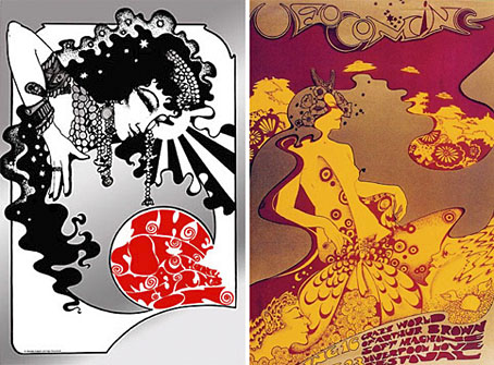
left: The Soft Machine Turns On (1967); right: UFO Coming (1967).
This was a bitter blow coming at a time when I’ve been working on something inspired in part by Hapshash and the Coloured Coat, the 1960s design duo comprised of Michael English and Nigel Waymouth. The two artists, together with associate Martin Sharp, are indelibly associated with the London psychedelic scene of the late Sixties. Whereas Sharp’s posters were often loose and dramatically bold explosions of shape and colour, the Hapshash posters were more carefully controlled in their curating of disparate elements borrowed from Art Nouveau—especially Mucha and Beardsely—comic strips, Op Art, Pop art and fantasy illustration. Their work perfectly complemented the very distinctive atmosphere of the capital’s psychedelic scene which, for a couple of hectic years, saw an explosion of new bands (or old bands in new guises) fervently engaged in a lysergic exploration of Victoriana, childhood memories and frequent silliness. UK psychedelia is generally more frivolous than its US equivalent which had the Vietnam War and civil disorder to deal with; English and Waymouth’s graphics captured the London mood.
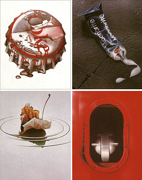
top left: Coke (1970); top right: Toothpaste (1974).
bottom left: Leaf Falls (1972); bottom right: Red no. 3 (1978).
In the 1970s English refashioned himself as a hyper-realist painter of foodstuffs and other consumer goods, and his meticulous airbrush style led to work as an advertising artist. Those paintings are beautifully rendered but often leave me feeling slightly queasy. I much prefer his work from later in the decade which depicted equally meticulous close-up views of oil-smeared buses and trains. Paper Tiger published a book collection in 1979, 3D Eye, which gathers the best of his work from the poster art on.
• Obituaries: Guardian | Times
• Hapshash poster galleries here and here
Previously on { feuilleton }
• The Look presents Nigel Waymouth
• The New Love Poetry
Design as virus 11: Burne Hogarth
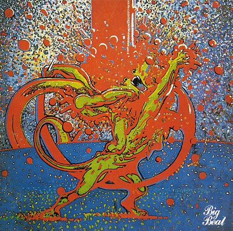
Mighty Baby (1969). Illustration by Martin Sharp.
Yet another album cover prompts this post, part of an occasional series. Mighty Baby were a British rock band who formed out of psychedelic group The Action in the late Sixties, and their music is fairly typical of the period, being “heavy” without any of the psych trappings which—for me—often make everything from that time a lot more interesting. This was a journey undertaken by many groups at the end of that lurid decade, a junking of the playful and evocative side of what was now called rock music in favour of a denim-clad earnestness. This album isn’t one I like very much—I’d rather listen to their earlier incarnation—but the cover painting by psych artist Martin Sharp is certainly a startling piece, being a violent mutation of one of the most famous Tarzan drawings by comic artist Burne Hogarth.
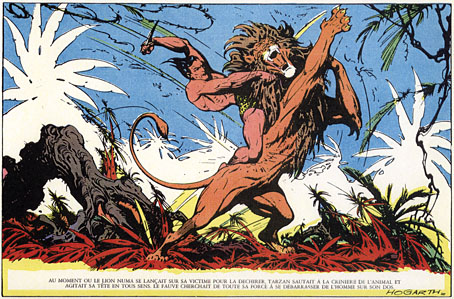
Tarzan by Burne Hogarth (194?).
Hogarth was drawing Tarzan for much of the 1940s and this particular panel showing the Ape-Man attacking Numa the lion dates from the latter part of his run on the series. I wish I could pin this to an actual year but I don’t have a complete set of the comics and that detail eluded me. If anyone knows the date, please leave a comment.
Max (The Birdman) Ernst
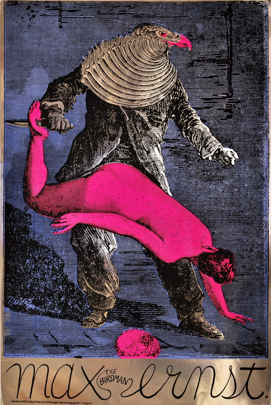
Max (The Birdman) Ernst (1967).
Psychedelia is never far away here at { feuilleton }. Yesterday’s film poster reminded me of this work from the psychedelic era by Martin Sharp, an Australian artist who moved to London and became closely-associated with Oz magazine and London’s other leading psych poster designers, Michael English and Nigel Waymouth, aka Hapshash & the Coloured Coat. Sharp’s homage to the great Max was one of a number of his designs produced on metallic foil sheets, the reflective nature of which often presents difficulties for reproduction in other media.

Performance (1970).
I wonder how many people who admired Sharp’s poster puzzled over the meaning of the image, one of twenty-eight similar collages from the fourth chapter of Ernst’s 1934 “collage novel” Une Semaine de Bonté. Chapter four—Wednesday; Blood—concerns the criminal travails of a series of bird-headed individuals (or possibly the same individual in different guises) which end in abduction, possible rape/murder, and suicide. This picture of Ernst’s has always struck me as a very obvious rape metaphor with the woman stretched over the birdman’s lap and the knife piercing her foot. Ernst’s dark imagination—informed by Freudian concerns, as were most of his fellow Surrealists—separates the picture from the more lightweight Art Nouveau/Beardsleyesque stylings of the other London artists. Martin Sharp was producing collages of his own during this period so it’s easy to see why he was attracted to Ernst. And the popularity of his poster may explain why the birdman turns up in a painted version in Donald Cammell & Nicolas Roeg’s Performance, seen when Pherber (Anita Pallenberg) goes to pick mushrooms in the greenhouse. Ernst’s sinister birdman suits Performance very well, a token of the film’s atmosphere of weirdness and violence. (“A heavy evil film, don’t see it on acid” warned underground newspaper International Times.)

Bob Dylan: Blowing in the Mind (1967).
And to compound the connections a little more, Sharp’s famous Bob Dylan collage portrait (another foil sheet production) also turns up in Performance as part of the collage-covered screen in one of Turner’s rooms. Unlike his fellow Hapshash artists, Sharp’s work is under-documented on the web beyond pages such as this one. The same goes for Ernst’s collage novel but then the best way to experience that is to buy the Dover book edition.
Previously on { feuilleton }
• The Robing of The Birds
• Gandharva by Beaver & Krause
• The Look presents Nigel Waymouth
• The New Love Poetry
• Judex, from Feuillade to Franju
• Further back and faster
• Quite a performance
• Borges in Performance
The New Love Poetry
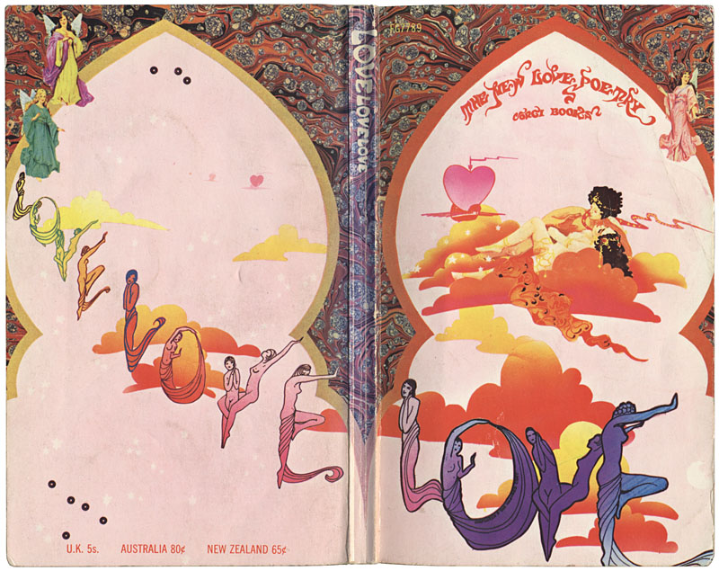
Yesterday’s book purchase was a small poetry collection from the magical year of 1967, edited by Peter Roche. Despite its Beatles cash-in title, Love, Love, Love: The New Love Poetry, not everything here is lightweight fare, Adrian Mitchell’s Peace is Milk is aimed more at the war in Vietnam than some object of affection. Among the other contributors there are the poets one would expect such as Roger McGough and Michael Horovitz, also Pete Brown who wrote lyrics for Cream and later had his own band, Piblokto. And there are contributions from Libby Houston, the wife of Mal Dean, an artist notable for his illustrations for Mike Moorcock’s books of the period and (later) some album sleeves for Pete Brown and others. Some of Libby’s poems appeared in the 50th anniversary edition of New Worlds magazine, along with an illustration by yours truly.
Contents aside, I picked this up mainly for the cover which I guessed was the work of Hapshash and the Coloured Coat, aka Michael English and Nigel Waymouth, along with Martin Sharp the leading psychedelic artists in the UK during the late Sixties. This proved to be a good guess as the book can be seen on this Hapshash page and if I’d have looked closer while in the shop I’d have seen their name written in tiny letters on the purple “O”. Not a difficult guess, their swirly lettering designs are very distinctive. See the full groovy cover here.
• A Hapshash and the Coloured Coat gallery
Elsewhere on { feuilleton }
• The book covers archive
Previously on { feuilleton }
• Dutch psychedelia
• Family Dog postcards
• The 14-Hour Technicolor Dream revisited