Album cover postage stamps

albums1.jpg

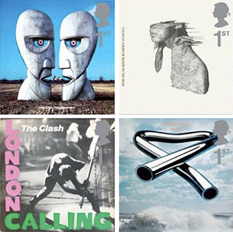
top row: The Division Bell by Pink Floyd; A Rush of Blood to the Head by Coldplay.
bottom row: London Calling by The Clash; Tubular Bells by Mike Oldfield.

The Royal Mail follows its series of British Design Classics postage stamps with a series dedicated to what they call “classic” album covers. The design classics in the earlier series deserved the term—a  Mini motor car, a Penguin book cover, the London Underground map, etc—whereas here we have the word “classic” being used in its lazy journalist sense where it becomes a synonym for “popular” and “familiar”, two attributes which often diminish with time.

albums2.jpg

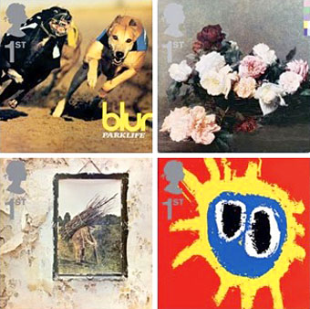
top row: Parklife by Blur; Power, Corruption and Lies by New Order.
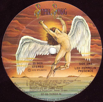
bottom row: IV by Led Zeppelin; Screamadelica by Primal Scream.

It should be noted that the choice of cover art was limited to releases by UK artists, and the designs had to be readable at the very small size of a postage stamp. Even so, I can’t help but regard this as a missed opportunity. There was no need to feature the Beatles since they’d been given their own set of stamps in 2006, but I’ve never thought of the cover of Let It Bleed (below) as a classic, even though musically it’s one of the best Stones albums. I’d rather choose Andy Warhol’s cover for Sticky Fingers but you can imagine the upset at stamp users being forced to lick a picture of a bulging pair of jeans. As for Pink Floyd’s Division Bell, it’s a typically striking design from Storm Thorgerson but does anyone really think it’s more classic than earlier Floyd covers, not least the Dark Side of the Moon prism which even people who hate the band can instantly recognise? Nearly all these choices seem confused or compromised; the Clash cover is the token punk offering—Royal Mail wouldn’t dare choose Never Mind the Bollocks—but Ray Lowry’s design was copied from an Elvis Presley sleeve; Led Zeppelin’s IV is a great album but other releases had far better covers; Primal Scream, another great album but the whole sleeve design is perfunctory; the Blur choice is merely bewildering.

albums3.jpg

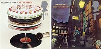
left: Let It Bleed by The Rolling Stones; right: The Rise and Fall of Ziggy Stardust and the Spiders from Mars by David Bowie.

As far as designers go, Hipgnosis (via Storm T), Peter Saville (New Order), and Stylorouge (Blur) are included here but there’s nothing from Barney Bubbles, Malcolm Garrett, 23 Envelope, Neville Brody, Designer’s Republic or any of the other pioneering British designers of the past 30 years. The trouble with those names, of course, is that many of the artists they worked for aren’t popular or familiar enough to the average British stamp purchaser so their work can’t be deemed “classic”. A best of British, then, which could have been a lot better.

Classic Album Covers will be issued on January 10th, 2010.

Elsewhere on { feuilleton }
The album covers archive

Previously on { feuilleton }
British Design Classics
Stamps of horror
Endangered insects postage stamps
James Bond postage stamps
Please Mr. Postman

The art of Pamela Colman Smith, 1878–1951

smith_tarot.jpg

Following yesterday’s post about Frieda Harris’s Tarot designs, it only seems right to acknowledge the other major Tarot artist of the 20th century. Pamela Colman Smith has been overshadowed by her male mentor, Golden Dawn scholar AE Waite, even more than Frieda Harris whose name at least gets mentioned as much as Crowley’s in discussion of her paintings. US Games lists Smith and Waite’s so-called Rider-Waite Tarot of 1909 as “the world’s most popular tarot deck” and uses a silhouette of Smith’s design for The Fool as the company logo, yet it was years before I saw a credit for Smith as artist of this deck, her personal presence being reduced to a tiny monogram in the corner of each picture.

crane.jpg

The Absurd ABC by Walter Crane (1874).

I’ve often thought of Smith’s deck as “the Art Nouveau Tarot” which it isn’t really—it’s more late Victorian in style, if anything—but it was created when Art Nouveau was at its height and has some of the character of the poster art of the period. Smith’s designs are incredibly striking in places, with the clarity of drawn archetypes, and her style possibly owes something to the books Walter Crane created for children in the 1870s and 1880s; the clean lines and bright colouring are very similar. In that respect, Smith’s deck might be more fittingly labelled “the Arts and Crafts Tarot.”

hermit.jpg

left: Pamela Colman Smith’s Hermit; right: Barrington Colby’s inner sleeve for Led Zeppelin IV.

Pamela Colman Smith also worked as a book illustrator but her other work is overshadowed completely by the popularity of the Rider-Waite cards. Her design for The Hermit was famously borrowed by Crowley obsessive Jimmy Page in 1971 for a gatefold illustration, View in Half or Varying Light by Barrington Colby, on Led Zeppelin IV. This use alone makes it possibly the most famous Tarot card in history (there was even a statue made of it for the now defunct Hard Rock Park Led Zeppelin roller coaster) but I doubt many people familiar with the image could name the original artist.

Happily, Ms Smith’s obscurity is gradually diminishing. US Games recently produced the Pamela Colman Smith Commemorative set for the 100th anniversary of the Rider-Waite deck, a package featuring a book of her artwork (including non-Tarot drawings), prints, postcards and a reprinted set of cards. A long overdue reappraisal but, as is always the case, it’s better late than never.

Mary K Greer’s Tarot blog has some excellent postings devoted to Pamela Colman Smith including this page which gathers links to sites containing further information about the artist’s life and work.

Elsewhere on { feuilleton }
The illustrators archive

Previously on { feuilleton }
Layered Orders: Crowley’s Thoth Deck and the Tarot
William Rimmer’s Evening Swan Song
The art of Cameron, 1922–1995

William Rimmer’s Evening Swan Song

rimmer.jpg

Evening: Fall of Day by William Rimmer (1869–70).

This curiously sexless figure is a good example of a work by an artist whose reputation may not have been as elevated as many of his contemporaries but who nonetheless created an image which speaks to future generations. Rimmer (1816–1879) was an American artist who produced a number of pictures along these pre-Symbolist lines. This particular drawing (a blend of crayon, oil and graphite on canvas) became hugely familiar in the Seventies when it was chosen by Led Zeppelin as the basis for their Swan Song label logo (below).

swan_song.jpg

Continue reading “William Rimmer’s Evening Swan Song”

High Priorities

high_priority.jpg

In which your humble narrator enters a contest…

Speak Up, in collaboration with New York magazine, is proud to announce the first-ever open contest to design the visually acclaimed, graphically exhilarating, by-invitation-only “High Priority” feature illustration in the magazine’s year-end, December 18, 2006 double issue.

High Priority highlights five activities, suggested by New York writers, that are not to be missed. Every week designers and illustrators from around the world are invited to create an interpretive typographic illustration to open “The Week” – the listings section of New York Magazine. New York readers place great weight on these five recommendations, and this page is a regular destination for many.

For examples of past editions of High Priority please visit:
New York‘s High Priority archive
Design Observer’s Variations on a Theme: New York‘s High Priorities

I knew about this listings feature from having read the Design Observer piece (I’ve never seen a copy of New York), and liked the idea for what amounts to the design equivalent of a “standard” in jazz, with different designers having to present a riff on the same brief in each issue. The restrictive nature of the problem is part of its appeal; only two colours are allowed (red and black), the box must be the shape it always is, and the design has to incorporate five categories—Movies, Theater (sic), Art, Nightlife and Restaurants—with the date, the words “High Priority” visible somewhere, and the accompanying critics’ recommendation for each category. Aside from that, anything goes.

My attempt can be seen above. I was going to do a couple of different designs then pick the best one but in the end I ran out of time. The initial idea was to do something along the lines of the cover for Physical Graffiti by Led Zeppelin (below) but—as is often the case with first ideas—making it work wasn’t so easy.

led_zep.jpg

Led Zeppelin’s building is a great photograph of a New York brownstone (the original vinyl sleeve had slots cut in the windows through which the lettering and various pictures on the inner sleeves could be seen); mine had to be pieced together from separate pictures of New York in the 1930s. It doesn’t quite work because there’s not much justification for having the category lettering arranged like rows of birthday cards on the window sills. But maybe I’m being too hasty in pulling it apart when the winner won’t be announced until December 4th. Until then you can browse the 186 other entries. I have to say that the quality of these is really exceptional, if I were one of the judges I’d have a hard time choosing only one. Most of the time I wouldn’t give a second glance to an online contest but this one was fun and the high standard of the other entries has made it worthwhile.

Maximum heaviosity

comets.jpg

Left: Comets on Fire at the Arthurfest,
Los Angeles, 2005.

Bassoons, flamenco, monks’ cowls…
welcome to the new rock underground

Julian Cope explains why heavy metal, so often maligned, is at the heart of today’s rock avant-garde

Julian Cope
Friday August 18, 2006
The Guardian

IN APRIL THIS YEAR, after my half-hour stint as a guest vocalist for the US doom metal band SunnO))), I left the stage at Brussels’ Domino festival and removed my burka. Backstage, I remarked to the band’s biographer, Seldon Hunt, how open-minded heavy metallers had become: they were accepting, as festival headliners, a band without a drummer, a bass player or guitars, and with every bearded, long-haired musician among them clad in the habit of a Christian monk. Percipiently, Seldon commented that because the support acts had contained all of those ingredients (except the habits), SunnO))) considered it their duty to reject every metal cliche, replacing each of the archetypal rock instruments with Moog synthesizers, downtuned enough to bring the plaster off the theatre’s ceiling.

SunnO))) are taking metal to places you never imagined. Their music inhabits the territory that once was the preserve of meditative, ambient and experimental music alone. And they are doing it through the most critically reviled music of all. More remarkably, they are not alone. Across the world, underground scenes are using the shell of heavy metal—the volume, the grinding riffs, the imagery, the nomenclature—to test rock’n’roll perceptions and explore boundaries, all the while shamelessly subsuming other vastly different musical styles into their own work.

In a worldwide underground music scene that encompasses artists playing improvisatory music, folk, psychedelic and free jazz, metal is the common thread. You don’t hear much about this music in the mainstream press, especially in Britain, where the kingmakers of the music press have inadvertently created generations of musical whores, all doing their utmost to produce what they think the NME will want, rather than the music they want to make. But why is metal the link? Because the avant-garde musicians in the vanguard of today’s experimental underground scene grew up on it. They spent their late childhoods/early teens playing noisy computer games, watching 24-hour news of the first Gulf war and listening to grunge and metal. As they are mostly in their late 20s and early 30s, their strongest cultural landmarks are the suicide of Kurt Cobain in 1994, and, before it, the overwhelmingly loud sludge of Slayer, Megadeth and Metallica. Therefore the “inner soundtracks” of the new avant gardists are informed by grinding metal bands, just as the sound of the Velvet Underground’s Sister Ray informed that of my own punk generation. Older readers who equate the term heavy metal with the brash, stupefying 1980s anthems of Def Leppard and Bon Jovi will do well to remember that these bands are long out of the equation, having been at their height over 20 years ago.

Continue reading “Maximum heaviosity”