One Hundred Views of Mount Fuji

hokusai01.jpg

You won’t get all one hundred views here, of course, but all may be seen in their original three-volume printing courtesy of the Smithsonian Library’s Hokusai archive. (See below for the individual book links.) I linked to this cache some time ago but it’s taken me until now to have a proper look at the Hundred Views, rather a shameful admission considering how good they are. In mitigation, this is partly the fault of the Smithsonian Library who insist on labelling all the books with their Japanese titles and no other information. To find the Fuji books you either have to already know the Japanese title (Fugaku Hyakkei), or else look through 82 different uploads to see what they contain.

hokusai02.jpg

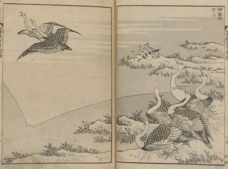
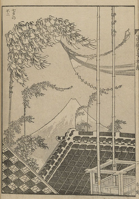
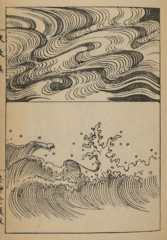
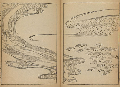
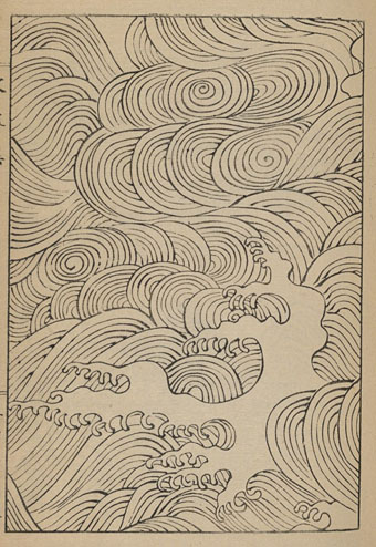
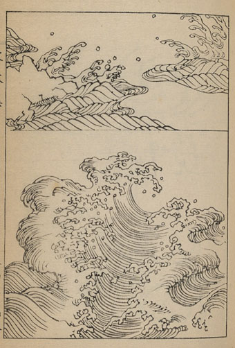
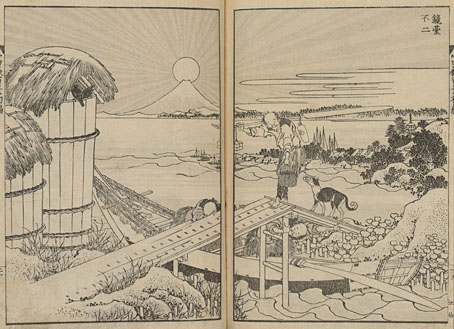
Hokusai’s books differ substantially from his colour prints, even though they use the same woodblock print process, and there’s often an overlap in subject matter, as with the Mount Fuji volumes. Many of the prints are monochrome, using combinations of black lines or dots with grey tones. A few of them also use a second colour, usually a flesh tone, while a handful are fully coloured. The books show greater artistic variety than in Hokusai’s ukiyo-e prints which, being intended for display, were subject to different aesthetic demands. One of the books is dedicated to the artist’s designs for painted combs, for example, while others—the manga series—are sketchbooks that show Hokusai’s invention, his sense of humour and his powers of observation. (The use of manga here shouldn’t be confused with the contemporary term for Japanese comics.)

hokusai03.jpg

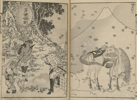
The Hundred views of Mount Fuji are more playful than the famous colour prints of the mountain, being inventions rather than drawings from life. The series is a virtuoso exercise in portraying the sacred volcano in as many ways as possible—silhouette, distant outline, reflection in water—at all times of the year and in all weathers. The views are populated by a wide range of Japanese humanity, from the upper classes to the lowest labourers, as well as a variety of animals: cranes and smaller birds, deer, horses, bats, a dragon, even a spider that seems to catch the mountain in its web. The perspectives also shift from drawing to drawing. There’s no question that Hokusai knew perfectly well how to represent perspectival depth yet his view of a group of astronomers looking at the mountain dispenses with the Western approach to perspective. The three Fuji books were created in the 1830s, at a time when there was no analogue for this type of pictorial experimentation in Western art. I love the formal invention in these drawings, all the ones that show columns of people where every face is obscured by a large hat. I could enthuse at length about so many other details but you should really just go and look at them yourself.

hokusai04.jpg

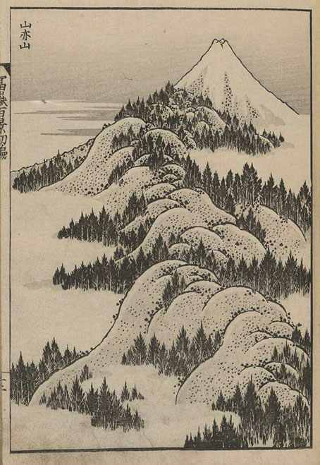
The Smithsonian collection has a couple of sets of Fugaku Hyakkei. The set I’ve chosen has lighter paper which provides better contrast for the printing, especially the grey tones which are often applied with great subtlety.

Fugaku Hyakkei: Book One | Book Two | Book Three

hokusai05.jpg

Continue reading “One Hundred Views of Mount Fuji”

Okinami letterforms

okinami4.jpg

A couple of years ago I posted an incomplete collection of record covers based on Hokusai’s prints, many of which included his most famous work, The Great Wave off Kanagawa. In our age of mechanical reproduction Hokusai’s wave has become as much an emblem for Japan itself as any of the official national symbols, reproduced endlessly in a variety of media while being subject to the usual 21st-century derivations and pastiches. This is a common fate for well-known artworks but Hokusai’s wave is one of the few that are flexible enough to be mutated into a seres of letterforms (you can’t really call this a font) like the ones we have here, a design created by Indonesian designer Aditya Tri which grafts portions of the print onto Garamond serifs. The name of the design, Okinami, is the Japanese word for an offshore wave.

okinami1.jpg

Okinami is an unusual design but this isn’t the first time that Hokusai’s wave has been combined with letterforms. When Tomita’s “Musical Fantasy of Science Fiction”, The Bermuda Triangle, was released in the West it was given new cover art, with a gatefold illustration by Don Punchatz and a title design that added the Great Wave to the modified Sinaloa typeface which by this time had become Tomita’s signature font.

tomita.jpg

Design by Joseph J. Stelmach.

Are there other examples out there? I wouldn’t be surprised. Meanwhile, Hokusai’s print will be even more visible next year when it appears on the back of the new 1000 Yen banknote. A good argument for the retaining of physical currency, and further evidence that Japan gets all the best things.

okinami2.jpg

Previously on { feuilleton }
Hokusai record covers
Waves and clouds
Tomita album covers

Weekend links 683

inshaw.jpg

She Did Not Turn (1974) by David Inshaw.

• “Pauline Kael compared Bruce Lee to Fred Astaire; I think the comparison works better with Rudolf Nureyev. Astaire had a besuited, playful grace, while Nureyev was shirtless, dramatic, and muscular. Astaire moved with athletic modesty, while Lee’s bravura dominated the screen.” Micah Nathan on 50 years of Enter the Dragon.

• New music: This Stolen Country Of Mine by Alva Noto, and Denshi Ongaku No Bigaku (The Aesthetics of Japanese Electronic Music) Vol.1 by Cosmocities Records.

• At Cartoon Brew: A profile of Sally Cruikshank. The spooky psychedelia of Face Like a Frog has long been a favourite round here.

• “My Life in a Hop, Skip and a Jump!” Clive Hicks-Jenkins answers a few questions about his art.

• At Public Domain Review: Hokusai’s Illustrated Warrior Vanguard of Japan and China (1836).

• More martial arts: Tom Wilmot on Bruce Lee’s greatest fight scenes at Golden Harvest.

• Submissions to the Astronomy Photographer of the Year Awards.

• At Dennis Cooper’s: Lucrecia Martel Day.

• RIP Jane Birkin.

Enter The Dragon (1974) by The Upsetters | Dragon Power (A Tribute To Bruce Lee) (1978) by JKD Band | Edit The Dragon (1985) by Colourbox

Weekend links 548

aurora.jpg

The Aurora Borealis by Charles H. Whymper.

• “In 1829, when the celebrated Japanese artist Katsushika Hokusai was almost 70 years old, he created more than 100 drawings of a dazzling array of subjects: playful cats, serene landscapes, even severed heads. Hokusai’s fame continued to grow after his death in 1849, and the suite of small, elaborate drawings was last purchased a century later, at a Paris auction in 1948. Then it disappeared from the public eye.” The British Museum now has the drawings which may be seen here.

• The week in cover design: Emily Temple compares US and UK covers for the same books, while Vyki Hendy collects recent titles with objects as the main feature of the cover designs. One of my recent covers (which will appear here soon) is less minimal than these but also features an arrangement of objects.

• The compilation experts at Light In The Attic Records have put together another collection of obscure Japanese music. Somewhere Between: Mutant Pop, Electronic Minimalism & Shadow Sounds Of Japan 1980–1988 will be released in January.

“A Jamesian world is one of cursed artefacts, endlessly subsuming landscapes, forgotten manuscripts and tactile beings that punish the curious and intellectually arrogant.” Adam Scovell visits the grave of MR James.

• Dragons and Unicorns: John Boardley on the lost art of the Hieroglyphic Bible.

• I almost missed John Waters’ favourite films of the year.

• At Dennis Cooper’s: Sade’s Castle, Cardin’s House.

Northern lights photographer of the year.

Aurora Hominis (1970) by Beaver & Krause | Aurora (1971) by Tonto’s Expanding Head Band | Soft Aurora (1979) by Tod Dockstader

Waves and clouds

mori01.jpg

Every so often it’s necessary for me to deploy some stylised Japanese graphics in a piece of art or illustration, an occasion which always prompts a laborious search through books or websites for suitable source material. Quite often what you require is an isolated example of a single motif, something that isn’t easy to find if you’re looking at a lot of detailed prints. The pages here are the kinds of thing I’ve been after for years, being a series of books showing the many ways an artist or craftsman might render flowing water, waves, ripples and clouds.

mori02.jpg

The books of waves by Yuzan Mori date from 1903, and are in three short volumes here, here and here. Mori’s drawings run through every possible style, from realistic linework to abstract tessellations. The books of clouds by Korin Furuya are in two volumes (also from 1903) here and here. Many of these are like the clouds you find in Chinese and Tibetan art but the books also feature one or two abstract suggestions which are strikingly advanced for the period. All of these books are from the Smithsonian Libraries whose archive of rare Japanese art books includes a Hokusai collection of 82 (!) volumes. Try this one for some vintage grotesquery and weirdness.

mori03.jpg

mori04.jpg

mori05.jpg

Continue reading “Waves and clouds”