Portraits of futures past

ttc1.jpg

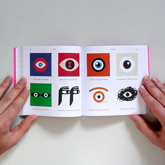
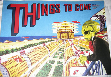
Since blogging here has become sporadic I find myself continually playing catch-up. Recent arrivals in the book department have included two art-related items that feature work of mine. The first is the catalogue for the Things To Come exhibition which ended last month at the Petach Tikva Museum of Art, Israel. When I posted photos of the exhibition back in May I was wondering about the identity of the curious iridescent structure occupying the gallery floor. This turns out to be a piece from 2015 by Netaly Aylon entitled Armour (Disappearing Methods). The same artist is also responsible for the cover of the catalogue, an homage to SF illustrator Frank R. Paul. I’ve always admired the wild inventiveness of Paul’s work so approve of the choice. There’s more Paul (and many other artists, past and present) inside the catalogue.

ttc2.jpg

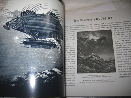
The booklet design by Yon Shavit cleverly solves the need to present bi-lingual information by having the English text run from the front while the Hebrew equivalent runs from the back. The artist pages feature both languages.

dg0.jpg

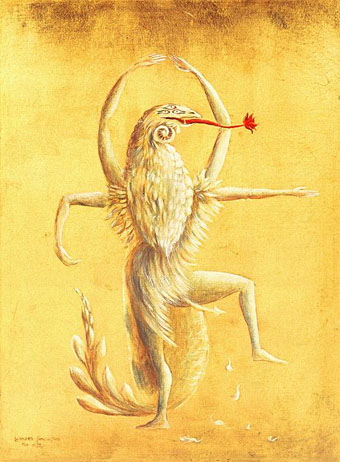
Book design by Emmanuel Dubois.

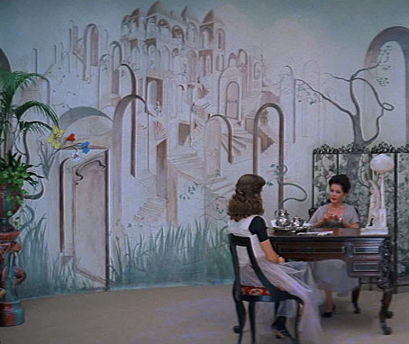
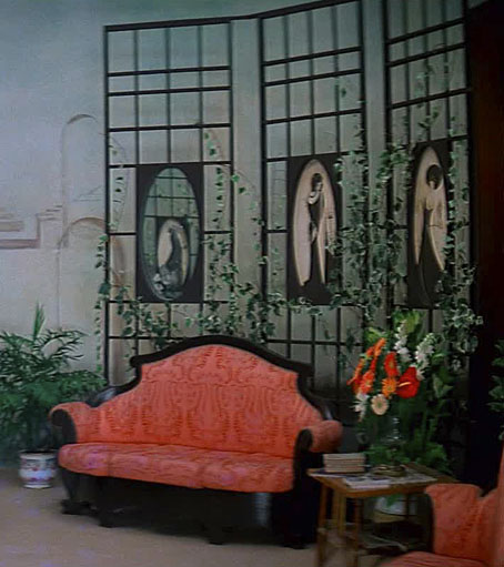
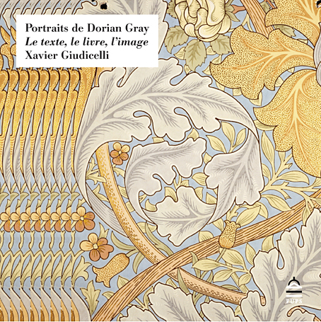
The other arrival was Portraits de Dorian Gray: Le texte, le livre, l’image by Xavier Giudicelli, a lavish, 404-page study from the Presses de l’université Paris-Sorbonne examining representations of Dorian Gray across various media. Xavier had already written about my illustrations based of Oscar Wilde’s novel for a French academic journal, Imaginaires. The book reprises that piece in the wider context of the many other adaptations of the novel. The text is French so much of the discussion is beyond me but the pictorial content is profuse, and includes many illustrations I’ve never seen before. Xavier says he’s already had an enquiry about a possible English edition so I’m hoping this goes ahead.

dg1.jpg

dg2.jpg

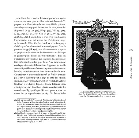
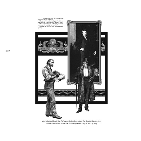
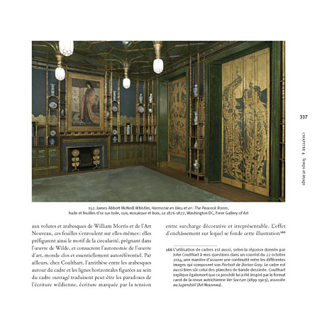
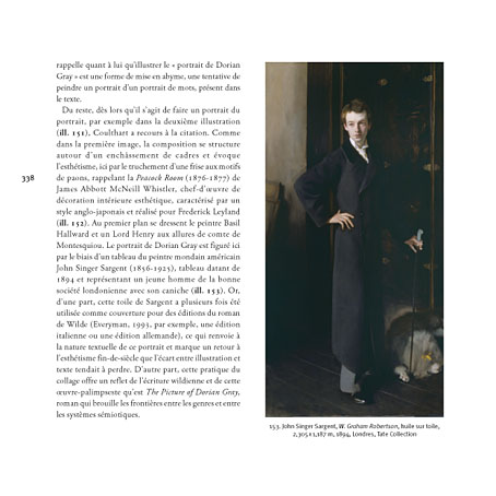
In addition to reproducing two of my pages from the Graphic Canon adaptation, Xavier illustrates my comments with photos of Whistler’s Peacock Room and Sargent’s portrait of W. Graham Robertson, a painting I used as the model for Basil Hallward’s portrait.

dg3.jpg

dg4.jpg

Previously on { feuilleton }
More Things to Come
Things to Come
Foreign appearances
Picturing Dorian Gray

Suspiria details

suspiria01.jpg

Wall decor based on MC Escher’s Study of Regular Division of the Plane with Fish and Birds (1938).

A few screen grabs from the weekend’s viewing of a German Blu-ray disc of Suspiria (1977). My old DVD didn’t look too bad but this is one film where high-definition is required to do justice to the vivid lighting and to Giuseppe Bassan’s marvellous production design. The Art Nouveau splendour of the cursed ballet school contains some notable art references but elsewhere there’s the Escher decoration on the walls of the apartment at the beginning, not the kind of decor you expect to find in a horror film. All these images are details cropped from widescreen frames.

suspiria02.jpg

Suzy (Jessica Harper) and Madame Blanc (Joan Bennett) in the madame’s office. The mural always fascinated me for being a strange confection of Escher motifs, all winding staircases and architecture borrowed from Belvedere (1958).

suspiria03.jpg

The far right of the same shot showing some of the Beardsley figures that fill the panels of Madame Blanc’s screens.

Continue reading “Suspiria details”

Icons

icon1.jpg

“Iconic” is a much abused word these days but this book from UK publisher Counter-Print can claim the term with some justification:

Icon contains over 200 examples of social media icons from many well-known, as well as up-and-coming, graphic designers and illustrators. This limited and concise canvas for self-expression is represented within this book through a host of examples collected from around the world, chosen for their creativity, intelligence and beauty.

My own icon/monogram/whatever is one of those featured in the “Shapes” section. It’s strange seeing this symbol subjected to any kind of attention even though it’s at the top of this web page and can also be found in much of my work. It appeared in drawings when I was about 15 or 16 and eventually became a personal identifier some time in the early 1980s. One reason I like it and continue to use it is because I don’t know what it is; it doesn’t originate out of any conscious expression, and doesn’t refer to any specific symbolic history even though it resembles other symbols. I always liked Whistler’s habit of using a peacock as his signature so he didn’t have to spoil his paintings with a scrawl; Aubrey Beardsley imitated his example for a while using three vertical lines as his signature. This icon has served a similar purpose for me although these days I’m as likely to use my surname and some Roman numerals.

Icon is a great little book, smartly designed by Leterme Dowling and brimming with equally smart content. Some page samples follow.

icon2.jpg

icon3.jpg

Continue reading “Icons”

Weekend links 202

carrington.jpg

Figuras Miticas: Bailarin II (1954) by Leonora Carrington.

• The 26th Annual Lambda Literary Award Finalists have been announced. Ghosts in Gaslight, Monsters in Steam; Gay City: Volume 5 made the LGBT Anthology list, so congratulations to editors Evan J. Peterson & Vincent Kovar, and everyone else involved. I illustrated and designed the cover of that volume which also contains a piece of my fiction, Study in Blue, Green, and Gold.

Music in School (1969), episode 4: “A New Sound”. Amazing BBC TV programme for schools showing children playing avant-garde compositions using bowed metal sheets, tape loops, and primitive electronic equipment. I was at school then, and can’t help but feel a little jealous. Related: Delia Derbyshire Day approaches.

Voices Of Haiti (1953), recorded during ceremonials near Croix Des Missions and Petionville in Haiti by Maya Deren.

These days it’s hard to remember that Whistler’s Symphony in White, No. 1: The White Girl caused a bigger uproar at the Salon des Refusés of 1863 than Manet’s Déjeuner sur l’herbe, or that Monet was more influenced by Whistler than vice-versa. The delicacy of Whistler’s perceptions and his willingness to sacrifice everything for the sake of harmony make for an art less bracing than that of Degas or Pissarro. And yet how much life there is in his little Thames riverscapes. Perhaps we need another major exhibition—there hasn’t been one for twenty years—to re-evaluate him.

Whistler’s Battles by Barry Schwabsky

• Mix of the week (and a very good one it is): Abandoned Edwardian Schoolhouse by The Geography Trip.

Morton Subotnick tells Alfred Hickling how recording Silver Apples of the Moon blew his mind.

• The fantasy artwork of Ian Miller. A new book, The Art of Ian Miller, is published next month.

Queen for a Day by Alison Fensterstock. A look at the Mardi Gras Queens of New Orleans.

Tex Avery (1988): A 50-minute BBC documentary about the great animation director.

• The Gentle Revolutionary: Peter Tatchell talks to Joseph Burnett about Derek Jarman.

The Soaring and Nearly Forgotten Arches of New York City.

Dennis Hopper‘s photos of American artists in the 1960s.

Vodun at Pinterest.

Litanie Des Saints (1992) by Dr. John | Dim Carcosa (2001) by Ancient Rites | Far From Any Road (2003) by The Handsome Family

Nocturnes

night1.jpg

KOBAYASHI, Eijiro–”A High Bridge by Night”

The Night Scenes is a series of 21 woodcut prints by Japanese artists published by Hasegawa/Nishinomiya in the early 1900s. Gorgeous work, and apparently popular enough for the prints to have been reissued many times since. These examples are from a print-selling site with several extensive galleries of 20th-century Japanese prints.

The High Bridge at Night struck me for being remarkably similar to Whistler’s famous painting of Old Battersea Bridge, Nocturne: Blue and Gold (1872–75). Whistler, of course, developed his mature style through looking at Japanese prints, and the Tate’s note for his painting says it may have been derived from a Hiroshige print. The Hiroshige looks nothing like the High Bridge at Night, however; was the latter based on an earlier print which Whistler had seen, or is the High Bridge (which post-dates Whistler’s painting) an example of the Japanese stealing back some of their influence from the West?

(Thanks to Wood s Lot for the prints tip.)

night2.jpg

ARAI, Yoshimune II–”A Ferry Boat”

night3.jpg

KOBAYASHI, Eijiro–”A Pagoda by Moonlight”

Continue reading “Nocturnes”