Intertextuality

cthulhu17.jpg

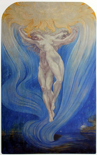
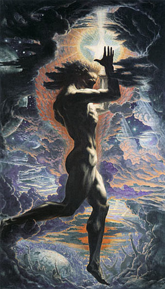
The Call of Cthulhu (1988): in the upper half there’s the big sun from Bob Peak’s poster for Apocalypse Now, in the lower half a radical reworking of Arnold Böcklin’s The Isle of the Dead.

In 1990, shortly after the first season of Twin Peaks had finished showing in the US, Video Watchdog magazine ran a feature by Tim Lucas which attempted to trace all the various cultural allusions in the character names and dialogue: references to old TV shows, song lyrics and the like. This was done in a spirit of celebration with Lucas and other contributors welcoming the opportunity to dig deeper into something they’d already enjoyed. This week we’ve had a similar unravelling of textual borrowings in a TV series, only now we have the internet which, with its boundless appetite for accusing and shaming, can often seem like something from the grand old days of the Cultural Revolution.

cthulhu01.jpg

The Call of Cthulhu (1988): a more subtle allusion to Apocalypse Now.

The latest culprit ushered to the front of the assembly for the Great Internet Struggle Session is Nic Pizzolatto whose script for True Detective has indeed been celebrated for its nods to Robert Chambers and The King in Yellow. It’s also in the process of being condemned for having borrowed phrases or aphorisms from Thomas Ligotti’s The Conspiracy Against the Human Race (2011). See this post for chapter and verse.

cthulhu02.jpg

The Call of Cthulhu (1988): It’s not very clear but that’s a boat from The Creature from the Black Lagoon.

If I find it difficult to get worked up over all this pearl-clutching it’s because a) it shows a misunderstanding of art and the way many artists work, b) True Detective was an outstanding series, and I’d love to see more from Pizzolatto and co, and c) I’ve done more than enough borrowing of my own in a variety of media, as these samples from my adaptation of The Call of Cthulhu demonstrate, a 33-page comic strip where there’s a reference to a painting, artist or film on almost all the pages, sometimes several on the same page.

cthulhu03.jpg

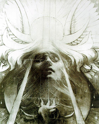
The Call of Cthulhu (1988): Ophelia by Millais.

Cthulhu is a good choice here since Pizzolatto’s story edged towards Lovecraft via the repeated “Carcosa” references. You’d think a Lovecraft zine of all things would know better than to haul someone over the coals for borrowing from another writer when Lovecraft himself borrowed from Robert Chambers (and Arthur Machen and others), while “Carcosa” isn’t even original to Chambers’ The King in Yellow but a borrowing from an Ambrose Bierce story, An Inhabitant of Carcosa (1886). Furthermore, Lovecraft famously complained about his own tendencies to pastiche other writers in a 1929 letter to Elizabeth Toldridge: “There are my ‘Poe’ pieces and my ‘Dunsany pieces’—but alas—where are any Lovecraft pieces?”

Continue reading “Intertextuality”

Jean Delville album covers

delville12.jpg

Scriabin: Symphony no 3; Arensky: Silhouettes (1992) by Neeme Järvi.

The Delville painting from yesterday’s post seems popular with classical recordings, this is only one example of its use, chosen here because some of the music is Scriabin for whom Delville created a sheet music illustration in 1912. Delville’s other work is understandably popular in the metal world among whose adherents there’s now a kind of tradition for using interesting paintings as album art. Examples of some of these follow.

delville3.jpg

The Treasures of Satan (1895).

Morbid Angel beat everyone to Delville’s masterwork. I wrote something about using the same painting on a book cover design here.

delville4.jpg

Blessed Are The Sick (1991) by Morbid Angel.

parsifal.jpg

Parsifal (1890).

Another very popular Delville image, that face was used by Stanley Mouse in a poster design in 1991, and even crept into my adaptation of The Call of Cthulhu.

delville6.jpg

Into The Flames (2004) by Pseudostratified Epithelium.

Pseudostratified Epithelium are a death metal band from Costa Rica. A shame they stretched Delville’s drawing; The Everdawn make a better fist of it.

delville7.jpg

Poems – Burn The Past (2012) by The Everdawn.

Continue reading “Jean Delville album covers”

L’amour des âmes

delville1.jpg

L’amour des âmes (1900) by Jean Delville.

Another of the many connections between the Symbolism and psychedelic poster art, the mystically-inclined Jean Delville (1867–1953) may at least have approved of the addition of a yin-yang symbol to his painting of drifting souls. I was originally going to post Delville’s Pour L’art poster design since I’ve not seen a copy on the web as good as the one below which is scanned from a book. (The principal Delville site has many of his works but in variable quality.) Delville’s pair of floating lovers happen coincidentally to suit the preoccupations of February 14th.

grimshaw.jpg

MC5 at the Grande Ballroom, Detroit (1967) by Gary Grimshaw.

Pour L’art was a Belgian circle of artists formed in Brussels in 1892 to stage exhibitions promoting their work. Delville was the most notable of the group as well as being one of its prime movers. Looking on the Delville website it’s good to see there’s a major study of the artist’s life and work in progress, with publication scheduled for later this year. Too many artists from the late 19th century have been neglected for far too long but attitudes are slowly changing. Anyone interested in Jean Delville is advised to also look at this site which is dedicated to that apostle of androgyny, Joséphin Péladan. One of the strangest characters in the Symbolist menagerie (and the competition for that label is fierce), Péladan’s occult theories inspired Delville and a number of other artists in Belgium and France. It’s good to see he’s also gaining some serious study at last.

delville2.jpg

Pour L’art (1892) by Jean Delville.

Previously on { feuilleton }
Philippe Jullian, connoisseur of the exotic
Delville, Scriabin and Prometheus
The faces of Parsifal
Masonic fonts and the designer’s dark materials
Angels 4: Fallen angels

Philippe Jullian, connoisseur of the exotic

jullian01

Monsieur Jullian as seen on the back cover of Dreamers of Decadence (1971).

Here at last is the long-promised (and long!) piece about the life and work of Philippe Jullian (1919–1977), a French writer and illustrator who’s become something of a cult figure of mine in recent years. Why the fascination? First and foremost because at the end of the 1960s he wrote Esthètes et Magiciens, or Dreamers of Decadence as it’s known to English readers, a book which effectively launched the Symbolist art revival and which remains the best introduction to Symbolist art and the aesthetic hothouse that was the 1890s. If I had to choose five favourite books Dreamers of Decadence would always be on the list. This point of obsession, and Philip Core’s account of the writer, made me curious about the rest of Jullian’s career.

jullian13

An illustration from Wilson & Jullian’s For Whom the Cloche Tolls (1953). “Tata has called these his Krafft-Ebbing (sic) pictures of his friend Kuno, whatever that means.”

Philip Core was friends with Philippe Jullian, and Core’s essential Camp: The Lie that Tells the Truth (1984) has Jullian as one of its dedicatees. It’s to Core’s appraisal that we have to turn for details of the man’s life. There is an autobiography, La Brocante (1975), but, like a number of other Jullian works, this doesn’t seem to have been translated and my French is dismally pauvre. Core’s piece begins:

Philippe Jullian, born to the intellectual family of Bordeaux Protestants which produced the well-known French historian, Camille Jullian, was a last and lasting example of pre-war camp. His career began as an artist in Paris with a reputation for drag-acts parodying English spinsters. Snobbery, a talent for sensitive daydreaming, and a consuming passion for antiques, obscure art and social history, made a very different figure out of the thin and dreamy young man. Jullian suffered terribly during the Second World War; he managed to survive by visiting some disapproving cousins dressed as a maiden aunt, whom they were happy to feed. However, he made a mark in the world of Violet Trefusis, Natalie Barney and Vita Sackville-West by illustrating their books with his wiry and delicate doodles; this led to a social connection in England, where he produced many book jackets and covers for Vogue throughout the 1950s.

Having only seen Jullian in his besuited and bespectacled guise it’s difficult to imagine him dragged up, but the cross-dressing interest is apparent in his humorous collaboration with Angus Wilson and in a later novel, Flight into Egypt. As for the wiry and delicate doodles, they’re very much of their time, in style often resembling a less-assured Ronald Searle. One early commission in 1945 was for the first of what would become a celebrated series of artist labels for Château Mouton Rothschild. Later cover illustrations included a run for Penguin Books some of which can be found at Flickr.

Philip Core continues the story:

Elegant in the austerely tweedy way the French imagine to be English, Jullian exploited his very considerable talents as a writer, producing a series of camp novels throughout the 1950s (Scraps, Milord) which deal frankly but amusingly with the vicissitudes of handsome young men and face-lifted ladies, grey-haired antique dealers and criminals. One of the first to reconsider Symbolist painting, Jullian reached an enormous public in the 1960s with his gorgeous book, Dreamers of Decadence – where an encyclopaedic knowledge of the genre and its accompanying literature helped to create the boom in fin de siècle revivalism among dealers and museums.

An acerbic wit accompanied this vast worldly success; always docile to duchesses, Jullian could easily remark to a hostess who offered him a chocolate and cream pudding called Nègre en chemise, “I prefer them without.” Less kindly, to a gay friend who objected to Jullian’s poodles accompanying them into a country food shop by saying “Think where their noses have been”, he could also retort “Yes, that’s what I think whenever I see you kiss your mother.”

Continue reading “Philippe Jullian, connoisseur of the exotic”

Delville, Scriabin and Prometheus

delville1.jpg

Another striking design found by chance. Symbolist artist Jean Delville (1867–1953) created this sheet music title page for Promethée by Scriabin in 1912, and the pair are well-matched given their shared predilection for mysticism (Theosophy in Delville’s case). Delville had also dealt with Prometheus in a typically dramatic, if sexless, picture a few years earlier (below). Once again it’s unfortunate that one of the really great artists of the Symbolist period is so poorly-served by the web that one has to discover his work by accident. There’s a dedicated site here but the gallery pages are only harvesting what’s already scattered around. Delville had a long and consistently high-quality career; he deserves better.

delville2.jpg

delville3.jpg

Prometheus (1907).

Update: Dave C reminds us of another Delville site with a better selection of pictures including a photo of the artist at work.

Previously on { feuilleton }
The faces of Parsifal
Masonic fonts and the designer’s dark materials
Angels 4: Fallen angels