James Cawthorn: The Man and His Art

cawthorn-cover.jpg

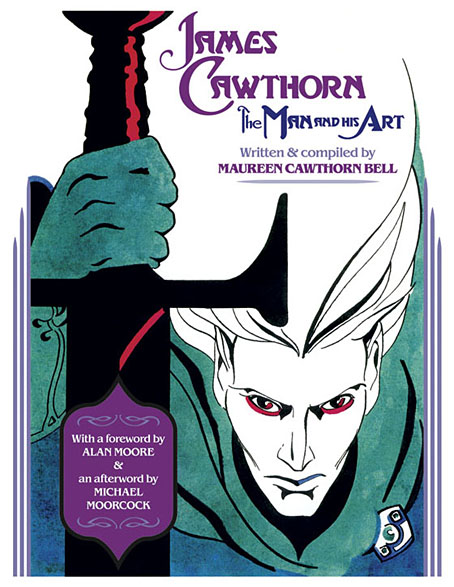
The past year would have been busier than usual with the amount of illustration work I had to deal with, but it was made even busier with my having to design this book at the same time. James Cawthorn: The Man and His Art was originally intended to be a modest memorial by Maureen Cawthorn Bell for her artist brother following his death in 2008, but the book grew into a heavyweight volume of 448 pages containing over 800 individual pieces of art: book covers, illustrations for magazines and fanzines, private pieces for friends and relatives, and many sketches or preliminary works, most of which have never seen print before.

cawthorn-coverspread.jpg

Given Jim Cawthorn’s long association with Michael Moorcock, as both friend and collaborator, the task of collating the artwork and editing the book went to Moorcock bibliographer John Davey, who also serves as the book’s publisher. John spent three years locating over 3000 pieces of artwork, large and small. Some of these pieces are now lodged with the Moorcock archives in the Bodleian Library, Oxford, while others may only be found in the pages of the many science fiction and fantasy fanzines that Jim illustrated, copies of which are stored at the British Library. From this body of material Maureen and John selected a core of representative work from Jim’s private as well as public life, although no-one at the outset of the project was expecting the final picture tally to be so high.

cawthorn-spread-01.jpg

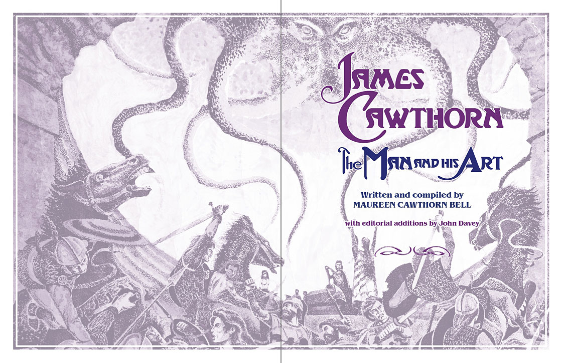
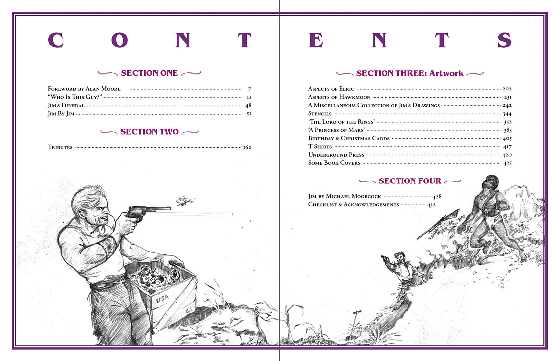
My task as the book’s designer involved making the text presentable (easy) and corralling the artwork (not so easy, and I also had to either clean or colour-adjust every single piece). Maureen had divided the book into several sections, beginning with a lengthy biographical reminiscence. Following this was “Jim by Jim”, a selection of interviews, magazine pieces, some fiction, essays and book reviews. There was also a lengthy extract from Fantasy: 100 Best Novels (1988), a book credited to Jim and Michael Moorcock but, by Moorcock’s admission, mostly Jim’s work. Jim Cawthorn was very well-read, especially in the genres—he was old enough and interested enough to have read The Lord of the Rings when it was first published—and could also present his erudition engagingly for a reader, so the text section of Maureen’s book is far from indulgent.

cawthorn-spread-02.jpg

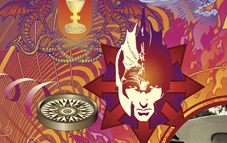
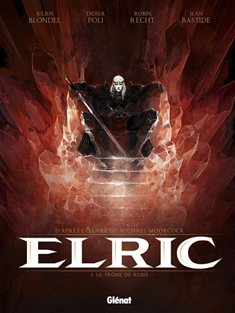
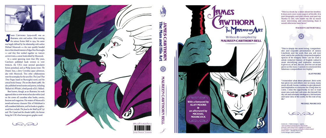
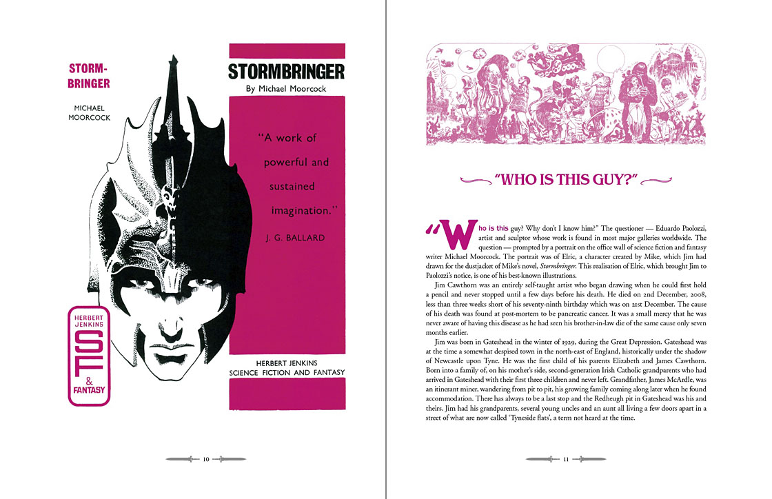
The book design isn’t as elaborate as some I’ve worked on but it didn’t need to be when the pictorial material is rich with what Moorcock calls “wizardry and wild romance”. Maureen wanted a particular picture of Moorcock’s Elric character on the cover so I took details and motifs from some of Jim’s many Elric illustrations to give the book a thematic thread and internal consistency. Cawthorn was present at the creation of Elric in the early 1960s; he not only provided Moorcock’s characters with their first illustrations but even helped plot one of the earliest stories, Kings in Darkness.

cawthorn-number.jpg

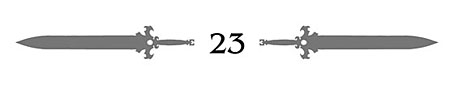
Page numbers are framed by the swords from the Elric stories.

Using motifs such as the sword silhouette and Elric head is something I frequently do with book designs but for this book I also went to the trouble of creating a one-off font for the drop capitals based on Jim’s hand-drawn lettering. Jim drew titles and other lettering throughout his career, so again this was a decision warranted by the book’s contents. The few times we met I never asked him about this but I’ve always thought his lettering designs were derived from the stylised titles that J. Allen St. John created for many of the early Edgar Rice Burroughs books. Jim spent most of his life drawing Burroughs’ characters, and was very familiar with the work of Burroughs’ original illustrators. I was hoping to find a title design of Jim’s that I could rework for the book’s title but none of the examples worked as well as I hoped. For this reason the title lettering is based on different styles from the John Carter novels that were Jim’s favourites among Burroughs’ works.

cawthorn-spread-03.jpg

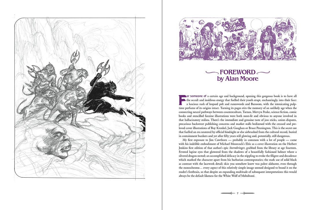
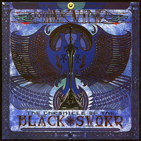
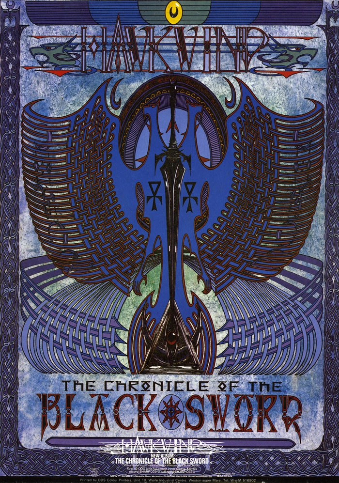
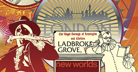
Other features include a foreword by Alan Moore, an afterword by Michael Moorcock, a gallery of Jim’s Lord of the Rings drawings and character sketches from the early 1960s (which predate all others bar those by Tolkien himself), artwork for Hawkwind (including Dave Brock’s “Meliadus” T-shirt), and even a handful of photos from the set of The Land that Time Forgot (1975), the ER Burroughs-derived feature film scripted by Jim with Michael Moorcock. The page samples here are necessarily few given the size of the book.

cawthorn-spread-04.jpg

For the moment James Cawthorn: The Man and His Art is available exclusively from publishers Jayde Design at a special pre-publication price of £20. After publication on 6th August the price will rise to £35. Further page samples follow.

Continue reading “James Cawthorn: The Man and His Art”

The Chronicle of the Cursed Sleeve

blacksword7.jpg

A copy of the cover art that I attempted to colour-correct some years ago to compensate for the poor print reproduction.

This month I’m in Record Collector magazine talking in a sidebar feature about my work on the Hawkwind album The Chronicle of the Black Sword. The issue is Hawkwind-heavy, with a Nik Turner interview, a history of Flicknife Records (the label that released COTBS), and a retrospective feature on the Black Sword album which was released in December 1985. My words were slightly cut to fit the allotted space but I can run the full text here in which I describe my ambivalent feelings towards this particular cover.

blacksword8.jpg

The Black Sword album for me has always been a combination of pleasure and disappointment. I was very pleased initially to hear that Hawkwind were writing a concept based on the Elric books, a series I’d enjoyed for many years. Cover discussions were a little more detailed than usual since this design was sketched out beforehand then approved by the Dave Brock and co. Prior to this I’d been creating something vague after equally vague requests; communication back then was all done via post and call box as I didn’t own a phone.

This was the first album where I was able to create an integrated front and back cover design. A friend had recently found me a copy of George Bain’s Celtic Art: Its Methods of Construction (1951), a study of the creation of Celtic knotwork, and I was keen to use this somehow. Rather than do a cover that looked like a fantasy paperback the idea was to use the knotwork style to create something that was suitably Hawkish whilst also fitting the Elric theme. The front cover has some nods back to earlier Hawkart in the winged sphere—which goes back to Barney Bubbles and his obsession with Ancient Egypt—and the eye-in-a-triangle, a symbol which first appeared on the cover of the Hawklog booklet in the In Search of Space album, and which I scattered throughout many of my Hawkwind designs.

All the lettering on the album was hand-drawn (not very well in places) using letterforms based on Bain’s examples from the books of Kells and Lindisfarne. I drew the track listing onto the artwork for the back cover, a decision that later proved to be a bad one when the band decided to change the running order of the songs, hence the large purple square that spoils the design. My lack of any direct contact with the record company made problems like this inevitable; I was trying to do graphic design at a distance without having any communication at all with the printers responsible for the sleeve. Before digital design, the creation of an album cover could be a complicated business involving photo-mechanical transfers, knockout areas, overlays, typesetters and more; if you weren’t in direct contact with the printer (or somebody who was) then you simply had to hope for the best.

This process of design-at-a-distance led to the disaster with the cover printing, the front of which has an unwarranted blue cast that dulled the impact of the sleeve and, for me, ruined the whole thing. You can see how the cover should have looked by comparing the background colours of front and back; the front was also printed in its true colours on the back page of the 1985 tour programme. It was this, and the messy appearance of the lettering on the back, that pushed me further towards ending my involvement with Hawkwind and doing something of my own over which I’d have complete control.

blacksword1.jpg

The retrospective feature in the magazine includes a picture of the back cover of the tour programme (above) so those familiar with the album can see the difference in reproduction. The difference isn’t so noticeable on the copies posted here after I tried altering the tones of the cover. Over the years I’ve grown used to the blueness but the back cover remains blighted by its purple boxes.

Continue reading “The Chronicle of the Cursed Sleeve”

Moorcock: Faith, Hope and Anxiety

moorcock.jpg

Photo of the author by Linda Moorcock.

I mentioned a few days ago that I had another new piece of work to reveal, and this is it, a poster/promotional piece for Russell Wall’s forthcoming documentary about Michael Moorcock. The main challenge with one was to create something that would give a sense of Moorcock’s extensive career and the genre-spanning content of his many books.

mm1.jpg

I took the 1970s as the starting point, since this was the period when his reputation as a writer was established worldwide. The decade began with Britain’s bookshelves being colonised by Moorcock’s SF and fantasy novels published by Mayflower with vivid covers; it saw a cult feature film—The Final Programme—made from his first Jerry Cornelius novel, and it ended with the fourth Jerry Cornelius novel, The Condition of Muzak, winning a serious literary award, the Guardian Fiction Prize.

mm2.jpg

So the general appearance of the design, the headline typography, and the colour scheme are a nod to the Mayflower covers and especially to Bob Haberfield’s artwork which often used a similar style of Tibetan flames and clouds. The rest of the type is set in Rockwell, a preferred typeface of the Hipgnosis design team for much of the 1970s. Early on I had the idea of filling the design with stylised graphics like those used by some of the Hipgnosis illustrators, chiefly George Hardie, but that idea receded once the composition began to arrange itself. The fountain pen is the main hangover from this, a hard-edged graphic tilted at an angle like many of Hardie’s illustrations. The pen is a little inappropriate given that Moorcock is famous for knocking out novels at speed on a typewriter but it made a good visual rhyme with the guitar, a Rickenbacker like the one the author played in his Deep Fix band.

mm3.jpg

Elsewhere there are many specific references competing for attention: the Elric head is Jim Cawthorn’s illustration from the first edition of Stormbringer (1965); the Jerry Cornelius figure (straddling a repurposed Mayflower logo) is one of Mal Dean’s best, as seen on the cover of issue 191 of New Worlds magazine; the sorcerous blades are my own designs from 1985 as seen on the sleeve of Hawkwind’s Chronicle of the Black Sword album; the Beardsley figures from Salomé were a vague gesture to the 1890s but the Pierrot figure happens to be one Moorcock used for a while as a bookplate, something I didn’t know until I’d placed it in the design; the cat at Pierrot’s feet is another Beardsley from one of the Bon-Mots books; the London skyline is a contemporary one, London past and present having been a continual feature of Moorcock’s writing throughout his career. Lastly, all these details are contained by a graphic based on Abram Games’ BBC TV ident from the 1950s. When Russell and I began talking about this project the words “television biography” were being used so this would have connected to that idea, and to the decade when Moorcock’s career began.

mm4.jpg

I don’t know when the documentary will be released but any news will be posted here in due course. There’s also talk of making copies of the poster available for purchase but nothing concrete has been decided yet.

Previously on { feuilleton }
Eduardo Paolozzi at New Worlds
Elric 1: Le trône de rubis
Into the Media Web by Michael Moorcock
The Best of Michael Moorcock
Revenant volumes: Bob Haberfield, New Worlds and others

The Use and Abuse of Books

savoy.jpg

Savoy • Savoy • Savoy: The first wave of book covers pinned to the Beardsley wallpaper of the Deansgate office.

I often feel I’m in a minority in never having been desperate to see my work in a gallery. We are, after all, living in the Age of Mechanical Reproduction (thanks, Walter), and the idea of having to visit a physical location in order to see a work of art can seem like a rather antiquated affair. (Plenty of arguments counter this, of course, but I don’t create anything that needs to be experienced in situ, and I’m also not enmeshed in the art market.) So it’s been surprising this month to realise that examples of my work are currently on display in Monterey, California (the Tentacles exhibition), London (Comics Unmasked: Art and Anarchy in the UK at the British Library which ends today) and in Manchester (The Exhibition Centre for the Use and Abuse of Books at the International Anthony Burgess Foundation). If all goes according to plan, some of my steampunk book covers will also be exhibited in Beijing next month; more about that later.

dbmb.jpg

Britton & Butterworth by Kris Guidio (1986).

The Use and Abuse of Books is a necessarily brief overview of the 40-year history of Savoy Books, a notable moment in the life of the company since this is the first time any Manchester institution has acknowledged the existence of a local publisher with such a long, varied and often controversial history. In part this is a result of the cultural histories of Manchester concentrating almost exclusively on the music scene. Many of the books and features written about Manchester arts have been produced by DJs or ex-musicians who appear tone-deaf to literary culture despite the existence of Carcanet Press (established 1969), Savoy Books, and other more recent publishers who are happy to operate outside London. (The venerable Jon Savage gets a pass here.) Carping aside, The Use and Abuse of Books describes itself thus:

Featuring text, images and rare promotional content from Savoy’s infamous 1989 publication Lord Horror, the exhibition tackles the question of whether the depiction and description of horrific acts is justified in satire. In 1992 Lord Horror was declared by Judge Gerrard Humphries as ‘a glorification of racism and violence’ whereas writer Michael Moorcock believed the book to belong to ‘a tradition of lampoon, of exaggeration. Its purpose is to show up social evils, and the evils within ourselves.’ Displaying artwork from Sinister Legends and Meng and Ecker alongside other panels from rare comics and graphic novels (including Reverbstorm), The Use and Abuse of Books also examines the relationship between text and imagery within Savoy’s publications, revealing how artwork from John Coulthart, Kris Guidio and James Cawthorn supplements and enhances the storytelling through visual references to architecture, cultural figures or specific works of art. The exhibition will be open 10am–4pm weekdays and in the evenings during events from Friday 15th August until Friday 5th September. (more)

Some of my pages from Lord Horror: Reverbstorm have been printed large-size for the walls, and there’s also a life-size cardboard figure of my Beardsley-style Lord Horror. Savoy publications past and present are on display, including some of my book designs. It’s fitting that this should be taking place under the aegis of the Anthony Burgess Foundation; Burgess was a great Joycean and a champion of two Savoy favourites: William Burroughs and JG Ballard. I can’t imagine him getting too enthusiastic about many of Savoy’s publications but I’d hope he might have appreciated the spirit of Mancunian bloody-mindedness in which they were produced.

Elric 1: Le trône de rubis

elric1.jpg

The closest I ever got to illustrating Michael Moorcock’s Elric character was the sleeve for The Chronicle of the Black Sword in 1985, a Hawkwind concept album based on the first couple of Elric books. That design favoured a decorative approach over anything illustrative, however. At the time I felt too intimidated by the renderings of Elric’s first illustrator, James Cawthorn, and subsequent depictions by book cover artists such as Michael Whelan, to attempt my own version of the character. These days I pay little attention to heroic fantasy of any kind but I do look out for new depictions of Moorcock’s anti-hero. Earlier this year the French bande dessinée publisher, Glénat, released the first album in a planned series of five comic-strip adaptations of the Elric books. Many creditable Elric comics have appeared since the 1970s, not least the Cawthorn version of Stormbringer, one of the earliest and best, and Philippe Druillet’s own somewhat eccentric production. Mike Moorcock very generously sent me a copy of the Glénat volume this week, and I’d say this is now the one to beat.

elric2.jpg

Writer Julien Blondel has adapted the books with the art duties being taken by Didier Poli and Robin Recht. Jean Bastide is the colourist. I’ve always preferred the French and Belgian approach to comic art over the American style so I’m naturally biased towards a book such as this. That said, the art is marvellous, and so many of the details feel just right. Moorcock portrays the Melnibonéans as decadent and cruel, something that Poli and Recht portray with scenes of naked slaves being bled, butchered, and even used as human torches for the blithe amusement of their masters. The general atmosphere in the opening pages is like something from Flaubert’s Salammbô with its combination of antique depravity and the massing of great armies prior to battle. They don’t slouch with the monstrosities, either, there’s a spot of Lovecraftian weirdness when Elric is rescued by Straasha, the Sea King. I look forward to seeing how they deal with Arioch (who puts in an appearance at the end) and the other Chaos Lords. The dialogue is all in French, of course, but if you know the books it’s easy to follow even with French as limited as mine.

elric3.jpg

The Glénat site has a few more page samples. Moorcock has been watching these books being adapated and re-adapted for decades, and he says this is among the very best. For anyone with more than a passing interest in the brooding albino prince it’s well worth seeking out.

Previously on { feuilleton }
Salammbô illustrated
Jim Cawthorn, 1929–2008