Jon Finch, 1941–2012

finch1.jpg

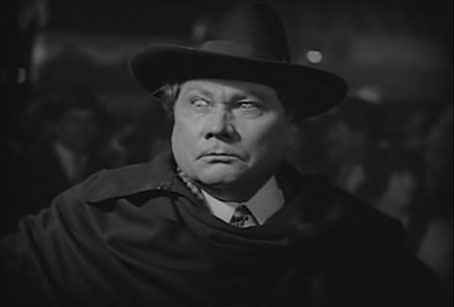
Macbeth (1971).

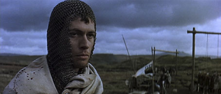
There are few actors I’ve ever felt sufficiently cultish about who could make me watch films or TV dramas I wouldn’t otherwise be interested in. Orson Welles would be one (up to a point, he was in a lot of crap in later years), Patrick McGoohan another and Jon Finch most definitely a third. Having watched Finch just over a week ago in Roman Polanski’s superb adaptation of Macbeth it’s been a shock to discover that he’d died shortly after Christmas, the news of his funeral only being announced this week.
finch4.jpg

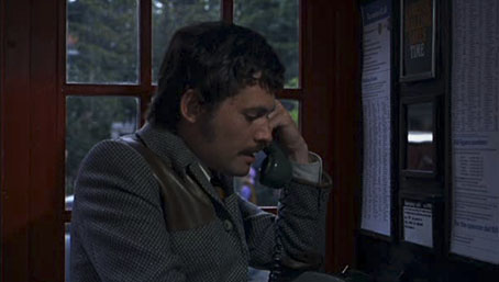
Frenzy (1972).

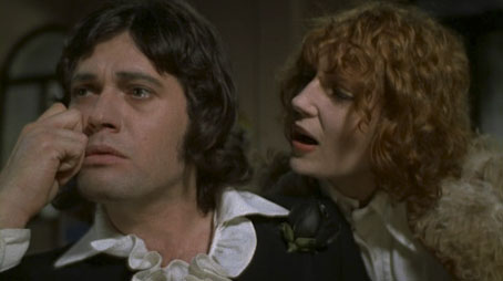
The cult status stems from the remarkable run of lead roles he was offered in the early 1970s: playing Macbeth for Polanski, the “wrong man” role in Hitchcock’s last great film, Frenzy, and a perfect Jerry Cornelius in Robert Fuest’s adaptation of Michael Moorcock’s The Final Programme. There were plenty of other roles, of course, but those three are standouts which also show something of his range: suitably brooding, weak and malevolent in Macbeth, in Frenzy a hounded man who seems disreputable enough for his friends to suspect he may be a murderer, in The Final Programme as smart and insouciant as Moorcock’s Cornelius ought to be.
finch2.jpg

The Final Programme (1973): Finch with Jenny Runacre (Miss Brunner).

I’m happier that Finch played Cornelius instead of James Bond, a role he was offered after Sean Connery quit. Jerry Cornelius, “the English Assassin”, in the first novel in Moorcock’s Cornelius quartet is a kind of anti-Bond, and there were few actors around in 1973 who would have possessed the necessary charisma and intelligence for the part. Mike Moorcock was friends with Finch around the time the film was being made so when I was visiting the Moorcocks in Paris a few years ago I asked him why Finch hadn’t done more with his career after such an impressive start. Mike says he was one of those actors who often preferred to be doing something else with his time.
finch3.jpg

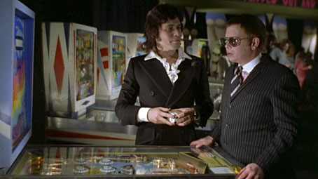
Finch and Ronald Lacey (Shades) in The Final Programme.
finch5.jpg

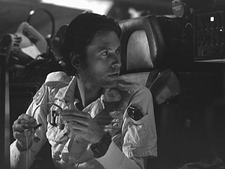
On the set of Alien (1978).

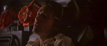
Obituaries will no doubt regard Finch’s rejection of the Bond role as a missed opportunity but I wish we could have seen him as intended in Ridley Scott’s Alien where he’d been cast as Kane but had to drop out after contracting a severe case of bronchitis once shooting was underway. The photo and screen grab below are seldom-seen images from the Alien DVD extras. I’ve nothing against John Hurt in the role but with Finch playing the part it would have made a cult film a little more special. He did get to act for Ridley Scott eventually with a small role in Kingdom of Heaven in 2005.
finch6.jpg

An outtake from Alien.

finch7.jpg

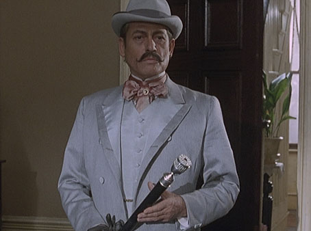
As Count Sylvius in The Memoirs of Sherlock Holmes (1994).

finch8.jpg

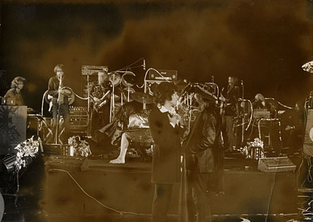
Update: Found on an archive disc, this rare photo from the set of The Final Programme showing Finch as Jerry Cornelius facing off with his creator, Michael Moorcock. (Click for a larger copy.) That’s the Space Ritual line-up of Hawkwind in the background. Band and author appear for a fraction of a second in a shot during the film’s arcade scene. Considering how common it was to have rock bands in feature films during this time it still surprises me that Fuest and co. went to all this trouble then left them on the cutting-room floor. The photo was Moorcock’s own, as I recall, something we ran in one of the Savoy books.

Guardian obituary
Independent obituary
Telegraph obituary
Macbeth trailer
Frenzy trailer
The Final Programme trailer

Previously on { feuilleton }
Dan O’Bannon, 1946–2009
Patrick McGoohan and The Prisoner
Rex Ingram’s The Magician

magician1.jpg

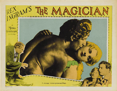
The Magician (1926), Rex Ingram’s curious occult horror film, receives a rare screening with live music accompaniment at the Brighton Fringe Festival on Tuesday, 22nd May. The film is notable for being based on the 1908 Somerset Maugham novel of the same name whose modern-day magus character, Oliver Haddo, was modelled on Aleister Crowley. The screening will feature an introduction by Gary Lachman, and a live soundtrack by the fabulous Ragged Ragtime Band, featuring members of Blondie, Indigo Octagon, Raagnagrok and Time. Booking details and other information here.

magician2.jpg

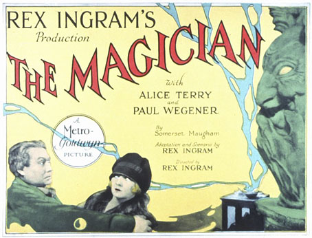
Maugham’s book has always been easier to find than Ingram’s film, more’s the pity when the film—despite some flaws—is the superior article. Read today, the novel comes across as a template for the standard Dennis Wheatley tale of middle-class innocents imperilled by grandiloquent villainy. A young couple, Arthur Burdon and his fiancée, Margaret, are pitted against Haddo’s extravagant diabolisms; for assistance they have a friend, Dr Porhoët, a Van Helsing type, older than the couple and with a convenient (but purely intellectual) interest in the occult. Haddo kidnaps Margaret and forces her with hypnosis into an unconsummated marriage. Haddo’s goal is to create artificial life—homunculi—and for that he requires a virgin’s blood. Maugham later described his novel as “lush and turgid”, an honest and accurate appraisal. Aleister Crowley was amused at being portrayed as a “Brother of the Shadows” but pretended to be scandalised by Maugham’s alleged plagiarism which he condemned in a Vanity Fair review that he signed “Oliver Haddo”. The best parts of the novel certainly owe something to other authors, usually the scenes concerning the sinister magus and his occult activities; the rest of the characters are lifeless by comparison. Some of the better passages read like HP Lovecraft writing Dorian Gray, and Maugham not only quotes from Walter Pater but also (uncredited) from Wilde’s Salomé.

magician4.jpg

Paul Wegener as Oliver Haddo.

Continue reading “Rex Ingram’s The Magician”

Weekend links 29

dancer.jpg

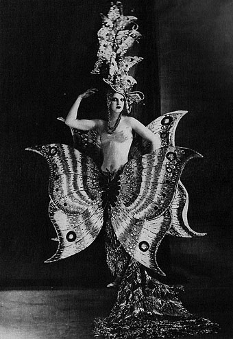
A Folies Bergère dancer, c. 1909.

Six Novels in Woodcuts: The Library of America publishes a boxed set of Lynd Ward’s works: Gods’ Man, Madman’s Drum, Wild Pilgrimage, Prelude to a Million Years, Song Without Words and Vertigo.

• RIP ace graphic designer Raymond Hawkey. Related: Raymond Hawkey: An eye for detail, and Hawkey’s James Bond cover designs from the mid-60s.

The Record: Contemporary Art and Vinyl, an exhibition at Duke University, North Carolina, features work by 41 artists from around the world, from the 1960s to the present, using vinyl records as subject or medium.

decaris.jpg

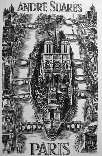
The Île de la Cité, a steel engraving by Albert Decaris (1950).

Fred Tomaselli will have a new exhibition of his work at the Brooklyn Museum next month.

Socialist Monuments in Bulgaria photographed by Linda Ferrari.

• What would Howard think of the Mythos Art Dildo?

Space is Process, a film about Olafur Eliasson.

Thurston Moore’s Indie Books.

Chris Colfer in a leather bar.

Ephemeral New York.

• Chrome! Helios Creed’s YouTube channel.

Album cover postage stamps

albums1.jpg

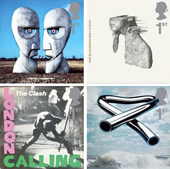
top row: The Division Bell by Pink Floyd; A Rush of Blood to the Head by Coldplay.
bottom row: London Calling by The Clash; Tubular Bells by Mike Oldfield.

The Royal Mail follows its series of British Design Classics postage stamps with a series dedicated to what they call “classic” album covers. The design classics in the earlier series deserved the term—a  Mini motor car, a Penguin book cover, the London Underground map, etc—whereas here we have the word “classic” being used in its lazy journalist sense where it becomes a synonym for “popular” and “familiar”, two attributes which often diminish with time.

albums2.jpg

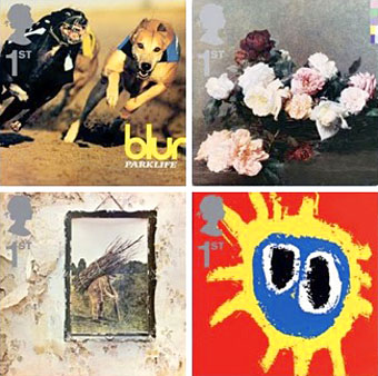
top row: Parklife by Blur; Power, Corruption and Lies by New Order.
bottom row: IV by Led Zeppelin; Screamadelica by Primal Scream.

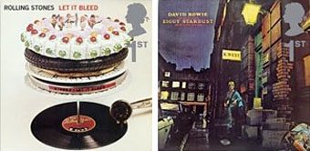
It should be noted that the choice of cover art was limited to releases by UK artists, and the designs had to be readable at the very small size of a postage stamp. Even so, I can’t help but regard this as a missed opportunity. There was no need to feature the Beatles since they’d been given their own set of stamps in 2006, but I’ve never thought of the cover of Let It Bleed (below) as a classic, even though musically it’s one of the best Stones albums. I’d rather choose Andy Warhol’s cover for Sticky Fingers but you can imagine the upset at stamp users being forced to lick a picture of a bulging pair of jeans. As for Pink Floyd’s Division Bell, it’s a typically striking design from Storm Thorgerson but does anyone really think it’s more classic than earlier Floyd covers, not least the Dark Side of the Moon prism which even people who hate the band can instantly recognise? Nearly all these choices seem confused or compromised; the Clash cover is the token punk offering—Royal Mail wouldn’t dare choose Never Mind the Bollocks—but Ray Lowry’s design was copied from an Elvis Presley sleeve; Led Zeppelin’s IV is a great album but other releases had far better covers; Primal Scream, another great album but the whole sleeve design is perfunctory; the Blur choice is merely bewildering.

albums3.jpg

left: Let It Bleed by The Rolling Stones; right: The Rise and Fall of Ziggy Stardust and the Spiders from Mars by David Bowie.

As far as designers go, Hipgnosis (via Storm T), Peter Saville (New Order), and Stylorouge (Blur) are included here but there’s nothing from Barney Bubbles, Malcolm Garrett, 23 Envelope, Neville Brody, Designer’s Republic or any of the other pioneering British designers of the past 30 years. The trouble with those names, of course, is that many of the artists they worked for aren’t popular or familiar enough to the average British stamp purchaser so their work can’t be deemed “classic”. A best of British, then, which could have been a lot better.

Classic Album Covers will be issued on January 10th, 2010.

Elsewhere on { feuilleton }
The album covers archive

Previously on { feuilleton }
British Design Classics
Stamps of horror
Endangered insects postage stamps
James Bond postage stamps
Please Mr. Postman

Peake’s Pan

pan1.jpg

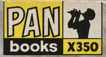
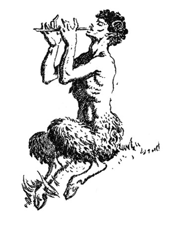
Another charity shop book-raid this week netted me a copy of Ian Fleming’s On Her Majesty’s Secret Service in its 1965 Pan Books edition, one of the Bond series with great covers designed by Raymond Hawkey. The sight of the tiny Pan silhouette above reminded me that this logo was based on drawings commissioned from Mervyn Peake when the company was launched at the end of the Second World War. The design persisted for many years, usually printed on a yellow background.

pan2.jpg

I wasn’t sure I had a copy of Peake’s original version to hand but G Peter Winnington‘s Peake biography, Vast Alchemies (2000), includes a reproduction, one of two drawings Peake produced for the publisher. The other can be seen on this Pan Books site which also reveals that Peake’s Pans were printed at quite large size on the initial run of books. The design model may have been the early Penguin style which nearly always had the famous bird prominently placed in the lower third of the cover. In book terms at least, the Penguin has proved to be the more powerful god, having survived virtually unchanged since 1935. Peake’s Pan is long gone, dropped in favour of two red squiggles.

Elsewhere on { feuilleton }
The illustrators archive

Previously on { feuilleton }
Buccaneers #1
Recovering Bond
Mervyn Peake in Lilliput
James Bond postage stamps
Wanna see something really scary?
T&H: At the Sign of the Dolphin