Rex Ingram’s The Magician

magician1.jpg

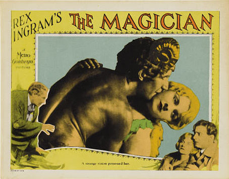
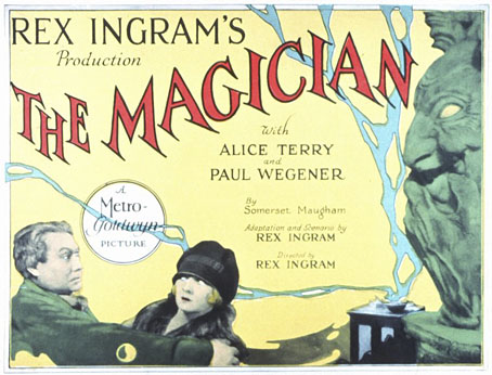
The Magician (1926), Rex Ingram’s curious occult horror film, receives a rare screening with live music accompaniment at the Brighton Fringe Festival on Tuesday, 22nd May. The film is notable for being based on the 1908 Somerset Maugham novel of the same name whose modern-day magus character, Oliver Haddo, was modelled on Aleister Crowley. The screening will feature an introduction by Gary Lachman, and a live soundtrack by the fabulous Ragged Ragtime Band, featuring members of Blondie, Indigo Octagon, Raagnagrok and Time. Booking details and other information here.

magician2.jpg

Maugham’s book has always been easier to find than Ingram’s film, more’s the pity when the film—despite some flaws—is the superior article. Read today, the novel comes across as a template for the standard Dennis Wheatley tale of middle-class innocents imperilled by grandiloquent villainy. A young couple, Arthur Burdon and his fiancée, Margaret, are pitted against Haddo’s extravagant diabolisms; for assistance they have a friend, Dr Porhoët, a Van Helsing type, older than the couple and with a convenient (but purely intellectual) interest in the occult. Haddo kidnaps Margaret and forces her with hypnosis into an unconsummated marriage. Haddo’s goal is to create artificial life—homunculi—and for that he requires a virgin’s blood. Maugham later described his novel as “lush and turgid”, an honest and accurate appraisal. Aleister Crowley was amused at being portrayed as a “Brother of the Shadows” but pretended to be scandalised by Maugham’s alleged plagiarism which he condemned in a Vanity Fair review that he signed “Oliver Haddo”. The best parts of the novel certainly owe something to other authors, usually the scenes concerning the sinister magus and his occult activities; the rest of the characters are lifeless by comparison. Some of the better passages read like HP Lovecraft writing Dorian Gray, and Maugham not only quotes from Walter Pater but also (uncredited) from Wilde’s Salomé.

magician4.jpg

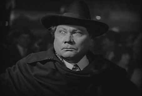
Paul Wegener as Oliver Haddo.

Continue reading “Rex Ingram’s The Magician”

Peake’s Pan

pan1.jpg

Another charity shop book-raid this week netted me a copy of Ian Fleming’s On Her Majesty’s Secret Service in its 1965 Pan Books edition, one of the Bond series with great covers designed by Raymond Hawkey. The sight of the tiny Pan silhouette above reminded me that this logo was based on drawings commissioned from Mervyn Peake when the company was launched at the end of the Second World War. The design persisted for many years, usually printed on a yellow background.

pan2.jpg

I wasn’t sure I had a copy of Peake’s original version to hand but G Peter Winnington‘s Peake biography, Vast Alchemies (2000), includes a reproduction, one of two drawings Peake produced for the publisher. The other can be seen on this Pan Books site which also reveals that Peake’s Pans were printed at quite large size on the initial run of books. The design model may have been the early Penguin style which nearly always had the famous bird prominently placed in the lower third of the cover. In book terms at least, the Penguin has proved to be the more powerful god, having survived virtually unchanged since 1935. Peake’s Pan is long gone, dropped in favour of two red squiggles.

Elsewhere on { feuilleton }
The illustrators archive

Previously on { feuilleton }
Buccaneers #1
Recovering Bond
Mervyn Peake in Lilliput
James Bond postage stamps
Wanna see something really scary?
T&H: At the Sign of the Dolphin

Recovering Bond

new_bonds.jpg

Penguin is really coming up with the goods these days, living up to their reputation as a house with high standards of cover design, unlike Picador and the shabby way they treated Cormac McCarthy recently.

Ian Fleming’s Bond novels are the latest to receive a makeover with some fabulous art from illustrator Michael Gillette. 2008 is Fleming’s centenary so the books have been republished as demi-format hardbacks with these new designs adorning the jackets. Each cover features a different girl matched to the theme of the book (yes, I know they’re women but in Bond’s world women are always girls unless they’re Miss Moneypenny); each cover also features groovy period type which alludes to the hand-drawn elaborations of the Sixties and Seventies. The effect is reminiscent of the poster art for the 1967 film of Casino Royale (below) which used a naked girl as the focal point; all Bond posters before and after this place oo7 himself centre stage. Penguin even dare to push the level of pastiche by making On Her Majesty’s Secret Service look rather like an old romance novel, not such a surprising decision since this is the book where Bond gets married.

casino.jpg

My favourite Bond covers remain the old Pan paperbacks from 1963 but that’s just me; these look great. There’s been a persistent moan recently from authors and publishers worrying about file sharing as they foresee the publishing world going the same way as the music business. The solution is obvious: you can’t stop texts being copied and distributed but you can make the books themselves desirable objects so make them worth buying and owning. Penguin has numbered the spines of the new Bond books as they did with their recent Sherlock Holmes reprints, a smart appeal to book collectors as well as a tip to read them in the order they were written. “Smart” is the key word here; Picador take note.

Update: The Pan covers mentioned above were designed by Raymond Hawkey. Bond site MI6.co.uk has some details about the designer.

Elsewhere on { feuilleton }
The book covers archive

Previously on { feuilleton }
Repackaging Cormac
The World’s Greatest Detective
James Bond postage stamps
Boys Own Books

James Bond postage stamps

stamps1.jpg

stamps3.jpg

stamps2.jpg

Proving once again the centrality of James Bond to contemporary British identity, the Royal Mail releases these stamps on January 8th, 2008, the 100th anniversary of Ian Fleming’s birth. If a sexist state assassin seems an awkward choice of cultural ambassador, Alan Moore and Kevin O’Neill present a more iconoclastic view of the super spy in the Black Dossier, the latest volume in their unfolding history of the League of Extraordinary Gentlemen.

Good to see that the stamp designs above include the Pan paperback covers from 1963. (The other examples are the first editions from Jonathan Cape, the 2006 Penguin reprints and what appear to be a set of Seventies reissues.) A friend of mine at school had a collection of the Pan books and they remain my favourite Bond book designs, not least because they were some of the first book covers to strike me as being well-designed rather than well-illustrated. What the Flickr link doesn’t show is the die-cut holes in the Thunderball jacket which made the cover seem as though it was pierced by bullets, the kind of expensive production detail you rarely see on anything other than a bestseller.

And while we’re on the subject of Bond design, Daniel Kleinman’s superb Casino Royale title sequence is on YouTube.

Elsewhere on { feuilleton }
The book covers archive

Previously on { feuilleton }
Please Mr. Postman