Reverbstorm: 1994–2012.
Art, intellectual pursuits, the development of the natural sciences, many branches of scholarship flourished in close spacial, temporal proximity to massacre and the death camps. It is the structure and meaning of that proximity that must be looked at. […] But there is a […] danger. Not only is the relevant material vast and intractable: it exercises a subtle, corrupting fascination. Bending too fixedly over hideousness, one feels queerly drawn. In some strange way the horror flatters attention, it gives to one’s own limited means a spurious resonance. […] I am not sure whether anyone, however scrupulous, who spends time and imaginative resources on these dark places, can, or indeed, ought to leave them personally intact. Yet the dark places are at the centre. Pass them by and there can be no serious discussion of human potential.
George Steiner, In Bluebeard’s Castle: Some Notes Towards the Re-definition of Culture (1971)
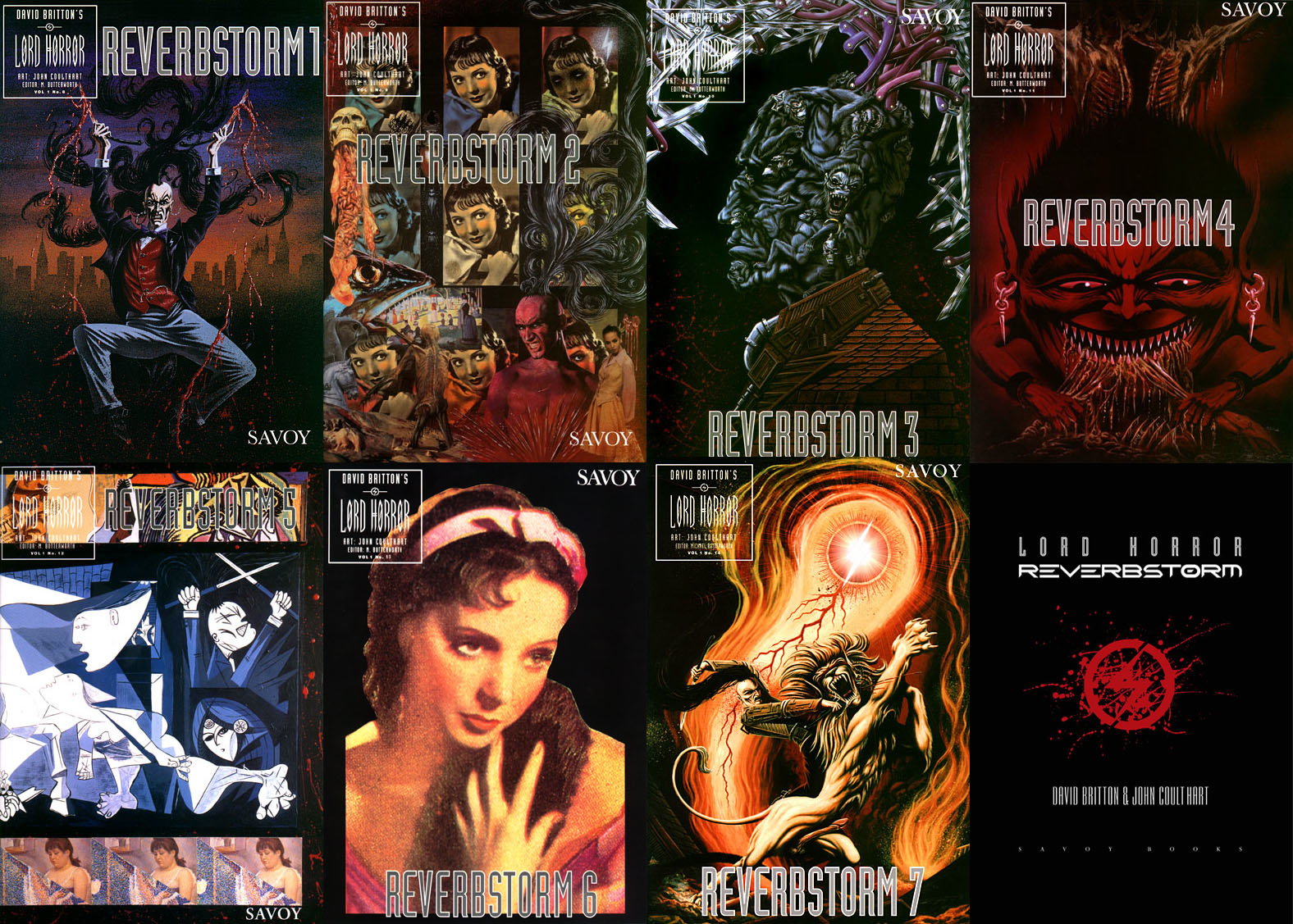
Reverbstorm is an eight-part comic series which I began drawing in 1990. Last week I finished work on the final section, and also completed the layout and design for the collected edition, a 344-page volume which Savoy Books will be publishing later this year. All the artwork has been scanned afresh, re-lettered and, in a few places, improved to fix compromises and print errors present in the published issues. This unfinished project has been hanging over me for so long that I make this announcement with some relief. The book will be published without a foreword so this post can serve as an introduction for the uninitiated. But before I get to the details, some history.
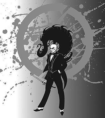
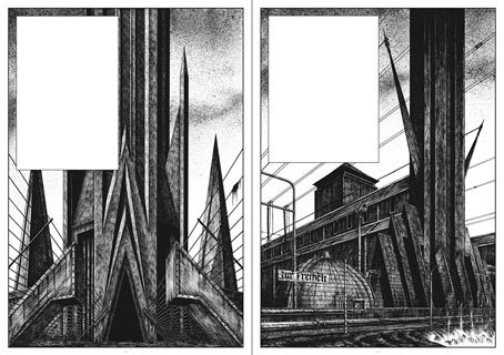
David Britton was the writer and instigator of Reverbstorm, the series being a continued exploration in the comics medium of his Lord Horror character. Lord Horror is an alternate-history equivalent of the real-life William Joyce, a member of the British Union of Fascists in the 1930s whose propaganda broadcasts to Britain from Nazi Germany during the Second World War led the press to dub him Lord Haw-Haw. The first five-part Lord Horror comic series, Hard Core Horror, showed the evolution of Horace William Joyce, aka Lord Horror, from charismatic politician to Nazi collaborator; the final two issues of the series concerned Horror’s involvement in the Holocaust. In Britton’s mythos James Joyce is the brother of Horace Joyce while Jessie Matthews, a popular British musical star of the 1930s, is Lord Horror’s wife. (Britton’s Lord Horror novels are examined in detail by Keith Seward in his Horror Panegyric essay.) My fellow artist at Savoy, Kris Guidio, drew the first four issues of Hard Core Horror; I drew issue five which was less a comic story, more a portfolio of static scenes of death-camp architecture. The series was well-received by regular Savoy readers but mostly ignored by the British comics world, with some justification: the comics were a glossy production but the narrative was very erratic, even technically inept in places. At Savoy the series was regarded as a failed experiment, Kris’s drawing style and flair for cartooning being more suited to the broad humour of the Meng & Ecker strips. But Dave liked what I’d done with the final issue and felt we could try something new that was also more original than a fictional skate through recent history.
In addition to producing comics in the late 1980s, Savoy had been recording a number of eccentric cover versions, most of them sung by PJ Proby. A music journalist, Paul Temple, came to interview Proby about the songs and stayed in touch. He subsequently approached the company with a song of his own entitled Reverbstorm, a bombastic number best described as “Wagnerian Northern Soul” which Savoy recorded in 1993. (Temple recounts the origin of the song here.) This gave a title to the new comic series that Dave was planning, the story outline being expanded from a scenario that he and Savoy colleague Michael Butterworth had sketched out when a film company showed some fleeting interest in Lord Horror. Kris Guidio and I worked on the opening pages, the initial idea being that Kris would continue drawing the Lord while I would do everything else. Once I’d convinced Dave that I could draw his Lordship to his satisfaction I took over the series while Kris carried on with the Meng & Ecker comics. I spent most of 1991–1996 drawing the first seven parts of Reverbstorm which were published as separate comics during that period. The first issue came with a CD single of Paul Temple’s song which was sung by Sue Quinn but credited to Jessie Matthews. (It’s now available on iTunes.) The last part of the series was always going to be something that differed from the preceding sections but I didn’t know how this might manifest until 1997 when I painted a series of monochrome double-spreads intended to form backgrounds for Dave’s text. That’s where the series stalled after the paintings had improvised themselves to such a degree of abstraction and incoherence that I didn’t feel able to continue. The breakthrough came a couple of years ago when I started scanning all the artwork into the computer and thinking again about the series. I realised I could complete everything now that my computer graphics skills were adequate enough to complement the earlier issues whilst also adding something new.