Visionaries: The Art of the Fantastic

hoffman.jpg

Curandera (2011) by Martina Hoffman.

Another US art exhibition, Visionaries: The Art of the Fantastic has been running since mid-July at the QCC Art Gallery, New York. I’d have mentioned this sooner but last month has been rather hectic, work-wise. A great opportunity for anyone in the NY area to see original works by artists such as Ernst Fuchs, HR Giger and the late Sibylle Ruppert, plus many works by newer artists. It also shows how fantastic art (as opposed to fantasy art) continues to pursue its parallel course and draw fresh talent despite never attracting attention from the art critics with the largest megaphones. Not everything in the show is to my taste—I’ve a low tolerance for saccharine, New-Agey things—but the quality and range of the exhibition is impressive. Visionaries: The Art of the Fantastic runs to 20th September, 2012.

abrams.jpg

The Revelation of the Turtle Pond (2010) by Isaac Abrams.

ruppert.jpg

Chant de Mald (1978) by Sibylle Ruppert.

Elsewhere on { feuilleton }
The fantastic art archive

Starowieyski in Switzerland

starowieyski1.jpg

Nike (1971) by Franciszek Starowieyski.

My thanks to Marco Witzig for sending some promotional materials for a new exhibition of work by the great Polish artist Franciszek Starowieyski (1930–2009). The exhibition is running at the gallery of the HR Giger Museum in Gruyères, Switzerland from now until Spring 2013. There’s a selection of photos of the works on show here. I’m always curious to know what size artists work at so it’s interesting to get an idea of this from views of the originals. I’ve linked to Starowieyski’s incredible poster art on several occasions but it’s always worth another look: go here and here and here.

starowieyski2.jpg

Elsewhere on { feuilleton }
The fantastic art archive

Previously on { feuilleton }
Surrealism, graphic design and Barney Bubbles
Polish posters: Freedom on the Fence
Franciszek Starowieyski, 1930–2009
The Hourglass Sanatorium by Wojciech Has

Heavy Metal, October 1979: the Lovecraft special

hm1.jpg

Mr Lovecraft by JK Potter.

HP Lovecraft died seventy-five years ago on 15th March, 1937. Twenty-five years ago I was halfway through drawing my comic strip adaptation of The Call of Cthulhu, conscious at the time that, yes, it was fifty years ago today… I mentioned at the weekend the special Lovecraft edition of Heavy Metal that was published in October 1979; of the many stimuli that led to the drawing of CoC, this magazine was by far the most important. Given the date, now seems as good a time as any to say something about it.

hm2.jpg

Illustration for the contents page by Stephen R. Bissette.

Heavy Metal was the US offshoot of Métal Hurlant, the sf/fantasy comics magazine founded by Jean Giraud (Moebius), Philippe Druillet and Jean-Pierre Dionnet in 1974. Copies of Métal Hurlant could be found in London but none ever made it further north. The advent of Heavy Metal provided an invaluable introduction to a generation of European artists whose work was otherwise difficult to find. Even better: their stories were being translated into English for the first time. The late 70s was a dizzying period for a Lovecraft reader: HR Giger appeared apparently out of nowhere in 1977 when Big O published the first UK collection of his art (which I couldn’t afford at the time), a book with Necronomicon in the title; a year later Thames & Hudson published Franz Rottensteiner‘s The Fantasy Book, an overview of the genre that devoted eight pages to Lovecraft and Arkham House, and which included many illustrations I’d never seen before; in 1979 Giger was all over the newspapers and magazines thanks to Alien; then in October the Lovecraft special dropped onto the shelves. I was stunned: this was that rare occasion when someone creates exactly the thing you want to see at precisely the right moment.

hm3.jpg

The Dunwich Horror by Alberto Breccia. A superb adaptation.

Looking back, the issue isn’t quite as good as it seemed at the time: many of the stories are slight, a couple have nothing whatever to do with Lovecraft, and, Breccia aside, none of the artists tackle the major works. What counted in the end was the idea of the issue, the implication that Lovecraft’s imagery was there to be seized and reworked in visual form. There were better issues of the magazine, before and after, but for the next six years this one remained for me a tantalising possibility. They hadn’t got it quite right…what if someone else did? After searching comic shop shelves in vain I eventually decided to have a go myself.

Continue reading “Heavy Metal, October 1979: the Lovecraft special”

The art of Robert Venosa, 1936–2011

venosa.jpg

A few years back, while experimenting with the hallucinogens, I experienced visions of a dynamic energy in constant high-velocity motion, crystallizing and manifesting in a form which could only be described as angelic. Potential energy, crystallizing energy and structured energy were all visible in the same instant…time and space transcended. These visions, and a new-found awareness of spirit brought about through worship and meditation, were too powerful not to be expressed: a translation had to be attempted.

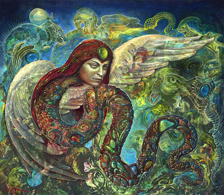
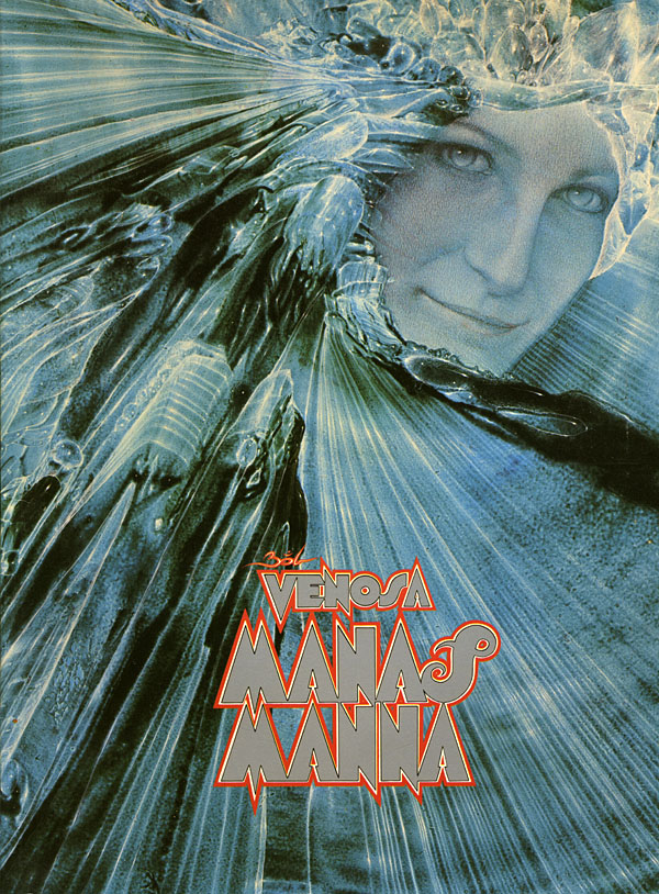
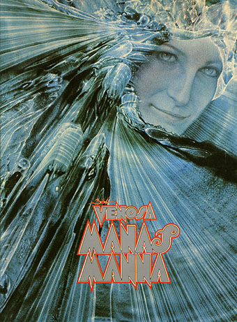
Robert Venosa, Manas Manna, 1978.

I only discovered a few days ago that American artist Robert Venosa had died last month. As with the late Sibylle Ruppert there’s the inevitable wish for some wider acknowledgement of the passing of these unique talents.

santana.jpg

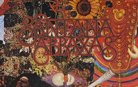
Millions of people have seen one of Venosa’s creations without being aware of it: in 1970 he designed the logo/title for Santana’s Abraxas album (the one with the amazing Mati Klarwein cover), a design which is still in use today. But it’s as a painter that he ought to be remembered. Manas Manna was the first collection of Venosa’s art published by Peter Ledeboer’s Big O imprint in 1978, and could be found on bookshelves that year with a pair of equally remarkable auto-monographs: Mati Klarwein‘s God Jokes and the first English edition of HR Giger‘s Necronomicon. All three artists were aware of each other (Venosa was friends with the other two), and all had managed the difficult feat of having their work sold in art galleries whilst also being visible to a much larger audience on album covers. All three books were eagerly plundered that year by the art team of OMNI magazine whose early issues made heavy use of paintings by Klarwein, Giger, Venosa, De Es Schwertberger and others. Of this Venosa has said:

OMNI was the first to give the artist equal credit with the author…something that to this day is still not seen in any other newsstand magazine. OMNI also put Fantastic Realism, Surrealism, Visionary, and every other type of ‘Fantasy’ art, square into the public’s eye. I and my colleagues owe OMNI a large measure of gratitude for its uncompromising stance and visionary concepts.

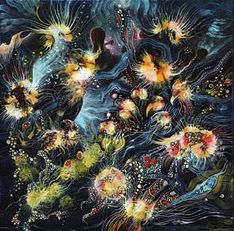
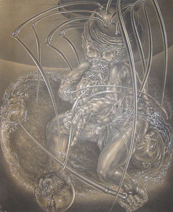
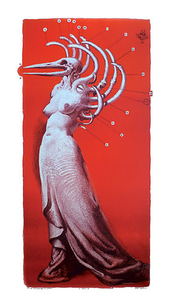
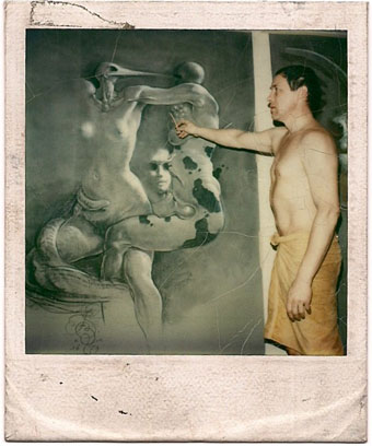
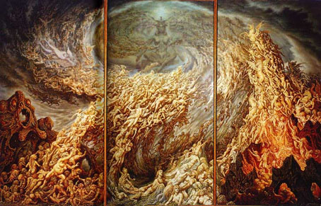
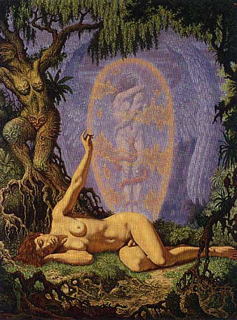
Venosa had been an art director at Columbia Records in the 1960s, a job he abandoned after he met Mati Klarwein and decided he’d rather devote his time to painting. Despite describing Klarwein in his book as his painting master, only a couple of his pictures are reminiscent of Klarwein’s distinctive style. Many of Venosa’s works are more loose and abstract than Klarwein’s tableaux, extending the processes of decalcomania which Max Ernst refined in works such as Europe After the Rain (1942) and The Eye of Silence (1944) to create stunning views of cosmic eruptions and vistas of crystalline beings rendered in a meticulous, hyper-realist manner. Many of his pictures could serve as illustrations for the later chapters of JG Ballard’s The Crystal World.

If the lazy definition of psychedelic art refers merely to shapeless forms and bright, clashing colours, Venosa’s art is psychedelic in the truest sense, an attempt to fix with paint and brush something revealed by a profound interior experience. This was deeply unfashionable by 1978, of course, but he carried on working anyway, and there are further book collections for those interested in his paintings. The Venosa website has a small selection of his extraordinary pictures although they really need to be seen at a larger size.

Elsewhere on { feuilleton }
The album covers archive
The fantastic art archive

The art of Johfra Bosschart, 1919–1998

johfra1.jpg

The Adoration of Pan triptych (1979).

The hyper-detailed paintings of this Dutch artist, who often seems to be referred to by his forename alone, were self-described as “Surrealism based on studies of psychology, religion, the Bible, astrology, antiquity, magic, witchcraft, mythology and occultism”. All bases are covered, in other words, and the work is certainly furious and intense at its best even if it’s not always to my taste. Some of Johfra’s Monsters from the Id are closer to Basil Wolverton than HR Giger which makes for unintentional comedy. As usual with detailed artwork, it’s a shame the reproductions on offer aren’t a larger size.

johfra2.jpg

Moldoror series: The Hermaphrodite (1976).

The pictures here are from one of the online numbers of Visionary Review which a biography and several galleries of work from different periods of Johfra’s career. Thanks to Thom for the reminder about this artist.

Elsewhere on { feuilleton }
The fantastic art archive