Kubrick shirts

kubrick1.jpg

These days I still wear T-shirts but only under other clothes, I’m no longer happy with the T-shirt as an item on its own. (It doesn’t help that my arms are so skinny they always look awkward depending from a pair of short sleeves.) The irony is that I’ve spent a lot of time over the past thirty years creating T-shirt designs, starting with tour shirts for Hawkwind in the early Eighties, and if I still wore anything with a distinctive design I’d probably want one of these, especially the HAL 9000 whose logo matches the one seen in the film.

kubrick2.jpg

All of these are from Last Exit to Nowhere who specialise in apparel derived from various cult and genre films. Most of their Kubrick items are shown here whereas films such as Blade Runner and the Alien series have a number of fictional brands to choose from. Smart and funny, although I feel that the Ludovico Technique should be promoted with a logo that looks more typically Seventies given the way A Clockwork Orange projects 1971 into the future. But kudos for not burdening the things with superfluous slogans; you either get the joke or you don’t.

kubrick3.jpg

Previously on { feuilleton }
Readouts
A Clockwork Orange: The Complete Original Score
Juice from A Clockwork Orange
Clockwork Orange bubblegum cards
Alex in the Chelsea Drug Store
2001: A Space Odyssey program

Barney ascendant

costello.jpg

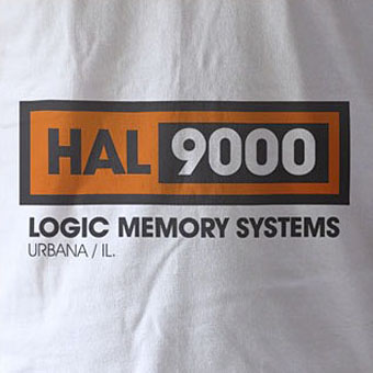
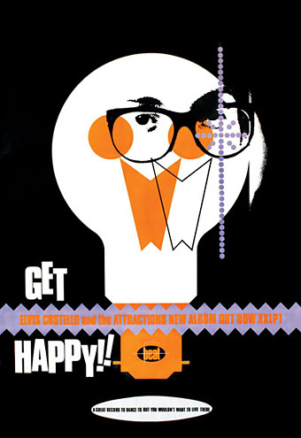
Poster by Barney Bubbles for Elvis Costello’s Get Happy!! (1980).

Adelita, the publishers of Reasons To Be Cheerful: the life and work of Barney Bubbles, announced this week that Paul Gorman’s essential collection of BB graphics has been named Book of the Year in Mojo magazine:

Reasons To Be Cheerful – the acclaimed study of the life and work of the late graphic genius Barney Bubbles – has been declared Book Of The Year by the UK’s leading rock monthly Mojo magazine.

Described as “fascinating and definitive” by the Sunday Times and “moving and lovingly researched,” by GQ editor Dylan Jones in The Independent, Reasons To Be Cheerful was written by Paul Gorman (author of style bible The Look and Straight with Boy George) and published by British independent popular culture imprint Adelita (sales and distribution through Turnaround Publisher Services).

Mojo will name Reasons To Be Cheerful Book Of The Year in its January 2010 issue (published November 27) with an exclusive interview with Factory Records designer Peter Saville praising its publication.

A quarter of a century after he took his own life at the age of 41, Reasons To Be Cheerful has transformed Barney Bubbles’ cult status by elevating him into the pantheon of graphic design greats. Among fans of the book are such prominent musicians as Paul Weller, Jah Wobble, Mick Jones, Nick Lowe and Billy Bragg.

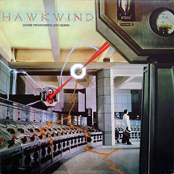
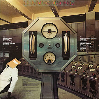
Reasons To Be Cheerful is the first and definitive exploration of this important visual artist’s body of work, with more than 600 images including student sketchbooks, private paintings, product, brand, underground and music press and examples of the hundreds of record sleeves, posters, adverts, promotional items and music videos he created for the likes of the Rolling Stones, Hawkwind, Ian Dury, Elvis Costello, Nick Lowe, Squeeze, Depeche Mode, The Specials and Billy Bragg.

Reasons To Be Cheerful has also spawned a spectacular online presence featuring fresh interviews, information and rare and previously unseen images (see http://barneybubbles.com/blog) and has been well received in the UK and US (where it is distributed by D.A.P). Author Paul Gorman will also curate a Barney Bubbles exhibition to be inaugurated at London’s Chelsea Space gallery during Design Week in September 2010.

By coincidence, two days after Mojo appears the All-Day Barney Bubbles Benefit Memorial Concert will be staged at the 229 Club, Great Portland Street, London. Bands featured include various members of the Hawkwind/Hawklords family led by Nik Turner. There’ll also be the return of Turner’s post-Hawks outfit Inner City Unit, for whom Barney created some of his last designs, and the resurrection of the Imperial Pompadours, a one-off rock’n’roll collaboration between Nik and Barney. That’s happening on 29th November and Turner’s website has all the necessary details.

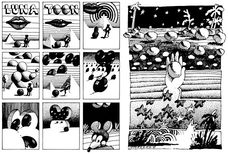
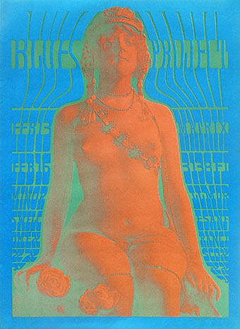
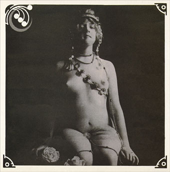
The Elvis Costello poster above comes from a feature about the Get Happy!! album at Paul Gorman’s BB site. I was never a great fan of Costello’s records but the designs Barney created for those early releases were outstanding and represent the peak of his career. (See the Armed Forces sleeve design for a real eye blast.) Paul’s post shows how much work went into creating a range of integrated graphics for the album, singles and promotional material, and he also has some exclusive material which didn’t make it into Reasons To Be Cheerful. The BB book has been a continual treat to look through this year, and the book design I happen to be finishing has not only been inspired by Barney’s example but also manages to make passing reference to him inside. More about that later.

Previously on { feuilleton }
Hawk things
Who is Heeps Willard?
The Sonic Assassins
Reasons To Be Cheerful, part 3: A Barney Bubbles exclusive
More Barney Bubbles
Reasons To Be Cheerful, part 2
Reasons To Be Cheerful: the Barney Bubbles revival
Barney Bubbles: artist and designer

Design as virus 10: Victor Moscoso

india.jpg

Continuing an occasional series.

A recent post at A Journey Round My Skull is a stylish series of Indian book jackets from 1964 to 1984. These impress partly for the way they rework western design approaches, and they consequently look very different from the florid visuals one might (lazily) expect of Indian cover design. Western culture borrowed more than enough from India in the 1960s, from clothes to music, so it only seems right that the sub-continent should be free to take something back.

luna.jpg

Luna Toon by Victor Moscoso (1968).

Will at A Journey Round My Skull mentions the above cover design as reminding him of this Krautrock bible, The Crack in the Cosmic Egg, a book which happens to be a favourite repository of musical obsession. The cover reminded me more of the weirdly abstract comic strips created by artist and graphic designer Victor Moscoso for the early run of Zap Comix in the late Sixties. Moscoso was one of the most graphically revolutionary of the West Coast poster artists, and his approach to comics looks surprisingly fresh today next to the work of fellow artists like Robert Crumb. Those limitless vistas go back to Giorgio de Chirico but it was Salvador Dalí who made deserts raked by evening shadows reflect interior landscapes of his own, and it was Dalí’s immense popularity that in turn popularised that endless plane as a stage for surreal events. Moscoso borrows from the Surrealists and comic artists like George Herriman as much as he borrows from Disney; in his posters he was one of many artists taking motifs or whole designs from Art Nouveau. Our Indian egg may well be an original work but the first example in Will’s post is a very Saul Bass-like hand, so I’m guessing that the designers of these books were looking around for inspiration. And that eye-in-a-hand? Moscoso had done that as well.

neon.jpg

Blues Project Poster by Victor Moscoso (1967).

While we’re discussing Victor Moscoso, it’s convenient to draw attention to a slight mystery connecting his poster art and the great album cover designer, Barney Bubbles. The poster above was one of a number that Moscoso made incorporating Victorian or Edwardian photographs, and two at least of these use antique erotica as their central image.

ritual.jpg

Space Ritual interior, design by Barney Bubbles (1973).

This particular photo always stands out for me. The woman is familiar to anyone who’s seen the interior of the fold-out sleeve Barney Bubbles created for Hawkwind’s Space Ritual album in 1973. Barney spent some time in San Francisco in the late Sixties and was undoubtedly familiar with Moscoso’s work, as he was with all the great designs coming from the West Coast at that time. What surprises me is that he should have somehow found the same image to use as Moscoso did. Was there a popular book of Edwardian erotica which everyone was familiar with? Did he ask Moscoso where he’d found the photo? Did he find it by chance? Barney Bubbles experts don’t know the answer (I’ve asked) and the question is in any case a rather trivial one. But I’m still curious… As early porn photos go it’s a particularly fine one and I’d like to know whether there are more like it and where it came from. Needless to say, if anyone knows more about this, please leave a comment.

Previously on { feuilleton }
Design as virus 9: Mondrian fashions
Design as virus 8: Keep Calm and Carry On
Design as virus 7: eyes and triangles
Design as virus 6: Cassandre
Design as virus 5: Gideon Glaser
Design as virus 4: Metamorphoses
Design as virus 3: the sincerest form of flattery
Design as virus 2: album covers
Design as virus 1: Victorian borders

Battersea Power Station

battersea.jpg

A photograph of the control room of Battersea Power Station, London, by Michael Collins, one of a series which will shortly be on display at the Royal Institute of British Architects.

The images show Battersea Power Station as what Collins describes as a “twentieth century ruined castle” – a building that was built to last, with a high quality structure and interior, including Art Deco walls and ceilings.

Giles Gilbert Scott’s enormous temple of heavy industry continues to sit decaying on the banks of the Thames while property developers come and go. The latest of these, Real Estate Opportunities, has fallen into debt which means proposals to develop the site are once again on hold. A part of me likes the idea of the building sitting there unused and purposeless year after year, like some vast Steampunk Stonehenge; Giles Gilbert Scott’s other Thames-side power station, Bankside, was successfully transformed as Tate Modern, but we know from various proposals that the fate of Battersea, whether as theme park or shopping centre, is likely to be a lot less edifying.

quark1.jpg

It took redevelopment to transform Bankside from temple of industry to temple of culture but Battersea’s unmistakable presence has a powerful cultural history of its own. Everyone knows the Hipgnosis sleeve design for Pink Floyd’s Animals (1977); less familiar is the photos of the control room which Hipgnosis used for Hawkwind’s Quark, Strangeness and Charm the same year. I tend to prefer the back cover of this sleeve to the front; that octagonal readout device is more interesting than the rather unconvincing sparks and exchanges of energy. And speaking of energy, my former employers are still active, unlike the rancorous Floyd.

quark2.jpg

There’s a page here listing other uses of the power station, including its many film appearances which date back to the 1930s. That list mentions the control room’s use as a background for the “Find the Fish” sequence in Monty Python’s The Meaning of Life (1983) but they omit an earlier Monty Python appearance when you briefly see the building in operation during And Now for Something Completely Different (1971). It was closed down a few years later. So here it is, then, belching fumes over west London on a profoundly gloomy winter afternoon.

battersea2.jpg

Elsewhere on { feuilleton }
The album covers archive

Previously on { feuilleton }
The Sonic Assassins
The Bradbury Building: Looking Backward from the Future