Font haiku

Nothing doing here for the past twenty-four hours due to things collapsing at the webhost end. Everything seems stable now (fingers crossed). In future when this happens check my Twitter feed for reports.

haiku.jpg

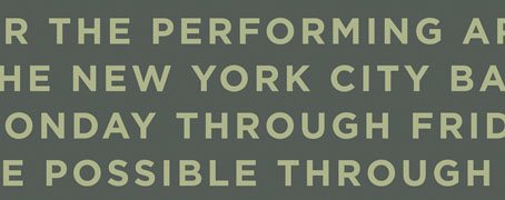
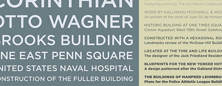
So then… The above is the better of my two entries for a Valentine’s day competition on the Extensis blog which required you to create a besotted ode to a typeface. The wonderful Gotham sans serif by Hoefler & Frere-Jones was used by the Obama campaign during the recent Presidential election, as I noted back in November. I didn’t win but they did give me an honourable mention which was a surprise. Some very witty and clever entries but it helps if you’re a type obsessive to appreciate many of the jokes.

Previously on { feuilleton }
The best font won

The best font won

gotham.jpg

The beautifully elegant Gotham typeface by Hoefler & Frere-Jones was already becoming pretty ubiquitous even before the Obama brand designers chose it for all their campaign graphics. I’ve used it myself a couple of times recently, notably on the jacket for Keith Seward’s Horror Panegyric. Some typefaces have a flush of popularity then fade as they start to look dated but I can’t see this happening with Gotham. Hoefler & Frere-Jones have pulled off the very difficult task of creating a new sans serif that not only works as well as classics such as Futura and Gill Sans but is on the way to being a classic in its own right.

gotham2.jpg

Previously on { feuilleton }
New things for December

Mervyn Peake in Lilliput

This month I’ve been redesigning the Savoy Books edition of The Exploits of Engelbrecht by Maurice Richardson, in preparation for a reprint. This has involved scanning the covers of the issues of Lilliput, the magazine where Richardson’s tales of the dwarf surrealist sportsman first appeared, and one number of these, from May 1950, also includes a feature about nursery rhymes illustrated by Mervyn Peake. The paintings were reprinted in Mervyn Peake: The Man and his Art in 2006 but shrunk onto a single page so this is a chance to see them at a larger size. Also reproduced below is the accompanying article by Leslie Daiken and the Arcimboldo-style cover by Ronald Ferris. Some of the earlier covers by Walter Trier—all of which featured a man, a woman and a dog in a variety of guises—can be seen at VTS.

Update: For more about Mervyn Peake, see also Peake Studies.

peake1.jpg

“How many miles to Babylon?”
“Three score miles and ten.”
“Can I get there by candle-light?”
“Yes, and back again.
If your heels are nimble and light
You may get there by candle-light.”

Continue reading “Mervyn Peake in Lilliput”

Hugh Ferriss and The Metropolis of Tomorrow

ferriss1.jpg

Philosophy from The Metropolis of Tomorrow (1929).

I’ve procrastinated for an entire year over the idea of writing something about Hugh Ferriss and now this marvellous Flickr set has forced my hand. Ferriss (1889–1962) was a highly-regarded architectural renderer in the Twenties and Thirties, chiefly employed creating large drawings to show the clients of architects how their buildings would look when completed. But he was also an architectural theorist and his 1929 book, The Metropolis of Tomorrow, which lays out his ideas for cities of the future, was a major influence on the work I produced for the Lord Horror comics during the 1990s. Ferriss’s book appeared two years after Fritz Lang’s Metropolis but bears little resemblance to Lang’s simplistic tale, despite superficial similarities. Rather than a science fiction warning, The Metropolis of Tomorrow was a serious proposal for the creation of Art Deco-styled megacities.

hch5bw.jpg

Lord Horror: Hard Core Horror #5 (1990).

Continue reading “Hugh Ferriss and The Metropolis of Tomorrow”