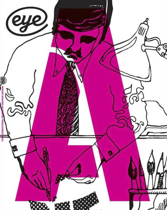
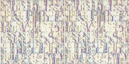
Cover of Eye no. 86 vol. 22, 2013, a type special. Detail from 1970s Letratone brochure, overprinted by character from the Marsh stencil alphabet.
The new edition of Eye magazine includes my essay on the evolution and aesthetics of steampunk. In the same issue Rick Poynor’s feature on the prints of Eduardo Paolozzi mentions a forthcoming book by David Brittain about the artist’s associations with New Worlds magazine in the 1960s. I designed the Paolozzi volume which will be published by Savoy Books in a few weeks’ time. More about that later.
Still on steampunk, KW Jeter notes its popularity among the younger crowd: “If some old fogey peering through his smudged bifocals can’t discern the cool and important stuff going on, such as the tsunami of anarchic multiculturalists using the steampunk scalpel to dissect the past and reassemble it like a two-dollar watch, that’s his loss; the readers are picking up on it.”
• Musicians interviewed: Rhys Chatham: “The reason I got into trumpet playing is because I wanted to play like [Black Sabbath guitarist] Tony Iommi.” | James Ginzburg: “One of the strongest feelings I had was that the act of sitting down and making dance music was like playing a video game…I felt disconnected from it…” | Julia Holter: “I love working with the voice, I love mystery, I love creating atmosphere.” | Roly Porter: “I sit at home and listen to folk and blues from before I was born. I listen to a lot of dub and reggae and classical music. These are all genres which to me seem really interlinked and influential.”
• At Kickstarter: From the director of Lovecraft: Fear of the Unknown, a short film entitled Do Not Disturb. “Two men are forced to share a motel room on a dark & stormy night. One man’s snoring starts to summon creatures into our world.”
The Notting Hill of the 1960s – with Moorcock’s marriage, children, celebrity, the editorship of New Worlds, the collaboration with JG Ballard, Brian Aldiss and the rest – became the proving ground for the shape-shifting Carnaby Street dandy Jerry Cornelius. But all the numerous Moorcock characters, those undying and born-again clones, have a part to play in his “multiverse”, a concept he developed alongside the earlier model suggested by John Cowper Powys. Moorcock’s astonishing catalogue of speculative fiction works to prove his key equation, which is based on meta-temporal parallel worlds drawn from HG Wells, Chaos Theory, String Theory, the Edgar Rice Burroughs of John Carter of Mars and the William Burroughs of Nova Express and the “Interzone”. Publishing all the strange rafts and pods of Moorcock’s prodigious science fiction and fantasy output, as Gollancz have done, is like assembling a ghost fleet, under the joint command of Dr John Dee and Admiral John Ford, with which to invade that uncertain continent we know as the past.
Iain Sinclair on the new series of Michael Moorcock editions from Gollancz.
• “What does science tell us about the relative dangers of drugs? Alcohol is by far the No. 1 most dangerous drug.” Some graphs from the American Enterprise Institute who no one would accuse of being a bunch of stoners.
• “I loved Eudora Welty, Flannery O’Connor, Katherine Ann Porter, Carson McCullers. There was a feeling that women could write about the freakish, the marginal.” Alice Munro at The Paris Review.
• Elena Smith on Literary Parkour: @Horse_ebooks, Jonathan Franzen, and the Rise of Twitter Fiction. Related: Boris Kachka has a list of Everything Jonathan Franzen currently hates.
• Mixes of the week: Joseph Burnett compiles Adventures in Modern Jazz while Kier-La Janisse puts together a British Horror mix for Fangoria.
• Explore the planet Mars, one giant image at a time.
• At BibliOdyssey: The Turner’s Manual.
• A Crimson Grail (for 400 Electric Guitars) (2007) by Rhys Chatham | Arrakis (2011) by Roly Porter | City Appearing (2013) by Julia Holter | Debris (2013) by Faint Wild Light

