Peculiar Shocks

bodyshocks02.jpg

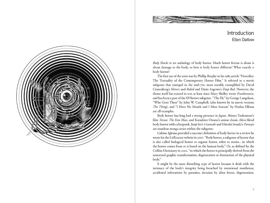
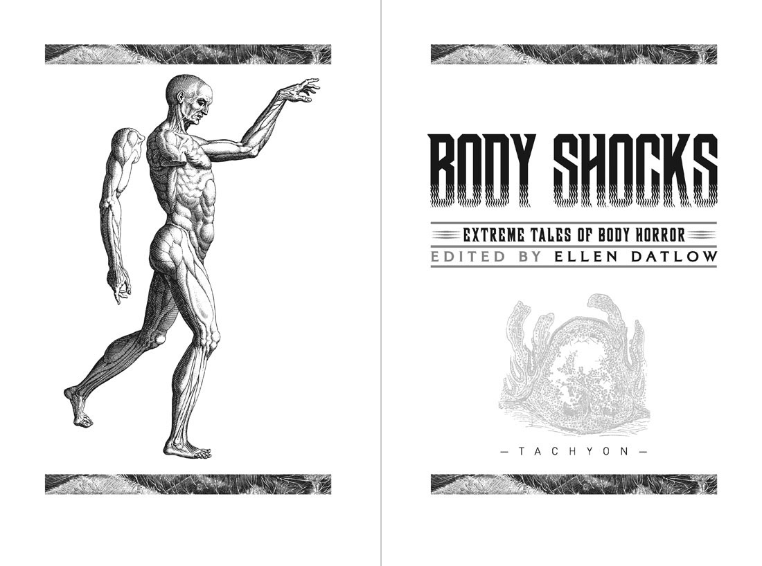
My cover design for Body Shocks, the body-horror story collection edited by Ellen Datlow, appeared here back in March. Now that the book is out from Tachyon I can show some of the interior design. In the earlier post I mentioned cover drafts that featured anatomical illustrations, none of which worked as well as the eyeball collage that became the final cover. The rejected pieces were better suited to the interior which combines engraved illustrations with the kind of sans-serif typography you might find on modern medical labels.

bodyshocks03.jpg

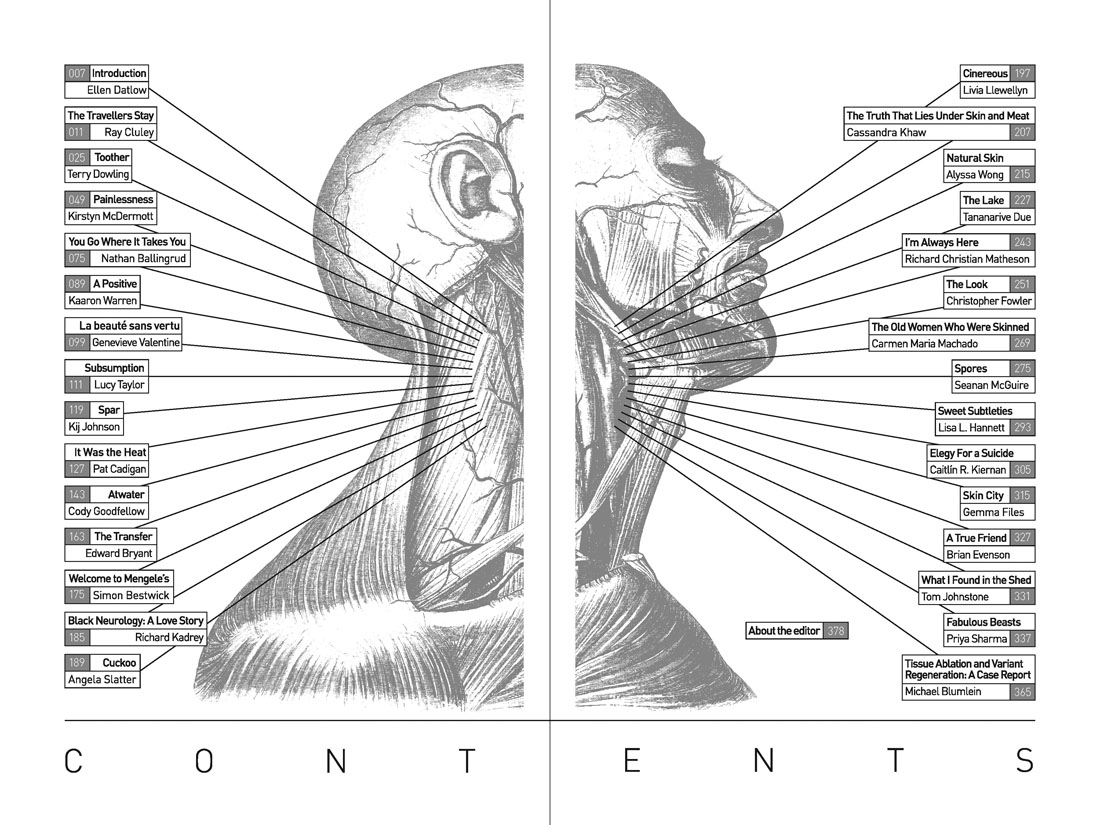
The diagram of veins that fills out the contents spread looks like an illustration from a 19th-century edition of Gray’s Anatomy but it’s actually an illustration from a book about massage whose title I don’t seem to have made a note of. Gray’s is a thorough volume, being a complete guide to the human body, but the illustrations aren’t as large or as detailed as those you can find elsewhere. The header bands used to indicate the beginning of each story are from Gray’s, however, while many of the stories end with full-page plates from The Anatomy of Humane Bodies by William Cowper. These are mostly engravings of autopsies which I processed by inverting the images then overlaying them with parallel lines. You can still tell the pictures are medical illustrations but they’re not as obtrusive as they would be if they’d been left untreated.

bodyshocks04.jpg

Continue reading “Peculiar Shocks”

Hazardous design

watts16.jpg

Cover design by Elizabeth Story.

Our present viral moment reminded me that I hadn’t written anything about Peter Watts is an Angry Sentient Tumor, a collection of essays by Canadian science-fiction writer Peter Watts whose interiors I designed for Tachyon last autumn. Watts has a special interest in biology, and several of the pieces in the collection are partly or wholly concerned with pandemics; needless to say, when I was adding a biohazard symbol to one of these pages six months ago I didn’t expect such a situation to be the event that defined the coming year, although for anyone who’s read enough SF (or horror, for that matter), potentialities like this tend to lurk in the back of your mind. Watts’ essays are mostly blog entries—much more substantial ones than the brief things I usually file here—together with a few articles from print sources. The contents range from polemics about police violence and the creeping surveillance state to personal entries covering his late brother, his father’s closeted sexuality, his beloved cats, and a near-fatal experience with a flesh-eating virus. There are also film reviews, scientific speculations and musings/warnings about global calamities, especially the climate variety. His writing is consistently witty, engaging and thought-provoking. The book was a pleasure to read as well as work on.

watts14.jpg

As with other interiors I’ve designed for Tachyon, I took the design cues from the cover, which in this case was the work of Elizabeth Story. The internal graphics are a combination of writhing tentacles and hazard/warning signs, the latter being taken unaltered from public information sets or adapted to suit the content of the piece. In a way they’re a sequel to the Tarot symbols I designed in 2006 based on graphics from the international symbols commonly used in public buildings. The bespoke designs were fun to create, and required some ingenuity in places: how do you show global warming in a simple, wordless symbol? My solution was to put a globe in a frying pan. There are 50 essays in all so the examples shown here represent a fifth of the book.

For an idea of Watts’ writing together with his thoughts about the pandemic, his most recent post is here. He’s not the only person who’s been saying we should expect more events like this one in the future.

watts02.jpg

watts04.jpg

watts05.jpg

Continue reading “Hazardous design”