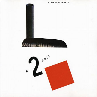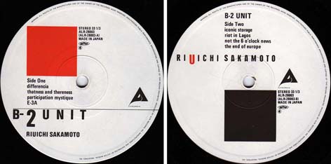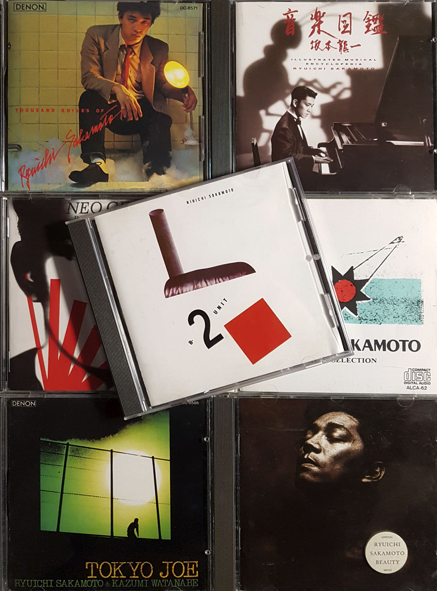
RIP Ryuichi Sakamoto. I bought quite a few of his albums over the years but these are only a small fraction of his huge and diverse discography; Discogs lists 116 albums recorded solo or in collaboration with other artists. B-2 Unit, released in 1980, was the first one I discovered, and it’s still a great favourite. The CD shown here was a replacement for a secondhand vinyl copy I bought circa 1982, at a time when albums by Japanese artists were often hard to find unless you could afford expensive imports. As with albums on German labels such as Brain and Sky, if you saw anything like this secondhand you grabbed it, even if the artists were a complete mystery.
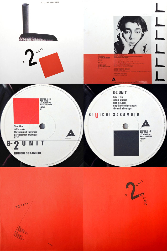
Design (after El Lissitzky) by Takeo Aizawa and Tsuguya Inoue.
Sakamoto wasn’t a mystery—I was already listening to Yellow Magic Orchestra and some of the other people he’d worked with—but I wasn’t sure what to expect from a solo release, especially one with such an enigmatic title. B-2 Unit turned out to be closer to the more experimental post-punk albums than anything by YMO: jerky rhythms, scratchy guitar, atonal electronics, distorted vocals, offbeat songs, plus that staple of post-punk music, dialogue samples from TV and radio. Subsequent interviews revealed that Sakamoto had arrived in London with the intention of making a dub (or dub-style) album like the one Andy Partridge released as Take Away/The Lure Of Salvage, hence the credits on B-2 Unit for both dub producer Dennis Bovell, who engineered some of the recording, and Partridge himself, the presence of the latter seeming very unusual at the time, as well as being hard to locate in the music when two guitarists are credited. (YMO ally Kenji Omura is the other guitarist. Andy Partridge apparently gave Sakamoto a tape of those scratchy guitar lines which were then dropped into the recordings.) The dub influence is most evident on E3-A, and the album’s stand-out track and only single, Riot In Lagos, a piece which sounds like an electronic composition deconstructing itself while it plays. The minimal documentation means it can be hard to tell who did what on the album but I’d be surprised if Hideki Matsutake hadn’t helped with the programming, if not the deconstruction, of Riot In Lagos. Matsutake was the synth programmer for YMO, he’s often referred to as the fourth member of the group, yet you never see his name mentioned in discussion of B-2 Unit. As for Sakamoto, he never did anything like this again. His experimental side still came to the fore now and then, especially the superb run of albums and EPs he recorded with Alva Noto, but his solo work during the 1980s and 90s was increasingly commercial, on albums over-burdened with international guests. For a taste of his less commercial side, here’s an improvisation with Carsten Nicolai (aka Alva Noto) in Philip Johnson’s Glass House, recorded one evening while the daylight was fading.
Previously on { feuilleton }
• Zen-Gun and The Zen Gun
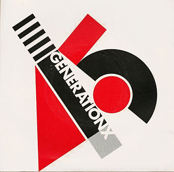
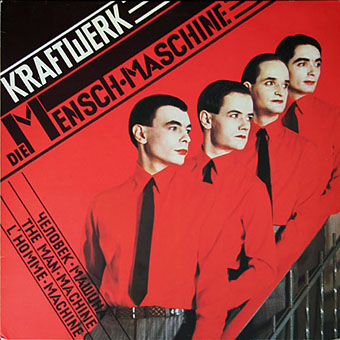
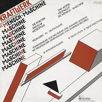
• El Lissitzky record covers