Weekend links 507

plone.jpg

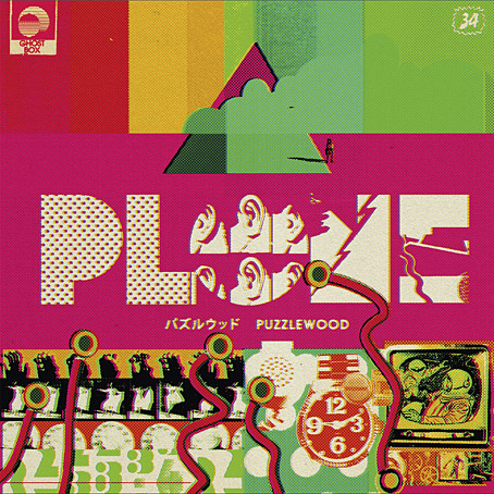
The next release on the Ghost Box label will be Puzzlewood by Plone, “unironically joyful and melodic electronica; informed by library music, music for children’s TV and a deep passion for the history of music technology”. The album will be available in April. Design, as always, is by Julian House.

• “With his panting breath and dripping sweat infused in each page of his memoir, Patrick Cowley describes himself on his knees, bending over and ‘worshipping Phallus.'” Maxwell Shand on Dark Entries‘ “holy trinity” of Patrick Cowley’s Mechanical Fantasy Box, Hot Rod To Hell by Roy Garrett & Man Parrish, and Maxx Mann’s gay synth-pop.

• “We’re gonna do economic activity—without money!”: Inside the criminal glamour of the San Francisco Diggers with Kent Minault. The third installment of a verbal history of the hippie anarchists by Jay Babcock.

• “Susanna Hoffs and friends remember David Roback, who stayed creative, and enigmatic, to the end.” By Randall Roberts.

My connection with [raga] was not to be able to duplicate or emulate it but to learn from it. I combined it with the electronics and the harmonizer and things like that. But I would have a line that was being drawn. You’re thinking about it like a shape that’s being drawn on a canvas. It’s a line that’s being drawn and another. You’re holding three pencils at once while you’re drawing on the wall. So, you’re able to get the shapes. This was my thing with it, because I was into the harmony that it would make. So, it was an easy and natural thing to do, was to go and move into the electronics. Then we had equipment that was doing transposition and all that kind of thing. So that’s one little part of it.

Jon Hassell talking to Aquarium Drunkard about his first album, Vernal Equinox, which is reissued later this month

• Published next month by Strange Attractor Press: Rated SavX: The Savage Pencil Skratchbook.

• They came from outer Finland: the town where everyone saw UFOs, as photographed by Maria Lax.

• Mix of the week: Through A Landscape Of Mirrors Vol. VI – Sweden II by David Colohan.

Moonstrips Empire News (1967) by Eduardo Paolozzi.

• At Dennis Cooper’s: Shelley Duvall Day.

Graham Massey‘s favourite albums.

Phallus Dei (1969) by Amon Düül II | Wrong Eye (1990) by Coil | Red Scratch (1994) by ELpH

Weekend links 349

burgess.jpg

• Before Stanley Kubrick fixed an image of Alex and his droogs in the popular imagination, artists could get away with playing on the threat of biker gangs as Wilson McLean does in this vaguely psychedelic cover from 1969. (McLean’s interpretation may possibly derive from a 1965 edition.) LibraryThing has a collection of Clockwork Orange covers from around the world which run the gamut of cogs, orange hues and variations on David Pelham’s famous Penguin design from 1972. Meanwhile, AL Kennedy celebrates 100 years of Anthony Burgess by examining the writer’s career as a whole, although the web feature still manages to get a photo of Malcolm McDowell in there.

• “Even bad books can change lives,” says Phil Baker reviewing The Outsider by Colin Wilson and Beyond the Robot, a Wilson biography by Gary Lachman. I wouldn’t call The Outsider a bad book but Wilson’s more wayward opinions (and later works) are best treated with scepticism.

• “Murtaugh refers to his subject’s ‘pervasive sense of doom’ and Welch himself speaks of ‘the extraordinary sadness of everything.'” David Pratt reviewing Good Night, Beloved Comrade: The Letters of Denton Welch to Eric Oliver, edited by Daniel J. Murtaugh.

• At The Quietus this week: Tinariwen bassist Eyadou Ag Leche is interviewed by Richie Troughton, Jane Weaver unveils a new song from her forthcoming album, Modern Kosmology, and Danny Riley explores the strange world of Ben Chasny.

• “A micro-history of cultural gatekeeping: once told by the censors what we may read, then by critics what we should, we are now told merely what we can read.” Ben Roth writing against the use of “readability” as a literary value.

• Yayoi Kusama’s amazing infinity rooms are at the Hirshhorn Museum and Sculpture Garden, Washington DC, until May. For the rest of us, Peter Murphy’s panoramic photo is still online.

• More music: my friends Watch Repair have become visible enough to be interviewed by an Argentinian website. The group’s Bandcamp page recently made three new releases available.

• Yet more music: They Walk Among Us, a new song and video by Barry Adamson, and Anymore, a new song and video by Goldfrapp.

• Earth and The Bug announce Concrete Desert, a collaborative album inspired by Los Angeles and the fiction of JG Ballard.

• Bad Books for Bad People: Episode 7: The Incal – Epic French Space-Opera Comics.

• Mixes of the week: FACT Mix 589 by Aisha Devi, and Secret Thirteen Mix 212 by Qual.

Eduardo Paolozzi‘s forays into fashion and furnishings.

Cooking with Vincent [Price]

Moroccan Tape Stash

• Tin Toy Clockwork Train (1986) by The Dukes Of Stratosphear | Clock (1995) by Node | Clockwork Horoscope (2009) by Belbury Poly

Moorcock: Faith, Hope and Anxiety

moorcock.jpg

Photo of the author by Linda Moorcock.

I mentioned a few days ago that I had another new piece of work to reveal, and this is it, a poster/promotional piece for Russell Wall’s forthcoming documentary about Michael Moorcock. The main challenge with one was to create something that would give a sense of Moorcock’s extensive career and the genre-spanning content of his many books.

mm1.jpg

I took the 1970s as the starting point, since this was the period when his reputation as a writer was established worldwide. The decade began with Britain’s bookshelves being colonised by Moorcock’s SF and fantasy novels published by Mayflower with vivid covers; it saw a cult feature film—The Final Programme—made from his first Jerry Cornelius novel, and it ended with the fourth Jerry Cornelius novel, The Condition of Muzak, winning a serious literary award, the Guardian Fiction Prize.

mm2.jpg

So the general appearance of the design, the headline typography, and the colour scheme are a nod to the Mayflower covers and especially to Bob Haberfield’s artwork which often used a similar style of Tibetan flames and clouds. The rest of the type is set in Rockwell, a preferred typeface of the Hipgnosis design team for much of the 1970s. Early on I had the idea of filling the design with stylised graphics like those used by some of the Hipgnosis illustrators, chiefly George Hardie, but that idea receded once the composition began to arrange itself. The fountain pen is the main hangover from this, a hard-edged graphic tilted at an angle like many of Hardie’s illustrations. The pen is a little inappropriate given that Moorcock is famous for knocking out novels at speed on a typewriter but it made a good visual rhyme with the guitar, a Rickenbacker like the one the author played in his Deep Fix band.

mm3.jpg

Elsewhere there are many specific references competing for attention: the Elric head is Jim Cawthorn’s illustration from the first edition of Stormbringer (1965); the Jerry Cornelius figure (straddling a repurposed Mayflower logo) is one of Mal Dean’s best, as seen on the cover of issue 191 of New Worlds magazine; the sorcerous blades are my own designs from 1985 as seen on the sleeve of Hawkwind’s Chronicle of the Black Sword album; the Beardsley figures from Salomé were a vague gesture to the 1890s but the Pierrot figure happens to be one Moorcock used for a while as a bookplate, something I didn’t know until I’d placed it in the design; the cat at Pierrot’s feet is another Beardsley from one of the Bon-Mots books; the London skyline is a contemporary one, London past and present having been a continual feature of Moorcock’s writing throughout his career. Lastly, all these details are contained by a graphic based on Abram Games’ BBC TV ident from the 1950s. When Russell and I began talking about this project the words “television biography” were being used so this would have connected to that idea, and to the decade when Moorcock’s career began.

mm4.jpg

I don’t know when the documentary will be released but any news will be posted here in due course. There’s also talk of making copies of the poster available for purchase but nothing concrete has been decided yet.

Previously on { feuilleton }
Eduardo Paolozzi at New Worlds
Elric 1: Le trône de rubis
Into the Media Web by Michael Moorcock
The Best of Michael Moorcock
Revenant volumes: Bob Haberfield, New Worlds and others

Weekend links 193

gauger.jpg

A Problem Glyph by Eliza Gauger. Problem Glyphs are “symbolic illustrations … drawn in response to problems sent in by tumblr users”.

Kosmische Night takes place at the Museum of Bath at Work, Bath, Somerset, on January 25th (Rescheduled to February 22nd).  “…a celebration of all things Teutonic for anyone who enjoys Neu!, Can, Tangerine Dream, Stockhausen and Kraftwerk,” say the organisers. Also on the bill, The Electric Pentacle, a Carnacki-esque collaboration between Narco Lounge Combo and The Levels.

• Shock Headed Peters’ Fear Engine II: Almost As If It Had Never Happened. Joe Banks on Karl Blake, “…one of the most fascinating and colourful characters to emerge from the fertile loam of the post-punk scene”.

• “The great question in the film and the tale is not the existence of the ghosts but the way the governess understands their no-longer-lived lives and desires.” Michael Wood on The Innocents.

Nobody, however, is a greater authority on the intersection of porn and alternative spirituality than Annie Sprinkle. Beginning as a prostitute in the 1960s and 70s, she entered porn in the pre-AIDS era and made over two hundred films. She then jumped into a career as a sex-positive author and educator, which brought her into close conflict not only with feminists like Andrea Dworkin and Catharine MacKinnon, but also right-wing patriarch Jesse Helms, who denounced one of her sex magick performance pieces on the floor of the Senate. For Sprinkle, both sexuality and performance are explicitly spiritual and magical, part of her role as a cultural shaman.

In the Valley of the Porn Witches by Jason Louv.

Stars of the Lid and Wordless Music Orchestra playing for two hours last month at the Basilica of Our Lady of Perpetual Help in Sunset Park, Brooklyn.

Rick Poynor on the late Martin Sharp’s contributions to People, Politics and Pop: Australians in the Sixties (1968) by Craig McGregor.

Maggie Greene on The Woman in Green: A Chinese Ghost Tale from Mao to Ming, 1981–1381.

• “TED actually stands for: middlebrow megachurch infotainment,” says Benjamin H Bratton.

Geoff Manaugh on how corpses helped shape the London Underground.

Tony White on Eduardo Paolozzi at New Worlds by David Brittain.

• Mix of the week: Secret Thirteen Mix 102 by Frank Bretschneider.

• At Dangerous Minds: film of Syd Barrett‘s first psychedelic trip.

NYPL Wire: a New York Public Library Tumblr.

Microbial art by Eshel Ben-Jacob and others.

Interstellar Rock: Kosmische Musik (1974) by The Cosmic Jokers | I, Bloodbrother Be (1984) by Shock Headed Peters | Obscene and Pornographic Art (1991) by Bongwater

Eduardo Paolozzi at New Worlds

paolozzi00.jpg

I was working on this book throughout the autumn, and it could hardly be more different to some of the visual extravagance that came before and after. Eduardo Paolozzi at New Worlds is published by Savoy Books this month. Predominantly an examination by David Brittain (no relation to David Britton) of the connections between artists such as Paolozzi and Richard Hamilton with New Worlds magazine in the 1960s, the book is also a rare study of the science fiction magazine when it was making its greatest impact in the late 60s and early 70s.

Brittain highlights many examples of Paolozzi’s sf-influenced art of the period, and examines the development of the magazine under Michael Moorcock’s editorship during which time New Worlds evolved from being a slightly moribund sf title in the early 60s to what JG Ballard later called “one of the most exciting magazines of any kind in this country”. An appendix features interviews with some of the key creators and contributors: editor Moorcock, designer Charles Platt, art editor Christopher Finch, contributor Michael Butterworth, and critic John Clute. Writer and illustrator Pamela Zoline created some original artwork for the endpapers. The introduction is by Rick Poynor.

paolozzi01.jpg

Despite being pressured for time I was very pleased to be designing this book. I’d liked Paolozzi’s work since I first encountered it in the Tate Gallery in the 1970s; a couple of years later I was buying up anthologies featuring New Worlds stories (I was too young for the 60s magazine), so discovering that Moorcock had made Paolozzi the magazine’s “Aeronautics Advisor” made perfect sense. In the past I’ve said that New Worlds ruined my taste for hard sf but that’s not really true since I never really liked the stuff beyond a few Arthur C. Clarke books. Too much bad writing, too many cardboard characters shuffling around between chunks of explanation about made-up technology. The discovery of New Worlds merely demonstrated that there were other ways of approaching sf, and you didn’t have to put up with the rubbish.

I also enjoyed the magazine’s bolshy attitude, a quality shared by Harlan Ellison in his Dangerous Visions anthologies. Moorcock says in Brittain’s interview that NW sympathised with the Underground of the late 60s but also tried to be more disciplined in its approach, especially where the design was concerned. You couldn’t have treated fiction to the semi-legible printing that Oz and Frendz often deployed. But the radical attitudes of the Underground can be discerned in the stance NW adopted. Some of the reviews and polemical articles by Moorcock (often under his “James Colvin” pseudonym), M. John Harrison and John Clute are bracingly vitriolic to a degree which if delivered today would probably see them ostracised for life.

paolozzi02.jpg

With the design the main intention was to present the information clearly and let the visuals speak for themselves. The book is heavily illustrated throughout, with many examples of Paolozzi’s marvellous prints. The layout nods obliquely to the period; before getting started I spent some time looking at the work of Erik Nitsche. I like the way Nitsche laid out the books he designed in the 1960s, and there’s also a connection in his work as a designer for the General Dynamics corporation: one of Paolozzi’s print series of the period is entitled General Dynamics F.U.N.

Being full-colour throughout, the print run for this book is smaller than usual so anyone interested is advised to move swiftly. Official publication is December 16th but it’s on sale now at Savoy and at Amazon.

paolozzi03.jpg

Continue reading “Eduardo Paolozzi at New Worlds”