My Easter weekend was profitably spent watching True Detective again, a series I enjoyed even more the second time around. For the past year I’ve been pondering off and on the connections the series makes with the suite of weird tales that Robert Chambers published in 1895 as The King in Yellow, and also the relationship between Chambers’ book and the chromatic preoccupations of the 1890s. The influence of Chambers on later writers such as HP Lovecraft is well established; this post traces some of the less obvious connections and correspondences.
1: À Rebours (1884) by JK Huysmans
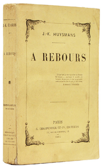
It begins, as many things do, with the bible of the Decadence. Neither Huysmans’ novel nor its dissipated central character, Des Esseintes, have much to say about the colour yellow but the first edition came packaged in a yellow wrapper, a common feature of French novels of the period. This detail is significant in light of the following connection.
2: The Picture of Dorian Gray (1890) by Oscar Wilde
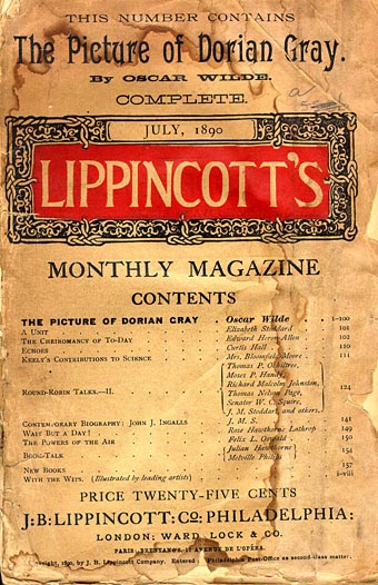
The decade that came to be called the Yellow Nineties opened with the publication of Oscar Wilde’s only novel. The influence of À Rebours may be felt most strongly in the chapters where Dorian indulges his senses and a passion for precious stones. Then there’s this famous section describing the unnamed novel that Lord Henry gives him to read:
His eye fell on the yellow book that Lord Henry had sent him. What was it, he wondered. He went towards the little, pearl-coloured octagonal stand that had always looked to him like the work of some strange Egyptian bees that wrought in silver, and taking up the volume, flung himself into an arm-chair and began to turn over the leaves. After a few minutes he became absorbed. It was the strangest book that he had ever read. It seemed to him that in exquisite raiment, and to the delicate sound of flutes, the sins of the world were passing in dumb show before him. Things that he had dimly dreamed of were suddenly made real to him. Things of which he had never dreamed were gradually revealed.
It was a novel without a plot and with only one character, being, indeed, simply a psychological study of a certain young Parisian who spent his life trying to realize in the nineteenth century all the passions and modes of thought that belonged to every century except his own, and to sum up, as it were, in himself the various moods through which the world-spirit had ever passed, loving for their mere artificiality those renunciations that men have unwisely called virtue, as much as those natural rebellions that wise men still call sin. The style in which it was written was that curious jewelled style, vivid and obscure at once, full of argot and of archaisms, of technical expressions and of elaborate paraphrases, that characterizes the work of some of the finest artists of the French school of Symbolistes. There were in it metaphors as monstrous as orchids and as subtle in colour. The life of the senses was described in the terms of mystical philosophy. One hardly knew at times whether one was reading the spiritual ecstasies of some mediaeval saint or the morbid confessions of a modern sinner. It was a poisonous book. The heavy odour of incense seemed to cling about its pages and to trouble the brain. The mere cadence of the sentences, the subtle monotony of their music, so full as it was of complex refrains and movements elaborately repeated, produced in the mind of the lad, as he passed from chapter to chapter, a form of reverie, a malady of dreaming, that made him unconscious of the falling day and creeping shadows.
Two things are connected here that coalesce in Chambers’ stories: the colour yellow, and the idea of “a poisonous book”, compellingly readable and thrilling in its capacity to corrupt. The “repairer of reputations” in Chambers’ story of the same name (the first in the King in Yellow cycle) also happens to be a Mr Wilde. Yellow is still only a detail at this point, but not for long.
3: The Yellow Book (1894)
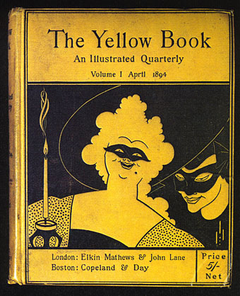
Cover design by Aubrey Beardsley. The second story in Chambers’ King in Yellow cycle is The Mask.
John Lane’s quarterly periodical almost lived up to its sensational reputation for the first year of its publication, a reputation derived in part from its implied association with scandalous French literature. Aubrey Beardsley was the art editor, and was well aware of these associations. The sight of his bold drawings on bright yellow covers was a shock to many Victorian readers even if the literary contents were more restrained. When Oscar Wilde was arrested in 1895 he was described by the newspapers as carrying “a yellow book”; many readers took this to refer to the yellow book, and there were protests at the publisher’s door. Guilt by unwholesome association led to the dismissal of Beardsley even though he and Wilde had never been close.
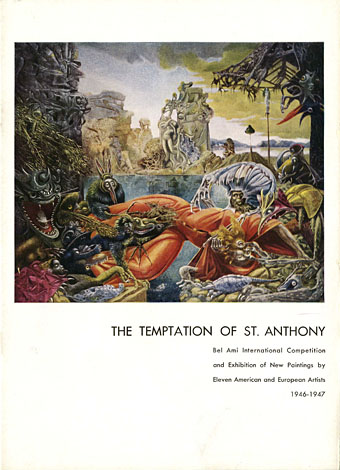
4: The King in Yellow (1895) by Robert W. Chambers
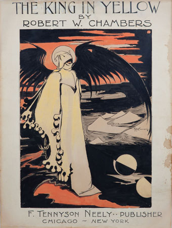
Chambers’ own design for the cover of his story collection.
Of the four stories that comprise the King in Yellow cycle, three concern some form of artistic activity. Prior to writing the stories Chambers had been studying and working as an artist in Paris, an experience that supplies the background to the third tale, In the Court of the Dragon. As an illustrator for Vogue and Life in the 1890s Chambers could hardly have been unaware of the fashion for yellow, especially when the colour is a feature not only of the title of the “poisonous” play and its central character, but is also central to the fourth story in the cycle, The Yellow Sign:
We had been speaking for some time in a dull monotonous strain before I realized that we were discussing The King in Yellow. Oh the sin of writing such words,—words which are clear as crystal, limpid and musical as bubbling springs, words which sparkle and glow like the poisoned diamonds of the Medicis! Oh the wickedness, the hopeless damnation of a soul who could fascinate and paralyze human creatures with such words,—words understood by the ignorant and wise alike, words which are more precious than jewels, more soothing than music, more awful than death!
In Chambers’ novel, The Common Law (1911), a disapproving description of an art club shows his familiarity with the avant-garde personalities of the Yellow Nineties:
A near-sighted study of various masters, brilliant, morbid, or essentially rotten, was the basis of this cult—not originality. Its devotees were the devotees of Richard Strauss, of Huysmans, of Manet, of Degas, Rops, Louis Le Grand, Forain, Monticelli…
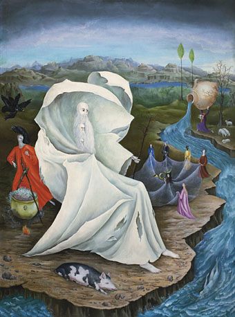
5: The Boom in Yellow (1896) by Richard le Galliene
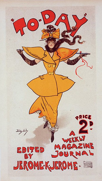
The Yellow Girl (c. 1895) by Dudley Hardy.
Richard le Galliene’s “prose fancy” describes at some length the colour of the decade:
Yellow is becoming more and more dominant in decoration—in wall-papers, and flowers cultivated with decorative intention, such as chrysanthemums. And one can easily understand why: seeing that, after white, yellow reflects more light than any other colour, and thus ministers to the growing preference for light and joyous rooms. A few yellow chrysanthemums will make a small room look twice its size, and when the sun comes out upon a yellow wall-paper the whole room seems suddenly to expand, to open like a flower. When it falls upon the pot of yellow chrysanthemums, and sets them ablaze, it seems as though one had an angel in the room. Bill-posters are beginning to discover the attractive qualities of the colour. Who can ever forget meeting for the first time upon a hoarding Mr. Dudley Hardy’s wonderful Yellow Girl, the pretty advance-guard of To-Day? But I suppose the honour of the discovery of the colour for advertising purposes rests with Mr. Colman; though its recent boom comes from the publishers, and particularly from the Bodley Head. The Yellow Book with any other colour would hardly have sold as well—the first private edition of Mr. Arthur Benson’s poems, by the way, came caparisoned in yellow, and with the identical name, Le Cahier Jaune; and no doubt it was largely its title that made the success of The Yellow Aster. In literature, indeed, yellow has long been the colour of romance. The word ‘yellow-back’ witnesses its close association with fiction; and in France, as we know, it is the all but universal custom to bind books in yellow paper. Mr. Heinemann and Mr. Unwin have endeavoured to naturalise the custom here; but, though in cloth yellow has emphatically ‘caught on,’ in paper it still hangs fire.
6: Il Giallo Mondadori (1929)
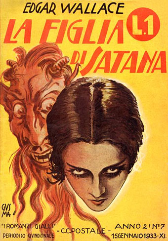
La Figlia di Satana (1933), an Italian edition of an Edgar Wallace crime novel. “I Romanzi Gialli”.
Everything associated with the 1890s was deeply unfashionable by the 1920s, florid Art Nouveau having been replaced by rectilinear Art Deco. Yellow slips at this point from a signifier of artistic and spiritual decadence to symbolise a more material form of corruption: crime. The giallo paperbacks published in Italy by Mondadori were so-named for their predominantly yellow covers. There’s nothing particularly weird or Chambers-related about these novels but their name was later transferred to a type of cinematic thriller being made in Italy in the 1960s. Those thrillers quickly mutated into supernatural horror films, and the giallo label went with them.
7: The King in Yellow (1938) by Raymond Chandler
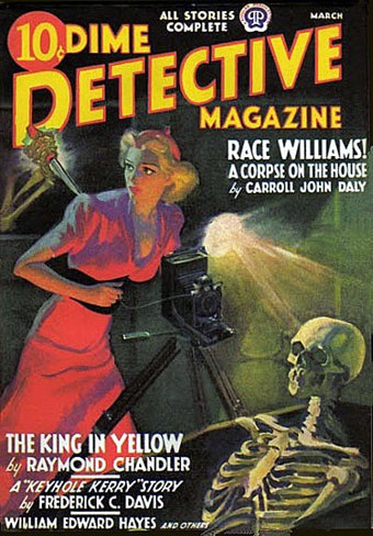
The masked figures on the first number of The Yellow Book reminded me at this point that Raymond Chandler had been writing for Black Mask magazine in the 1920s. Chandler’s King in Yellow is a murder mystery which in its magazine version concerns an investigation by detective Steve Grayce into the death of jazz trumpeter King Leopardi:
The King wore yellow silk pajamas, the slip-on kind, with a turned collar. They were loose and thin. Over his breast they were dark with blood that had seeped into the silk as if into blotting-paper. There was a little blood on his bare brown neck.
Steve stared at him and said tonelessly: “The King in Yellow. I read a book with that title once. He liked yellow, I guess. I packed some of his stuff last night. And he wasn’t yellow either. Guys like him usually are—or are they?”
Grayce’s name was changed to Philip Marlowe when the story was reprinted in a collection in 1945. In 1983 Powers Boothe played Marlowe in a series of TV adaptations.
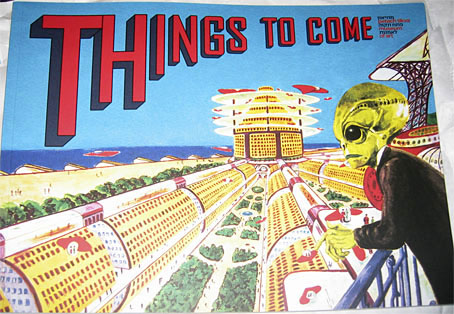
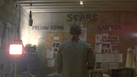
8: True Detective, series one (2014) by Nic Pizzolatto
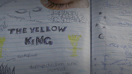
True Detective: pages from Dora Lange’s diary.
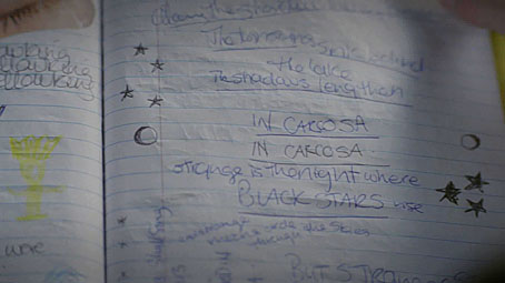
And so to the latest TV detectives. What struck me most about the Chambers thread this time round was how little is explained or revealed about the nature of “the yellow king” or Carcosa, and how much of the characterisation is concerned with figurative masks. Camilla’s words from the opening of Chambers’ The Mask—”You sir, should unmask”—are paraphrased by the killer in the final episode, something I missed the first time; elsewhere there’s a great deal of deception in the personal and professional spheres and, of course, Rust Cohle’s undercover exploits. Leaving all the Carcosa business unexplained is a strength; it’s what Chambers does himself in the stories, and it’s just what many of the lesser writers who’ve tried to expand his mythos don’t do at all.
What next for the King in Yellow? As the old lady says in episode 7: “Death is not the end!” The sinister regent will be back again, all we have to do is wait.
Previously on { feuilleton }
• Intertextuality
• Lovecraft’s Monsters
• The Court of the Dragon
• The King in Yellow