4 Hours by Clock DVA

clockdva1.jpg

Sleeve by Neville Brody.

After mentioning Clock DVA’s Thirst (1981) a couple of days ago I’ve been playing the album together with Pow-Wow ever since. 4 Hours was Thirst‘s accompanying 7-inch single, a marvellous slice of rumbling post-punk angst. The B-side, Sensorium, includes the words “Uptown apocalypse” among its lyrics, a phrase that’s also the title of the second track on the equally marvellous Music For Stowaways (1981), an instrumental album by the post-Human League, pre-Heaven 17 offshoot British Electric Foundation. This isn’t a coincidence; the latter number was co-written by Clock DVA’s Adi Newton, and features him playing guitar and synth, Newton having been in The Future with BEF’s Marsh & Ware prior to the formation of Clock DVA and The Human League. And to further complicate this tangle of Sheffield connections, 4 Hours was reissued in 1985 in 12-inch format on Cabaret Voltaire’s Doublevision label. I bought almost all the Doublevision releases but this was one I missed. (Was the title of Cabaret Voltaire’s Sensoria derived from Sensorium? Maybe…)

clockdva2.jpg

Previously on { feuilleton }
Pow-Wow by Stephen Mallinder
Old music and old technology
Neville Brody and Fetish Records

Pow-Wow by Stephen Mallinder

pow-wow1.jpg

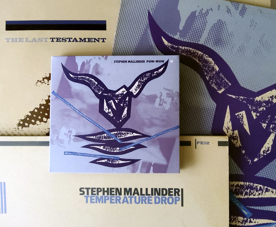
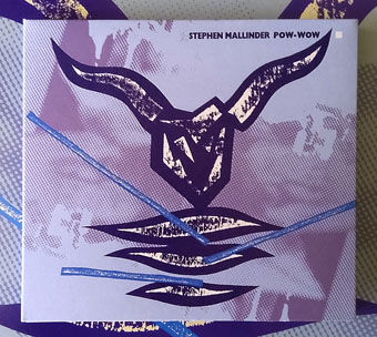
The debut solo album by Stephen Mallinder of Cabaret Voltaire received an overdue reissue on the Ice Machine label a few weeks ago; my CD turned up yesterday. Pow-Wow was one of the last albums released by Fetish Records in 1982, and it’s always been one I preferred to the solo recordings by Mallinder’s much more prolific colleague, Richard H. Kirk. Away from Cabaret Voltaire, Kirk and Mallinder’s music is mostly instrumental but the latter had a very different sound, dubbier and much more rhythmic than Kirk’s abrasive distortions. The longer pieces on Pow-Wow work variations on the energetic industrial funk developed by the Cabs and 23 Skidoo, benefiting a great deal from Mallinder’s dominant bass and insistent rhythms for which he was aided by Cabaret Voltaire’s regular percussionist, Alan Fish. Last Few Days, the most mysterious of Britain’s early Industrial groups, receive a credit for “chance element”. Mallinder sings on a couple of the tracks (if his whispered growl can be described as singing) while taped voices fill out the spaces elsewhere: a ménage à trois on Three Piece Swing, a voice from an assassination drama (Executive Action?) identifying the speaker as “Lee Harvey Oswald”, and so on. A handful of shorter pieces that run for less than two minutes are little more than looped sketches, but the unidentifiable analogue sources still sound unusual and original today, unlike synth-heavy albums from the same period.

pow-wow2.jpg

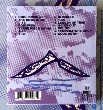
Mallinder’s other solo recordings from this time were just as good: a 12-inch single, Temperature Drop/Cool Down, and Del Sol, his uptempo contribution to the Fetish compilation/memorial album, The Last Testament. Cabs-affiliated groups like Hula and Chakk aimed for a similar blend of industrial menace and danceable grooves but the results were seldom as successful. Mallinder’s greater experience shows on these recordings, the best of which are the equal of anything that Cabaret Voltaire was doing at the time.

pow-wow4.jpg

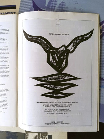
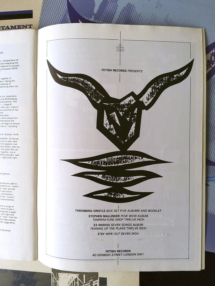
A Fetish ad from the Neville Brody-designed event booklet for The Final Academy, 1982.

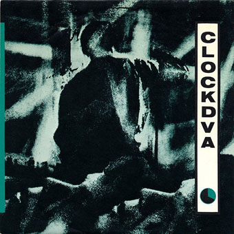
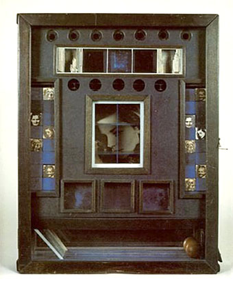
The sleeve design by Neville Brody is another plus, vying with his cover art for Thirst by Clock DVA for being the most cryptic design among the many covers he produced for Fetish Records. The designer revealed his rationale in The Graphic Language of Neville Brody (1988):

This sleeve was about human ritual and human slaughter. In the media world of newscasters and advertisers everybody becomes a viewer; conditioned to regard other people’s sufferings as no more than a form of entertainment. The bullring is a metaphor for this.

A good example, then, of a cover that means more to the designer than to the record owner.

pow-wow3.jpg

All design by Neville Brody.

The new edition of Pow-Wow improves on the original and the scarce reissues by bundling the album with Del Sol, both tracks from the 12-inch single and an edit of Cool Down from a Japanese release. It also includes one of the shorter tracks which for some reason was missing from previous reissues (this and the long version of Cool Down are from vinyl sources). I’ve had all of this material for many years so didn’t really need the CD, but my records are a little worn through over-use, and besides which, these are cult works.

Previously on { feuilleton }
TV Wipeout revisited
Doublevision Presents Cabaret Voltaire
Just the ticket: Cabaret Voltaire
European Rendezvous by CTI
TV Wipeout
Seven Songs by 23 Skidoo
Elemental 7 by CTI
The Crackdown by Cabaret Voltaire
Neville Brody and Fetish Records

El Lissitzky record covers

genx.jpg

Your Generation (1977) by Generation X. Design by Barney Bubbles.

Continuing an occasional series about the work of particular artists or designers being used on record sleeves. El Lissitzky (1890–1941) is an interesting candidate in this area since his pioneering abstractions have greatly influenced subsequent generations of graphic designers. As a result of this you’re just as likely to find his Suprematist style being pastiched on an album cover as find one of his paintings decorating the sleeve. Pastiches are difficult to locate unless you already know they exist—or unless the album credits acknowledge the style they’re imitating—so this list will no doubt be incomplete.

Barney Bubbles’ design for the debut single by Generation X is the earliest example I’m aware of that makes use of the El Lissitzky style. It was also one of Bubbles’ first sleeves for a punk band, and a significant break with his often florid hippy designs.

kraftwerk1.jpg

Die Mensch Maschine (1978) by Kraftwerk. Design by Karl Klefisch, “inspired by El Lissitzky”.

Kraftwerk’s seventh album uses Lissitzkian typography and graphics on its front and back covers. A very popular album with the post-punk crowd that would have been the first introduction for many people to El Lissitzky’s name. Kraftwerk still use that vibrant arrangement of black, red and white in their stage shows.

kraftwerk2.jpg

sakamoto1.jpg

B-2 Unit (1980) by Riuichi Sakamoto. Design by Tsuguya Inoue.

More pastiche, this time borrowing from El Lissitzky’s Suprematist book for children: About Two Squares: In 6 Constructions: A Suprematist Tale (1922). The book’s two characters of a red square and a black square appear on the vinyl labels. This is a great album, incidentally, still my favourite by Sakamoto.

sakamoto2.jpg

Continue reading “El Lissitzky record covers”

Weekend links 221

cornell.jpg

Untitled (Penny Arcade Portrait of Lauren Bacall) (1946) by Joseph Cornell.

• Having been a Bernard Szajner enthusiast for many years it’s good to see his music receiving some belated reappraisal. David McKenna talked to Szajner about his Visions Of Dune album (which is being reissued by InFiné next month), laser harps, The (Hypothetical) Prophets, and working with Howard Devoto.

• Priscilla Frank posts some big views of Marjorie Cameron’s occult paintings as a preview of the forthcoming exhibition at MOCA Pacific Design Center, Los Angeles.

• Fascinating reading in light of the recent kerfuffle over True Detective, Christopher Loring Knowles on the possible sources of HP Lovecraft’s Cthulhu Mythos.

Those who set up oppositions between the electronic technology and that of the printing press perpetuate Frollo’s fallacy. They want us to believe that the book—an instrument as perfect as the wheel or the knife, capable of holding memory and experience, an instrument that is truly interactive, allowing us to begin and end a text wherever we choose, to annotate in the margins, to give its reading a rhythm at will—should be discarded in favor of a newer tool. Such intransigent choices result in technocratic extremism. In an intelligent world, electronic devices and printed books share the space of our work desks and offer each of us different qualities and reading possibilities. Context, whether intellectual or material, matters, as most readers know.

Alberto Manguel, lucid as always, on the act and import of reading.

• “It’s time to give prog rock’s artist-in-residence Roger Dean his due,” says Amber Frost. No argument there, I did my bit in 2010.

• “Why do the covers of so many self-published books look like shit?” asks B. David Zarley.

• Mixes of the week: FACT mix 455 by Airhead, and Secret Thirteen mix 225 by Clock DVA.

• At Core77: Rain Noe chooses favourite skyscraper photos by Russian urban explorers.

• “O, Excellent Air Bag”: Mike Jay on the nitrous oxide fad of the early 19th century.

Nick Carr goes in search of Manhattan’s last remaining skybridges.

Lauren Bacall at Pinterest.

• Shaï Hulud (1979) by Zed (Bernard Szajner) | Welcome (To Death Row) (1980) by Bernard Szajner | Person To Person (1982) by The (Hypothetical) Prophets

Les Chants de Maldoror by Shuji Terayama

terayama.jpg

27 minutes of experimental video from 1977 in which director Shuji Terayama retrieves some predictably unorthodox images from the bottomless pit of Lautréamont’s text. The preoccupations here seem to belong as much to the director’s mind as to that of Isidore Ducasse, what with the emphasis on various forms of bondage and unusual erotics. (Not that Maldoror lacks sexual material but what there is adopts a different guise.) With a score that sounds like outtakes from a Clock DVA studio session it’s very much a product of its time, but not without interest. Terayama was (among other things) the director of Emperor Tomato Ketchup (1971), a film whose title was later swiped by Stereolab. Les Chants de Maldoror may be viewed at Ubuweb.

terayama2.jpg

Previously on { feuilleton }
Polypodes
Ulysses versus Maldoror
Maldoror
Books of blood
Magritte’s Maldoror
Frans De Geetere’s illustrated Maldoror
Maldoror illustrated