Recovering Viriconium

viriconium01.jpg

Detail from Assassination in the Night (c. 1600?) by Monsù Desiderio.

Yesterday’s post looked at some of the past cover designs for M. John Harrison’s Viriconium books. This post makes a few suggestions for how they might be presented in the future. Since these are mostly covers that I’d like to see they’re not necessarily ideal for the audience a publisher might be aiming at, cover design is usually a three-way process involving designer, author and publisher. In the end I’ve resisted the temptation to draft a range of original cover proposals—writing these posts has taken long enough—so almost everything here uses pre-existing art. If I was designing covers for all four Viriconium books, however, and the brief was to orient them towards a fantasy readership, the first thing I’d try would be a series of four imaginary Tarot designs. A peculiar pack of Tarot cards is a recurrent feature of the books so I’d create four emblematic cards that featured significant elements and characters from each. The characters wouldn’t be too well defined, they’d be stylised, maybe even silhouettes. Each card would feature a dominant presence: offhand these would be one of the geteit chemosit for The Pastel City, a locust for A Storm of Wings, the Barley Brothers for In Viriconium and a Mari Lwyd horse skull for Viriconium Nights. These presences together with the human characters would loom over a silhouette city at the foot of each card whose outlines would change appearance from book to book, evolving gradually from a fantastic outline of domes and towers to something that resembles a contemporary city. The colours and treatments would show a similar evolution from the bright and bold styles of the Pamela Colman Smith Tarot deck to something more photographic, collaged from elements closer to our world. Maybe.

That’s an idea for the four individual books. All the examples here use the convenience of the omnibus edition so a single image (or pair of images) has to somehow represent the entire series. To save time and effort I’ve taken the liberty of hijacking a couple of Penguin Books layouts. I hope Penguin doesn’t mind, and I should also apologise to Harrison’s UK publishers, Gollancz, for making one of their authors jump ship. The Viriconium omnibus is certainly good enough to be considered a modern classic. Penguin’s recent template for its Modern Classics series happens to be very easy to apply to a wide range of artwork.

viriconium04.jpg

The Anti-Pope (1942) by Max Ernst.

Penguin has a long tradition of using pre-existing art on its covers, especially on those in its Penguin Classics series. You can almost make this into a parlour game: match your favourite novel with the best choice of painting. The tradition was extended to its science fiction titles in the early 1960s when the art of Max Ernst was featured several times along with the work of other Surrealists. Max Ernst is a favourite artist of mine so this is one I can’t resist. Many of Ernst’s decalcomania paintings of the 1940s would suit Viriconium but The Anti-Pope with its horse heads seems especially suitable.

Also on the Penguin sf covers was a picture by the mysterious “Monsù Desiderio” one of whose works can be seen at the top of this post. Desiderio was a 17th-century painter with a vague enough presence—works have been attributed to both François de Nomé and Didier Barra—and a line in gloomy architectural fantasias to make him an ideal Viriconium artist.

Continue reading “Recovering Viriconium”

Reverbstorm: Bauhaus Horror

reverbstorm1.jpg

Lord Horror (after Klaus Barthelmess).

(No, not Pete Murphy and co.) Now that the Reverbstorm book is at the printers I have an excuse to discuss a few of the art and design appropriations that run through the narrative. I wanted to use some Bauhaus-style design back in the early 1990s when we were putting the first of the comic issues together but that idea got buried under conflicting demands and the need to actually finish all the drawing. It was only when I started designing the opening pages in 2008 that I was able to return to some of the original intentions. There were two reasons for this choice: one was that the minimalist graphics of the Bauhaus style worked well in black-and-white, and also provided an effective counterpoint to the very dense and detailed drawings that followed. The second was that the Bauhaus design school found itself in the early 1930s in opposition to the fascist forces which the figure of Lord Horror represents. (Many of the Bauhaus architects and designers eventually fled Germany for Britain and the United States.) This combination of antagonistic elements yielded another of Reverbstorm‘s collisions of counterposed philosophies and aesthetics.

reverbstorm2.jpg

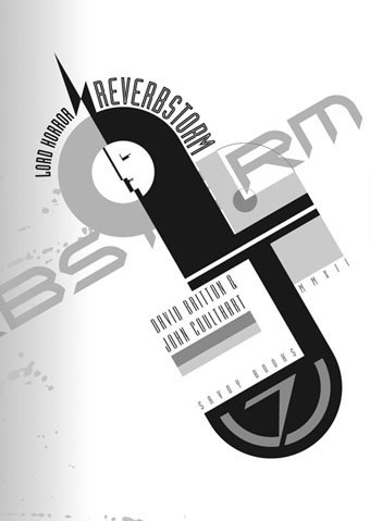
Reverbstorm title page.

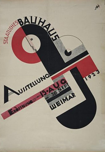
The title page is the most flagrant Bauhaus appropriation, a swipe worthy of Peter Saville at his plundering height. Joost Schmidt’s famous Bauhaus-Ausstellung poster is reworked with a Neville Brody typeface (Industria) and with Oskar Schlemmer’s face logo turned into a scowling profile.

On a typographic note, Industria was used right from the start with Reverbstorm since Brody designed it in the Thatcherite 1980s as a deliberate harking back to the authoritarian 1930s. It also has a very appropriate name. The other typefaces used in the book—Morris Fuller Benton’s Empire and Eric Gill’s Perpetua—date from 1937 and 1928 respectively.

reverbstorm3.jpg

Joost Schmidt (1923).

reverbstorm4.jpg

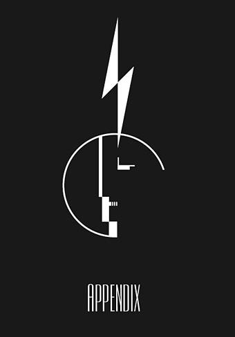
The reworked Oskar Schlemmer face/logo as it appears on the Appendix page. The lightning flash in Reverbstorm has multiple associations: adapted initially from the symbol used by Oswald Mosley’s British Union of Fascists (a symbol also appropriated at various times by David Bowie and Throbbing Gristle) it can also relate to storms, radio broadcasts and electricity in general. Here it becomes a minimal cipher representing Horror’s outrageous plume of hair.

reverbstorm5.jpg

Oskar Schlemmer (1923).

reverbstorm6.jpg

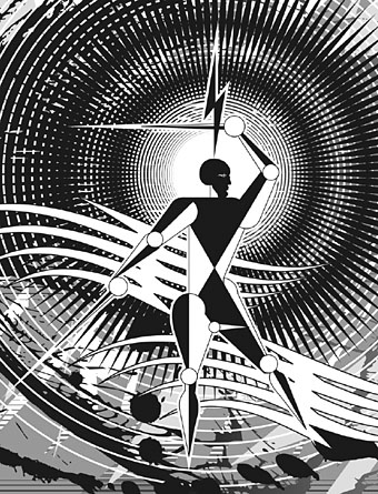
Reverbstorm, part 8.

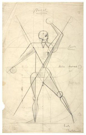
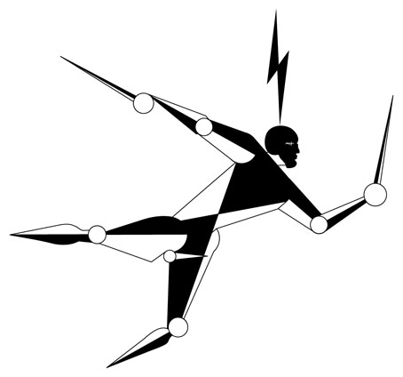
In part 8 of Reverbstorm Horror ends up naked inside “a Soul” (don’t ask), and we see his figure juxtaposed against a series of backgrounds that recapitulate earlier aspects of the narrative. It was always the intention to end the series with a change of style so I did this by creating a kind of digital maquette figure using vector shapes that could be posed in a variety of ways. The origin of the figure was a sketch by Klaus Barthelmess, one of the students in Oskar Schlemmer’s drawing class. The sketch below appeared in a slightly altered form in issue 5 of the original publications but I always felt more could have been done with it: a posable figure turned out to be the perfect solution. By coincidence, while I was working on the final pages, Clive Hicks-Jenkins had been running a maquette exhibition on his blog. I was tempted to offer my example but a combination of too much work and a reluctance to throw Lord Horror’s obscene and reprehensible presence into the mix put paid to that. Besides which, my figure is a digital creation, not a bona fide paper cut-out.

reverbstorm7.jpg

Drawing by Klaus Barthelmess (1922).

For those who want more Bauhaus design, the Barbican in London is currently staging a major exhibition, Bauhaus: Art as Life, that will run throughout the summer.

Previously on { feuilleton }
Reverbstorm: an introduction and preview

Weekend links 101

cabat.jpg

Kraken from Ernie Cabat’s Magical World Of Monsters (1992) at Monster Brains.

“I think for a lot of people who don’t read pulp growing up, there’s a real surprise that the particular kind of Pulp Modernism of a certain kind of lush purple prose isn’t necessarily a failure or a mistake, but is part of the fabric of the story and what makes it weird. There’s a big default notion that ‘spare,’ or ‘precise’ prose is somehow better. I keep insisting to them that while such prose is completely legitimate, it’s in no way intrinsically more accurate, more relevant, or better than lush prose.” China Miéville at Weird Fiction Review expressing an opinion that few in the literary world ever articulate, never mind agree with. Far more common is (to pick a recent example) Ursula K Le Guin dismissing Cormac McCarthy for “pretentious prose”.

• “Militant feminist scientists brainwash a research subject to assassinate the Welsh Minister of Prostitution. Meanwhile World War III is being fought and the USA has been invaded.” The IMDB précis for Taking Tiger Mountain (1983), a feature film directed by Tom Huckabee from a script by William Burroughs, and featuring a 19-year-old pre-Aliens/Near Dark Bill Paxton. The director discusses the film’s production at Screen Slate and attends a rare screening at Spectacle, Brooklyn, NYC, today (March 25th). YouTube has a three-minute clip. Surprising this has remained buried for so long. When can the rest of us get to see it?

• Prestel have published the catalogue for In Wonderland: The Surrealist Adventures of Women Artists in Mexico and the United States. AnOther previewed some of the contents. The exhibition runs at the LACMA, Los Angeles, until 6th May.

…gays only make up about 3% of the population so we spend our whole lives “translating” straight movies, books, ballets into gay terms and studying the heterosexuals around us—we know much more about them than they know about us, just as blacks know a lot about whites but whites know virtually nothing about blacks.

Edmund White (again) interviewed by Frank Pizzoli at Lambda Literary Review.

• New on Caroline True Records: Jon Savage’s “Fame”, Secret History of Post-Punk 1978–81. “Some of it doesn’t sound like anything that has happened since,” says Savage. Indeed. FACT has the track list which I was pleased to see includes Chrome among the usual suspects. Hear a 12-minute promo mix at Soundcloud.

guerin.jpg

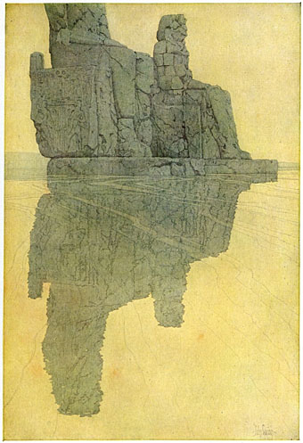
The Colossi of Memnon by Jules Guerin. From Egypt and its Monuments (1908) by Robert Hichens at Golden Age Comic Book Stories.

Gay Life Stories, “a colourful compendium of same-sex love through the ages” by Robert Aldrich. Reviewed here. Related: Alice Dreger asks “Are straight people born that way?”

• Clive Hicks-Jenkins created a series of designs for a Washington DC performance of Stravinsky’s The Soldier’s Tale. Follow their evolution in reverse order at his blog.

• Hocus Pocus: Margaret Eby on the brief epistolary relationship between Harry Houdini and Arthur Conan Doyle.

Rick Poynor on more cover designs for JG Ballard’s Crash.

London, city of dreams and rivers, caught on Polaroid.

• Photo prints by Thom Ayres for sale at Society6.

B*tches in Bookshops

• Meet You In The Subway (1979) by Chrome | New Age (Version III) (1980) by Chrome | Danger Zone (1981) by Chrome | Firebomb (1982) by Chrome.

The Weird Questionnaire

peacock.jpg

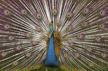
A peacock. Photograph by Vidhya Narayanan.

Posted at the Weird Fiction Review in the past week, The Weird (or Étrange) Questionnaire is Éric Poindron’s Weird (or Étrange) riposte to the Proust Questionnaire. I’d read the post, and seen Jeff VanderMeer’s answers to the questions, but wasn’t planning on answering it myself until Neddal Ayad wrote asking whether I’d be willing to do so for a future WFR assembly of responses. So here we are. The rules are as follows:

…there are sixty questions (twice as many as most versions of the Proust Questionnaire). Spend no more than a minute on each, and an hour in total. However, don’t keep checking your watch: “let writing define time.”

In the end I took longer than an hour but the time limit is a good idea, otherwise I’d have spent far too long pondering, revising, qualifying remarks, unqualifying the qualifications, and so on. Deadlines have their uses.


The Weird Questionnaire

1: Write the first sentence of a novel, short story, or book of the weird yet to be written.

The first night of winter moonlight revealed a pattern of tiny runic figures etched inside the window glass.

2: Without looking at your watch: what time is it?

01:15

3: Look at your watch. What time is it?

01:20

4: How do you explain this—or these—discrepancy(ies) in time?

It’s always later than you think.

5: Do you believe in meteorological predictions?

“Believe” seems the wrong word in this context since the question concerns a conjecture based on scientific study. Short-range forecasts are fine, long-range ones seldom seem to be.

6: Do you believe in astrological predictions?

If this refers to newspaper columns, they’re always so vague they may as well be computer-generated. Maybe they are.

7: Do you gaze at the sky and stars by night?

Yes, when I’m out of the city.

8: What do you think of the sky and stars by night?

My bad eyesight (the stars are always a blur), the length of time the light has taken to reach us, how the familiarity of the few stars we do manage to see shields us from the true immensity of the stellar gulfs.

9: What were you looking at before starting this questionnaire?

A guest post by Clive Hicks-Jenkins on Kathe Koja’s blog.

10: What do cathedrals, churches, mosques, shrines, synagogues, and other religious monuments inspire in you?

Further appreciation of the values of art, architecture and related crafts. In the case of cathedrals: astonishment at the feats of labour required to build them in a pre-industrial age; their presence as sites of accumulated history.

Continue reading “The Weird Questionnaire”

Weekend links 85

farmanfarmaian.jpg

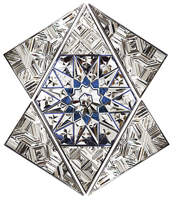
Group I (Convertible Series, 2010) by Monir Farmanfarmaian.

The four albums recorded by Bruce Gilbert and Graham Lewis under the name Dome are being reissued by Editions Mego together with Gilbert & Lewis’s Yclept album. I always preferred Gilbert & Lewis in their Dome incarnation (and Colin Newman solo) to the punk and post-punk stylings of their former band, Wire. Dome were (among other things) eccentric, awkward, noisy, hypnotic and experimental. Their recordings seemed to go largely unnoticed in the early 1980s so it’s good to see them being reissued.

A Children’s Treasury of American Cops Brutally Attacking Citizens: “…it takes quite a lot of tax money to keep a bunch of vicious thugs overfed and dressed like junior Darth Vaders with their portable hard-ons, on the off-chance some college kids might one day peacefully sit outside to protest this nation’s revolting descent.”

• “Stevenson, as has been said, was disarmingly candid about the material he borrowed for Treasure Island. One name, however, is missing from the extensive catalogue of self-confessed ‘plagiarisms’.” John Sutherland at the TLS.

• “Messiaen’s advice was revelatory. ‘You have the good fortune of being an architect and having studied special mathematics’, he told Xenakis. ‘Take advantage of these things. Do them in your music.'”

• “They always said punk was an influence. Tracey Emin, Damien Hirst, what a load of old shit that was. It’s Thatcherite art care of Saatchi & Saatchi.” And don’t ask Jamie Reid about the Sex Pistols.

Dennis Cooper is interviewed at Lambda Literary. I was surprised last week to find my recent post about William Burroughs’ The Wild Boys linked on a feature about the novel at Cooper’s blog.

Cosmic Geometry: The art of Monir Farmanfarmaian at The Paris Review. Related: Monir Farmanfarmaian at the Haines Gallery, San Francisco.

• Paleolithic phallic art suggests that many early European men scarred, pierced and tattooed their penises.

FACT mix 301 is a selection of dub tracks, dubstep pieces and Middle Eastern songs compiled by Kahn.

Who left a tree, then a coffin in the library?

The Little Journal of Rejections (1896).

Clive finished another painting.

The Great Salt Desert of Iran.

Keep Drawing.

• Troisième (1980) by Colin Newman | And Then… (1980) by Dome | The Red Tent pts I & II (1980) by Dome) | Jasz (1981) by Dome.