Clichés & Gravures

cliche01.jpg

The clichés we have here aren’t the verbal variety but those which the OED defines as:

1. The French name for a stereotype block; a cast or ‘dab’; applied esp. to a metal stereotype of a wood-engraving used to print from. Originally, a cast obtained by letting a matrix fall face downward upon a surface of molten metal on the point of cooling, called in English type-foundries ‘dabbing’.

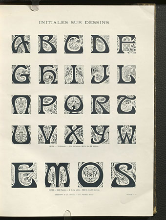
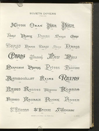
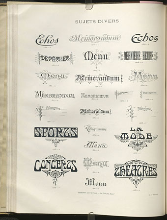
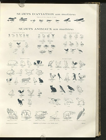
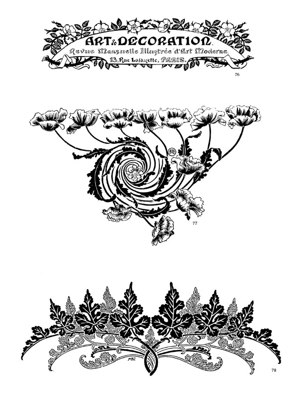
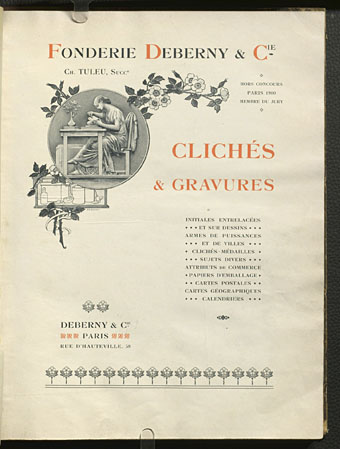
Clichés & Gravures is a two-volume collection (Volume 1 and Volume 2) of emblems, icons, small illustrations, initials, headings, frames and other print details published by the Deberny type foundry in 1912. Carol Belanger Grafton’s 3,800 Early Advertising Cuts is an edited selection of the same images which Dover Publications added to their Pictorial Archive series in 1991. I’ve been borrowing from Ms. Grafton’s book for many years, during which time I’ve wondered what might have been omitted from her selection. Once again the Internet Archive turns up the goods. The Dover reprint gives no indication that Deberny’s collection ran to two volumes and included colour printing in the second volume, plus a few pages of type designs; the Art Nouveau-styled design shown below is one that I can find immediate use for. If all of this somehow wasn’t enough, there are yet more clichés et gravures (and a lot more typefaces) in this type catalogue which Deberny published a few years later.

cliche02.jpg

cliche03.jpg

cliche04.jpg

cliche05.jpg

Continue reading “Clichés & Gravures”

The case of the fin de siècle fleuron

artnouveau.jpg

I said yesterday that poppies are a common feature of the fin de siècle magazines for the convenient way they combine long-stemmed flowers—ideal for all those Art Nouveau flourishes—with narcotic connotations that signal Decadence. The spiralling fleuron above is one example that readers of Savoy books may recognise, an occasional company logo which has been in use since the mid-1980s. David Britton chose the design from one of the Dover Pictorial Archive books, Carol Belanger Grafton’s Treasury of Art Nouveau Design and Ornament, and I later made a digital version from this page scan.

heroes.jpg

One of the earliest Savoy uses, a label design for Heroes (1986) by PJ Proby.

Having spent a great deal of time in recent years trawling through Art Nouveau magazines I was sure I was going to run into the original printing of the fleuron eventually. Some of the page decorations in Jugend are very similar but it wasn’t there or in Pan, Deutsche Kunst und Dekoration or The Studio. I don’t have a copy of the Grafton book, and Dave says his copy is lost, so I’ve no idea whether there’s a credit for the source of the designs; not all Dover books credit their source material in any detail. Earlier this week I decided to look in Art et Décoration, a magazine that was the French equivalent of The Studio, since the header at the top of the scanned page implied that the other designs might be from the same magazine. Aside from a couple of copies at the Internet Archive this means looking through the poor-quality scans at Gallica; by a fluke—because they don’t seem to have a complete run of the early issues—the January 1898 edition contained the page below showing the Savoy fleuron, an endpiece for an article devoted to another French art magazine, L’Image.

Continue reading “The case of the fin de siècle fleuron”