Saragossa Manuscript posters

saragossa1.jpg

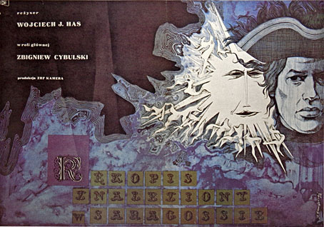
Polish poster (1965) by Jerzy Skarzynski who was also the film’s production designer.

I love The Saragossa Manuscript, both the novel by Potocki and the movie by Has. I saw the film three times which, in my case, is absolutely exceptional.

Luis Buñuel in My Last Sigh (1983)

No surprise that a lifelong Surrealist was enamoured with Jan Potocki’s rambling collection of stories-within-stories. The 1965 Polish film by Wojciech Has had another famous enthusiast in Jerry Garcia whose efforts to restore and reissue The Saragossa Manuscript helped bring the film to a new generation of viewers in 1999. I was a beneficiary of this, having been intrigued for years by descriptions whilst hoping in vain that it might turn up on television. I prefer the film to the novel although to be fair to Potocki it’s a long time since I read his book.

saragossa2.jpg

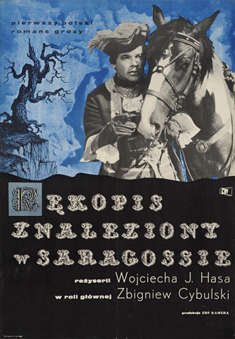
Another Polish design showing Zbigniew Cybulski as Alphonse.

Watching The Saragossa Manuscript again this weekend sent me looking for posters, some of which can be seen below. There are odd omissions: plenty of examples from the Eastern Bloc countries but few at all from Western Europe. The film suffered by having its 3-hour running time hacked about by distributors which didn’t help its reception outside Poland. The manuscript of the title is a book discovered during a skirmish in the Napoleonic wars, an account of the strange adventures of Alphonse Van Worden in the Sierra Morena region of Spain; one of the soldiers reading the manuscript is Van Worden’s grandson, the first of many coincidental connections. Van Worden’s adventures seem macabre at first—there are more bones in the opening scenes than in many horror films—but they soon turn farcical. As a burgeoning cast of characters appears, many of whom have their own tales to tell, the mood veers into outright sex comedy, albeit with mild philosophical overtones. Some scenes aren’t very far removed from Monty Python, especially those that feature an inept band of Spanish Inquisitors.

saragossa10.jpg

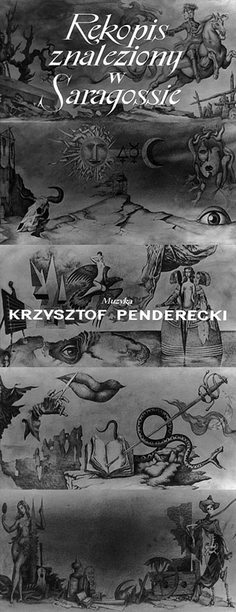
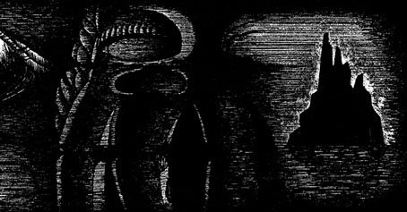
Background drawings from the title sequence. Yes, the score is by Penderecki, his first.

All of which means this is another film that presents a challenge for a poster designer. Most of the early examples take their cues from the opening titles whose backgrounds feature drawings with a vaguely Surrealist and occult flavour that I’m guessing are also the work of Jerzy Skarzynski.

Continue reading “Saragossa Manuscript posters”

Intertextuality

cthulhu17.jpg

The Call of Cthulhu (1988): in the upper half there’s the big sun from Bob Peak’s poster for Apocalypse Now, in the lower half a radical reworking of Arnold Böcklin’s The Isle of the Dead.

In 1990, shortly after the first season of Twin Peaks had finished showing in the US, Video Watchdog magazine ran a feature by Tim Lucas which attempted to trace all the various cultural allusions in the character names and dialogue: references to old TV shows, song lyrics and the like. This was done in a spirit of celebration with Lucas and other contributors welcoming the opportunity to dig deeper into something they’d already enjoyed. This week we’ve had a similar unravelling of textual borrowings in a TV series, only now we have the internet which, with its boundless appetite for accusing and shaming, can often seem like something from the grand old days of the Cultural Revolution.

cthulhu01.jpg

The Call of Cthulhu (1988): a more subtle allusion to Apocalypse Now.

The latest culprit ushered to the front of the assembly for the Great Internet Struggle Session is Nic Pizzolatto whose script for True Detective has indeed been celebrated for its nods to Robert Chambers and The King in Yellow. It’s also in the process of being condemned for having borrowed phrases or aphorisms from Thomas Ligotti’s The Conspiracy Against the Human Race (2011). See this post for chapter and verse.

cthulhu02.jpg

The Call of Cthulhu (1988): It’s not very clear but that’s a boat from The Creature from the Black Lagoon.

If I find it difficult to get worked up over all this pearl-clutching it’s because a) it shows a misunderstanding of art and the way many artists work, b) True Detective was an outstanding series, and I’d love to see more from Pizzolatto and co, and c) I’ve done more than enough borrowing of my own in a variety of media, as these samples from my adaptation of The Call of Cthulhu demonstrate, a 33-page comic strip where there’s a reference to a painting, artist or film on almost all the pages, sometimes several on the same page.

cthulhu03.jpg

The Call of Cthulhu (1988): Ophelia by Millais.

Cthulhu is a good choice here since Pizzolatto’s story edged towards Lovecraft via the repeated “Carcosa” references. You’d think a Lovecraft zine of all things would know better than to haul someone over the coals for borrowing from another writer when Lovecraft himself borrowed from Robert Chambers (and Arthur Machen and others), while “Carcosa” isn’t even original to Chambers’ The King in Yellow but a borrowing from an Ambrose Bierce story, An Inhabitant of Carcosa (1886). Furthermore, Lovecraft famously complained about his own tendencies to pastiche other writers in a 1929 letter to Elizabeth Toldridge: “There are my ‘Poe’ pieces and my ‘Dunsany pieces’—but alas—where are any Lovecraft pieces?”

Continue reading “Intertextuality”

The poster art of Akiko Stehrenberger

stehrenberger1.jpg

W.E. (2011).

Being someone who enjoys adopting and pastiching different art and design styles for different projects I naturally like to see other people doing the same. American illustrator and designer Akiko Stehrenberger is very adept at using this approach for her film posters. Without knowing the identity of the person responsible you wouldn’t guess that they were all the work of the same person.

The Madonna and Polanski posters are the two most overt pastiches, being based respectively on the paintings of Tamara de Lempicka, and the posters by Jan Lenica for Polanski’s Repulsion and Cul-de-Sac. Good as the poster for W.E. is, it seems the studio preferred a more cliched “romantic” treatment for their international sales. Stehrenberger’s Mac desktop design for Burn After Reading was dropped in favour of yet another Saul Bass pastiche. (As a sidenote I’d suggest a moratorium on imitating Saul Bass for the time being; it’s getting boring.) The Lost Highway design isn’t a poster but I added it here since it’s a surprising take on David Lynch’s noir piece. I like the way the dotted line can be taken either as road markings or a line signifying the division in the film between the separate storylines and the separated characters.

Akiko Stehrenberger talked to Adrian Curry earlier this year about her favourite film posters.

stehrenberger2.jpg

Burn After Reading (2008).

stehrenberger3.jpg

Roman Polanski: Wanted and Desired (2008).

stehrenberger4.jpg

Lost Highway (Spanish Blu-ray cover).

Previously on { feuilleton }
La Belle et la Bête posters
Dr Mabuse posters
The poster art of Frank McCarthy
Repulsion posters
The poster art of Vic Fair
Petulia film posters
Lucifer Rising posters
Wild Salomés
Druillet’s vampires
Bob Peak revisited
Alice in Acidland
Salomé posters
Polish posters: Freedom on the Fence
Kaleidoscope: the switched-on thriller
The Robing of The Birds
Franciszek Starowieyski, 1930–2009
Dallamano’s Dorian Gray
Czech film posters
The poster art of Richard Amsel
Bollywood posters
Lussuria, Invidia, Superbia
The poster art of Bob Peak
A premonition of Premonition
Metropolis posters
Film noir posters

The poster art of Frank McCarthy

mccarthy06.jpg

The Venetian Affair (1967).

“Murder! Spies! Women!” If you added “guns” and “explosions” to that list you’d have the ingredients of the wild poster art of Frank McCarthy (1924–2002). I used to love posters like this when I was a boy, especially those from the everything-happening-at-once school which, by the look of these examples, was McCarthy’s specialty. Where action films are concerned the posters are often more exciting than the scenes they depict, in part because artists such as McCarthy were often working from their own imaginations as much as from any stills they’d been given.

mccarthy04.jpg

The Caper of the Golden Bulls (1967).

McCarthy had a career painting Western scenes which explains why his horses are so good. Some of his posters are for very well-known films, including a couple of Bond pictures, but I prefer those where he evidently had more of a free reign. The painting for The Caper of the Golden Bulls is a great composition with a use of colour you wouldn’t see today. Below there’s an example of the colossal title lettering that Terry Gilliam used to enjoy parodying. I still wonder which film did this first. Was it Ben-Hur? See more of Frank McCarthy’s poster art here.

mccarthy01.jpg

Genghis Khan (1965).

mccarthy02.jpg

Around the World Under the Sea (1966).

Continue reading “The poster art of Frank McCarthy”

Repulsion posters

repulsion1.jpg

More Roman Polanski. The BFI is running a season of the director’s work through January and February so Repulsion (1965) and Chinatown (1974) have been put back into circulation nationwide. I don’t live in London but I have a large number of Polanski’s films on DVD so it looks like this month will also see a mini-season in south Manchester. Anchor Bay released a set of Polanski’s first three films (plus a disc of his short works) a few years ago, a great collection whose only flaw was a lack of Jan Lenica’s poster art for Repulsion and Cul-de-Sac (1966). I don’t know what posters are being used to promote the new release of Repulsion but something using Lenica’s artwork would seem essential.

repulsion2.jpg

The colour and brush style of the prone figure is very typical of Lenica but when combined with either the Clarendon typeface in the British example above, or the blocky lettering for the French poster, a Saul Bass-like design appears. The gender and eye symbols in the hand-drawn lettering reinforce a resemblance which I’d guess was deliberate. The title sequence for Repulsion, with the credits sliding across a close view of Catherine Deneuve’s eyeball, could almost have been created by Bass; the director’s credit (below) requires no further argument.

repulsion7.jpg

Continue reading “Repulsion posters”