A theme for maniacs

bach.jpg

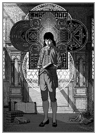
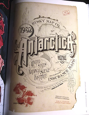
The theme in question.

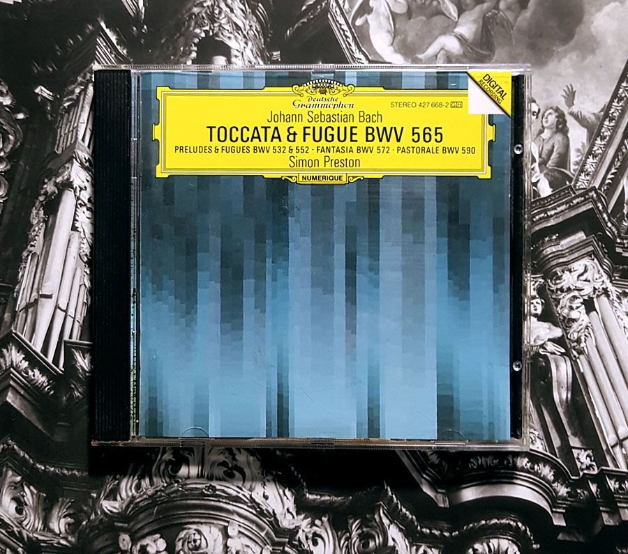
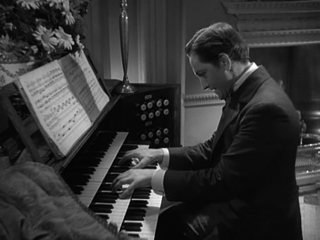
When did the first few bars of Bach’s Toccata and Fugue in D Minor BWV 565 become a signifier of an unhinged personality, and thereby a horror cliché? The question was raised by my film viewing in the run-up to Halloween following a return visit to The Black Cat, Edgar G. Ulmer’s Universal oddity. Ulmer’s film is the best of a trio of Universal horrors packaged by Eureka in a double-disc set, part of the company’s ongoing programme to reissue obscure films starring Boris Karloff and Bela Lugosi. The three films in the set—Murders in the Rue Morgue (1932), The Black Cat (1934) and The Raven (1935)—all star Lugosi, with Karloff co-starring in The Black Cat and The Raven. The Bach piece was impossible to ignore after watching all three films together. In The Black Cat we see a villainous Karloff regaling a potential victim with a performance of Toccata and Fugue on his home organ. Bela Lugosi does the same in The Raven, where he portrays an equally villainous but much more demented doctor obsessed with the writings of Edgar Allan Poe. The Universal horror films have been the source of many cinematic clichés of which this is a further example, even if the use of Toccata and Fugue to signify villainy or madness predates The Black Cat.

Wikipedia’s incomplete list of the composition’s cinematic appearances states that Toccata and Fugue was already a theatrical cliché by the early 1930s but offers no evidence for the claim. It’s likely there were silent films using the piece for their scores when so much silent orchestration borrows from pre-existing classical music. But silent films, today as in the past, can be scored in many different ways, the score isn’t always permanently attached to the film. The one silent film that you might expect to use the Bach piece, the 1925 version of The Phantom of the Opera, has a fine score by Carl Davis in its restored form, but no Toccata and Fugue. A brief history of the cinematic life of the piece would go something like this…

jekyll.jpg

Dr Jekyll and Mr Hyde (1931)
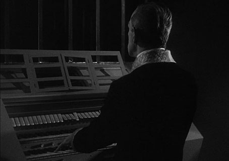
Rouben Mamoulian’s excellent adaptation opens with a view through the eyes of Dr Jekyll (Frederic March) playing another Bach piece on the organ; prior to this the film’s titles had been scored with an orchestral arrangement of Toccata and Fugue. An hour later the composition returns when Jekyll plays an extract from the fugue section, an ominous sign despite his joy at his impending marriage.

blackcat.jpg

The Black Cat (1934)
Despite the title, this one has nothing at all to do with Edgar Allan Poe. Instead of another spurious adaptation we get Boris Karloff as Hjalmar Poelzig, cinema’s only Satanist architect. The character is a bizarre amalgam of Aleister Crowley and Hans Poelzig, a German architect who designed the sets for Paul Wegener’s third and best Golem film.
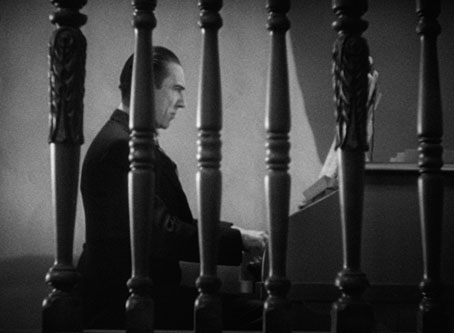
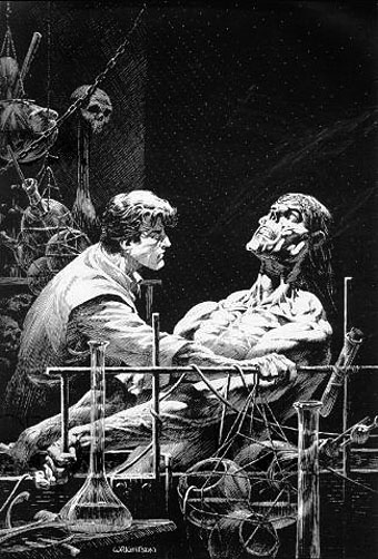
raven.jpg

The Raven (1935)
This one does at least contain a number of Poe references. Lugosi is a brilliant doctor who also happens to be a homicidal maniac, his Poe obsession having led him to fill the secret rooms in his house with torture devices.

canterbury.jpg

A Canterbury Tale (1944)
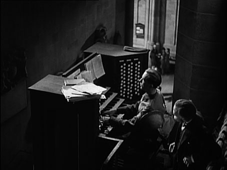
Not a horror film but included here because Powell & Pressburger’s war-time drama is about the last time you find the Bach piece being used in an unironic manner, intended to evoke religious awe rather than madness or doom. Prior to this the piece had also been used to soundtrack an abstract animation by Mary Ellen Bute, Synchromy No. 4: Escape (1938), two years before Disney did something very similar in Fantasia. In A Canterbury Tale Dennis Price is a conscripted cinema organist finally arrived at Canterbury Cathedral prior to being shipped to the front. Before he leaves, the cathedral organist allows him to play the music for the departure service which in turn allows us to hear Bach’s piece illustrating views of genuine Gothic grandeur.

sunset.jpg

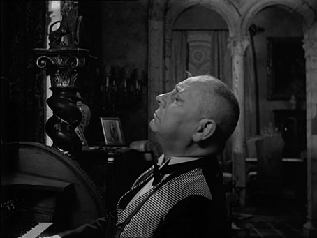
Sunset Boulevard (1950)
Its fitting that the self-conscious use of Toccata and Fugue begins with a supremely self-conscious film. Billy Wilder’s masterpiece isn’t a horror film either but it is a full-blown Gothic drama, being narrated by a dead man whose first encounter with the mentally fragile Norma Desmond sees him being mistaken for an undertaker. The Bach piece is played by Desmond’s butler, Max, a washed-up film director portrayed by a genuine (and genuinely great) washed-up film director, Erich von Stroheim. Max may not be a maniac but his employer (and ex-wife) is certainly unhinged, while Stroheim himself was notorious in his directing days for his megalomania, overspending lavishly and refusing to compromise with the studios over the editing of his films. (The first cut of his mutilated epic, Greed, ran over nine hours.) Since the 1925 Phantom of the Opera was mentioned earlier, it’s worth noting that Norma Desmond’s boat-shaped bed is the same prop that appears in the silent Phantom’s underground lair.

Continue reading “A theme for maniacs”

Illustrating Frankenstein

holst.jpg

Frontispiece by Theodore Von Holst of the 1831 edition of Frankenstein. The monster in this illustration, which Mary Shelley would no doubt have seen, is closer to the description in the text than the myriad shambling figures that came later.

It’s a recurrent feature of commissioned work that you sometimes find yourself illustrating novels or stories you might otherwise have never attempted. Spanish publisher Editorial Alma have just added a new edition of Mary Shelley’s Frankenstein to their series of illustrated classics, convenient timing with this year being the bicentenary of the book’s first publication. Last year I produced 33 illustrations for Alma’s collection of Poe stories, as well as 3 new illustrations for a small Lovecraft collection. For their edition of Frankenstein I’ve created 24 full-page pictures, one for each chapter. (I produced 25 in total, 24 for the chapters and one for the letters at the front, but the Spanish translation is arranged slightly differently so one of the drawings has been omitted.) In the past I’ve given little consideration to illustrating classic books, preferring to look for subjects which were less familiar. Frankenstein is a book that isn’t illustrated as much as some but Lynd Ward in 1934, and Berni Wrightson in 1977/78 both produced sufficiently exceptional sets of drawings for me to regard the novel as almost unassailable. Until last year, that is.

ward1.jpg

Frankenstein by Lynd Ward (1934).

Despite such formidable predecessors, I felt that with this book at least I might be able to offer something new using the blend of collage and drawing that I’ve been evolving recently. There was additional promise in that the story as it’s written is less familiar than the Poe stories, and much less familiar than its fellow horror classic, Dracula. People think they know Frankenstein but what they often know is the manglings the novel has received in various film and TV adaptations. The Ward and Wrightson illustrations stay close to the text, the latter being replete with period detail, and rendered in a style reminiscent of 19th-century wood engravings. Wrightson even copied two of Gustave Dore’s pictures from The Rime of the Ancient Mariner for the opening scenes on the ship, one of which went unused. But Wrightson’s drawings are closer still to Franklin Booth‘s pen-and-ink style which was also derived from wood engraving yet which achieves its effects in a different manner to the engraving process.

frankenstein2.jpg

Frankenstein by Berni Wrightson (1977/78).

Even when artists follow the text of Frankenstein more closely than the screenplay adapters, personal tastes can’t help manifest themselves. So Ward’s drawings reflect the angular and stylised compositions of his “novels in woodcuts”, while Wrightson’s work still shows evidence of his earlier career as a comic artist. With my illustrations I wanted to reflect the artistic spirit that gave birth to the novel, namely Romanticism. Frankenstein is very much a Romantic tragedy with violent passions set against the overwhelming landscapes of the Swiss Alps, the Rhine valley and the Arctic seas. Three of the illustrations below allude to Caspar David Friedrich’s paintings, while many of the others have had their mundane cloudscapes exchanged for gloom and tumult.

I’ve said before that one of the things I enjoy about the collage technique is being able to use engravings and other graphics from the same period (give or take a few decades) as the story itself. The disadvantage of relying on pre-existing sources is that you’re always limited by the available material, so recently I’ve been pushing the technique further to achieve a hybrid style, something midway between the Ernst/Sätty engraving-collage technique and the very laborious, heavily-shaded pen-and-ink style I used when I was drawing comics. The approach isn’t so different to the one I used in my Lovecraft comics many of whose backgrounds and other details were copied from photographs. The difference is that where I used to spend several days working on a single panel (and two weeks working on a page) I can now create an entire picture in half the time. In these new illustrations I feel the hybrid style is working as I intended, allowing me greater freedom to create the picture I have in mind rather than a picture dictated by the source material. Without incorporating original figures and other drawn elements into the compositions it would have been difficult to illustrate a story with the same characters in so many scenes, a problem I encountered when I was illustrating Lewis Carroll’s Alice books and ran out of pictures of Victorian girls.

The full run of pictures follows below, including the one which was omitted from the print edition. All may be seen at a larger size here. Since the scenes aren’t always self-explanatory I’ve included fragments of text from each chapter.

frankenstein00.jpg

“In the morning, however, as soon as it was light, I went upon deck and found all the sailors busy on one side of the vessel, apparently talking to someone in the sea. It was, in fact, a sledge, like that we had seen before, which had drifted towards us in the night on a large fragment of ice.”

frankenstein01.jpg

“During one of their walks a poor cot in the foldings of a vale attracted their notice as being singularly disconsolate, while the number of half-clothed children gathered about it spoke of penury in its worst shape.”

This one was omitted from the Alma edition. No loss, really, since the scene doesn’t add much to the story.

frankenstein02.jpg

“When I returned home my first care was to procure the whole works of this author, and afterwards of Paracelsus and Albertus Magnus. I read and studied the wild fancies of these writers with delight; they appeared to me treasures known to few besides myself.”

The diagrams here are taken from some of the books the young Victor Frankenstein is reading. There’s an allusion to this in the magic square on the wall in the back of Theodore Von Holst’s frontispiece, the square being the kind of thing seen in books like this one by Cornelius Agrippa, one of the occult philosophers mentioned in the novel.

Continue reading “Illustrating Frankenstein”

The Thing: Artbook

thing01.jpg

It was just over a year ago that I was asked to contribute to The Thing: Artbook, and the thing itself (so to speak) turned up in the post a few days ago. This is a large, heavyweight volume of 400 colour pages, stuffed to the slavering gills with fanged abominations (and more than a few Kurt Russells), a suitably excessive tribute to an excessive film.

thing02.jpg

Publishers Printed In Blood have previewed a fair amount of the artwork over the past year but the variety of interpretations of John Carpenter’s (and, lest we forget, John W. Campbell’s) monsters is quite overwhelming. After wondering how (or if) they were going to order contributions from 375 different artists, the book turns out to be divided into sections based on lines of dialogue from the film, a clever idea when much of the imagery reprises the same scenes or characters. My piece, which you can see below the fold, is in the “Nobody trusts anybody now” section.

thing03.jpg

One surprise was the dedication to Berni Wrightson who died earlier this year. As for Mike Ploog’s original designs for the film’s creatures, I was hoping there might be more of these but the book does open with a couple of Ploog’s drawings.

thing04.jpg

thing05.jpg

I’ve resisted the temptation to post favourites by other artists aside from this piece by Steve Thomas. This one stood out for me since it’s a riff on the same lettering designs from fire insurance maps that I pastiched myself a few years ago for Lavie Tidhar’s The Bookman Histories. Not all the artists produced monster art, there are quite a few contributions like this which present the film via infographics or pastiche.

Continue reading “The Thing: Artbook”

Du Tac au Tac: Druillet, Hogarth and Buscema

tacautac.jpg

I thought I was done with Druillet for this week but no, there’s more. I hadn’t come across Du Tac au Tac before, a French TV show from the early 70s in which three (sometimes four) different comic artists are given a total of 15 minutes to improvise a drawing on a single board. The list of contributors is a who’s who of comic talent from France, Belgium, America and elsewhere. French TV site Ina.fr (which is pay-to-view) has 130 episodes in their archive, many of which have found their way onto YouTube. Druillet was a regular contributor, as was Moebius.

I’ve singled out this episode from 1972 for the astonishing conjunction of Druillet with Burne Hogarth, two artists with a considerable influence on my own comics work. Without the example of Heavy Metal magazine in general, and Druillet in particular, I might not have bothered trying to adapt Lovecraft’s stories into comics in the 1980s; at one point I was prepared to put together a book of stories-plus-illustrations along the lines of Berni Wrightson’s Frankenstein. Burne Hogarth, meanwhile, casts a Tarzan-shaped shadow over the darker shadows of the Reverbstorm series, his work being quoted throughout, especially in the appropriation of the bizarre and sinister Ononoes from the Tarzan Sunday strips. The third artist present, John Buscema, is notable if only for representing the comics creation that I like the least: the over-muscled, flat-groined, stupidly-costumed, always-fighting, corporate superhero. As it is, Buscema doesn’t fare too well in this exchange, sketching a half-hearted Silver Surfer while Hogarth (who was left-handed; don’t think I knew that) draws a profile of Tarzan in pastels, and Druillet works furiously with markers to create a typical melange of bat-winged demon, alien glyph and screaming head. I’ve not watched any of the other episodes yet but for those interested there are two channels of the things here and here.

Previously on { feuilleton }
Sorcerer: Druillet and Friedkin
Ô Sidarta: a film about Philippe Druillet
Lovecraft: Démons et Merveilles
Heavy Metal, October 1979: the Lovecraft special
Philippe Druillet album covers
Druillet’s vampires
Salammbô illustrated
Druillet meets Hodgson

Weekend links 79

brody-va.jpg

Neville Brody creates a cover design for an issue of the V&A magazine tied to the museum’s current exhibition, Postmodernism: Style and Subversion 1970–1990. Brody’s comment amused me for the way he smartly explained the thinking behind the design whilst also distancing himself from its theme:

For me, Post Modernism felt like a kind of facade built to cover over the cracks of a divided world, a surface of plucked effects and stylistic devices emptied of meaning, an extrusion of hollow traces and flat outlines forcing 2D into apparent depth. I was never a Post Modernist, rather a Modernist exploring humanist lines of enquiry in the collapsing world behind a wall of decoration.

• It’s a common thing today to give images from the past a queer reappraisal, finding homoerotic qualities in pictures which, when they were made, would have seemed free of any sexual subtext. This post finds such a subtext in recruitment posters for US armed forces although none of the examples are as overt as this wartime magazine ad. Over at Front Free Endpaper Callum notes that many vintage photos which people regard today as evidence of gay relationships are unlikely to be quite that. The photo he posts, however, really does appear to show a pair of men who were more than just good friends.

• A play by Ororo Productions of HP Lovecraft’s The Dunwich Horror will be staged at the London Horror Festival from October 25th. Related: Horror Made Delightful: The Strange Stories of Sheridan Le Fanu, MR James, and Robert Aickman. “Aickman never spells out his meaning,” says Greer Mansfield, “His stories end abruptly and inconclusively, and in fact the ‘meaning’ is less important than the utter mysteriousness of what happens.” Which is just what some of us enjoy.

deville.jpg

Black Beauty, a decorated horse skull by Julia deVille.

• “Jackpot is a comedic short film about a 14-year-old gay boy in 1994 who sets off on a quest to find a stash of gay porn and get it home before anyone finds out.” Director Adam Baran is requesting completion funds at Kickstarter.

Gendai Shogyo Bijutsu Zenshu (The Complete Commercial Artist), published in Tokyo from 1927 to 1930.

Ishac Bertran tries some analogue sampling by chopping up vinyl discs with a laser cutter.

Steve Jobs does LSD and The Residents pay tribute to Steve Jobs.

• A rare post at Ballardian: Outpost 13: The Atrocity Exhibition.

• It’s all fun and games until Charles Manson turns up…again.

The Edgar Allan Poe Portfolio (1976) by Berni Wrightson.

• RIP David Bedford and Bert Jansch.

John Waters: Roles of a Lifetime.

Octopi Wall Street!

Homocomix.

Poison (1969) by Bert Jansch | Pentangle at the BBC (1970): Train Song | House Carpenter | Hunting Song | Light Flight