The art of Claude Fayette Bragdon, 1866–1946

bragdon1.jpg

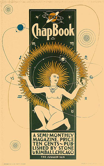
The Juggler Sun (1895).

On the shortest day of the year it seems fitting to post a picture of the sun and hope that in 2009 the clouds clear long enough for us Brits to see more than a month of it. Claude Fayette Bragdon’s poster is a remarkably stylised work for 1895 and might easily have been produced twenty or more years later. The Chap-Book was a periodical which included Bragdon among its illustrators although none of the cover designs to be found online are this striking. Bragdon wasn’t only an illustrator, however.

A man of many talents, Claude Fayette Bragdon (1866–1946) was an architect, artist, writer, philosopher, and stage designer. Bragdon’s work in these varied fields interrelated and overlapped, tied together by his theosophical belief in creating and communicating beauty. After a successful career as an architect in Rochester, NY, Bragdon entered the world of stage design in 1919, at the age of 53, by consenting to design a traveling production of Hamlet for actor-producer and personal friend Walter Hampden. Bragdon’s arrival in the world of theater came at a time when significant changes in staging techniques were on the horizon. (More.)

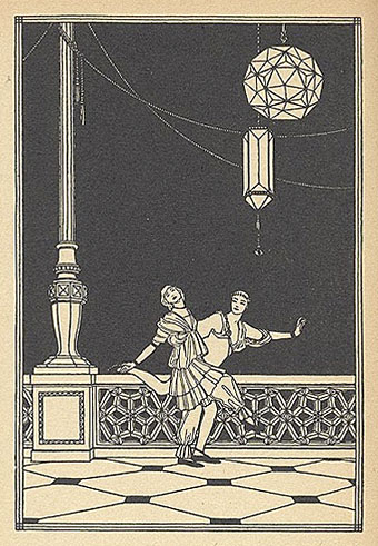
I usually celebrate polymathy but in Bragdon’s case his varied interests seem to have deprived us of more work by a unique illustrative talent. The indispensable VTS has further examples of his clean style from a 1915 treatise on architecture and design, Projective Ornament. It was increasingly common during this period to regard ornamentation in architecture as a 19th century evil to be purged from all future buildings, a concept expressed most notoriously by Adolf Loos in his 1908 essay, Ornament and Crime. Bragdon engaged with the argument by proposing that architects put aside historical and natural pastiche and look to geometry for a new style of decoration. His illustrations in Projective Ornament are beautifully done and some (like the one below) might almost be the work of an Art Deco illustrator such as George Barbier.

bragdon2.jpg

Elsewhere on { feuilleton }
The illustrators archive

Previously on { feuilleton }
The Decorative Age
Images of Nijinsky

Decorative car mascots

sphinx.jpg

The Hood Ornament Flickr pool features an impressive range of antique car mascots from the age when motor vehicles were emblazoned with mythological motifs and pedestrian safety was an afterthought. Most of them tend to be Art Deco-styled but a few display the florid elegance of Art Nouveau, a design trend that was being eclipsed as car ownership became more popular. I have one of these sphinx mascots, the trademark of Armstrong Siddeley motors for several decades. I always thought the similarity to London’s Embankment sphinxes was a coincidence but it appears not.

Previously on { feuilleton }
The Feminine Sphinx
Lalique’s dragonflies
The Decorative Age
Frémiet’s Lizard

Hugh Ferriss and The Metropolis of Tomorrow

ferriss1.jpg

Philosophy from The Metropolis of Tomorrow (1929).

I’ve procrastinated for an entire year over the idea of writing something about Hugh Ferriss and now this marvellous Flickr set has forced my hand. Ferriss (1889–1962) was a highly-regarded architectural renderer in the Twenties and Thirties, chiefly employed creating large drawings to show the clients of architects how their buildings would look when completed. But he was also an architectural theorist and his 1929 book, The Metropolis of Tomorrow, which lays out his ideas for cities of the future, was a major influence on the work I produced for the Lord Horror comics during the 1990s. Ferriss’s book appeared two years after Fritz Lang’s Metropolis but bears little resemblance to Lang’s simplistic tale, despite superficial similarities. Rather than a science fiction warning, The Metropolis of Tomorrow was a serious proposal for the creation of Art Deco-styled megacities.

hch5bw.jpg

Lord Horror: Hard Core Horror #5 (1990).

Continue reading “Hugh Ferriss and The Metropolis of Tomorrow”

The art of John Austen, 1886–1948

austen1.jpg

A few drawings by British illustrator John Austen (1886–1948), like Patten Wilson another artist whose work is hard to come by today. Austen was one of the many young illustrators over whom Aubrey Beardsley’s etiolated shadow fell from 1900 onwards and it’s the first ten years of Austen’s work I find most interesting, mainly because of the Beardsley stylings. He’s not as original or as elegant as Harry Clarke but he’s a lot better than the frequently overrated (yet interesting for other reasons) Hans Henning Voigt, or Alastair as he preferred to be known.

Continue reading “The art of John Austen, 1886–1948”