Invisible Cities: Miscellanea

cities01.jpg

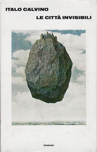
Cover art: The Castle in the Pyrenees (1961) by René Magritte.

A final post for this week devoted to Italo Calvino’s Invisible Cities, and it occurs to me that “Miscellanea” could easily be the name of one of Marco Polo’s cities.

One thing that’s become apparent over the past few days is that this subject is a very popular one with artists, especially in Italy. This is understandable but it also means you could probably fill another week of posts pursuing further illustrations and homages. Rather than belabour things I’m ending with a few of the more notable derivations including some cover designs. The Einaudi volume above was the first printing in Italy in 1972.

cities03.jpg

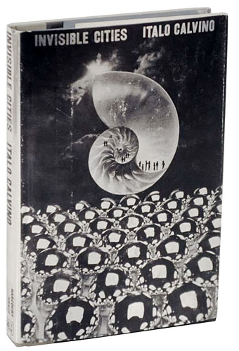
Cover design by Arnold Skolnick.

And this was the first American edition from Harcourt, Brace and Jovanovich in 1974. The cover is printed in silver foil which makes the book a particularly desirable item. This might explain why it’s also rather expensive today.

cities04.jpg

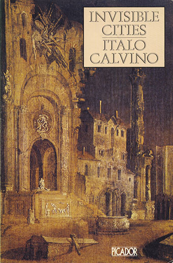
Cover art: Martyrdom of a Saint by Monsù Desiderio.

The 1979 Picador edition is one of two paperback editions I own. The enigmatic “Monsù Desiderio” has a confused identity (see this post), and specialised in curious architectural paintings so this is an apt choice.

Continue reading “Invisible Cities: Miscellanea”

Taking Woodstock

taking_woodstock.jpg

I mentioned Ang Lee’s forthcoming film, Taking Woodstock, last week and this poster by Mojo makes a decent fist of capturing some of the West Coast psychedelic style. I thought at first that the rainbow hues were garish in the wrong way, the San Francisco poster artists used bold colours but limited their palette since many of them were working for screenprinting. But since this film concerns the story of a gay man, Elliot Tiber, and his attempt to provide a home for the Woodstock festival in 1969—and since the rainbow flag is now a gay symbol—it makes sense even if the overall impression is of colour clash. I like the subtle touch of making the poster look worn, something I’ve done myself on a recent book cover design which is also styled as a cinema poster. I’ll be posting that here in due course.

woodstock.jpg

That’s the film promotion; the posters for the original event can be seen at Woodstock posters. The pencil sketch on the left is an elaborate Art Nouveau-styled design intended for the festival before the original choice of venue was refused. The sheet in the centre looks like a hasty promo piece for the new venue while the poster on the right is the final version with the famous dove graphic by Arnold Skolnick. That dove came to symbolise the whole event, hence its appearance on the Taking Woodstock one-sheet.

Taking Woodstock opens in the US on August 15th, 2009, the 40th anniversary of the festival.

Previously on { feuilleton }
Over the rainbow
Dutch psychedelia
Family Dog postcards