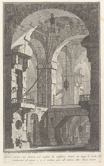
Dark prison with a courtyard for the punishment of criminals (c.1750) by Giovanni Battista Piranesi. (NB: not one of the Carceri d’Invenzione although it is another imaginary prison.)
Piranesi’s etchings of imaginary prisons, the Carceri d’Invenzione, are his most celebrated and influential works but they’re not the only such views to be found in 18th-century art. What you see here are some of the prison settings designed for the theatre and opera of the time, where incarceration or unjust imprisonment was a recurrent theme. Beethoven’s only opera, Fidelio, is one of the more famous examples, with all the action taking place inside the walls of a Spanish prison.
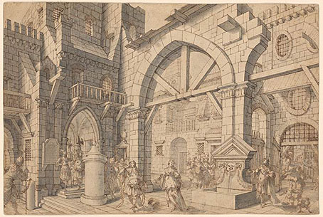
Prison Courtyard with Figures (c. 1720). Attributed to Francesco Galli Bibiena.
Many of these designs are by various Galli Bibienas, a multi-generational family of Italian artists and architects who included theatrical designers among their talented number. The Galli Bibienas’ prisons lack the invention and menace of Piranesi’s etchings—many of them look as neat and tidy as their designs for colossal gardens and palaces—but I enjoy the dramatic perspectives all the same.
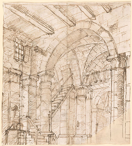
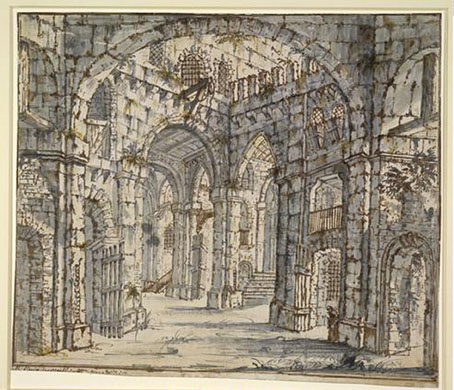
Prison Interior (c.1725–1730) by Antonio Galli Bibiena.
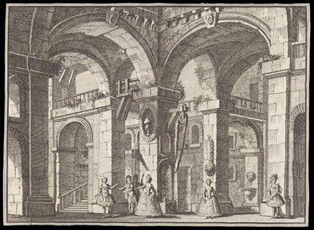
Print depicting the Prison scene in the opera-ballet Cerere placata at the Royal Palace of Jove (1772). Carlo Bibiena (artist) and Giovanni Battista Nolli (etcher).
Design for a stage set: the interior of a prison. School of Francesco Galli Bibiena.