Hector Guimard’s Castel Béranger

guimard01.jpg

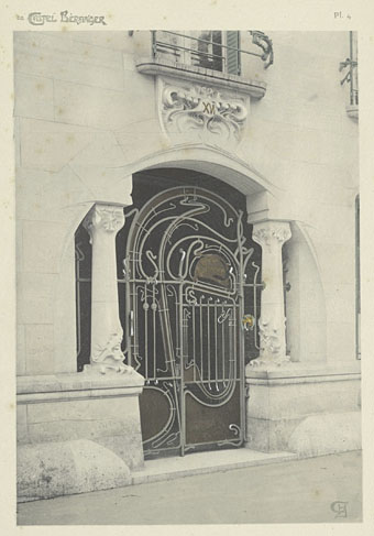
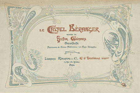
Art Nouveau is never far from these pages or from my own work, as has been the case this week when work-related research turned up this recent addition to the scanned books at the Internet Archive. Hector Guimard is best known today for his entrances to the Paris Metro not all of which survived the ravages of the 20th century. His designs for the Castel Béranger, an apartment block in Paris, slightly precede the Metro commission, and were intended by Guimard as a showcase for his own development of the Art Nouveau style.

guimard02.jpg

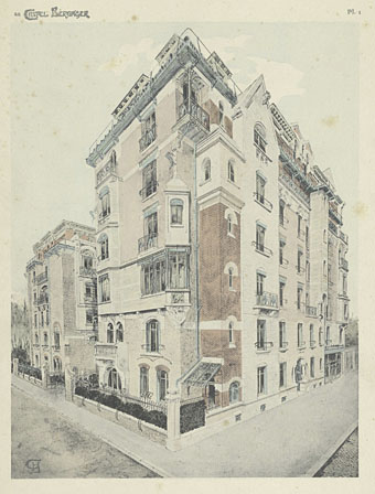
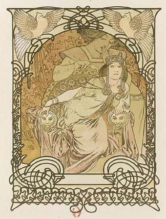
Like Frank Lloyd Wright, Guimard attended to every detail of the building’s construction and interior design, furniture included, and that’s what you have here, a book length guide to the building inside and out. The asymmetrical wrought-iron gate is a familiar sight from studies of Art Nouveau but other views of the building are less common. Compared to Alphonse Mucha’s control and Victor Horta’s sinuous curves, Guimard’s decoration can appear undisciplined but the wildness also makes it seem in advance of its time. Some of the wallpaper patterns for the Castel Béranger contain shapes that wouldn’t be seen again in a design context until the psychedelic posters of the 1960s. Guimard believed he was designing for the future but didn’t live to see the world that could make use of such stylistic delirium.

guimard03.jpg

Continue reading “Hector Guimard’s Castel Béranger”

Alphonse Mucha’s Ilsée, Princesse de Tripoli

mucha1.jpg

One of the recent weekend posts linked to a Kickstarter page for a reprinting of Le Pater, one of several books designed and illustrated by Alphonse Mucha. Two years before Le Pater Mucha had created an equally sumptuous volume, Ilsée, Princesse de Tripoli. The Mucha Foundation describes the book thus:

Based on Edmond Rostand’s La Princesse Lointaine, written for Sarah Bernhardt in 1895, L’Ilsée, Princesse de Tripoli was commissioned from the author Robert de Flers by the Parisian publisher Henri Piazza.

By the time De Flers had completed his manuscript, Mucha had only three months to prepare 134 coloured lithographs before the edition was due to go to print. (more)

I’ve often wondered how Mucha managed to create so many posters and other designs—never mind books—in a short space of time, even if he used assistants now and then. Judging by this example he could work fast without diminishing his flair or invention. The pages here are from Gallica where the scans seem to be improving in quality. The whole of Ilsée, Princesse de Tripoli is available for viewing or downloading, as is their copy of Le Pater and many other Mucha prints and illustrations.

mucha2.jpg

mucha3.jpg

mucha4.jpg

mucha5.jpg

Previously on { feuilleton }
Alphonse Mucha record covers
Combinaisons Ornementales

Weekend links 317

mucha.jpg

Alphonse Mucha’s Le Pater, a book of mystical Symbolism written, designed and illustrated by the artist, was published in a limited edition in 1899. The book has been out of print ever since but Thomas Negovan at Century Guild will be reprinting it later this year.

• “Five axioms to define Europe: the coffee house; the landscape on a traversable and human scale; these streets and squares named after the statesmen, scientists, artists, writers of the past; our twofold descent from Athens and Jerusalem; and, lastly, that apprehension of a closing chapter, of that famous Hegelian sunset, which shadowed the idea and substance of Europe even in their noon hours.” George Steiner explores his idea of Europe.

Journey To The Edge Of The Universe by Upper Astral, 43 minutes of cosmic ambience, is a cassette-only release from 1983. The album has never been reissued so secondhand copies command excessive prices but it may be downloaded here.

• Mixes of the week: Three hours of ambience by Gregg Hermetech, XLR8R Podcast 446 by [Adrian] Sherwood x Nisennenmondai, and Secret Thirteen Mix 190 by Shxcxchcxsh.

Today [Angela] Carter is well known, widely taught in schools and universities, and much of what she presaged—in terms of recycling and updating (“old wine in new bottles”, she called it), or gender role play and reversal—has become commonplace in the culture. Despite this, many critics find it difficult to situate her work properly. This is partly because Carter is so sui generis (she has literary offspring but few antecedents), and partly because many struggle with the relationship of politics and aesthetics in her writing.

Kate Webb reviews two new books about Angela Carter

• Words that will forever pursue us: Tim Page on the late Michael Herr, “rock’n’roll voice of the Vietnam War”.

• From 2015: Luigi Serafini on how and why he created an encyclopedia of an imaginary world.

James Campbell on Ginsberg, Kerouac and Burroughs: celebrating the Beats in Paris.

Fragile Beasts, an exhibition of grotesque print ornaments at Cooper Hewitt, NYC.

• Not before time, Guy Gavriel Kay wants to see an end to the plague of writing tips.

• David Bowie and Buster Keaton by Steve Schapiro.

Tom Charity on the films of Michael Cimino.

Alison Goldfrapp: photographer.

Golem Mecanique

European Man (1981) by Landscape | Europe After The Rain (1981) by John Foxx | Trans Europe Express (1994) by The One You Love

The case of the fin de siècle fleuron

artnouveau.jpg

I said yesterday that poppies are a common feature of the fin de siècle magazines for the convenient way they combine long-stemmed flowers—ideal for all those Art Nouveau flourishes—with narcotic connotations that signal Decadence. The spiralling fleuron above is one example that readers of Savoy books may recognise, an occasional company logo which has been in use since the mid-1980s. David Britton chose the design from one of the Dover Pictorial Archive books, Carol Belanger Grafton’s Treasury of Art Nouveau Design and Ornament, and I later made a digital version from this page scan.

heroes.jpg

One of the earliest Savoy uses, a label design for Heroes (1986) by PJ Proby.

Having spent a great deal of time in recent years trawling through Art Nouveau magazines I was sure I was going to run into the original printing of the fleuron eventually. Some of the page decorations in Jugend are very similar but it wasn’t there or in Pan, Deutsche Kunst und Dekoration or The Studio. I don’t have a copy of the Grafton book, and Dave says his copy is lost, so I’ve no idea whether there’s a credit for the source of the designs; not all Dover books credit their source material in any detail. Earlier this week I decided to look in Art et Décoration, a magazine that was the French equivalent of The Studio, since the header at the top of the scanned page implied that the other designs might be from the same magazine. Aside from a couple of copies at the Internet Archive this means looking through the poor-quality scans at Gallica; by a fluke—because they don’t seem to have a complete run of the early issues—the January 1898 edition contained the page below showing the Savoy fleuron, an endpiece for an article devoted to another French art magazine, L’Image.

Continue reading “The case of the fin de siècle fleuron”

Cocorico covers

cocorico01.jpg

Alphonse Mucha.

For a while now I’ve been waiting for several French journals of the fin de siècle to turn up online but humour magazine Cocorico has never been among them. I knew that Alphonse Mucha had contributed a handful of covers and some other graphics to Cocorico, notably the frontispiece (below) which ran in every issue. What I didn’t realise was that this title was effectively the French counterpart to Jugend magazine which had been running for two years when the first issue of Cocorico appeared in December 1898. Both magazines share the same mix of humorous articles, cartoons, serious art pieces and poetry, all connected by some very fine Art Nouveau graphics.

cocorico19.jpg

Alphonse Mucha.

Jugend has the edge when it comes to the graphics, some of which are very strange, but Cocorico looks much more like a humour magazine to contemporary eyes, with many cartoons that resemble those drawn today. Cocorico is also mostly free of the Jugend brand of satire which is often little more than nationalist rabble-rousing. Cocorico ran for 63 issues to 1902 by which time its format had changed and the florid graphics had been abandoned for a more sober layout. What follows is a selection of cover designs, many of which are Mucha’s work, and all of which follow the Jugend template of varying the art style and title design. There’s also one by František Kupka (or François as he was credited here) who also contributed interior illustrations in the later issues. There’ll be more about him tomorrow.

cocorico02.jpg

Alphonse Mucha.

Continue reading “Cocorico covers”