Painted devils

bewick1.jpg

Alright, these devils are inked rather than painted, but the phrase is a memorable one from Macbeth which was also used by Robert Aickman as a title for one of his story collections.
bewick2.jpg

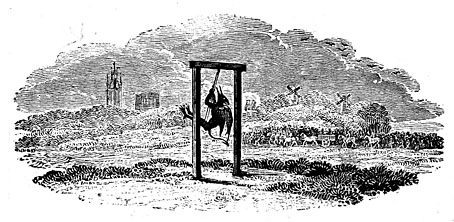
The devils in question are the work of Thomas Bewick (1753–1858), an English engraver referred to twice in Casting the Runes by MR James. I was reminded of this recently after I’d watched the excellent film adaptation, Night of the Demon, and decided to reacquaint myself with its origin. In James’ story, Karswell, a vengeful occultist with a vague resemblance to Aleister Crowley, torments a man he’s cursed by reminding him of the escalating supernatural threat and its potentially fatal outcome. One of the warnings is as follows:

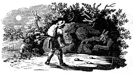
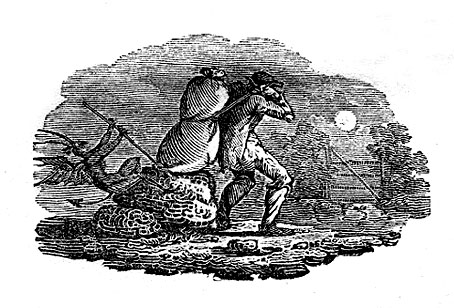
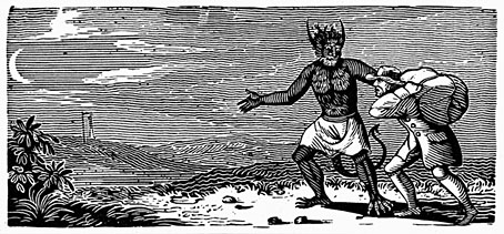
…two things came for him by post during those weeks, both with a London postmark, and addressed in a commercial hand. One was a woodcut of Bewick’s, roughly torn out of the page: one which shows a moonlit road and a man walking along it, followed by an awful demon creature. Under it were written the lines out of the “Ancient Mariner” (which I suppose the cut illustrates) about one who, having once looked round—
walks on,

And turns no more his head,
Because he knows a frightful fiend
Doth close behind him tread.
bewick4.jpg

The Coleridge quote makes it into the film but there’s no mention of the woodcut, although we do see some other engravings of medieval devils. (Likewise, the ITV Playhouse adaptation from 1979 includes the quote but omits the woodcut.) Since the quote is a genuine one I was curious to know whether the Bewick picture also existed. Unfortunately, this doesn’t seem to be the case. I’m equivocating, as usual, because I’m not entirely certain, but in an article from 2006 Tom Lubbock had this to say about Bewick and James:

Like Borges, James delights in the fictional but plausible work of literature. In Casting the Runes, he also contrives a fictional work of art. Though a contemporary of Coleridge, the engraver Thomas Bewick never made any woodcuts illustrating The Rime of the Ancient Mariner, nor do any of his works quite correspond to the one described in this passage. Still, it’s a good fake. Many of Bewick’s woodcuts have travellers. Some of them have moonlight and demons, too. You can see what James had in mind.
bewick3.jpg

Continue reading “Painted devils”

Led Zeppelin IV: Jimmy Page versus Little Bo-Peep

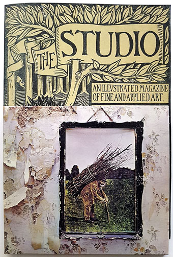
lz4.jpg

Background graphics by Aubrey Beardsley, 1893.

You’d think by now that everything would be known about an album with a Godzilla-sized cultural footprint like Led Zeppelin IV. I certainly thought so until last week when I turned up the source of something that the more obsessive Zepp-heads have been pondering for years. If this puts a bustle in your hedgerow then read on.

symbols.jpg

Led Zeppelin’s fourth album has been around now for half a century which means there really is a lot known about every detail of its production. Mysteries that used to confound friends of mine when we were teenagers have long been solved, questions such as what the hell the four symbols assigned to each member of the group actually signified; not only do we know the origin and meaning of those symbols, the enigmatic “Zoso” sigil chosen by Jimmy Page has an entire website dedicated to its various manifestations. We know where the photo on the cover was taken (Birmingham), and why the sleeve is devoid of identification (Page was annoyed with the press reaction to the previous album); we know that the hermit painting inside the gatefold is based on the Tarot card by Pamela Colman Smith, and we also know a great deal about the writing and recording of Stairway To Heaven. Erik Davis logged much of this in his 33 1/3 study of the album, and while he examines the band symbols in some detail he doesn’t say much about the rest of the hand-written inner sleeve beyond this comment:

Is there a meaning to the nifty Arts and Crafts typeface that Page lifted for the Stairway To Heaven lyrics on the other side of the sleeve? Or just a vibe?

The source, if not the meaning, of this script has been intriguing Zeppelin fans for many years, but I wasn’t aware of this until I happened to be reading the Wikipedia entry about the album and found myself equally intrigued. The game was afoot, Watson.

soh1.jpg

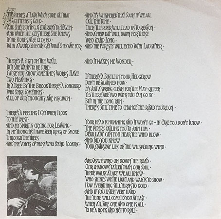
It makes them wonder: the hand-lettered lyrics.

A persistent question you see in fan circles is “What font was used to create X?” People will ask this question even when the design is a one-off, like Syd Mead’s logo for Tron, or something that’s obviously been lettered by hand. Led Zeppelin IV is an album guaranteed to raise the “What font?” question because the lyrics of the group’s most famous song, Stairway To Heaven, cover an entire side of the inner sleeve. On one of the fan forums I was reading someone was eager to identify “the font” because they wanted to apply the words to a bedroom wall. Many more people must have copied out those lyrics since 1971; I once had to do this myself for a female friend who was so besotted with Jimmy Page that she wanted the lyrics in a frame on her own bedroom wall.

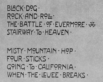
tracks.jpg

According to the Wikipedia entry, Page revealed the source of the lettering to be an issue of The Studio, the British art and design magazine which helped launch Aubrey Beardsley’s career and did much to develop and promote the Art Nouveau style in the 1890s. I’m very familiar with The Studio, many posts here refer to it, and I happen to have a complete collection of issues downloaded from the journal archive at Heidelberg University. Seeing the magazine mentioned in this context immediately made me want to find the design that Page had adopted, but before I started flicking through thousands of pages I looked around to see if any of the Zepp-heads had tried searching for the magazine themselves. Evidently not; all the discussion I’ve seen about the inner sleeve tends to recycle the Wikipedia entry, nobody seems to have bothered looking for copies of the magazine. Okay then…

Continue reading “Led Zeppelin IV: Jimmy Page versus Little Bo-Peep”

Weekend links 615

tesla.jpg

Tesla does the Astro. Hunter Dukes at Public Domain Review examines the promotion of Nikola Tesla’s ideas via this famous photograph.

• Coming soon from Side Real Press: Kokain—The Modern Revue, a magazine produced in Vienna that ran for five issues during 1925. “Original copies are so rare that it scarcely appears in any of the literature relating to the Weimar period and its contents have remained almost entirely ignored and certainly untranslated. Until now.”

• “Magritte had gotten this far in life by refusing to obey anyone, and in a way his disobedience proved that he understood Surrealism better than the leader of the Surrealists.” Jackson Arn reviewing Magritte: A Life by Alex Danchev.

• “Go as far into your dream as possible and find your own unique voice.” Meredith Monk (again) talking to Elizabeth Aubrey.

• Coming soon from Strange Attractor: City of the Beast: The London of Aleister Crowley by Phil Baker.

• At Spoon & Tamago: The natural world springs to life in kirie paintings by Tamami Kubota.

Antonia Mufarech on why sunflowers are Ukraine’s national flower.

• At Dennis Cooper’s: Etienne-Louis Boullée’s unbuildable tombs.

• Mix of the week: I Can’t Go For That by The Ephemeral Man.

• New music: Triumph Of The Oak by The Lord.

• RIP Philip Jeck.

Tesla (1997) by Jimi Tenor | Tesla (2011) by They Might Be Giants | Tesla Coil (2016) by Xhei

Peculiar Shocks

bodyshocks02.jpg

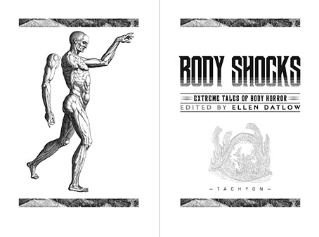
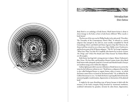
My cover design for Body Shocks, the body-horror story collection edited by Ellen Datlow, appeared here back in March. Now that the book is out from Tachyon I can show some of the interior design. In the earlier post I mentioned cover drafts that featured anatomical illustrations, none of which worked as well as the eyeball collage that became the final cover. The rejected pieces were better suited to the interior which combines engraved illustrations with the kind of sans-serif typography you might find on modern medical labels.

bodyshocks03.jpg

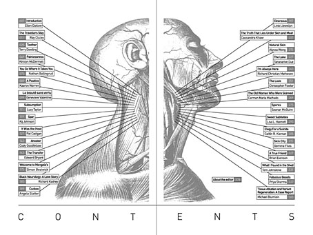
The diagram of veins that fills out the contents spread looks like an illustration from a 19th-century edition of Gray’s Anatomy but it’s actually an illustration from a book about massage whose title I don’t seem to have made a note of. Gray’s is a thorough volume, being a complete guide to the human body, but the illustrations aren’t as large or as detailed as those you can find elsewhere. The header bands used to indicate the beginning of each story are from Gray’s, however, while many of the stories end with full-page plates from The Anatomy of Humane Bodies by William Cowper. These are mostly engravings of autopsies which I processed by inverting the images then overlaying them with parallel lines. You can still tell the pictures are medical illustrations but they’re not as obtrusive as they would be if they’d been left untreated.

bodyshocks04.jpg

Continue reading “Peculiar Shocks”

Weekend links 584

crowley.jpg

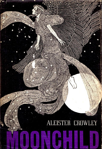
Cover for the 1970 US edition of Moonchild by Aleister Crowley. No artist credited (unless you know better…). Update: The artist is Dugald Stewart Walker, and the drawing is from a 1914 edition of Hans Christian Andersen’s fairy tales. Thanks to Mr TjZ!

• “…a very mid-Seventies cauldron of Cold War technology, ESP, sociology, black magic and white magic, experimental science and standing stones, secret radar and satanic rituals, whirring aerials and wild moors: a seething potion of Wyndham and Wheatley.” Mark Valentine on The Twelve Maidens, a novel by Stewart Farrar.

• “The line in the song ‘feed your head’ is both about reading and psychedelics. I was talking about feeding your head by paying attention: read some books, pay attention.” Grace Slick explains why those three little words have been attached to these pages since 2006.

Freddie deBoer reposted his “Planet of Cops” polemic, a piece I linked to when it first appeared in 2017, and which used to come to mind all the time before I absented myself from the poisonous sump of negativity that we call social media.

• RIP Charlie Watts. The Rolling Stones’ last moment of psychedelic strangeness is Child Of The Moon, a promo film by Michael Lindsay-Hogg featuring an uncredited Eileen Atkins and Sylvia Coleridge.

• Old music: A live performance by John Coltrane and ensemble of A Love Supreme from Seattle in 1965 that’s somehow managed to remain unreleased until now.

• A short film about Suzanne Cianni which sees her creating electronic sounds and music for the Xenon pinball machine in the early 1980s.

• “I’ll be in another world”: A rediscovered interview with Jorge Luis Borges.

Steven Heller explains why Magnat is his font of the month.

Clive Hicks-Jenkins on the allure of toy theatre.

• New music: Vexed by The Bug ft. Moor Mother.

• At Dennis Cooper’s: Nikola Tesla Festschrift.

Moon Child (1964) by The Ventures | Moonchild (1969) by King Crimson | Moonchild (1992) by Shakespears Sister