The Dreamers (2013) by Kate Baylay, from Seven Gothic Tales by Isak Dinesen.
• RIP composer and musique-concrète pioneer Tod Dockstader. “I didn’t have the money for electronic sounds…I had to have things like bottles, or anything that would make a noise. It didn’t matter what it was; if it sounded interesting, or I could make it interesting, I’d go for it.” Geeta Dayal talked to Dockstader for Wired in 2012. Dockstader’s film credits included Fellini’s Satyricon and Tom and Jerry cartoons. He also wrote the story for one of the latter, Mouse into Space, in 1962. Ubuweb has some early Dockstader recordings.
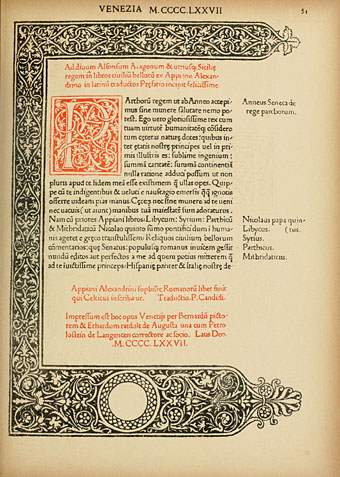
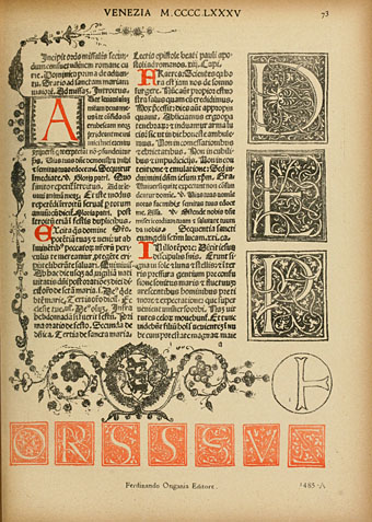
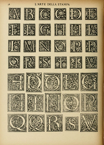
• “…anyone who has ever sat in a cafe, or in the bath, with a paperback owes a debt to Aldus and the small, cleanly designed editions of the secular classics he called libelli portatiles, or portable little books.” Jennifer Schuessler on Aldus Manutius, and the roots of the paperback.
• “At Chernobyl, we made ‘the world’s first radioactive nature preserve.’ We made black rain. We made the Red Forest, which was green when the day began, and is dead.” Mary Margaret Alvarado reviews The Long Shadow Of Chernobyl by Gerd Ludwig.
Prison was often the fate of those caught circulating samizdat in the Soviet Union—not only the “high” samizdat such as Solzhenitsyn, but the crude and lowly joke books as well. The official rationale for the prohibition was in context no less reasonable than the rationale given more recently for condemning Charlie Hebdo or R. Crumb. There is always a perception that the very serious project of perfecting society is being undermined. But society will not be perfected, and it is a last resort of desperate perfecters to go after the subtle-minded satirists who understand this.
Justin EH Smith on why satire matters
• “You have to do your research, and you’ll find treasures that you couldn’t even have begun to sit down and draw until you saw them in front of your eyes,” says Annie Atkins, graphic designer behind The Grand Budapest Hotel.
• The Tales of Hoffmann: exclusive materials from the making of Powell and Pressburger’s masterpiece. The film will be released on Blu-ray by the BFI later this month.
• The illustrated score for Irma, the opera offshoot of Tom Phillips’ A Humument, is now available from Lulu.
• Mellifluous Ichor From Sunless Regions, a free album of Hauntological electronica by The Wyrding Module.
• Kraftwerk at the controls: what the group’s live instrument setup looks like today.
• Booze, Blood and Noise: The Violent Roots of Manchester Punk by Frank Owen.
• Mix of the week: 14th February 2015 by The Séance.
• Transmission (1979) by Joy Division | Radioactivity (William Orbit mix, 1991) by Kraftwerk | Bellstomp/Pond Dance (Mordant Music remix, 2012) by Tod Dockstader