The Kosmische Tarot

geitner-tarot-box.jpg

Revelation of the weekend has been the discovery that there are two sets of (for want of a better term) Krautrock Tarot cards. The first, Walter Wegmüller’s Zigeuner Tarot, is familiar for being included in the Tarot concept album released on the Kosmischen Kuriere label in 1973. The album was credited to Wegmüller but he only advised on the symbolism and acts as MC/narrator. Wegmüller’s cards are detailed and somewhat original, but their drawing is from the enthusiasm-over-technique school which goes against the grain of the rest of the album design and the accomplishment of the musicians.

mythos.jpg

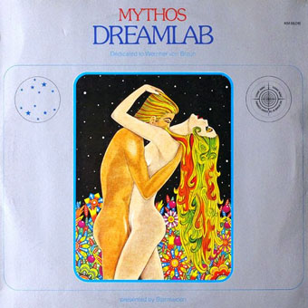
Dreamlab (1975) by Mythos. Design by Peter Geitner.

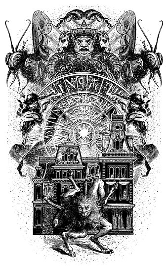
As noted a few days ago, the designer of the Tarot album was Peter Geitner working under the direction of a pair of very hands-on label bosses, Rolf-Ulrich Kaiser and Gille Lettmann. The story of Kaiser’s rise and fall has been recounted in some detail over the years (see here and here). Given the colourful saga, and the cast of notable musicians, writers and artists, I’m surprised to have seen no mention of the second Tarot set that Peter Geitner designed and illustrated in 1975 while the Kosmische Musik empire was imploding. One illustration (The Lovers) was even used as cover art for the Dreamlab album by Mythos.

geitner-tarot-back.jpg

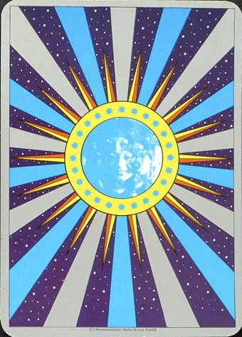
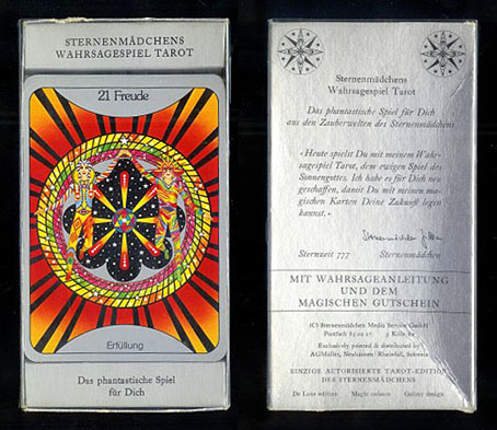
Card back for the Sternenmädchen’s Wahrsagespiel.

Sternenmädchen’s Wahrsagespiel (Star Girl’s Fortune Telling Game) is a specialised set of the Major Arcana presented as a spin-off from Gille Lettmann’s Sternenmädchen persona as featured on the Gilles Zeitschiff album; the back of the 22 cards features the photo of Gille from the album cover. I’ve said that Geitner illustrated the cards but some of the drawings may have originated as sketches by Gille Lettmann; information is scant but I’ve seen mention of her having been a textile or fashion designer. What’s most striking to me about these designs is how psychedelic they all are, more so than any of the Kosmische Musik album covers even though they maintain the cosmic themes of the record label. Many of those involved with the Kosmische empire were taking LSD at the time so this isn’t very surprising but psychedelia of this intensity was an outmoded thing by the mid-70s. Also of interest is the renaming of the cards which push the attributions away from medieval tradition and into the cosmos. I’ve not been able to find examples of all 22 designs but a list of the cards follows, together with examples of variable quality. The set was printed by AGM Müller but has never been reissued so it now commands high prices. (Many thanks to Jeff for drawing my attention to these!)

Continue reading “The Kosmische Tarot”

Heliotropic

heliotropic9.jpg

Arriving in the post this week was a catalogue for a Maison & Objet exposition of design and decoration which includes one of my paintings among the listed “Inspirations“. The event was held in Paris at the end of January but I’ve been so busy for the past few of months I forgot to see when it was on. Not that I could have said much about it since this is a showcase event you have to attend rather than experience remotely.

Catalogues for big art and design events often tend to the lavish and expensive but the Elsewhere book is the most lavish I’ve ever encountered. The production runs the gamut of the many expensive options which modern printing can provide: metallic inks, varnish effects, iridescent and translucent sheets, embossing, die-cutting, tipped-in inserts, and variable page sizes. The inflexible icing on the cake comes in the shape of a small square of polished marble glued to one of the pages. Excess aside, the print quality is excellent, and I’m very pleased with the way my Elvis painting appears.

sunking.jpg

Sun King (1996).

Sun King was commissioned by Creation Books in 1996 as cover art for a Jeremy Reed novel which ended up being dropped by the company. The concept was the author’s, and while I’m pleased with the way it turned out I always felt it should have had more of a Gustave Moreau quality. This is the first time the picture been used anywhere although I did reuse the Elvis-in-a-Cadillac idea recently for one of the Alas Vegas Tarot cards.

heliotropic1.jpg

My painting is included in the Heliotropic section of the book which shows some of François Bernard’s inspirations. I’m pleased they placed one of the die-cut overlays before my piece. The photos below show some of the pages from the other sections which concern the inspirations of Elizabeth Leriche—her section includes the chunk of marble—and Vincent Grégoire whose section features futurism, space scenes, metallic effects, and Daft Punk.

heliotropic2.jpg

heliotropic3.jpg

Continue reading “Heliotropic”

Lovecraft’s Monsters

Lovecraft's Monsters

Graphic for the title page and ends of chapters.

I don’t usually post things so far away from publication, but editor Ellen Datlow put these pictures on her Facebook page a few hours ago so I may as well do the same here.

Back in February I bought a Wacom Intuos drawing tablet, something I’ve been using with regularity for the past few months. The Alas Vegas Tarot cards I designed in the summer were the first major attempt at getting used to working with it; Lovecraft’s Monsters, a forthcoming fiction anthology for Tachyon is the second, and I now feel very comfortable working with it. More than that, I’m increasingly pleased with the way it’s possible to combine the drawing techniques I’ve been using for years with the additional possibilities provided by working in Photoshop. As always, it’s the end result that counts but arriving at an end result can be easy or difficult. Some of these illustrations look no different than they would have done had I used ink on paper but they took half the time to create, a considerable benefit when a deadline is looming.

The stories Ellen Datlow has chosen for this collection all present different aspects of monstrosity seen through the lens of Lovecraft’s fiction and his cosmic menagerie. Some are full-on extensions of the Mythos, others are more allusive; all the pieces bar one have been published before but I’d not read any of them so for me this was fresh material. Having spent the past few years saying I was finished with Lovecraft’s fiction I was excited to be working on this book. The stories are good, and I welcomed the challenge of having to illustrate such a variety of material.

Larger copies of all the pictures can be seen here.

The star-headed thing at the top of this page is another amalgam of elements plundered from Haeckel’s Kunstformen der Natur and other sources. I’ve leaned rather heavily on Haeckel in the past, something I wanted to avoid here; this serves as a kind of visual punctuation separating the stories.

Lovecraft's Monsters

Cthulhu.

The drawing I’ve called Cthulhu is a piece for the introductory pages. Having already produced a lot of Cthulhoid art I didn’t want to repeat myself. The initial idea was of a tiny human figure faced with something enormous and nightmarish; that could be a vast eyeball or it could be a mouth or some other organ/aperture, the vagueness was intentional. Lovecraft continually impresses upon his readers how difficult things are to describe or apprehend but you seldom find this quality in art based upon his stories. Cthulhu especially has devolved into little more than an outsize man-in-a-rubber-suit à la the Creature from the Black Lagoon. In The Call of Cthulhu the figure on the mysterious statuette is described as having a humanoid shape but Lovecraft doesn’t describe the appalling reality in any detail at all. When Cthulhu is struck by a ship at the end of the story it breaks apart and is then seen recombining, the implication being that the creature is corporeally amorphous.

Lovecraft's Monsters

Only the End of the World Again by Neil Gaiman.

Neil Gaiman’s entry concerns a werewolf private detective in Innsmouth. Lovecraft’s decaying fishing village and its inhabitants turn up in several of the stories so care was taken to avoid repetition.

Lovecraft's Monsters

Bulldozer by Laird Barron.

A great story about another detective, a Pinkerton agent this time, hunting his quarry through the Old West. Collin de Plancy’s Dictionnaire Infernal is mentioned so I used some of Louis Breton’s illustrations from the third edition.

Continue reading “Lovecraft’s Monsters”

Magicians

magic01.jpg

The stage variety rather than occult practitioners. The levitating Mephistopheles above is the one I borrowed earlier this year for the Alas Vegas Tarot designs. “Kellar” was Harry Kellar (1849–1922), a popular American magician blessed with some talented poster designers who stripped away the superfluous text to concentrate on his name and the recurrent motif of a red devil. Considering their age (they date from around 1900) these posters are surprisingly elusive, with no indication on some of them that Kellar is a stage performer at all. He retired in 1908 so by this time his name alone was evidently enough of an audience draw.

Howard Thurston was Kellar’s appointed successor, hence the continuity of the red devils and type design. Devils and imps weren’t the sole property of the pair as the other examples here demonstrate. “Miss Baldwin” is a rare example of a woman achieving parity with her male colleagues, at least in the poster department. All these posters are from the collection at the Library of Congress where many more examples may be seen. A detail from the horizontal Kellar poster below appears on the cover of the recent lavish Taschen volume Magic: 1400s–1950s by Mike Caveney, Jim Steinmeyer, Ricky Jay and Noel Daniel.

magic02.jpg

magic03.jpg

magic04.jpg

Continue reading “Magicians”

Alas Vegas Tarot cards

alasvegasdevil.jpg

Back in February I bought a Wacom drawing tablet and said I’d show some proper results from its use later. For the past few months I’ve been working on this project using a combination of Wacom drawing and vector graphics. The initial brief from games designer James Wallis was for six Tarot-style card designs for his Alas Vegas role-playing game which has as its theme a fantasy extrapolation from Las Vegas and its gaudy mythology. The Kickstarter funding for the game turned out to be more successful than was anticipated so James asked me to expand the six cards idea into a full set of black-and-white Major Arcana designs.

This has been a fun series to work on although a number of the cards presented problems at first, the antique nature of the Tarot symbolism being a difficult thing to map across a very commercial American city. The symbolism from the Rider-Waite-Smith (RWS) deck was used as a rough guide although we deviated in a few places from the more traditional attributes. Las Vegas has changed over the years so rather than represent a single period of the city’s history there are references to different eras, from the huge casinos of today back to the buildings of the 50s and 60s with their distinctive “Googie” architecture. Notes for the cards follow below. The artwork can be seen at larger size here.

alasvegas00.jpg

The Fool is usually a young man about to step off a cliff edge with a dog barking a warning at his heels, hence the dog on the sign.

alasvegas01.jpg

Several of the cards convert the Tarot characters into cabaret acts. This one was pretty inevitable, and I’m sure it’s not the first time a stage conjuror has appeared on this card.

alasvegas02.jpg

The chair is based on the 1965 “Ball Chair” design by Eero Aarnio (as seen in The Prisoner TV series), adapted here to resemble the Priestess’s crescent moon.

alasvegas03.jpg

The style on this one is more 70s than 60s: patterned wallpaper (the hearts derive from the symbolism of The Empress, and from playing cards, of course), white rug, Kung Fu pyjamas.

Continue reading “Alas Vegas Tarot cards”