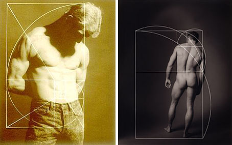
left: Interior Golden Section Series (1988); right: Untitled (1992).
Photography by Craig Cowan.
A journal by artist and designer John Coulthart.

left: Interior Golden Section Series (1988); right: Untitled (1992).
Photography by Craig Cowan.
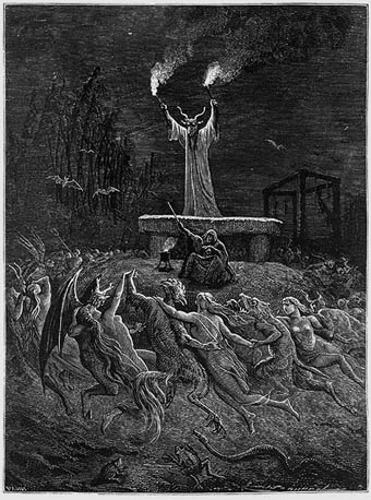
La Danse du Sabbat from Histoire de la Magie (1884) by P. Christian.
Elsewhere on { feuilleton }
• The etching and engraving archive
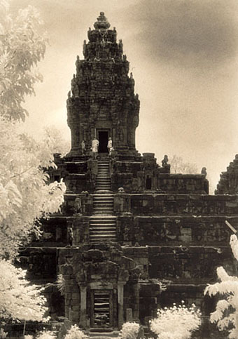
The Temple of Bakong (2001).
The temples and ruins of Angkor Wat and Angkor Thom are effortlessly photogenic, so much so it seems impossible to take a bad picture of them. John McDermott’s photographs are especially fine, not least because he’s used infra-red film which always gives foliage a peculiar luminous appearance. Simon Marsden is the big populariser of this technique with his many photographs of ruins in Britain and Ireland.
Previously on { feuilleton }
• Adolph Sutro’s Gingerbread Palace
• The Jantar Mantar
• Hungarian water towers
• Karel Plicka’s views of Prague
• Atget’s Paris
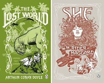
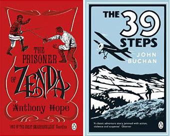
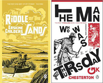
More pulp revenants come blinking back into the light. The runaway success of The Dangerous Book for Boys among fathers as well as sons has set British publishers casting about for new ways to exploit masculine nostalgia. Repackaging a few old warhorses is Penguin’s solution and a cheap one since most (all?) of these titles are out of copyright. I like these covers (and can’t find a design credit unfortunately), they’re well done, capture the right tone and look great as a set.
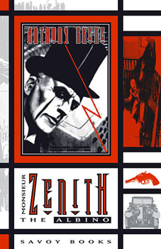 The Man Who Was Thursday seems to be the odd man out (as it were) story-wise. All the other books are typical adventure fare but in Chesterton’s novel what appears at first to be a pot-boiler turns out to be a metaphysical allegory closer to Charles Williams than John Buchan. One of Sax Rohmer‘s Fu Manchu volumes would have been more suited to this series but I suspect their “Yellow Peril” racism makes that less easy today. The Chesterton cover is curiously out-of-synch too, a pastiche of El Lissitzky/Bauhaus styles rather than the Edwardian designs the others are imitating. This isn’t a mistake, however, the fractured lettering suits a tale of anarchists with a plot full of twists and surprises. I tried a similar Modernist approach in 2001 with my jacket for Savoy’s edition of Zenith the Albino. In that instance the style was derived from Mondrian, with the colours coming from the initial description of the albino’s black clothes, white skin and red eyes. I’d venture to suggest that Anthony Skene’s thriller is a far better book than all of the above, Chesterton included, but then I am rather biased.
Update: Coralie from Penguin has the credits in the comments.
Elsewhere on { feuilleton }
• The book covers archive
I posted an old James Joyce portrait sketch for Bloomsday a couple of days ago and today decided to rework it as a vector graphic. This is the result. I was producing a lot of sketches like this while working on Reverbstorm a decade ago, most of them post-Picasso/Bauhaus/De Stijl variations. Joyce is particularly easy to render in a semi-abstract form on account of his distinctive features and apparel: hat, glasses, nose, moustache and bow tie. The Reverbstorm series is still in the process of being reworked as a single volume so this will probably find a home there.