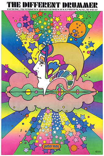
Peter Max, 1968.
Artists complain justifiably about the constraining effect of labels but sometimes you really do need a label in order to identify a particular idiom. The artwork here is what most people would regard as psychedelic even though the subject matter isn’t always psychedelic at all. I doubt that Citroën intended their new Dyane car to be associated with LSD when they asked Michel Quarez to create a comic book to promote the vehicle, while Quarez’s Mod Love comic is just as hallucinogenically chaste. I tend to think of this style as “groovy”, an unsatisfying term with other associations but “post-psychedelic”, while accurate, feels too cumbersome for such playful graphics. The groovy look is where the purely psychedelic style enters the mundane world, and where the intended audience may be youthful but isn’t always a crowd of experienced lysergic voyagers; a watering down of psych delirium mixed with a dash of Pop Art, all bold shapes, heavy outlines and very bright colours, comic art (or actual comics) with the edges and detail smoothed away and the gain pushed to the maximum. I keep wishing someone would put together a collection of this stuff. There’s a lot more to be found.
Update 1: I knew I’d forgotten somebody. I replaced the book cover by Gray Morrow—an artist who was never really groovy in the manner of these other works—with a contraception poster by Nicole Claveloux, who was very much in the Groove Zone in the 1970s.
Update 2: Added designs by Miguel Calatayud, Mike Hinge, György Kemény, and Tito Topin. Thanks to Vadim for the tips!
• Further browsing: The Peculiar Manicule.
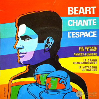
Guy Peellaert, 1967.
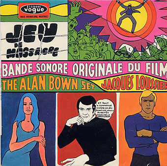
Guy Peellaert, 1968.
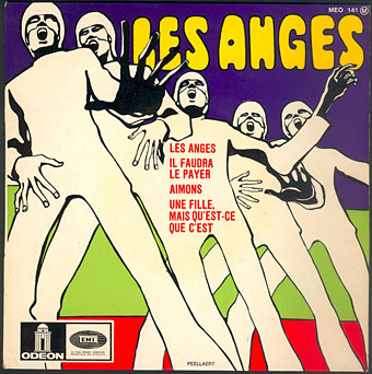
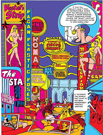
Guy Peellaert, 1968.
The Adventures of Jodelle by Pierre Barbier and Guy Peellaert, 1966.