New things for June II

chaoticum.jpg

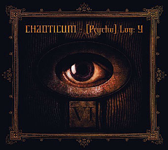
Work on two very different CDs was completed this month, a pair of releases so different they’re almost polar opposites. Chaoticum describe their music as “art for your ears” and the label for this album is HORUS CyclicDaemon, producers of the Aleister Crowley anthology I designed in 2005. The package is a digipak and will include a poster which features one of my Great Old Ones portraits.

eskiboy.jpg

Eskiboy is UK Grime artist Wiley who’s proved himself notable enough to be featured on the cover of last month’s Wire magazine. This compilation was a commission from Baked Goods in Manchester. I was trying to avoid the obvious tunnel image at first but the label was keen to see something along those lines so this is the result of the usual to-ing and fro-ing which design work often entails.

Meanwhile the CD I designed earlier this year for Turisas is now in the shops and the band is interviewed in this month’s Metal Hammer. I’ll be putting the full artwork for all these releases onto the site over the next week or so.

Boys Own Books

boys_own1.jpg

boys_own2.jpg

boys_own3.jpg

More pulp revenants come blinking back into the light. The runaway success of The Dangerous Book for Boys among fathers as well as sons has set British publishers casting about for new ways to exploit masculine nostalgia. Repackaging a few old warhorses is Penguin’s solution and a cheap one since most (all?) of these titles are out of copyright. I like these covers (and can’t find a design credit unfortunately), they’re well done, capture the right tone and look great as a set.

zenith.jpgThe Man Who Was Thursday seems to be the odd man out (as it were) story-wise. All the other books are typical adventure fare but in Chesterton’s novel what appears at first to be a pot-boiler turns out to be a metaphysical allegory closer to Charles Williams than John Buchan. One of Sax Rohmer‘s Fu Manchu volumes would have been more suited to this series but I suspect their “Yellow Peril” racism makes that less easy today. The Chesterton cover is curiously out-of-synch too, a pastiche of El Lissitzky/Bauhaus styles rather than the Edwardian designs the others are imitating. This isn’t a mistake, however, the fractured lettering suits a tale of anarchists with a plot full of twists and surprises. I tried a similar Modernist approach in 2001 with my jacket for Savoy’s edition of Zenith the Albino. In that instance the style was derived from Mondrian, with the colours coming from the initial description of the albino’s black clothes, white skin and red eyes. I’d venture to suggest that Anthony Skene’s thriller is a far better book than all of the above, Chesterton included, but then I am rather biased.

Update: Coralie from Penguin has the credits in the comments.

Elsewhere on { feuilleton }
The book covers archive

Finnegan begin again

joyce2.jpg

I posted an old James Joyce portrait sketch for Bloomsday a couple of days ago and today decided to rework it as a vector graphic. This is the result. I was producing a lot of sketches like this while working on Reverbstorm a decade ago, most of them post-Picasso/Bauhaus/De Stijl variations. Joyce is particularly easy to render in a semi-abstract form on account of his distinctive features and apparel: hat, glasses, nose, moustache and bow tie. The Reverbstorm series is still in the process of being reworked as a single volume so this will probably find a home there.

New things for June

mindscape.jpg

New and not-so-new work-related arrivals include The Mindscape of Alan Moore DVD which finally arrived after the usual postal delays caused by bank holidays and other trivia. Those interested can order this from the Shadowsnake Films site.

And copies of the CD from metal band Azathoth turned up a few weeks ago but I’d neglected to mention this. My sole involvement was letting them use my Azathoth portrait from The Haunter of the Dark for the cover but they’ve done a nice job with the rest of the design. Their insectile name/logo fits very well with the picture.