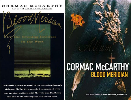
left: Vintage International (US), cover design by Susan Mitchell (1993).
right: Picador (UK) reprint (2008).
After the Oscars success of No Country for Old Men it’s understandable that Cormac McCarthy’s publishers would want to reprint all his works. His books still appear under the Picador imprint in the UK where they’ve been reissued recently in uniform editions with new cover designs. A couple of these are an improvement on their lacklustre predecessors, and they don’t look so bad when seen together on a shelf, but on the whole this McCarthy reader is disappointed by the overall blandness they present.
 My earlier post about McCarthy’s UK covers was critical of the The Road which used a combination of a stock photo and Akzidenz-Grotesk Condensed for the typography. In the case of No Country for Old Men the photo from the American original by Chip Kidd was used but his carefully-judged type layout was dropped. Unfortunately it’s The Road approach which has been continued on the new covers, with variable degrees of success. The Chip Kidd designs that Picador repeated in the 1990s made similar use of suggestive photos but there was at least some attempt made to match form to content; a number of the new designs are vague in the extreme. I assume that the disparate group of objects on the cover of Blood Meridian relate to the character of the Judge when he reveals his intention to catalogue every new object that he comes across. But that’s an incidental detail in one scene of a baroque, ferocious and very violent historical novel. So the image isn’t exactly a misrepresentation but it puts the wrong emphasis on a book that could easily be described as a Western nightmare. And they’ve also dropped the book’s subtitle, an amendment I find especially egregious.
Even more bland is the picture of a shack on the cover of Child of God, McCarthy’s tale of a backwoods psychopath who moves into a cave and murders women so he can have sex with their corpses. Anyone buying the Picador book on the strength of the cover is in for a surprise. And since when did that novel have a definite article in its title? Best of the bunch is probably The Crossing (above) which shows the wolf that provides the impetus for the story. The type works better on this cover while the animal’s reflection in the water is a nice touch that can be read as relating to the various symmetries and reflections in The Border Trilogy, of which this book forms the second part.
Picador set a high standard for paperback design in the Seventies which makes the sight of uninspired and lazy work doubly-dismaying. Susan Mitchell’s covers for the Vintage paperbacks are still the best I’ve seen for McCarthy’s books—and they’re still available—but if these new editions pick up new readers on the strength of the author’s moment in the limelight then that’s no bad thing. It’s the words that count, after all.
Elsewhere on { feuilleton }
• The book covers archive
Previously on { feuilleton }
• Cormac McCarthy book covers