The Studio & Studio International

studio1.jpg

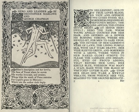
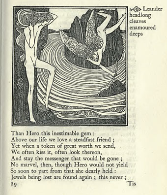
Back in February I posted some pictures from a 1971 collection of Art Nouveau illustration and design, some of which were competition entries from The Studio magazine. The Studio, which later became the long-running Studio International, can be seen from issue 11 onwards at the Internet Archive now that they’ve started uploading Google’s book scans. I’ve only looked at one of these so far, Volume 11–13 which runs over 850 pages and so takes some time to go through, as do all these rather unwieldy PDF books. The issues are missing their covers and so aren’t dated but would appear to be from around 1896 to 1898, one of the final entries being a memorial piece for Aubrey Beardsley who died that year; The Studio was the magazine which had introduced Beardsley to the public only five years earlier.

studio2.jpg

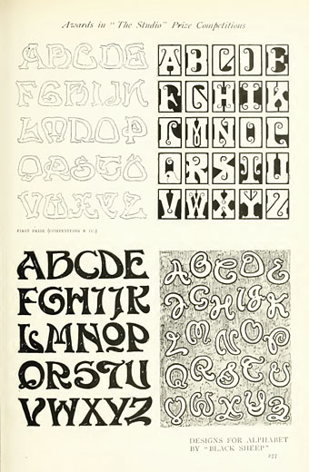
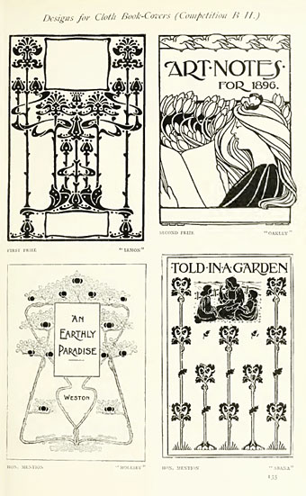
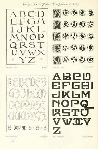
The Studio ran regular competitions among its readers and the examples shown here are from some of those. I especially like these type designs; dare we assume that the “Dorian” design below is named after Dorian Gray? As a whole the magazine is an odd mix of very dull Victorian art of the landscapes and artisans type, with occasional flares of interest when they devote a feature to the emerging Art Nouveau style or profile a Symbolist artist such as Giovanni Segantini.

studio3.jpg

A note for anyone wishing to download Google scans from the Internet Archive: some of the PDF links lead you to a Google page where they’re trying to sell you an e-text or get you to buy a book. To see the available files you need to click “All Files: HTTP”.

Previously on { feuilleton }
The Great God Pan
Art Nouveau illustration
Jugend Magazine

Charles Ricketts’ Hero and Leander

ricketts1.jpg

Enthusiasts of Charles Ricketts’ illustrations can find book collections of his drawings and paintings but the artist (with partner Charles Shannon) was also a printer, typographer and book designer who would no doubt have preferred his illustrations to be seen in their intended setting. The Internet Archive has a few choice examples of Rickett’s books, of which the most profusely illustrated is Hero and Leander (1894), Christopher Marlowe’s poem (completed by George Chapman).

ricketts2.jpg

Also of interest is Danaë (1903) by Thomas Sturge Moore with its black and red type, A Bibliography of the Books Issued by Hacon & Ricketts (1904), and A Defence of the Revival of Printing (1899). The latter is of interest to book designers and typographers for its presentation of Ricketts’ aesthetic philosophy. Ricketts’ and Shannon’s books made continual use of a small leaf motif as a pilcrow to mark a fresh paragraph. In A Defence of the Revival of Printing Ricketts discusses his replacement for the ampersand (&), which he disliked, preferring instead a new character combining the letters E and T, ampersands being a contraction of the Latin word “et”. There’s also some discussion of his unique type designs which he charmingly refers to as “founts”, preferring, like contemporary William Morris, the antique terminology.

ricketts3.jpg

Colophon from Hero and Leander. A rose forms the monogram of Ricketts’ and Shannon’s Vale Press.

Elsewhere on { feuilleton }
The illustrators archive

Previously on { feuilleton }
Art Nouveau illustration
Dorian Gray revisited

Plates: Volume 2

plates.jpg

My third CD design for the Tectonic label is another piece of relative minimalism which once again features photos by Liz Eve. All the backgrounds on this occasion are microscope close-ups of vinyl records, very fitting for a double-CD collection of recent 12″ releases.

The Tectonic logo (which predates my involvement with the label) is based on the Technics logo and for this release I tidied the label logo slightly, a process which led to the discovery that the Technics design used a variant of the Clarendon typeface for its letter shapes (it’s not an exact match). This in turn led me to use Clarendon in various weights across the packaging, something which made a change from the usual sans serif or monospace font. The great Saul Bass frequently used Clarendon for his title sequences; if it’s good enough for Saul, it’s certainly good enough for me.

Tectonic main man Rob Ellis talked to Fact magazine about the new release earlier this week.

Previously on { feuilleton }
Aerial by 2562
New things for November

The Best of Michael Moorcock

mm1.jpg

The first of the books I’ve been designing for Tachyon Publications appears this month. Two more are due to follow and I’m working on another at the moment; more about those titles later.

The Best of Michael Moorcock was a pleasure to be involved with not only because I’ve been reading Moorcock’s fiction for a very long time but I’ve also been fortunate during that time to get to know the writer and Linda Moorcock, his wife. Mike likes the work I’ve done in the past for Savoy Books and we did have an anthology of his favourite pieces by other writers planned for Constable & Robinson back in 2005. That book didn’t work out so this makes up for its cancellation. This is an excellent anthology, put together initially as a private enterprise by editor John Davey who managed the difficult task of compiling a collection which ranges over forty years of writing. Ann and Jeff VanderMeer came aboard as co-editors for the Tachyon edition.

I’ve been working mainly on the interior design of the Tachyon volumes (although I’ve also done the cover for Jeff VanderMeer’s forthcoming Booklife) and for this title I took a cue from Ann Morn’s cover design which features a pair of gates emblazoned with large letter Ms. The title spread above takes the letter M from the typeface used for the author’s name and multiplies that to create an equivalent set of gates for the reader to pass through. I try to play down the pyrotechnics for fiction—the words are the important thing, not the graphic design—but since this was a story collection I thought I’d try illustrating each piece using the title typography alone. Most of these are done by using a suitable typeface but for a few pieces I managed to create an arrangement that reflected the story. Behold the Man (below) is the Nebula Award-winning story of a journey back in time to find the historical Jesus. The cross shape not only relates to the Biblical theme but also implies the crossed time streams and Moorcock’s layered, cross-cut narrative.

mm2.jpg

The Best of Michael Moorcock is available now from the usual sources and received a glowing review in the Guardian. Later this month, and other work permitting, I’m hoping to make a start on what will effectively be a companion volume, Savoy’s long-delayed Into the Media Web, another collection by John Davey which this time collects the best of Moorcock’s copious essays, reviews and other non-fiction.

Previously on { feuilleton }
Designing Booklife
The Sonic Assassins
Revenant volumes: Bob Haberfield, New Worlds and others
An announcement redux

Gramato-graphices

gramato-graphices.jpg

Or Gramato-graphices. In quo varia scripturae emblemata, belgicis, germanicis, italicis, hispanicis, gallicis characteribus exaata… scripta, aeri incisa, et impressa per Cornelium Boissenium Enchusanum to give the full title. A treatise on penmanship and calligraphy from 1605 by Cornelis Dirckszoon Boissens. Also another free scan at the Internet Archive. Searching for better reproductions turned up this stunning engraving by Boissens in the Rijksmuseum collection.

Elsewhere on { feuilleton }
The illustrators archive
The etching and engraving archive

Previously on { feuilleton }
John Bickham’s Fables and other short poems
Letters and Lettering
Studies in Pen Art
Flourishes