Into the Media Web by Michael Moorcock

itmw11.jpg

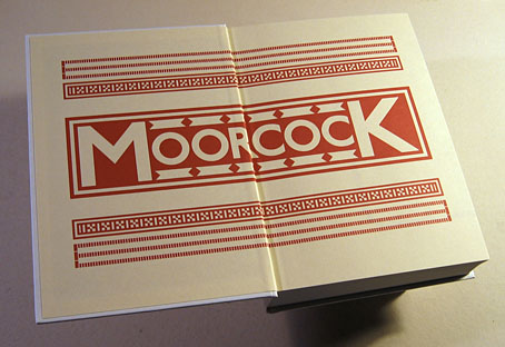
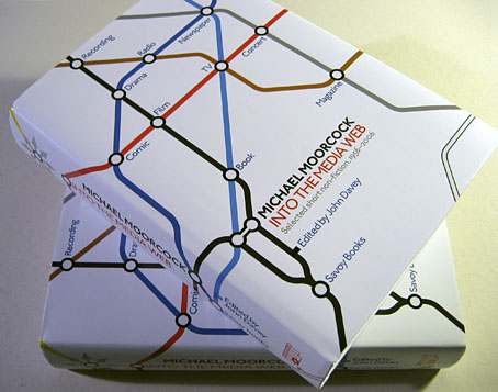
Here at last is the book I spent a good part of last year designing. Into the Media Web is a huge volume as befits a huge talent, 720 pages of Michael Moorcock’s non-fiction spanning fifty years of his career from his days writing for sf and fantasy fanzines, through to journalism, reviews and articles for major newspapers and magazines. Moorcock expert John Davey did an amazingly thorough job of compiling, editing and annotating it all, and it’s been a considerable pleasure to design such an important collection. Alan Moore provided the substantial introduction. Savoy Books haven’t announced a price yet but it’s going to be about £45 since it’s another limited edition and weighs a ton. Into the Media Web makes a fine companion to last year’s The Best of Michael Moorcock from Tachyon, also edited by John Davey (with Ann & Jeff VanderMeer) and whose interior I also designed. Details about Into the Media Web‘s design follow below.

itmw12.jpg

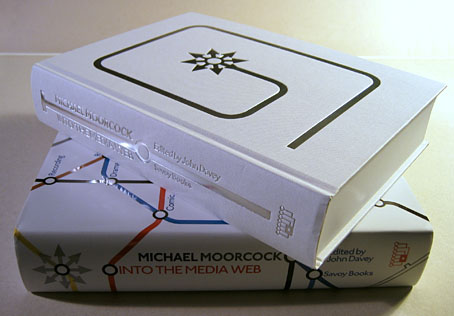
The dust jacket is matt white with a spot UV layer which picks out the titles and lines in gloss.

itmw13.jpg

Continue reading “Into the Media Web by Michael Moorcock”

Weekend links 13

metropolis01.jpg

Watch the trailer for the newly-restored version of Fritz Lang’s masterwork, Metropolis.

My cover design for Jeff VanderMeer’s Finch was voted best cover in the 2010 Spinetingler Awards.

• Figment announces the 2nd Annual Figment Album Cover Design Contest. The judge this time round is William Schaff.

• Two interviews at The Quietus: Jon Brooks of The Advisory Circle and Richard H Kirk of Cabaret Voltaire.

• “Merely a Man of Letters.” Jorge Luis Borges interviewed in 1977.

• Another Engelbrecht: The Miniature Theatres of Martin Engelbrecht.

The Unearthing Box Set by Alan Moore & Mitch Jenkins.

• The gays: RIP Felix Lance Falkon, author of the landmark study, A Historic Collection of Gay Art (1972). The Independent is the latest newspaper to look at sexuality in the animal kingdom.

Publisher to Release Philip K Dick’s Insights Into Secrets of the Universe.

• Roger Ebert shows the world a draft of his unfilmed Sex Pistols screenplay, Who Killed Bambi? Jon Savage comments.

• Further Flickr sets: History of the Book/Typography and Dutch Graphic Design. Related: more Dutch graphic design at the NAGO.

Far Red: Video by u-matic & telematique, music by Monolake.

Has steampunk jumped Captain Nemo’s clockwork shark yet?

An edge over which it is impossible to look.

Surrender. It’s Brian Eno.

Ecstatic Peace Library.

• Songs of the week: See Emily Play by Pink Floyd and Metropolis by Kraftwerk.

Weekend links 8

adur.jpg

Another label design of mine for the Adur Brewery. Much as I like Otto Weisert’s Arnold Böcklin typeface it’s something I’ve been reluctant to use in the past due to its lazy deployment by UK shop sign makers. The ribbon motifs and the hops are adapted from one of my Art Nouveau reference books, however, so it seemed appropriate in this case.

Dead Fingers Talk: The Tape Experiments of William S. Burroughs, a forthcoming exhibition at IMT, London, “presenting two unreleased tape experiments by William Burroughs from the mid 1960s alongside responses by 23 artists, musicians, writers, composers and curators.” Related: get a Naked Lunch t-shirt (or another cover design) at Out of Print clothing.

Ronald Clyne: American folk modernist. Rediscovering the album and book cover designer.

Better Things: The Life and Choices of Jeffrey Jones. A documentary about the work of artist Jeffrey Jones. Related: Mike Kaluta appears in the trailer and Golden Age Comic Book Stories has pages from Kaluta’s illustrated Metropolis (1988), a novel by Thea von Harbou.

• “I imagined myself as a giant penis launching off from earth like a spaceship.” WFMU’s Beware of the Blog explores Cary Grant’s use of LSD. Related: Orange Sunshine – The Brotherhood of Eternal Love and Its Quest to Spread Peace, Love, and Acid to the World, a book by Nicholas Schou.

• Britain’s armed forces have a lesson for the US: “Only 10 years ago, the Army was expelling soldiers for homosexuality. Now gay weddings get the regimental blessing.” A very modern military partnership.

Cassette tapes and their growing curiosity/fetish value. Related: Michael Stipe and Maison Martin Margiela’s sterling silver microcassette charm.

• Another week, another theremin link: Detergent bottles become theremins.

• “Edinburgh is a city built on the production of books”.

The National Archives UK’s photostream at Flickr.

Typographic playing cards.

• A song for Cary Grant: The Trip by Park Avenue Playground, an obscurity from 1967. And These New Puritans have a new video for Attack Music.

Styles of Ornament

speltz1.jpg

Pages from Styles of Ornament (1904), a collection of ornamental designs by Alexander Speltz. This is one of a great collection of books from the Digital Library for the Decorative Arts and Material Culture at the University of Wisconsin. I only found their collection today so I’ve yet to take a detailed look at the rest of the volumes.

speltz2.jpg

And speaking of ornament, Callum at Front Free Endpaper posted this elegant Art Nouveau-styled cover from a Pearson’s Magazine collection, just the kind of thing I enviously covet.

pearsons.jpg

Previously on { feuilleton }
The Grammar of Ornament by Owen Jones

Equus and the Executionist

equus.jpg

I wrote about Peter Shaffer’s fascinating play, Equus, in September last year, and in passing touched on the horse and Mari Lwyd-inspired paintings of Clive Hicks-Jenkins which seemed to complement the play’s themes of sexuality and passionate obsession. Callum James had been having similar thoughts about Clive’s art and urged his friends at The Old Stile Press to bring play and artist together. Clive was in touch last week to let me know that his illustrated edition of the play is now in print. The Old Stile Press produce limited collectors’ editions of books to the highest standard. Consequently these are expensive works but then they’re as much art pieces as books, as you can see from the care which has been lavished on this particular volume. Nice to see one of my favourite typefaces, Bodoni, used for the text.

scott.jpg

Also in touch last week was photographer Gray Scott with news of this striking picture entitled Executionist which also happens to be a limited edition print. This is another expensive piece—as limited prints tend to be—but there’s no law that says the best things have to be cheap, is there?

Elsewhere on { feuilleton }
The illustrators archive

Previously on { feuilleton }
Dark horses
Gray Scott