Prince Iskandar’s horoscope

iskandar.jpg

The horoscope of Prince Iskandar, grandson of Tamerlane, the Turkman Mongol conqueror, by Imad al-Din Mahmud al-Kashi, showing the positions of the heavens at the moment of Iskandar’s birth on 25th April 1384.

From the Wellcome Trust image collection. Considering the Wellcome Trust’s medical background, there’s a surprising amount of non-scientific material in its image library, not least a collection devoted to Witchcraft. This perhaps reflects the wide-ranging interests of the Trust’s founder, Henry Wellcome. Jay Babcock and I visited the exhibition of artefacts from Wellcome’s vast collection at the British Museum in 2003 and that proved to be a similarly surprising cabinet of curiosities, including sheets of tattooed human skin and Charles Darwin’s skull-headed walking stick. I was sure I had a photograph of the latter but don’t seem able to find it if it’s still around. Never mind, the BBC has a picture, together with other items from the exhibition. Also on display there was a specially-commissioned film from the Brothers Quay which can now be seen in their DVD collection.
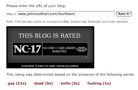
Via Boing Boing.

Previously on { feuilleton }
Calligraphy by Mouneer Al-Shaárani
The Brothers Quay on DVD
The Journal of Ottoman Calligraphy
Word into Art: Artists of the Modern Middle East
The Atlas Coelestis of Johann Gabriel Doppelmayr

Masonic fonts and the designer’s dark materials

golden_compass.jpg

The trailer for The Golden Compass turned up this week, the first part of Philip Pullman‘s His Dark Materials trilogy, and I can’t help but note that the film’s designers have chosen Jonathan Barnbrook’s Mason font for the titles and the rest of the typography. This isn’t so surprising given that Mason has been used on the covers of several editions of the books already but I wonder if this flush of even greater popularity will spell (as it were) the end of a stylish typeface.

hdm.jpgMason (originally named Manson) was one of Barnbrook’s earliest published type designs, appearing in 1992 via the Emigré foundry, and over the past fifteen years has been widely imitated and become the default font for fantasy works, especially book jackets. The attraction for the genre is obvious in the way the design uses elegant and traditional serif letterforms that have been amended slightly to give them a distinctive quasi-ecclesiastical flavour, with flourishes derived from Greek, Renaissance and Biblical letters. The Gothic arch of the letter A has also helped make the font a popular choice for New Age or occult books. Mason was designed as a set of serif and sans serif variations but it’s Mason Serif Regular which is used the most. (The cover for The Science of His Dark Materials shown here is using both the sans serif variation and Mason Regular Alternate.)

Distinctive fonts take a while to get around and I don’t recall seeing Mason until at least 1994. From 1995 to 2000 it began to appear everywhere, even in newspaper ads for a while, before finding a permanent place in the book world. The trouble with this kind of ubiquity is that the novelty the design once possessed quickly vanishes and it begins to runs the risk of becoming a design cliché. Many typefaces go this way, especially in the publishing world where the choice of typeface is often dictated by genre expectations. So Orbit-B and its variants used to signify “science fiction” or “the future” in the 1970s, Caslon Antique and Rubens have become associated with horror while FF Confidential has been over-used for crime novels.

Continue reading “Masonic fonts and the designer’s dark materials”

London Pride

london_pride.jpg

One of the exotic creatures at today’s London Pride march. More pictures at this Flickr pool. Marchers braved wet weather and renewed terrorist threats after two unexploded car bombs were found on Friday. (And where that matter is concerned, The Register has a rebuke to the inevitable hysterics.)

nc-17.jpg

On a related note, this site has a feature that allows you to see how your blog (or page) would be rated by the MPAA. As Queerty notes, overuse of the word “gay” pushes up the supposed offensiveness quotient, something which results in this page receiving an NC-17 rating when it scans the past month of postings. Yes, it’s only a bit of web silliness but when the real Motion Picture Ass. of America has been shown to treat gay themes or stories with greater restriction than straight ones then it’s probably more accurate than its creators suspect.

Update: also in The Register, an ex-armed forces bomb-disposal operator explains why the London “terror clowns” shouldn’t be dignified with the hysteria they’ve been receiving.

Arabesque by John Whitney

arabesque.jpg

I made the complaint in November last year when writing about James Whitney’s Lapis that few of the classic works of abstract cinema have yet to find their way to YouTube. Happily, things change fast in the online world and you can now see a clip of Lapis here. Another recent addition is the whole of Arabesque by James’s brother, John, a very early (1975) example of using computer graphics to create animations. This is necessarily crude by today’s standards—coloured lines and shapes—but it was made at a time when computers frequently filled entire rooms and recording their visual output meant pointing a camera at a monitor. Arabesque has a suitably Arabian santur soundtrack by Manoochehr Sadeghi.

Update: link changed to a better copy.

Elsewhere on { feuilleton }
The abstract cinema archive