Stevenson and the dynamiters

dynamiter.jpg

The Dynamiter: More New Arabian Nights (Longmans, London; 1914).

I’ve mentioned before that I’m a sporadic collector of the Tusitala Edition of Robert Louis Stevenson’s works, 35 small blue volumes published by Heinemann, London in 1924. I’ve found 15 of them so far and today turned up another one, volume 25, Virginibus Pueresque and Other Essays in Belles Lettres. Most of the ones I’ve collected are later reprints and this is no exception, being a sixth edition from 1928. The popularity of the series and the many reprint editions is the main reason they still appear with such frequency. Another reason is that these small pocket books, which were very common before and after the First World War, were well-made and have easily outlasted the first generation of paperbacks that eventually replaced them. I’d have no trouble ordering a complete set of the Stevensons from a book dealer but prefer to let chance find new additions. Given the dearth of good secondhand shops this is becoming increasingly difficult.

dynamiter2.jpg

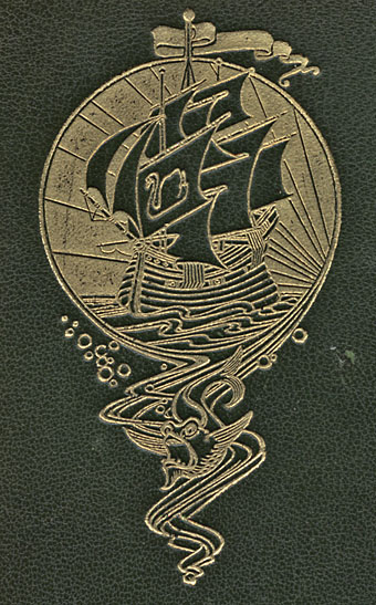
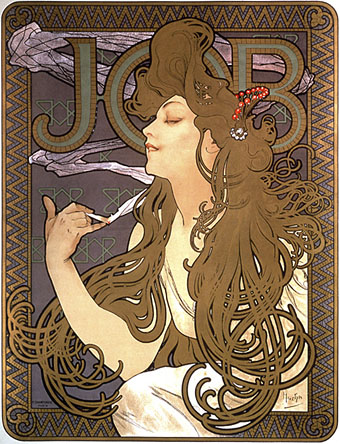
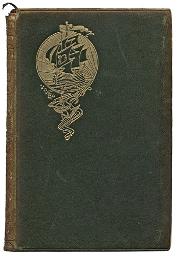
Also in today’s book haul was an earlier Stevenson, The Dynamiter: More New Arabian Nights, in a rather battered leather binding from 1914. I bought it almost solely for the Art Nouveau motif on the cover whose ship suits the author of Treasure Island but doesn’t really fit with the London setting of this particular book. I seem to recall having seen this design before which means it’s probably part of a uniform set like the Tusitala Edition, each volume of which bears a palm tree design on the spine and the signature of RLS blocked on the front board.

The only number of the Tusitala Edition I have in a leather binding is this book’s precursor, volume 1, New Arabian Nights. The Dynamiters is a collection of linked stories that Stevenson wrote with his wife, the Arabian Nights conceit being an attempt to transplant the telling of tall tales from medieval Baghdad to Victorian London. The dynamiters are a group of inept terrorists whose comic exploits were based on the real Fenian bombings that took place in London in the 1880s. A later attempted bomb attack on the Greenwich Observatory inspired the unsuccessful anarchists in Joseph Conrad’s The Secret Agent. Whatever some contemporary commentators might have us believe, terrorist attacks in cities are nothing new at all, only in Stevenson’s day they were labelled “dynamite outrages”. Stevenson dedicates his stories to the police officers charged with protecting the capital and apologises for making light of a serious matter. I have to wonder what he would have made of modern Baghdad being plagued by dynamite outrages on such a regular basis. And I also wonder how much real dynamite many of these Longmans’ books might have encountered, having been published just in time to be packed in the kit of soldiers going to the Western Front.

Elsewhere on { feuilleton }
The book covers archive

Previously on { feuilleton }
The Chronicles of Clovis and other sarcastic delights

Smoke

smoke1.jpg

Advertising poster for Job cigarette papers by Alphonse Mucha (1898).

The law forbidding smoking in public places finally came into effect in England on Sunday, something that the nation’s smokers are still coming to terms with. I’ve never been a smoker but have always been easy-going about the activity, having had smoking parents and been around smokers for years. That said, it’ll be nice to go out now and not return home smelling like an ashtray.

To mark the passing of a nicotine-stained era, here’s a few of the many representations of smoking in the art world. Until I started looking for pictures today I hadn’t realised how many paintings there are of people (and dogs!) having smoke blown in their faces, like this one and this one.

smoke2.jpg

The Opium Smoker by Jean-Jules-Antoine Lecomte du Noüy.

smoke3.jpg

A Voluptuous Smoke by Charles Edouard Edmond Delort.

Previously on { feuilleton }
Perfume: the art of scent
German opium smokers, 1900

Barney Bubbles: artist and designer

barney1.jpg

Image-heavy post! Please be patient.

Four designs for three bands, all by the same designer, the versatile and brilliant Barney Bubbles. A recent reference over at Ace Jet 170 to the sleeve for In Search of Space by Hawkwind made me realise that Barney Bubbles receives little posthumous attention outside the histories of his former employers. Since he was a major influence on my career I thought it time to give him at least part of the appraisal he deserves. His work has grown in relevance to my own even though I stopped working for Hawkwind myself in 1985, not least because I’ve made a similar transition away from derivative space art towards pure design. Barney Bubbles was equally adept at design as he was at illustration, unlike contemporaries in the album cover field such as Roger Dean (mainly an illustrator although he did create lettering designs) and Hipgnosis (who were more designers and photographers who drafted in illustrators when required).

Colin Fulcher became Barney Bubbles sometime in the late sixties, probably when he was working either part-time or full-time with the underground magazines such as Oz and later Friends/Frendz. He enjoyed pseudonyms and was still using them in the 1980s; Barney Bubbles must have been one that stuck. The Friends documentary website mentions that he may have worked in San Francisco for a while with Stanley Mouse, something I can easily believe since his early artwork has the same direct, high-impact quality as the best of the American psychedelic posters. Barney brought that sensibility to album cover design. His first work for Hawkwind, In Search of Space, is a classic of inventive packaging.

Update: BB didn’t work with Mouse in SF, I’ve now been told.

in_search_of_space.jpg

Hawkwind: In Search of Space (1971).

It’s fair to say that Hawkwind were very lucky to find Barney Bubbles, he immediately gave their music—which was often rambling and semi-improvised at the time—a compelling visual dimension that exaggerated their science fiction image while still presenting different aspects of the band’s persona. In Search of Space is an emblematic design that opens out to reveal a poster layout inside. One of the things that distinguishes Barney Bubbles’ designs from other illustrators of this period is a frequent use of hard graphical elements, something that’s here right at the outset of his work for Hawkwind.

This album also included a Bubbles-designed “Hawklog”, a booklet purporting to be the logbook of the crew of the Hawkwind spacecraft. I scanned my copy some time ago and converted it to a PDF; you can download it here.

Continue reading “Barney Bubbles: artist and designer”

Paris V: Details

Final Paris posting here, gathering up more of the better photos.

door.jpg

Walk down any residential street and you’ll see amazing doors like this that lead to the courtyards of apartment blocks. All the decorations are different, as are the brass door-handles emblazoned with human or animal heads. You could spend months photographing them.

Continue reading “Paris V: Details”